Welcome to our community

Be a part of something great, join today!

  • Hey all, just changed over the backend after 15 years I figured time to give it a bit of an update, its probably gonna be a bit weird for most of you and i am sure there is a few bugs to work out but it should kinda work the same as before... hopefully :)

The Great Gatsby Trailer

No 360˚ shutter was used on the entire film. What you're seeing is a post retiming for the trailer.

I think this why a lot of the slow motion look a little wrong, shutter-wise, and a little digital.
Most of the slow-mo in the trailer seems to have interpolated frames, after being shot with a 180 shutter.
Only a couple of shots, with fast-moving objects, or quick pans, we're spared the interpolating.

I think the perception of the cleanness of the trailer is part of a dilemma facing filmmakers in today's times.
Pictures are viewed on 4k theatrical screens, as well as iPhones.
What looks great in the theater looks too clean on a computer screen.
A close-up make sense on a small screen, but is way too in-your-face on a 4k big screen...
 
Why doesn't anybody include info like what lenses where used. When I see something I like on reduser, I look for lenses that where used, but not many people post this information.
 
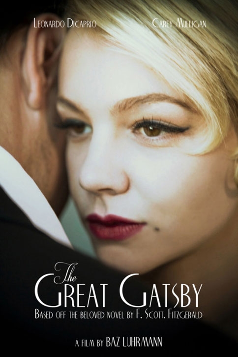
great-gatsby-movie-poster.jpg


The poster above must have been derived from bad makeup too. Hence why they had to blur the entire image.

Obviously I own three RED cameras and sold another... so I'm heavily invested in RED... I haven't seen anything this bad in any of my shoots. My opinion still remains the same... this looks terrible. Perhaps it will look better in 3D.... I hope so. I saw "Haywire" at the movies and it was the worse looking movie I had to endure... lets hope this is not another one.


Andrae, this actually is a classical look that my colleagues and my self some times use in Portrait Fashion photography and especially so in Product photography more so when joulery is involved.

The highlitgh in her face is an obvious DOP choice too, possibly to bring back looks of that period.
 
The thing I noticed was that I was drawn in, felt emotions while watching, and saw the beauty in the images. All the other details people mentioned mean nothing when the film moves you. The VFX look great, and thank-you for making such a beautiful film!
 
I'm a little surprised of the look, personally being a period piece I would prefer a softer and warmer more contrast look. It's a little too sharp and neutral based for my personal liking but, it still looks very good. It's different, and I can't wait to see it in theaters and see how it holds up.
 
I personally dislike all of Luhrmann's films but this looks interesting.

I wouldn't say that the CGI-look of this trailer won me over but I can't see any fault in its images that could be attributed as an EPIC's one.

The skin tones look fine in my calibrated monitor.
 
Strictly Ballroom is one of my faves. I'm really looking forwards to Gatsby.

Graeme
 
Skin tones look fine, great even, on my monitor as well.

Oddly enough it looks "stylized" to be neutral, if that sounds contradictory - the classic Hollywood tradition was always for good skin tone reproduction no matter what the scene itself was, so (for example) you have these wonderful colors in Leon Shamroy's work like in "Cleopatra", orange firelight mixed with cyan spots on golden temples at night, gorgeous... but people always step into some white light in their close-ups even when the scene is established as being fire-lit. And he was one of the most extreme colorists in cinematography ever since the 1940's.

So oddly enough the use of white light inside at night in "Gatsby" is a bit of old-fashioned glamour rather than naturalistic, because a real nighttime party in the 1920's would have been lit by low-wattage bulbs and candles. The neutrality is refreshing but it's not necessarily as realistic as an image with a slight color bias would be in that setting. So neutral is not natural, if that seems weird to say.

But I'm all for style and artistic interpretation so more power to these artists.

The trailer looks great, but I agree that it sticks out somewhat in its sharpness and cleanliness, more digital than film-like. It's a choice obviously. Gordon Willis, who took a different approach with "The Godfather" made some comment when he shot the film that a period movie shouldn't look like it just came fresh from the photo lab, it should have a bit of distancing. Other people have the opposite idea, that period movies should feel as immediate and fresh as something shot right now, that there should be no visual distancing, aging, etc. because people in the past didn't see their world as being in the past, it was all present to them, so no diffusion, no sepia tones, no old lenses, etc. It's just a different choice. "Assassination of Jesse James" for example did things with funky optics to create some feeling that we were looking into the past, that this was all a memory being recalled.

Anyway, the Jack Clayton "Gatsby", shot by Douglas Slocombe, did a lot with net diffusion, etc. so I can see why a new version would try a different approach.
 
is it possible that we're not seeing the final 'look', or that the images for the trailer have been processed, colored, and sharpened for marketing purposes?

not sure how those things usually work on big budget productions, but the disconnect there seems to be in line with how most things work... for better or worse.
 
I think this is the look. It's a high fructose corn syrup interpretation of the 1920's. I guess there was no need to try replicating the Robert Redford version.
 
I am not too sure about the look of this film. I've watched many Asian/Chinese period pieces shot on the Red-MX and Epic, and they look fantastic. I have a feeling this looks over-sharpend due to the Quicktime compression for the trailer to keep it clean. And yes the yellow stains on the faces is a Red compression trait. Easily cleaned in post. crashed blacks and desaturated images are also a very Redcentric look as well. For some reason lightiron, and cinema 3 get very nice rounded warm skintones and deep detailed blacks. I pay close attention to them.
 
is it possible that we're not seeing the final 'look', or that the images for the trailer have been processed, colored, and sharpened for marketing purposes?

not sure how those things usually work on big budget productions, but the disconnect there seems to be in line with how most things work... for better or worse.

Nothing is final until the show is finished and released, and often trailers are color-corrected by marketing departments, not the filmmaker, though in this case I'm sure that the filmmaker approved what was released. But it's a fool's errand to spend too much time analyzing image characteristics from an internet trailer. All you can say right now from the "Gatsby" trailer is that the Epic shoots pretty great footage... for trailers (though we already know it shoots great footage for features of course). Wait for the release in the theaters to make final judgements.

Besides every time a filmmaker color-corrects his footage, he makes some changes, it's just human nature. Even if Lurmann himself color-corrected the trailer it doesn't mean that when he finishes color-correction in a few months that he won't make adjustments.
 
It doesn't sing to me personally, but I accept every frame as being the result of a very deliberate, finely conceived and masterfully crafted piece of filmmaking.
 
Looked amazing on my plasma! The CGI of the car was a bit out of left field, kinda said "look at me" I'm fake, but other than that it looked awesome!
 
This should probably be discussed in a different thread on this topic, but I too notice a lot of weird green/yellow in a good deal of the skin tones. Some of it appears to be make-up, and there have been threads discussing how Red sees certain make-up. As well as the Hobbit diaries mentioning it. But some of it doesn't.

I just did some tests with daylight fluorescents on Epic and some dSLRs to compare stills. I expected some green from the flos, but while it was easily correctable on the dSLR raw files, no matter what I tried, I couldn't get the green out of the shadow areas in the skin tones on the Epic files. I'm perfectly happy accepting that I just don't have the specific skills to perform that correction. I'm by no means a colorist. But I do find it odd that the same simple steps that I've always taken to correct raw stills of these minor color casts wouldn't work on my .R3Ds. And then to see the same, or at least a very similar, issue presented here, it just piques my interest.

Normally skin tones look great on the Epic and I have no complaints. And I think that the rest of Gatsby looks great. But I'm interested in understanding what's happening with these colors. From an educational standpoint and not as a criticism. If I can understand it, I can fix it or work around it : ) And it is, in my opinion, our jobs to be scrutinizing and discerning, after all...
 
Paris, there's some makeups that just don't work that well. I've tested to find some, and when I did I threw every digital camera I had at them as well as the REDs, and it's a makeup issue. It's exacerbated by makeup being applied while not under the "to be shot" lighting, and also by neutral white balance (leaving the balance warm hides a lot of things). You can actually see the makeup issue with your own eyes when you change the lighting too. The Hobbit issue was something rather different - the colour change through the mirror of the 3D rig.

Graeme
 
Back
Top