Welcome to our community

Be a part of something great, join today!

  • Hey all, just changed over the backend after 15 years I figured time to give it a bit of an update, its probably gonna be a bit weird for most of you and i am sure there is a few bugs to work out but it should kinda work the same as before... hopefully :)

RED V-Raptor vs Alexa 35

You can use a CDL Grade in Redcine-X Pro In Baselight for AVID

Redcine-X Pro

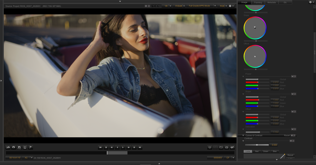
Original Image
1.png


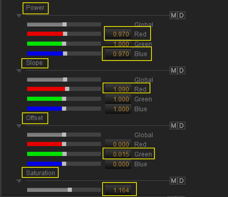
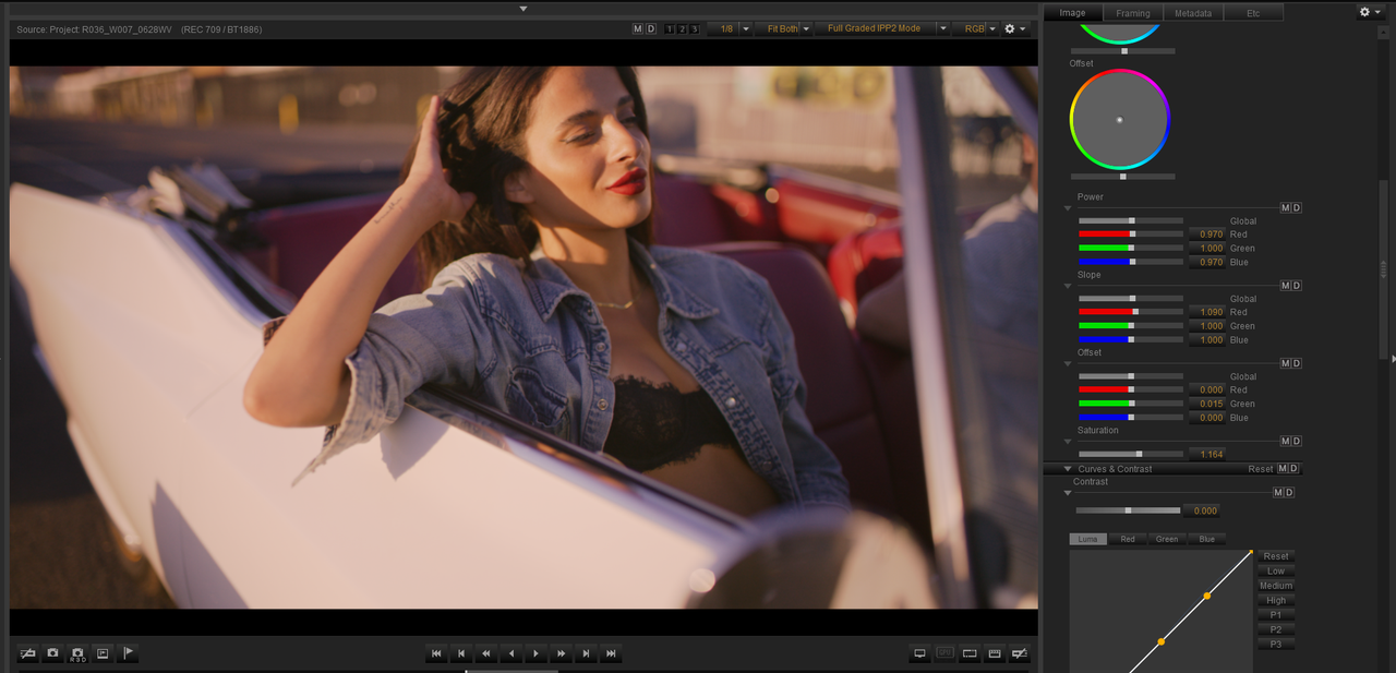
Quick sample CDL Grade in Redcine-X Pro
2.png


3.png


Screenshot-9625.png


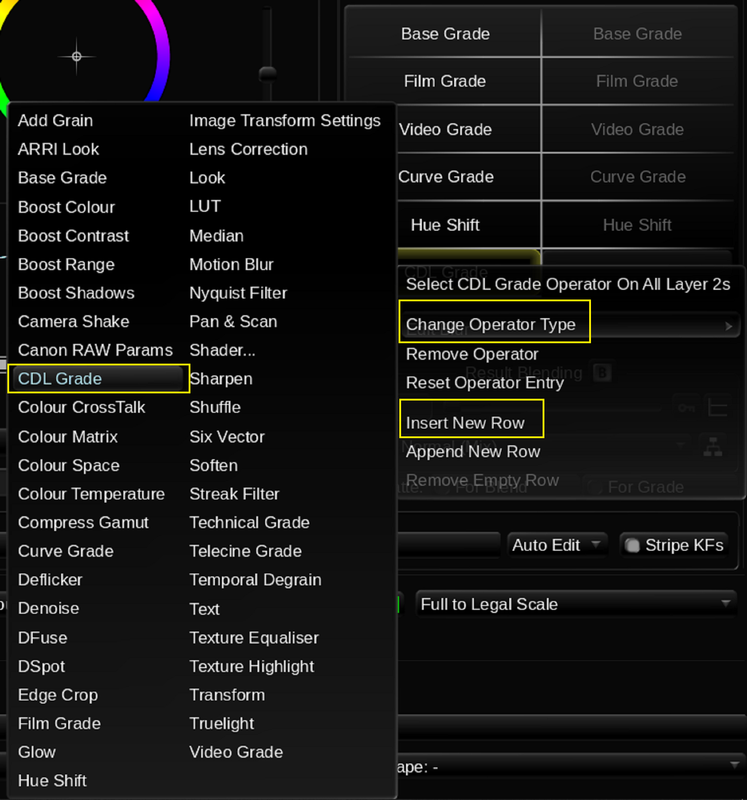
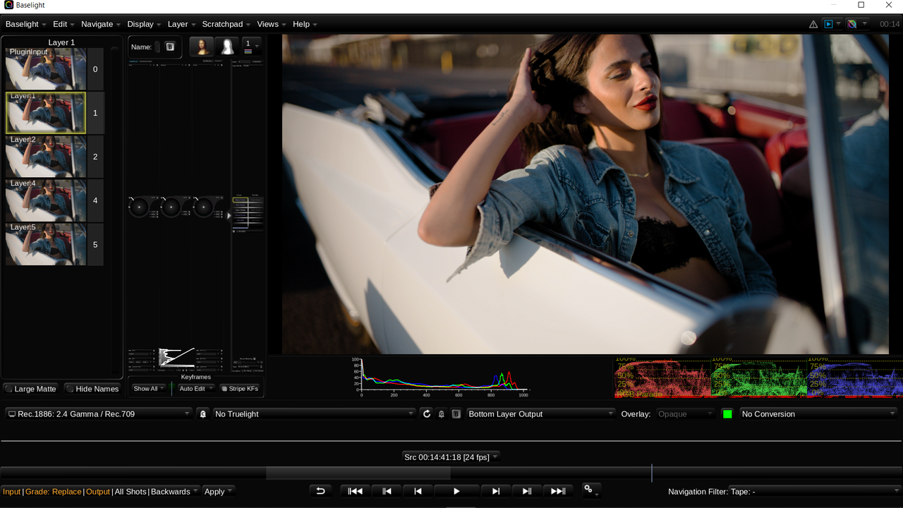
In Baselight For Avid


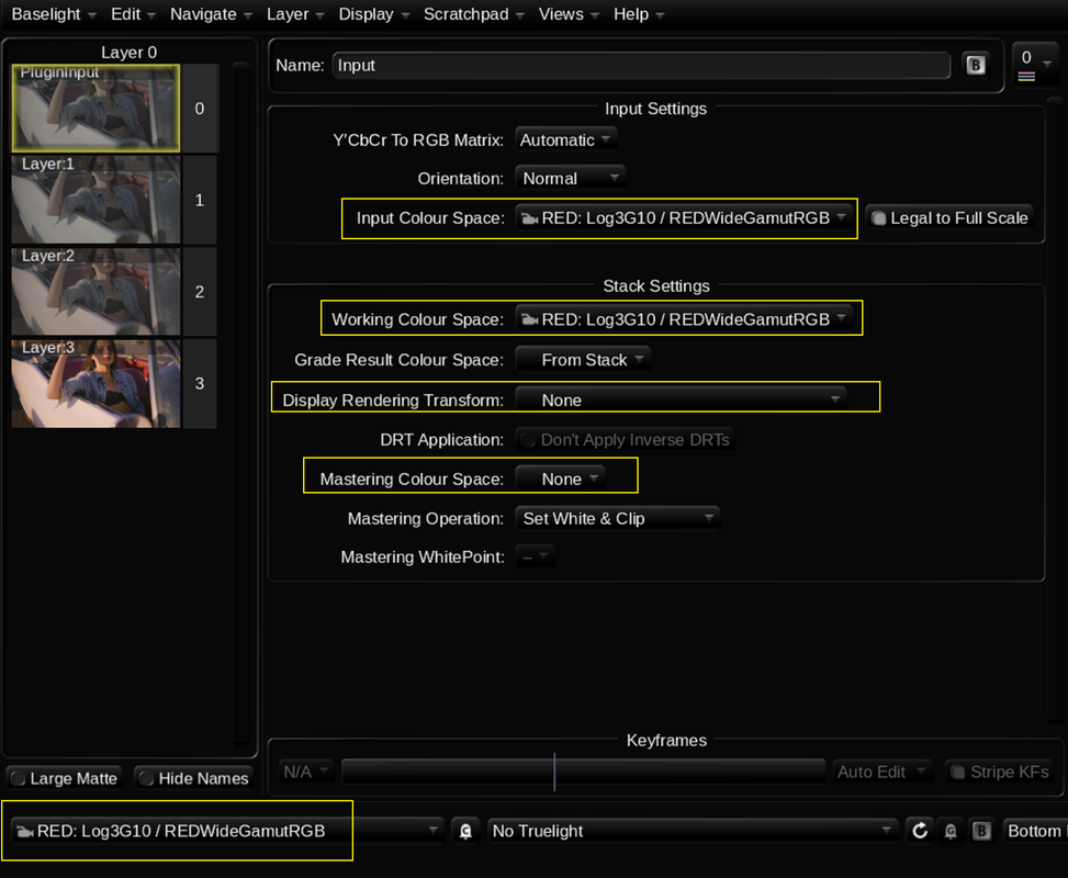
Settings

3a.png


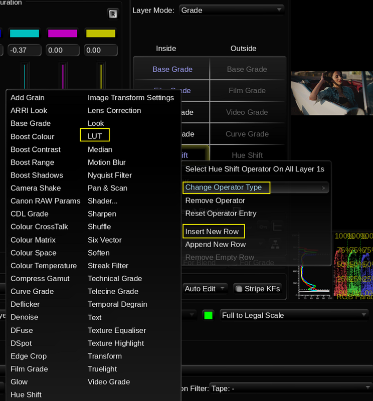
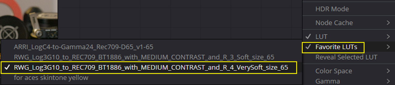
Again, I added a "LUT OPERATOR" to add the RED IPP2 Output Transfrorm Lut of "MEDIUM/ VERY SOFT" in the Bottom Layer 3
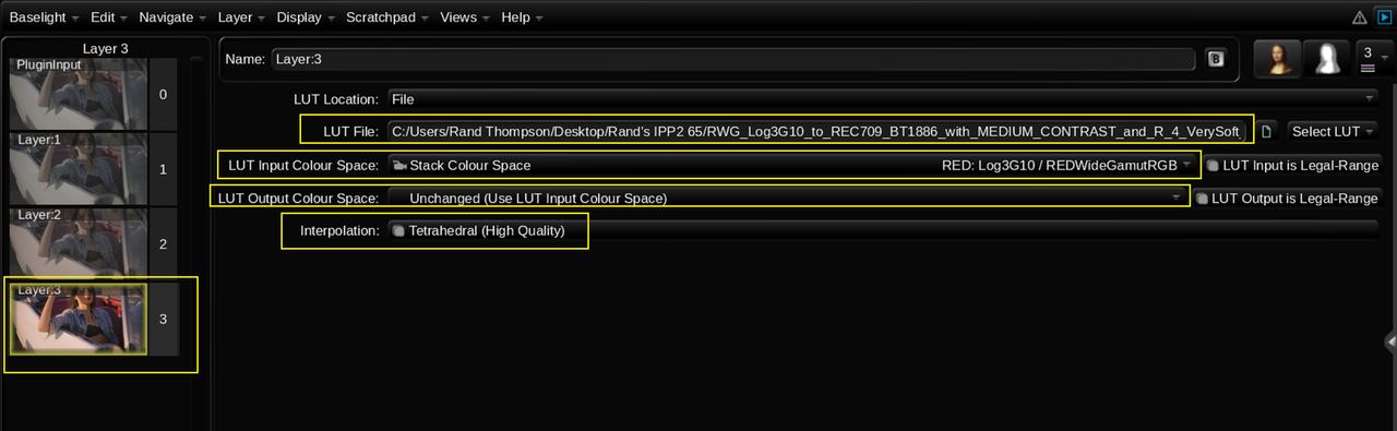
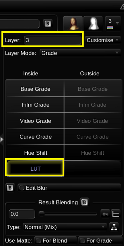
3b.png

3c.png


3d.png


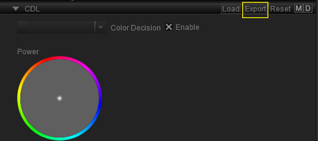
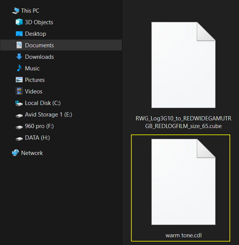
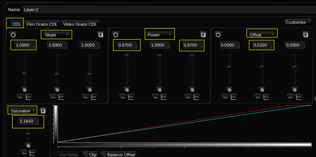
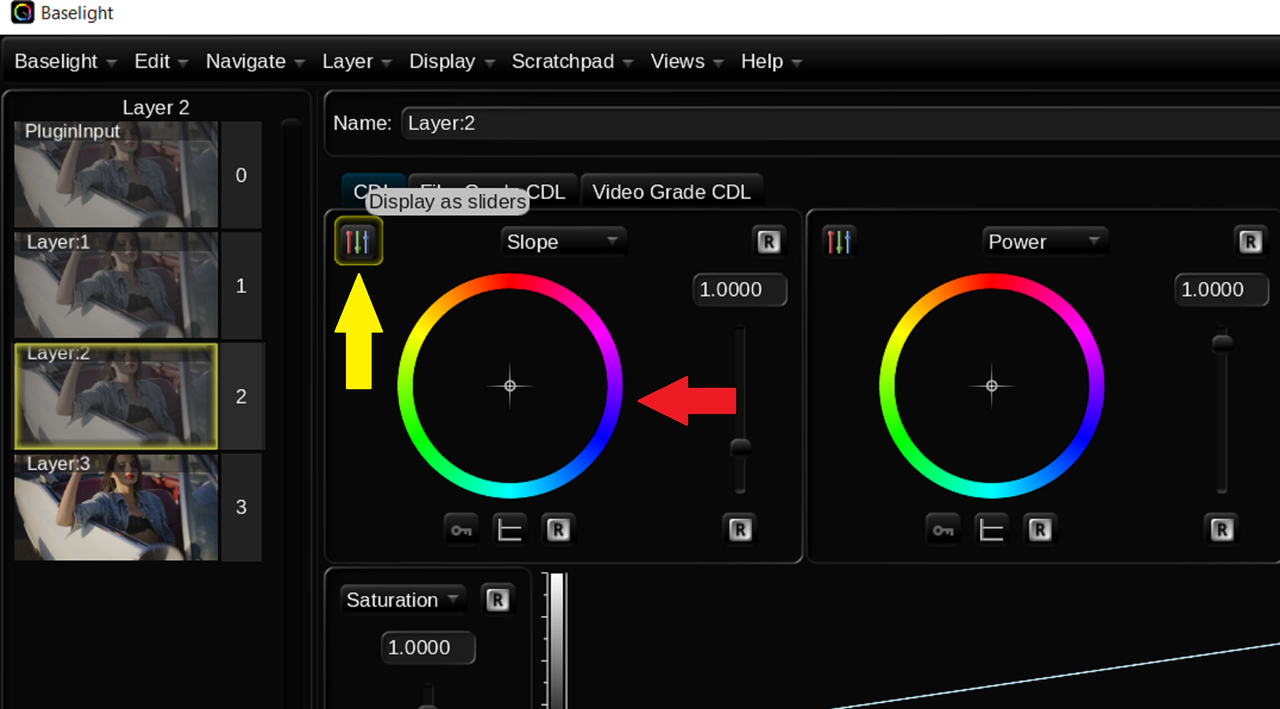
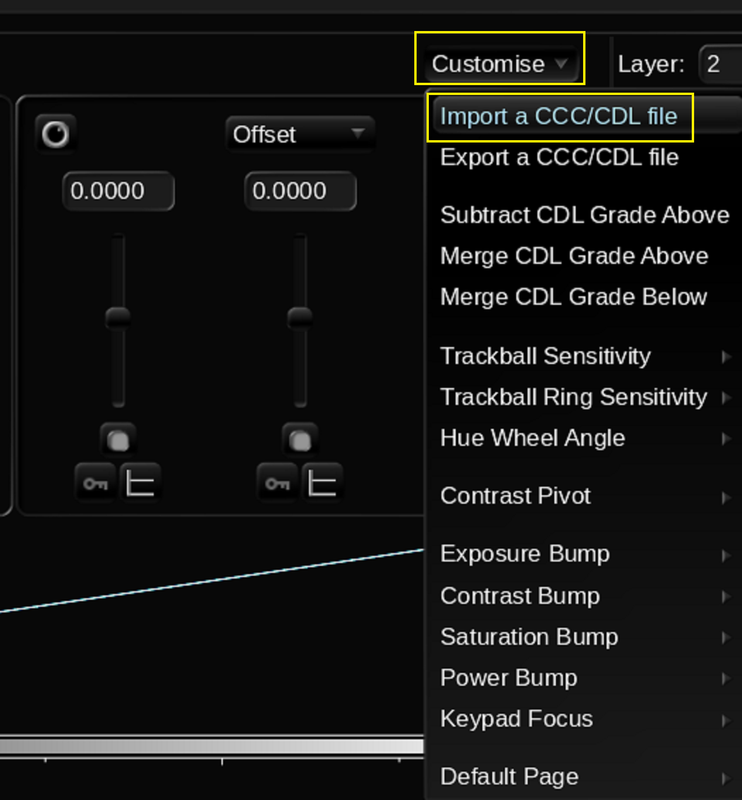
Before the RED IPP2 Output Transfrom Lut in Layer 3, In Layer 2 I added a "CDL GRADE OPERATOR" so that I could import the CDL from Redcine-X Pro
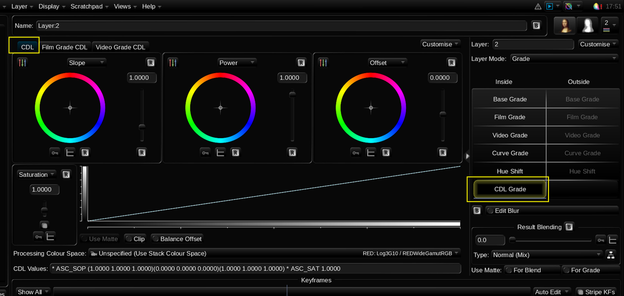
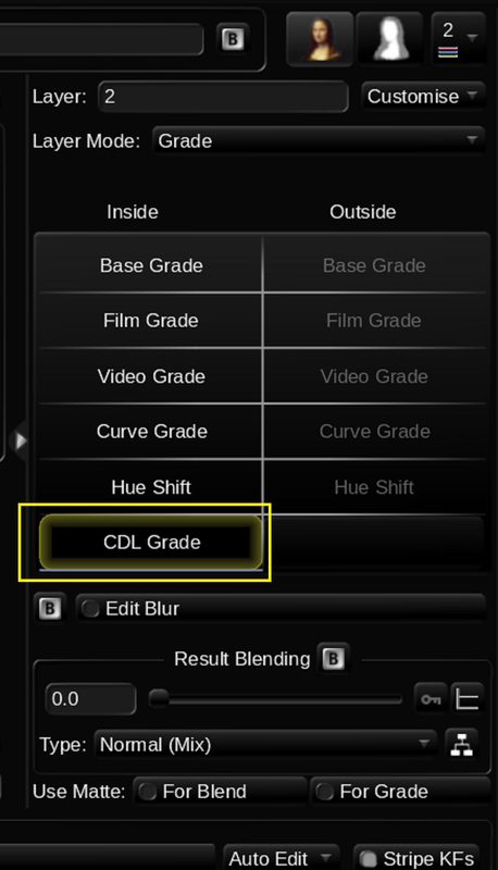
4.png


4a.png


5.png


I chose the "Bars" instead of the Wheels so that I could show that the CDL that was imported had the same Numerical Parameters as the the CDL that was imported from Redcine-X Pro.
6.png

7.png


8.png


9.png


Reminder of CDL Numerical Parameters from REDCINE-X Pro

3.png


REDCINE-X PRO

2.png


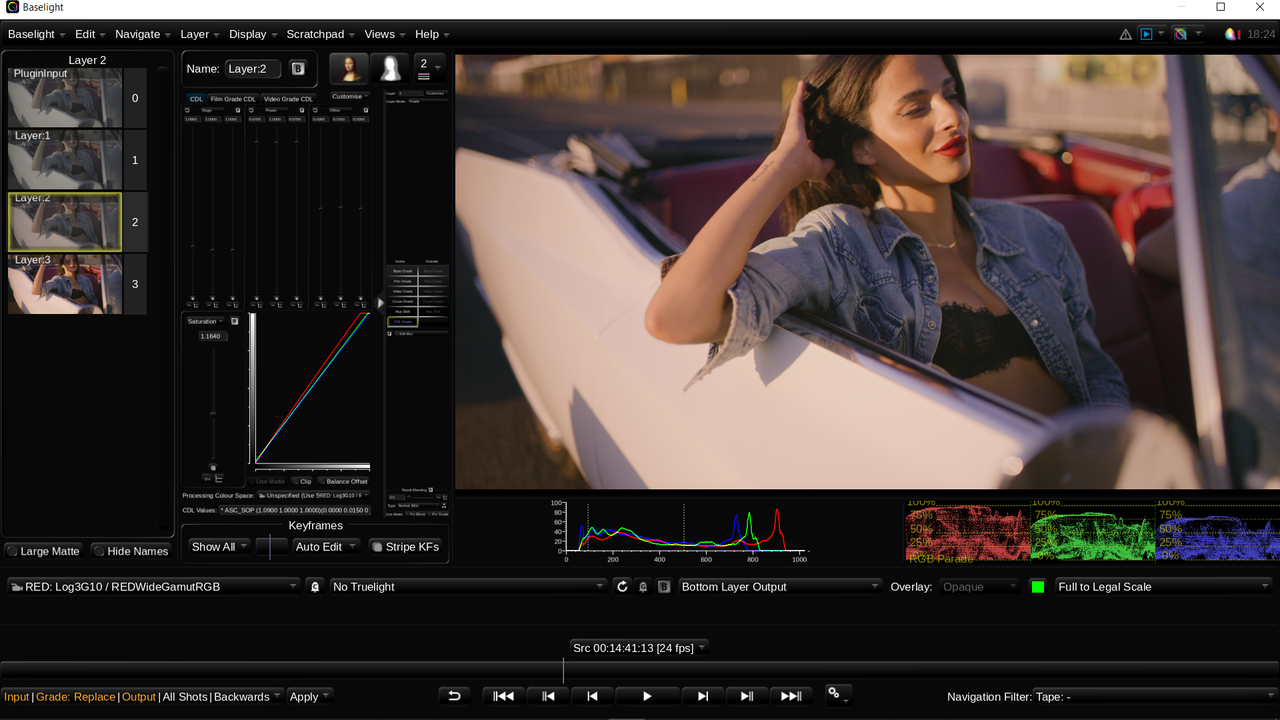
BASELIGHT FOR AVID
( Blacks are a Little lifted due to the nature of the Baselight for Avid and Avid Media Composer Workflow)
10.png


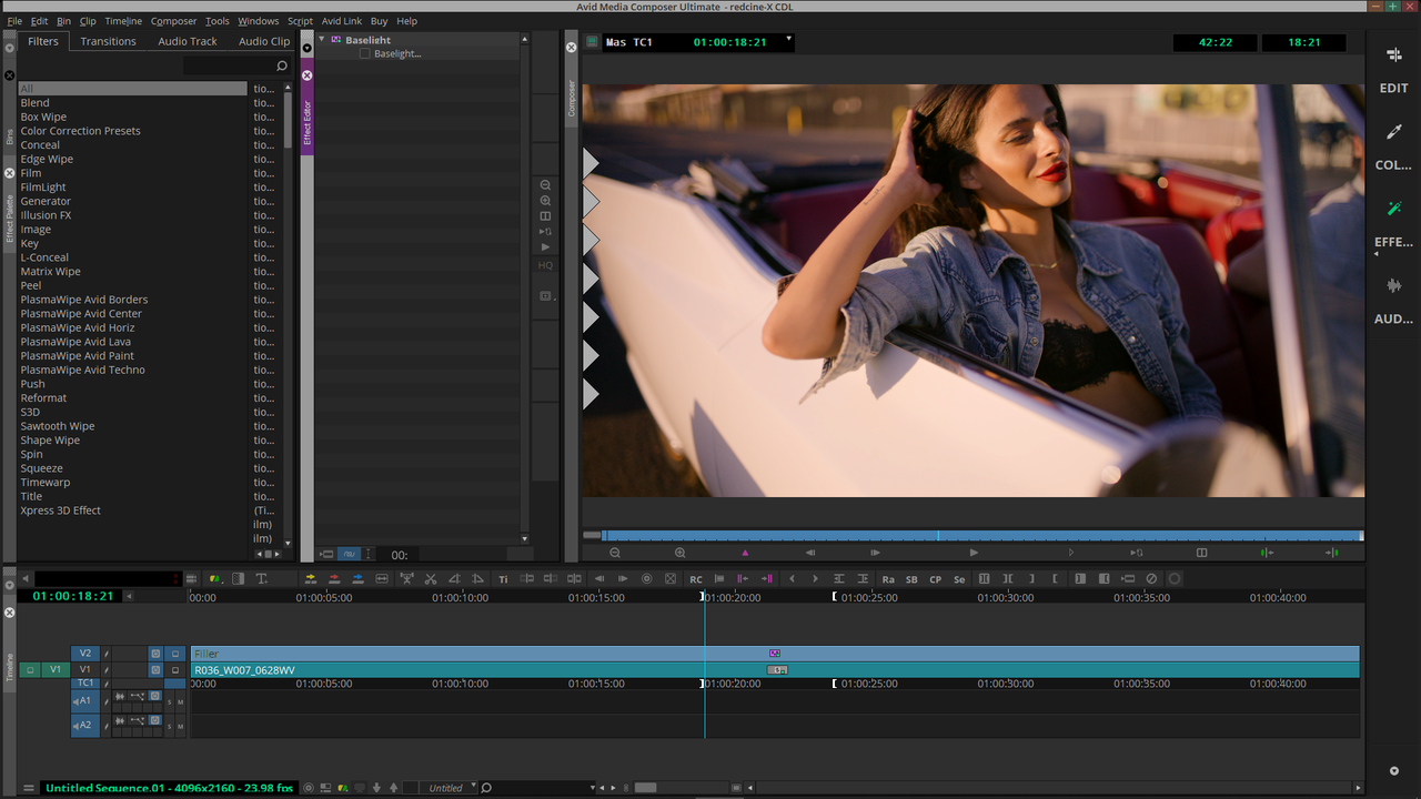
AVID MEDIA COMPOSER

11.png
 
Last edited:
Last Piece of the Puzzle

Even thought I finally worked out the Baselight for Avid / Avid Media Composer workflow to get a correct final video image to my satisfaction, the one thing that kept gnawing at me was the raised Black Level in the Basselight Viewer. Would I just have to make contrast adjustments and then wait until I got back to the Avid Media Composer UI to see if they were correct or not. So I figured out that I only needed to make one change in Baselight before going back to the Avid Media Composer UI to correct that.


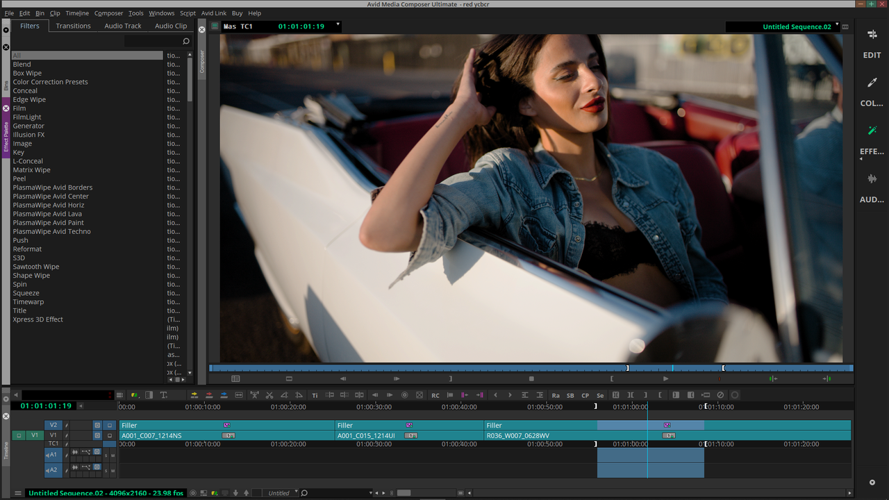
Here is the Final Avid Media Composer UI Image in the Viewer in a " REC 709( Full Range)" " Display Color Space"

1.png


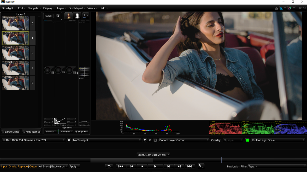
Here is the Image as it appears in the Baselight for Avid Viewer Window( The Blacks are lifted somewhat)


5.png


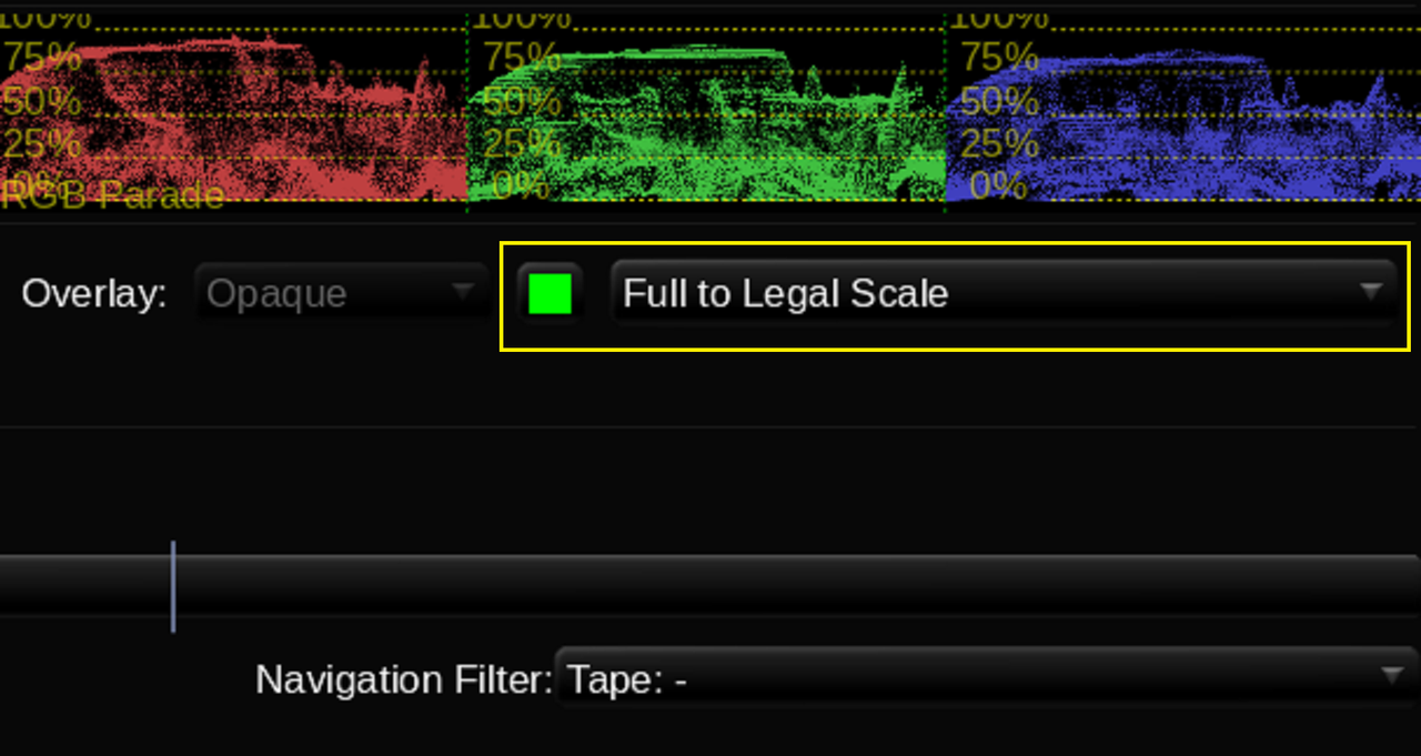
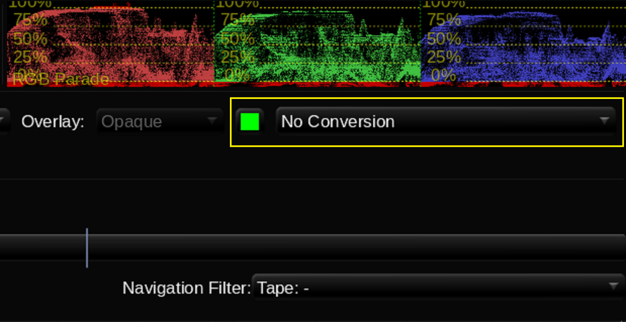
My Solution, Change the setting in Baselight For Avid from "Full To Legal Scale" to "No Conversion" while adjusting the image for the Contrast settings. The Baselight Viewer Image looks exactly the same as the Avid Media Composer Viewer Window in a " REC 709( Full Range)" " Display Color Space" when " No Conversion" is used. Then before going back to the Avid Media Composer UI change it back from "No Conversion" to "Full To Legal Scale". But make damn sure you do because if you don't change it back from "No Conversion" to "Full To Legal Scale" before going back to the Avid Media Composer UI, your resulting Exported Video File will have crushed Blacks again.


Before going from "Full To Legal Scale" to "No Conversion" in Baselight in comparison to Avid's Viewer Window in a " REC 709( Full Range)" " Display Color Space".


4.png


5.png


1.png


After going from "Full To Legal Scale" to "No Conversion" in Baselight in comparison to Avid's Viewer Window in a " REC 709( Full Range)" " Display Color Space".


2.png


3.png


1.png


But don't forget to change it back from "NO Conversion" to "Full to Legal Scale" before going back to the Avid Media Composer UI before Exporting the Final Video File.


From

2.png


To

4.png


5.png
 
Rand, at this point all of these comments you made have far removed this thread from being Alexa 35 vs V-raptor. You should make a separate forum post with all of these resolve and base light stuff you did.
 
Rand, at this point all of these comments you made have far removed this thread from being Alexa 35 vs V-raptor. You should make a separate forum post with all of these resolve and base light stuff you did.

Leonardo,

Yeah, I Kinda thought so too. So From now on it will be only Alexa vs V-raptor Info. All of these Tutorials were just to show some of the ways that you can process Red footage so that it looks as good as or even better than the Footage coming from the Alexa 35. So there shouldn't be any real reason for poor looking Red footage.
 
Last edited:
Some nice grades and conversions though.

And finding that 'Tetra-DCTL' you linked to made scrolling through all the other stuff worth it.

Just don't know how I'll be able to grade now without throwing a colour chart into frame for each specific lighting condition, that I can then use for dialling in the colours with the Tetra-DCTL and a vectorscope. It's crazy how variable even the same exact light sources can be, depending on their intensity, the environment they're in and what they're pointed at.

I guess that's just cinematography and colour grading 101 kind of stuff, but as someone who's always just deliberately eye-balled it more or less, finally taking the time to look at and being able to use the tools to adjust things more accurately has definitely made a difference. Not going to make myself a slave to the numbers, but at least I can maintain a more consistent base-line to veer off from if and when I want to do that.


Edit - Spell-checking ftw :)
 
Last edited:
Les ,

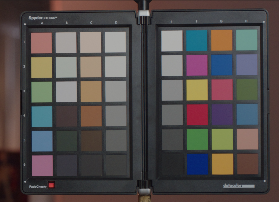
I bought into the Color Chart Hype when I first started Color Grading, I even Bought a C-Stand to attach it to. But after using it for a month or so I realized that I didn't really like the "Accurate Color" that I was suppose to get every time I used it. Plus Color Charts really need almost perfect conditions, atleast IMHO. to get good results every time. The Chart has to be evenly illuminated and it has to have all or most of the lights that will be used in scene illuminating it also. I found that a shadow on some of the color patches could yield inaccurate results. Color Charts to me are only good for matching cameras and for creating IDTs( Input Display Transforms) for cameras that don't have one or an accurately made one. My Datacolor SpyderCheckr is somewhere in a drawer collecting dust. Unless you will only grade footage that you shot, You can never depend on others whom shot the footage you will be grading to have taken the same care and considerations that you might have taken to insure the best looking image possible.


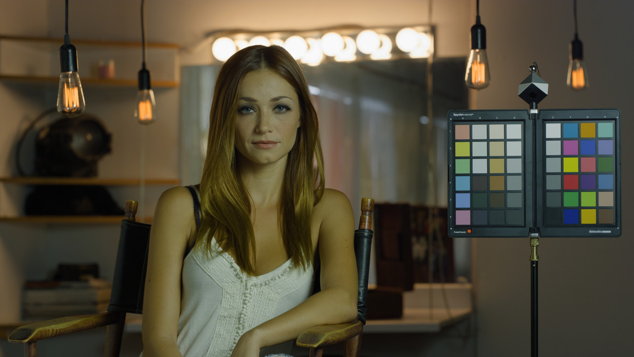
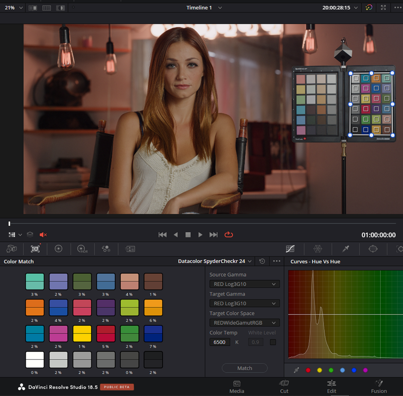
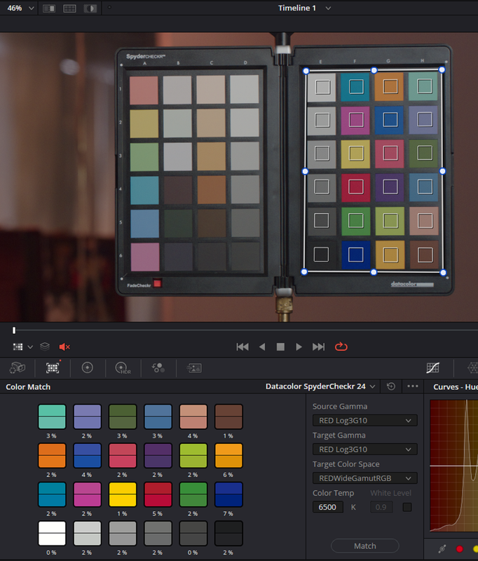
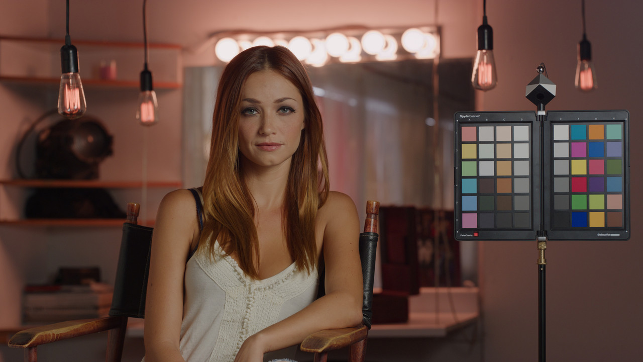
I rely more on Scopes and by eyes. Here is a RED Sample image that Phil Holland shot that I'm sure everyone is familiar with. It also has a Datacolor SpyderCheckr in the scene. I believe Phil stated that he only used the chart as a Guide and it was never suppose to be used to acquire accurate results, although through the years I have seen people use it for exactly that.


Here is an example of an image with three different light sources but only one is illuminating the Color Chart. Let me show you how using the chart to gain an accurate looking image will yield poor results.


Original image in RWG/LOG3G10

W001-C005-1014-V3-001-1-1-5.jpg


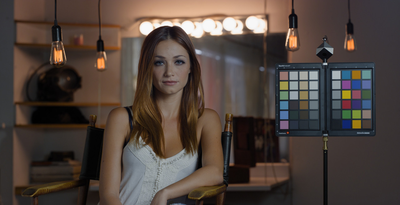
Color Chart Corrected Image

Screenshot-9666.png


Screenshot-9668.png


Screenshot-9665.png


Screenshot-9663.png


Screenshot-9659.png


Screenshot-9659-2.png


Screenshot-9664.png

W001-C005-1014-V3-001-1-1-2.jpg


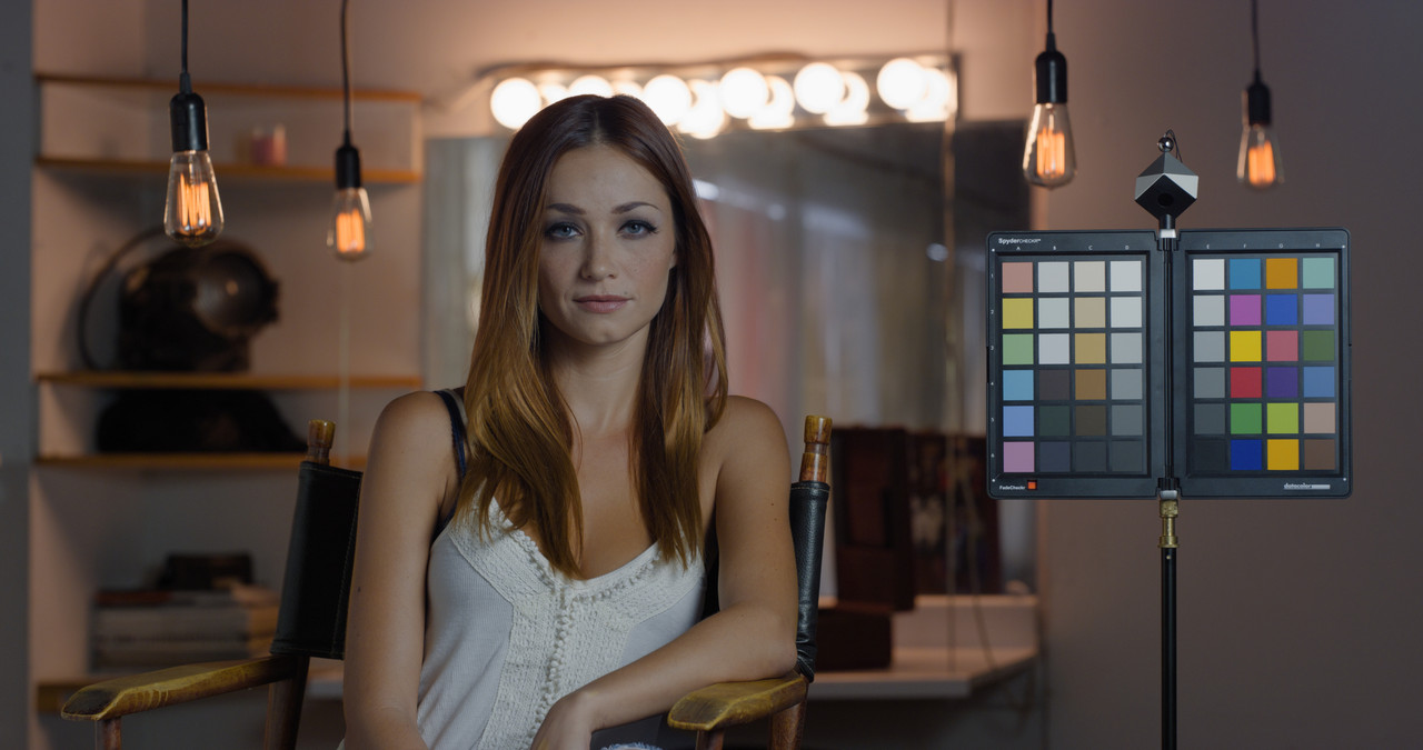
Grade without using The Color Chart in this image just using ACES instead


new-6-1-1-11.jpg


With Slightly Brighter Background

new-7-1-2-1.jpg

Here is a video of the Clip above BEFORE and AFTER it was graded. It was exported out of Resolve as a DCI4K DNxHR file.

 
Last edited:
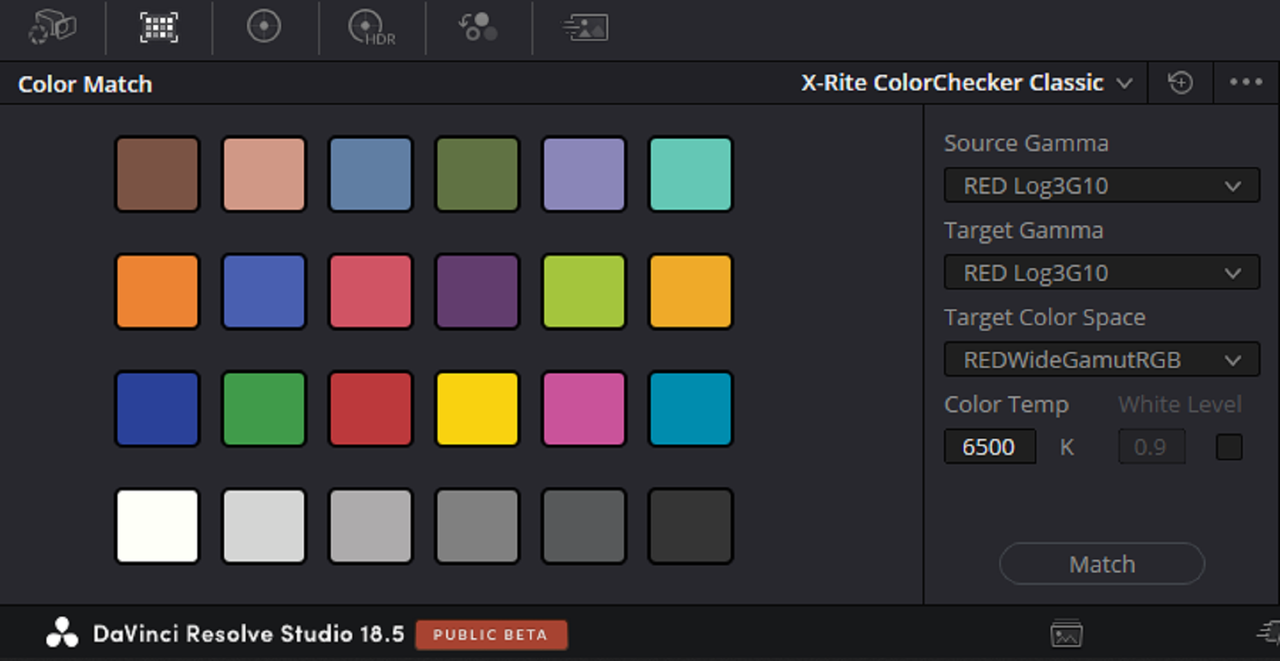
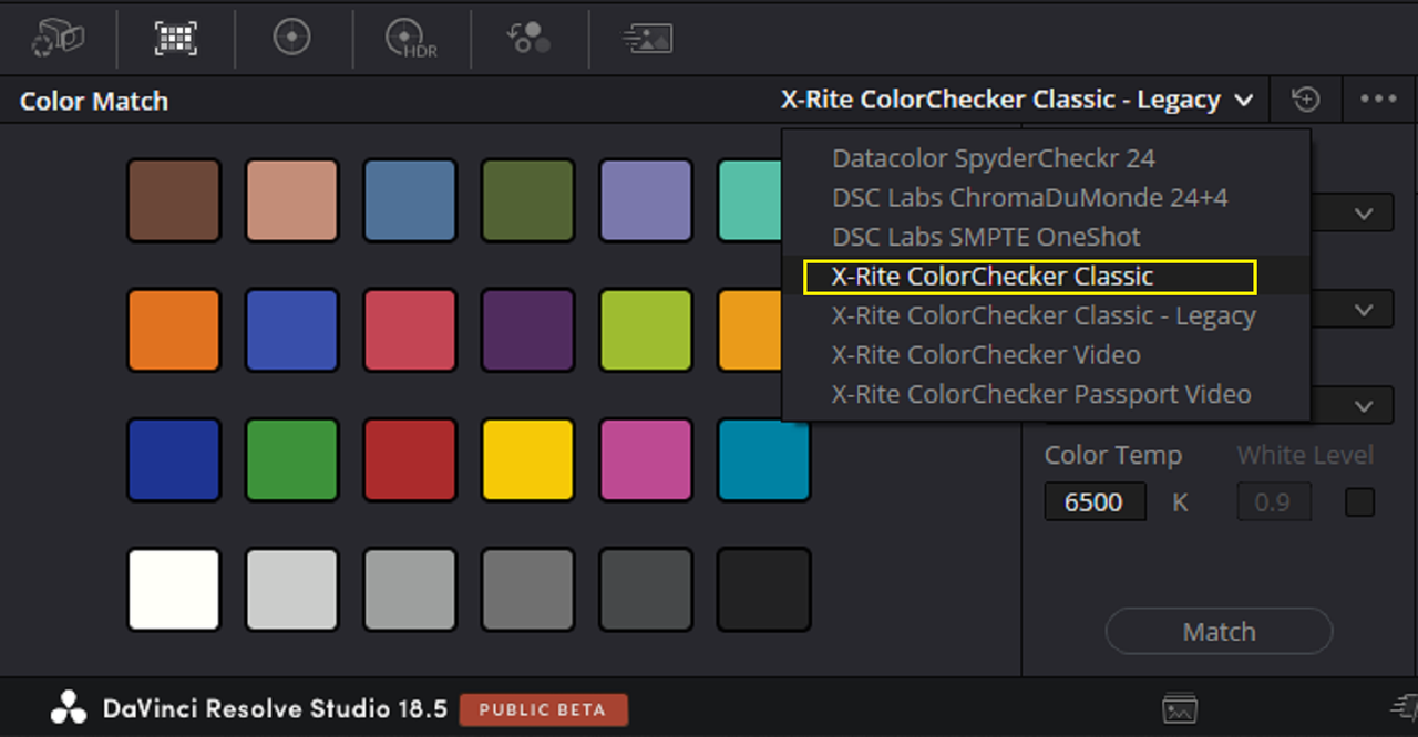
Yeah, I should have been more specific. I was just talking about footage I was shooting and grading myself, using the same colour chart placed and angled for consistent results, manually adjusted partly using the Tetra-DCTL interface in conjunction with the vectorscope in Resolve. Definitely not talking about using the 'Color Match' feature in Resolve, or things like the 'Auto' balance feature (except in that case, sometimes I'll look at it to get a kind of second opinion if I'm experimenting or looking at a problematic shot).

Generally speaking, I find the closer I get to relying on what the camera and software are expected to capture and display by default, the more consistently true to life and what-you-see-is-what-you-get the results are (which is what I'm trying to achieve, at least as a base or starting 'look').

At the same time, I'm still nudging colours and hues off-target a bit and making other adjustments for a more pleasing and less technically accurate result, when those same 'realistic' WYSIWYG levels of illumination, colour, contrast and saturation are just too boring and unappealing. That's not even factoring in mixed-lighting scenarios.

Nothing particularly noteworthy in any of that, but mentioning it anyway. For me personally, the RED footage I'm adjusting has never looked better, largely in part as a result of things I've been tuned into and inspired to check out here on RedUser. So thanks for that, and for the info regarding other processes and methods that I might end up exploring or using at some other point too.
 
Alright Les,I'm sorry I misunderstood what you were saying. Yeah it always good to try to adhere to technically acceptable practices, but sometimes what has been determined to be technically accurate Color Wise sometimes don't look so great.You have to sometimes explore what you feel are your own methods of obtaining the type and style of images you prefer however within other technically set forth guidelines.

I think the more ways you have for solving color correction problems, the less ikely you are to run across a problem that you don't already have a solution for.
 
No worries Rand.

Just for the hell of it (and to sort of prove your point), I had a play with that Dragon 6K sample shot, trying to see if I could get reasonably accurate colours on the chart and skin.

This was prioritizing the colours on the chart, but still taking the skin into consideration and making overall adjustments for that -


Couldn't find a way to get even that degree of colour balancing without letting the colours on the chart go out of alignment.

This was then simply warming the whole thing up by 300°K for a nicer overall look (that technically skewed the colours even further out of 'proper' alignment) -


This was going the other way and cooling the initial image down by 300°K and also putting the colours out of whack -


So yeah, at the end of the day it still comes down to making creative choices rather than simply painting by the numbers.

Which kinds of answers my own question - of how to get accurate colours when I can't shoot a colour chart for reference. The answer being, even with a chart (or a grade from a similar scene), at the end of the day it's still a matter of having to just eye-ball it and adjust to taste.

And yeah, I'll bring it back on topic by saying, that's the same thing you'll end up doing if you end up shooting with a RED V-Raptor or Alexa 35, or both. And so, in that sense, what does it matter?
 
Last edited:
An advantage of the chart is that you have several colors there that might not be present in the current frame but similar colors might show up in other frames. When grading the frame with the chart in view, I can immediately see if some of these colors got out of control by a change, but without seeing them I will only find out later while playing the clip.
But apart from this, yeah, taste beats chart.
 
An advantage of the chart is that you have several colors there that might not be present in the current frame but similar colors might show up in other frames. When grading the frame with the chart in view, I can immediately see if some of these colors got out of control by a change, but without seeing them I will only find out later while playing the clip.
But apart from this, yeah, taste beats chart.

Alex,

Yeah, Color Charts can save you alot of headaches and time but only if you'll have them in every scene that you will shoot. You have to be careful that you don't rely on them completely and understand exactly what information that they are actually giving you. In the sample image from Phil above, the Color chart would have given an excellent starting point from which to start grading from, if maybe all three lighting sources ( the light Illuminating the female talent and the Spydercheckr Color Chart, the 4 hanging bulbs and the 6 lights of the vanity) would have all been evenly illuminated on the Color Chart . But in this case you would only be trying to correct the lighting that illuminated the Female Talent and the Color chart, the lighting from the hanging bulbs and vanity mirror wouldn't be accounted for at all.

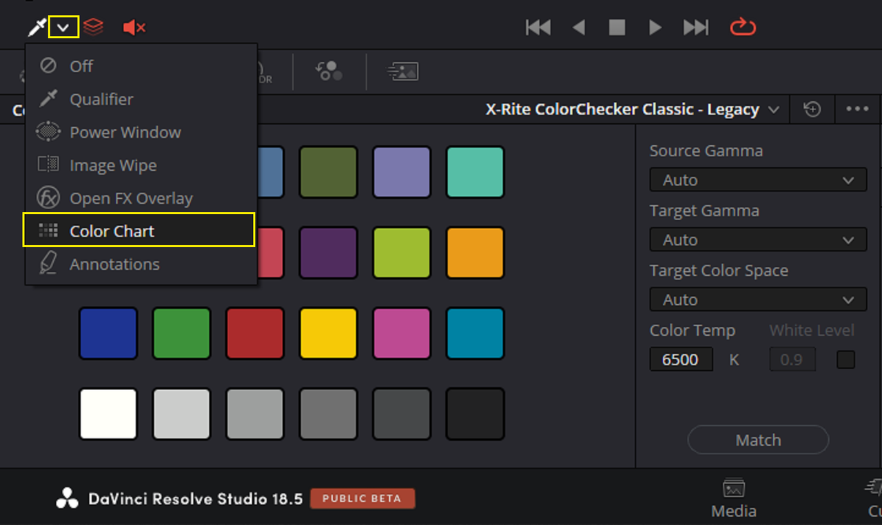
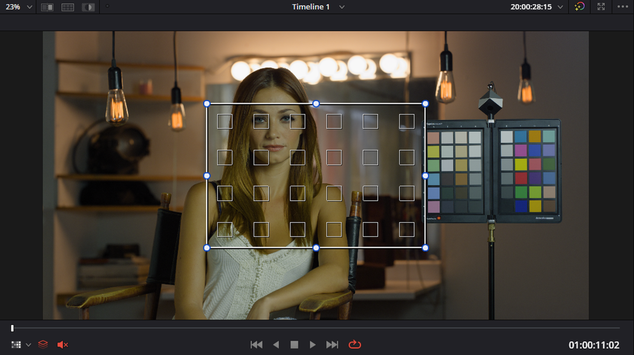
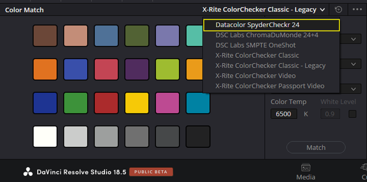
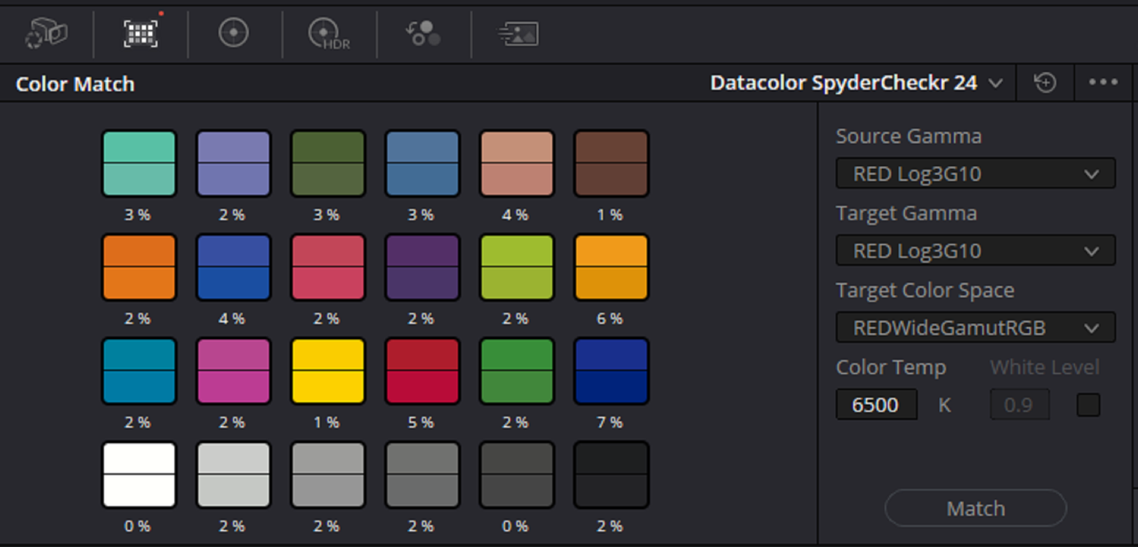
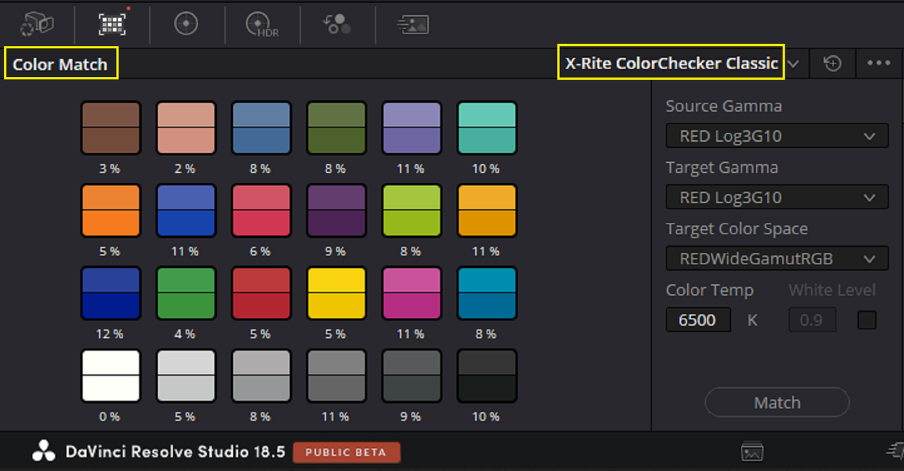
This is why when I used the COLOR MATCH tool in Resolve to correct for inaccurate colors the overall image looks pink. As you can see from the Color Chart in that Pink corrected image all the colors of the Chart have been accurately represented with very little correction. The problem was that it only accurately aligned the colors for the light that illuminated the chart and the female talent. I think if the scene was shot with the same lights from the same manufacturer with the same CRI rating that very little else would have been needed but your own stylized color grade.
 
Yeah, Color Charts can save you alot of headaches and time but only if you'll have them in every scene that you will shoot. You have to be careful that you don't rely on them completely and understand exactly what information that they are actually giving you. In the sample image from Phil above, the Color chart would have given an excellent starting point from which to start grading from, if maybe all three lighting sources ( the light Illuminating the female talent and the Spydercheckr Color Chart, the 4 hanging bulbs and the 6 lights of the vanity) would have all been evenly illuminated on the Color Chart . But in this case you would only be trying to correct the lighting that illuminated the Female Talent and the Color chart, the lighting from the hanging bulbs and vanity mirror wouldn't be accounted for at all.
Many rely for charts as a go tool, forgetting that coloured (skewed) light CAN be an artistic intent of the DP.
Charts are good for tests, or a test on a set from time to time, BUT not something to have in every shoot.
It is pointless to rule out all beautiful light that can be made or captured on set. Let's say sunset, or hand made sunset in decoration cinema set. What good will do a chart, except kill the atmosphere?
 
Many rely for charts as a go tool, forgetting that coloured (skewed) light CAN be an artistic intent of the DP.
Charts are good for tests, or a test on a set from time to time, BUT not something to have in every shoot.
It is pointless to rule out all beautiful light that can be made or captured on set. Let's say sunset, or hand made sunset in decoration cinema set. What good will do a chart, except kill the atmosphere?

Alex,

I don't really use Color Charts. But I'm not going to knock individuals who do. from using Color Charts earlier on when I first started Color Grading, I realized that I never liked the GREENs of grass and other Foliage that were supposed to be more Yellow Green and not the Blueish Greens that I liked. And I think some people, whom will start using COLOR CHARTS, don't understand that COLOR CHARTS are just to help you get properly aligned colors within the Scene that they are using it in. There may still be some additional Color Grading required to get those colors to be visually pleasing. Sometimes Accurate Colors are not always the best looking colors.

Those "Beautiful Colors" also still have to adhere to certain Technical Guidelines like not going "Out Of Gamut" and have to also adhere to some type of Color Theory. The viewing audience expects Skintones to be accurate and if they are not they expect a reason based on generally accepted rules of Color Theory in film.


If Color Charts did everything some people whom purchased them believed they did, There really wouldn't be a need for Colorist.
 
Last edited:
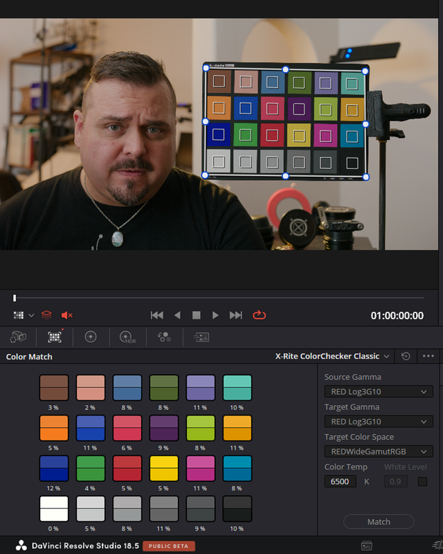
What good will do a chart, except kill the atmosphere?

Charts are good as a reference but not necessarily as the target. It can of course be used as target for your colors if your intention is a color neutral daylight look. It can be helpful for identifying colors that are unintentionally "off" from what you had planned. And it's helpful when you want normalized colors for a part of the scene or across clips as a starting point for moody grades on top of it. Just not, as you said, as an all-time ultimate imperative for the end result because it can kill all atmosphere.

It will be noticed if the colors don't correspond to the experience and thus expectation everyone has while watching, for example, if colors in a sunset or night scene show up with the full spectrum equally stretched out after adjusting everything to the chart, as an unnatural, unexpected an slightly confusing look, physically. And then, on top of the physically expected look, any artistic lighting that was intentionally applied almost forbid using a chart as target beyond the very first primary or secondary adjustments.
 
I did a Thread on FREELAB an Application that uses .X01 files thought to be a future replacement for LUTS. I didn't want to continue to add long tutorials to this thread so i made a separate thread. Hopefully there will be more content on Alexa 35 vs Red V-Raptor posted online, I for one have been looking for some.

Link
FREELAB and X01 files, Touted to be the Replacement for LUTS - REDUSER.net
 
I bought into the Color Chart Hype

The first thing to do is not use automatic tools to match the chart.

But the other key observation and use regarding the use of charts isn't for their accurate values, but rather having an accurate reference point.

My shot there isn't the best "pure light" for a chart reference as there are competing sources, I was mainly using it for it's tonal properties.

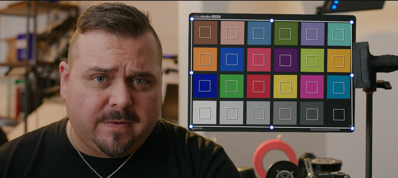
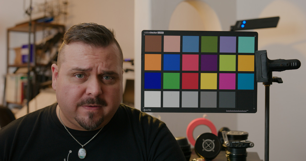
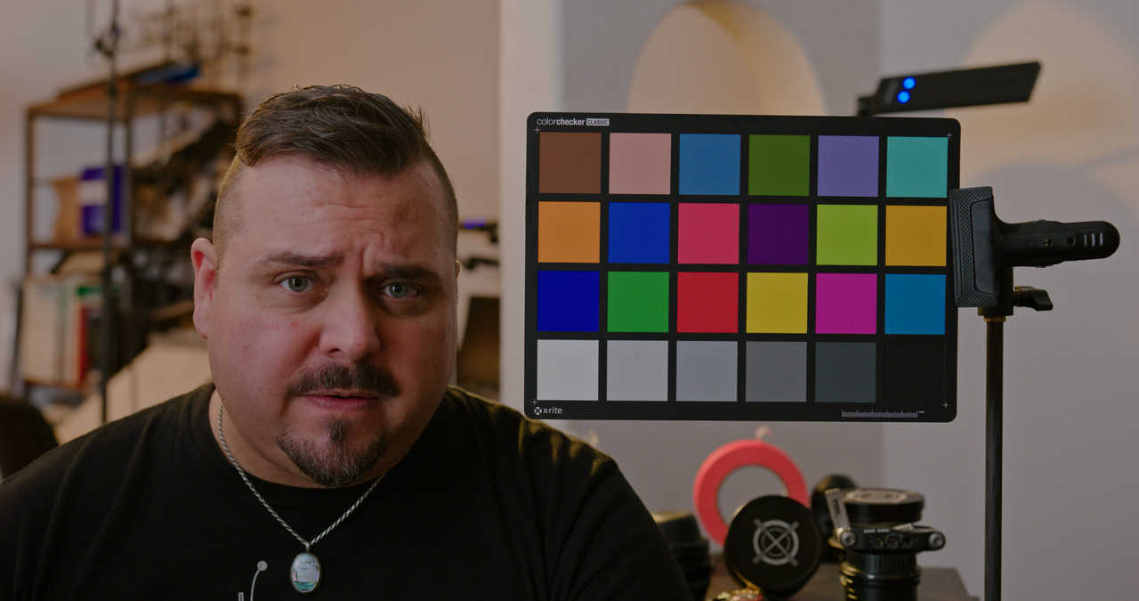
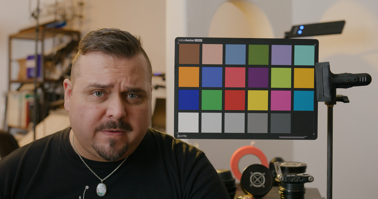
If you want a really, really sexy singular temp source, that R3D I shot of my noggin on Komodo's launch w/ the Macbeth/X-Rite chart is good for that.
 
The first thing to do is not use automatic tools to match the chart.

But the other key observation and use regarding the use of charts isn't for their accurate values, but rather having an accurate reference point.

My shot there isn't the best "pure light" for a chart reference as there are competing sources, I was mainly using it for it's tonal properties.

If you want a really, really sexy singular temp source, that R3D I shot of my noggin on Komodo's launch w/ the Macbeth/X-Rite chart is good for that.

Phil,

Yeah, I think we are saying the same thing. I was trying to show what I believe I remembering you saying a while back, which was don't rely on the chart in this image to make an accurate assessment of the proper/ accurate relationship of the colors in this image. It was meant as a general guide to make an overall assessment on how to go about correcting the image. I also brought up the point of the multiple lighting sources in this image which would also render the results from the Color chart inaccurate.

Thanks for reminding me of the Komodo lanch video image as well. When I get back on my laptop from my tablet I will try it out.
 
Phil,

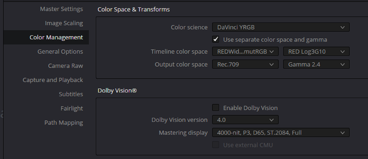
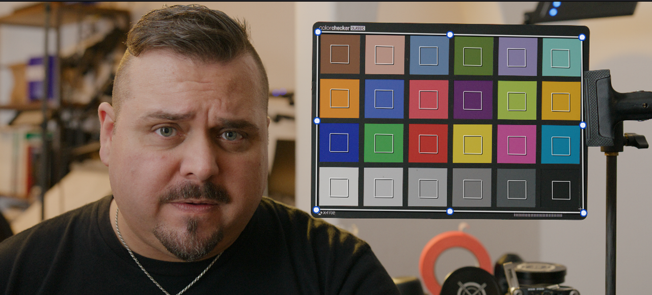
Here is the Test with your introduction of the Komodo Video. I used a RED IPP2 Node based Workflow with an IPP2 Output Transform of "Medium/ Very Soft".

Screenshot-9854.png

Screenshot-9856.png


Original Image with initial Setup

1-before-1-1-1.jpg

2.png


3.png


4.png


After ColorMatch Process

7.png


5.png

6.png


Before ColorMatch Process

1-before-1-1-1.jpg


After ColorMatch Process

After-1-1-2.jpg


Final

K002-C002-0606-LA-0015-1-1-1.jpg
 
Last edited:
My conclusion is that you really don't need charts in such a situation. Except if there are other shots you want to match but then the chart would be needed in these otther shots, not this.
 
Back
Top