
Miguel Angel Martos Bello
Member
Hi!
I'm having some problem with the color in my clips, especially when I compare it with other clips.
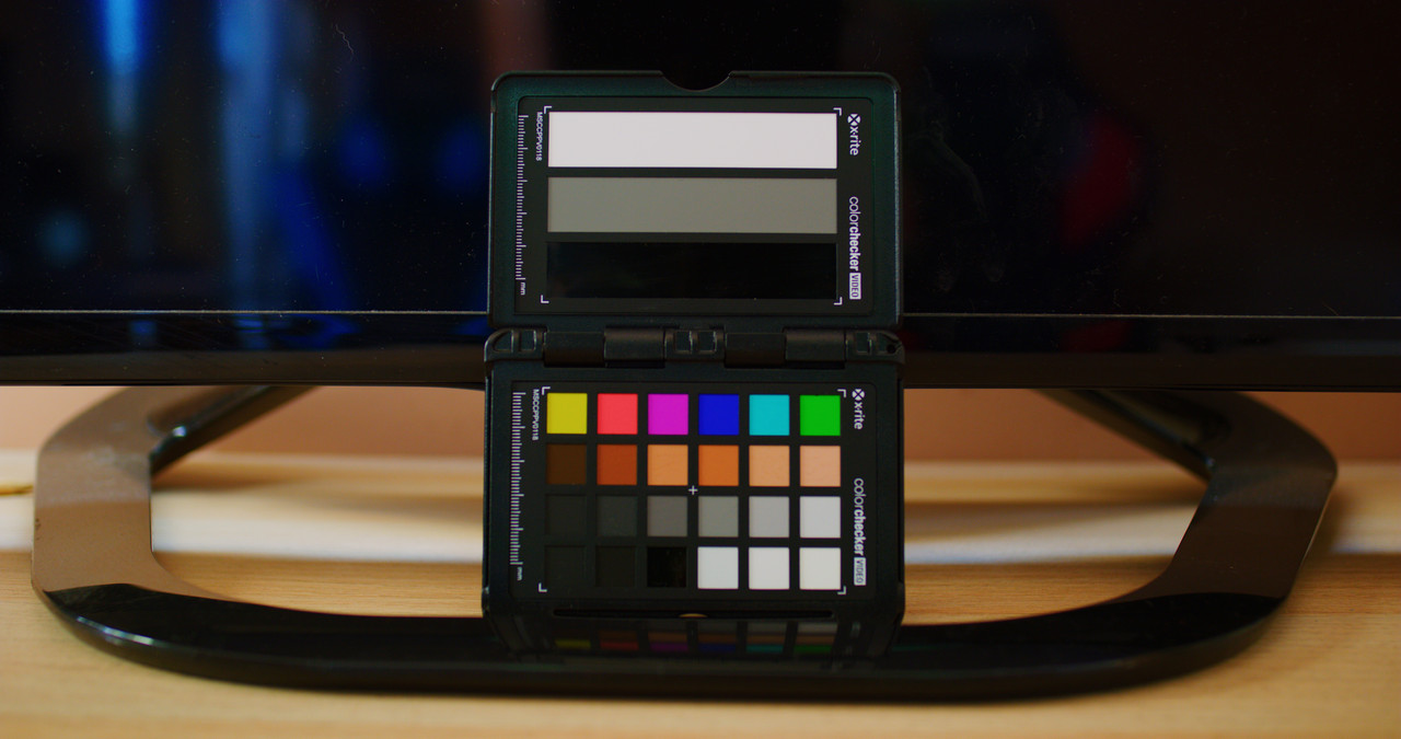
We share it with images: The first image corresponds to the colors of my video, using "X-rite ColorCheker".

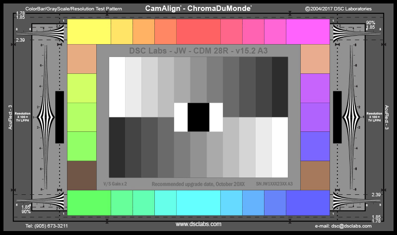
And the second image is what I want to achieve.

Does anyone know what I'm doing wrong?
Thanks and best regards
I'm having some problem with the color in my clips, especially when I compare it with other clips.
We share it with images: The first image corresponds to the colors of my video, using "X-rite ColorCheker".
And the second image is what I want to achieve.
Does anyone know what I'm doing wrong?
Thanks and best regards


")