- Thread starter
- #61

Christoffer Glans
Well-known member
Thanks for updating your version of the grade Christoffer, I got what you were saying/pointing out before, but those latest examples show more clearly the look you were going for compared to the originals.
I could be wrong, but it also makes me more certain the makers of the movie were in fact going for a more colourful and saturated look than the 'normal' one that can be seen in your grade.
Do you think it is possible to make the image more punchy and saturated without going out of gamut or messing up the skin-tones?
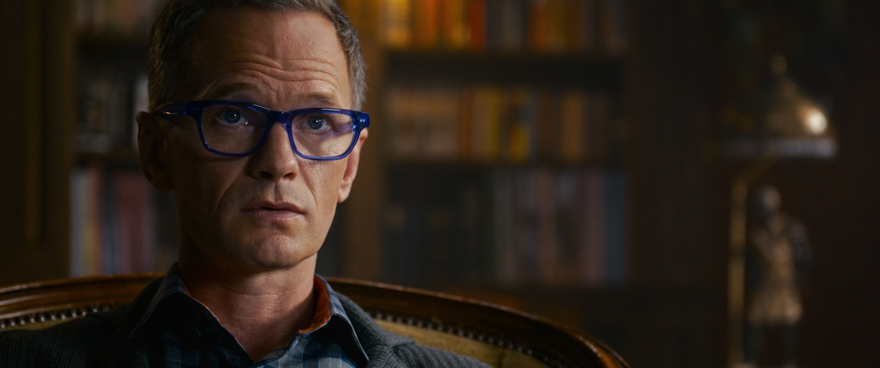
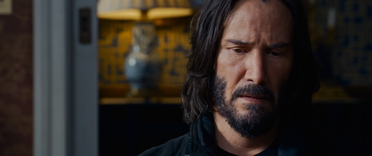
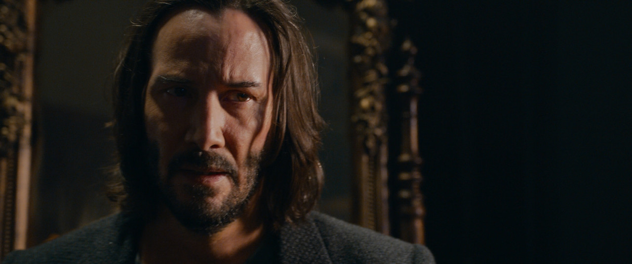
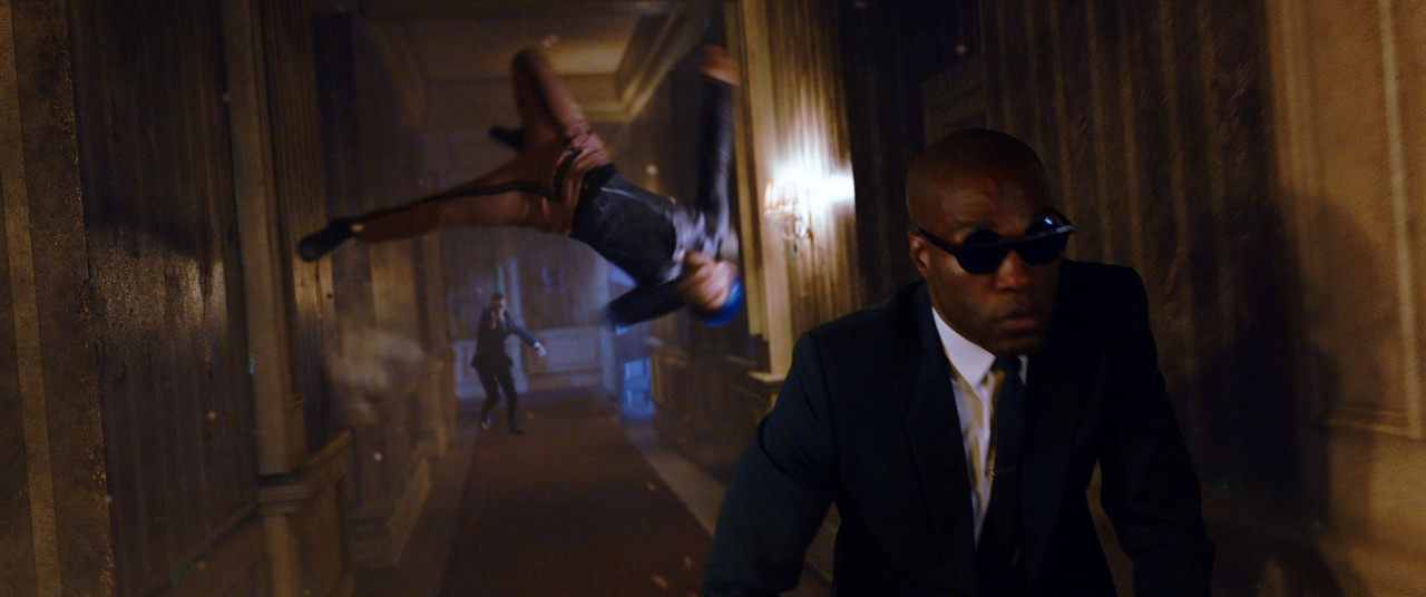
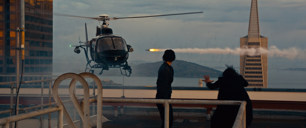
Well, this is essentially what I did on the previous page (page 6). Since I got a more high-quality version now, the qualifiers work. The biggest problem when people think of "more saturation", is that just increasing saturation creates that look, but that's not how we perceive "more saturation". A highly saturated image needs to have the saturation high in the art direction first, then lighting, and last in grade. This movie has a lot of that, but just increasing saturation on top of a digital image, especially Red material, introduces a lot of weird bleeding effects, especially in warm tones. Tungsten on Red has always looked a bit contaminated by green, there's something oversaturated from the start with those yellows that never look really good. Compare that to the more balanced and real-looking yellow that Arri produces. I believe it's exactly this that makes people like Arri color science more than Red. As long as we're not working in any tungsten or warm yellow tones, Arri and Red looks very similar, but as soon as we start using 4000 kelvin on the camera with tungsten lights, we get this weird yellow tones and if we push saturation in post with the current transforms we get these weird yellow tones that look far from real or pleasent.
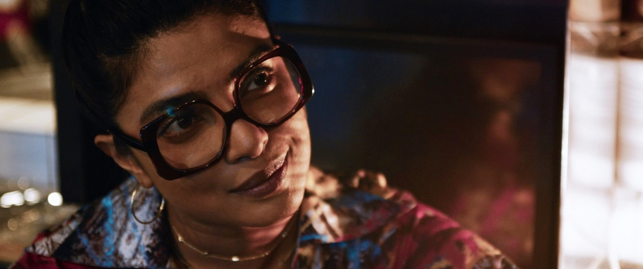
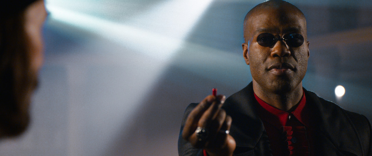
So, on the previous page I kept the look of the film but aimed to fix the problems with these things. Cannot fix out of gamut stuff due to not having the R3Ds or LOG, but it's only the extreme ends of unnatural colors that I've pushed back on, the rest is as vivid as before and it hasn't lost the original look, just the "bad looking" parts are gone. And of course, we can argue to the end of the world about "good" vs "bad" and yes, it is subjective. But the fact is that plenty have pointed out that it looks bad and going by statistics of such response, there's something people don't like about the images. The first thing that hit me when watching this was that it would never leave my grading suite like this. As a colorist, I would have argued against pinkish skin tones and unnatural tungsten/warm tones. What I see in the trailer is the basic Red transform with pushed saturation and I've never seen good results with that. This is why I don't use Red's transforms and instead made my own using some of the same techniques I applied here.
The key thing when doing pushed saturation is to keep track of how the skin tones look. There's a lot of things happening when increasing saturation, most notably our brain starts to compensate colors, so if you get a lot of one color in the background, our mind pushes against that on the colors breaking against it. So even if you balance your grade and skin tones first and then push saturation, you can make it so our minds perceive the colors you already balanced, totally wrong. If going for an extreme look, I would push saturation first and get the environment looking as it's supposed to, then fix the skin tones to have saturation and balance that looks natural against the environment.
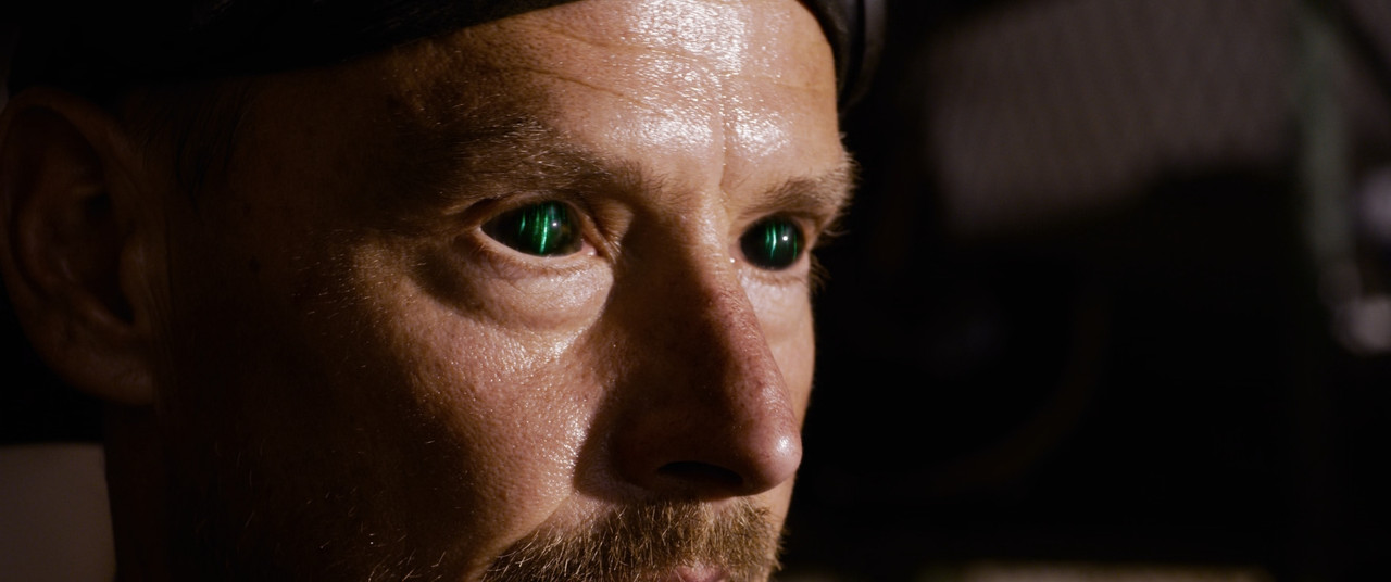
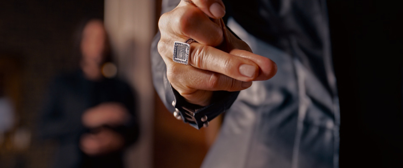
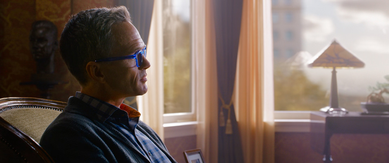
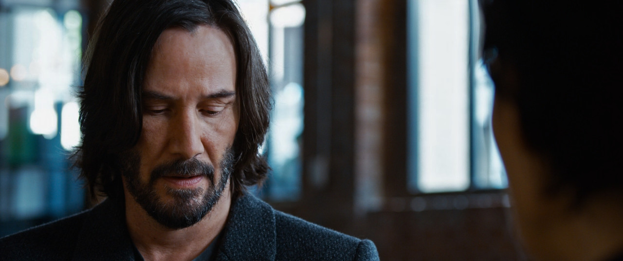
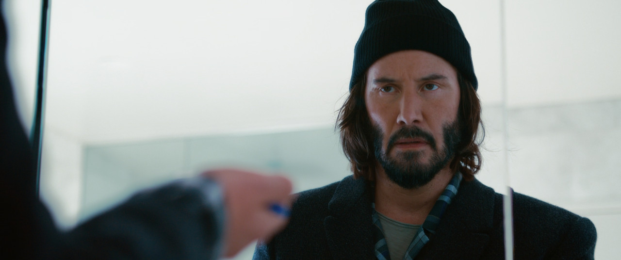
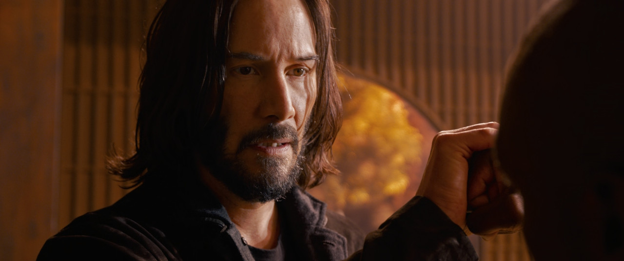
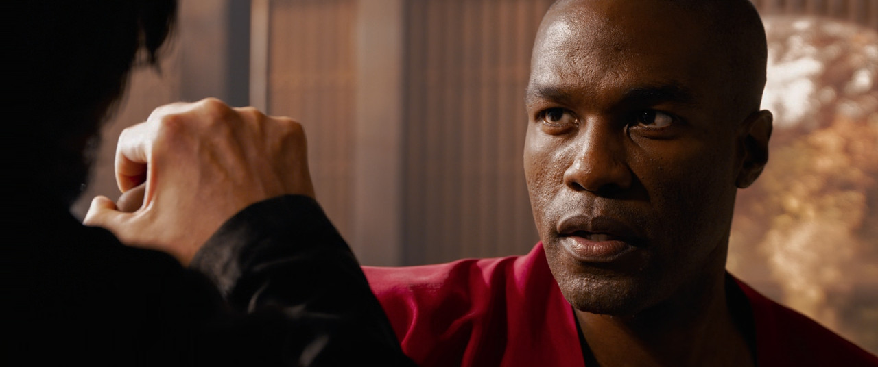
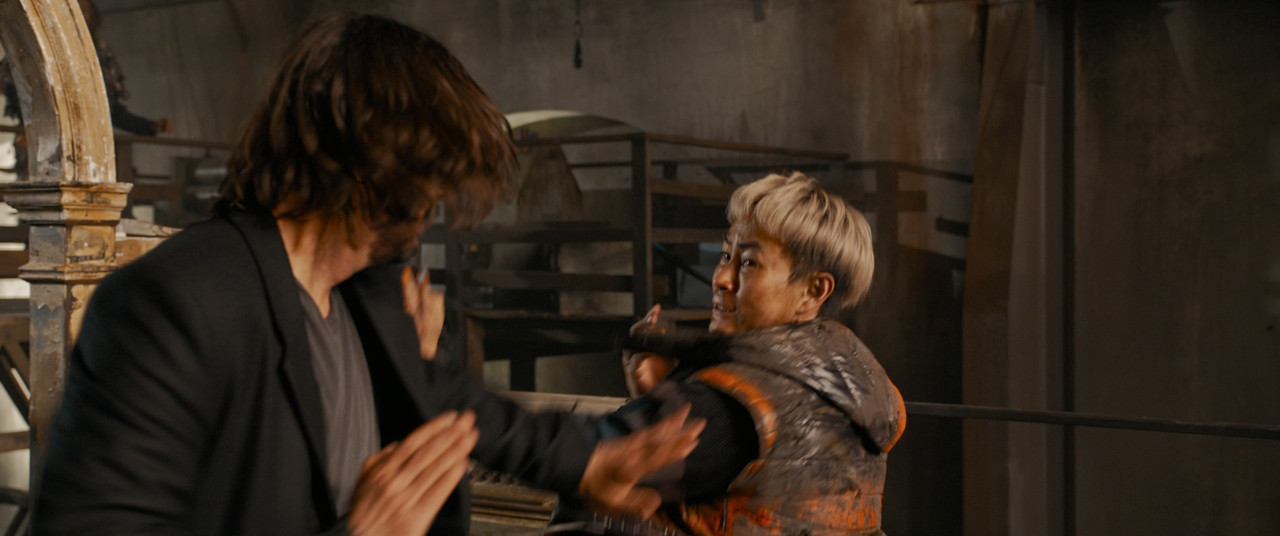
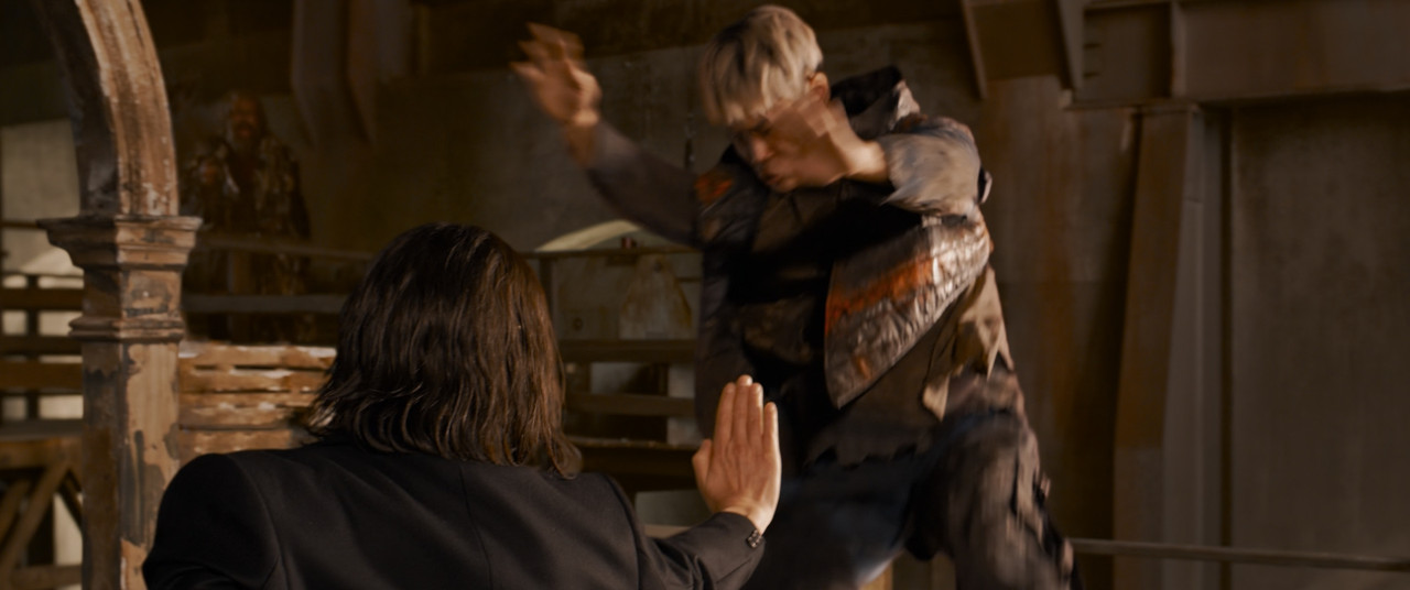
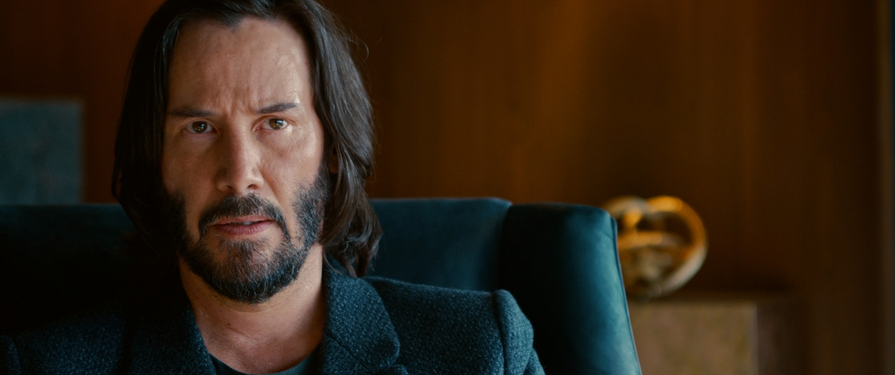
This is most notable in this shot:
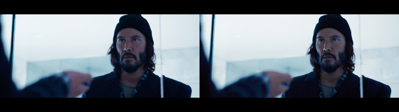
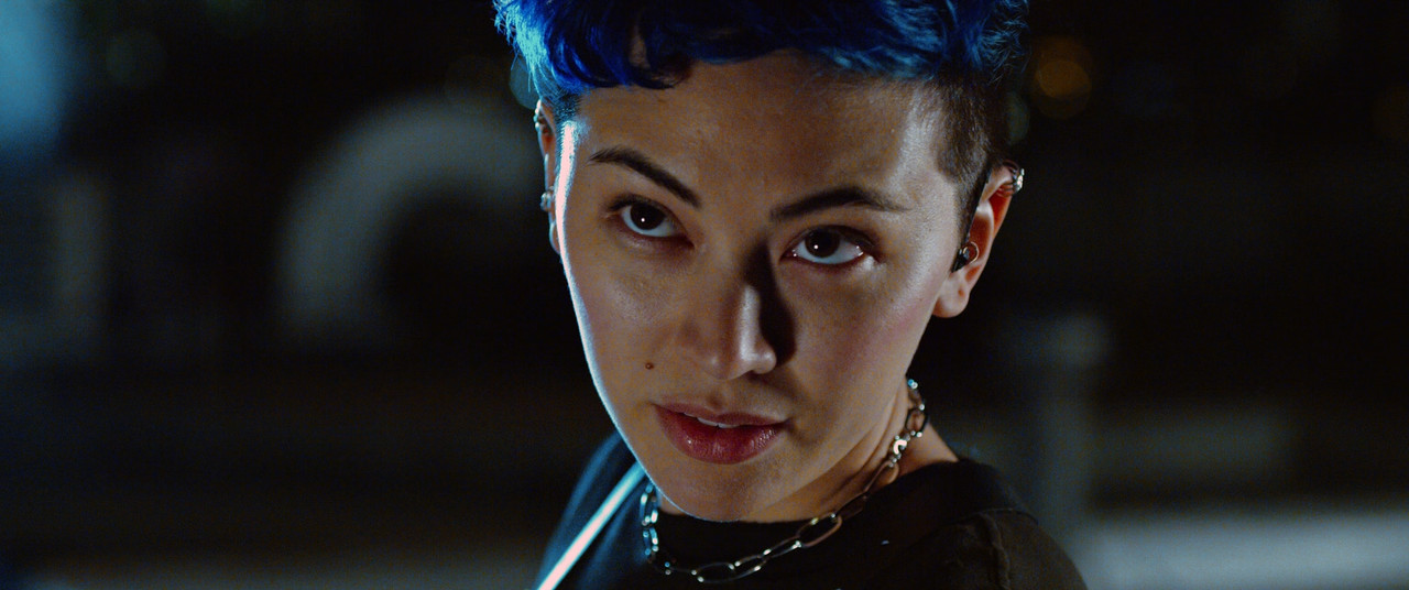
You see how the left image (original) looks like he's been struck by lethal doses of radiation or been out in the cold so long his blood vessels cracked. This is not a good skin tone balance and it's very distracting to see this level of pink in his skin. Never make people look sick if they aren't in the scene.
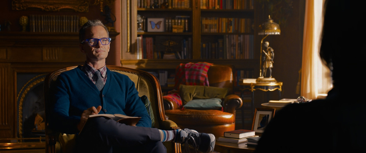
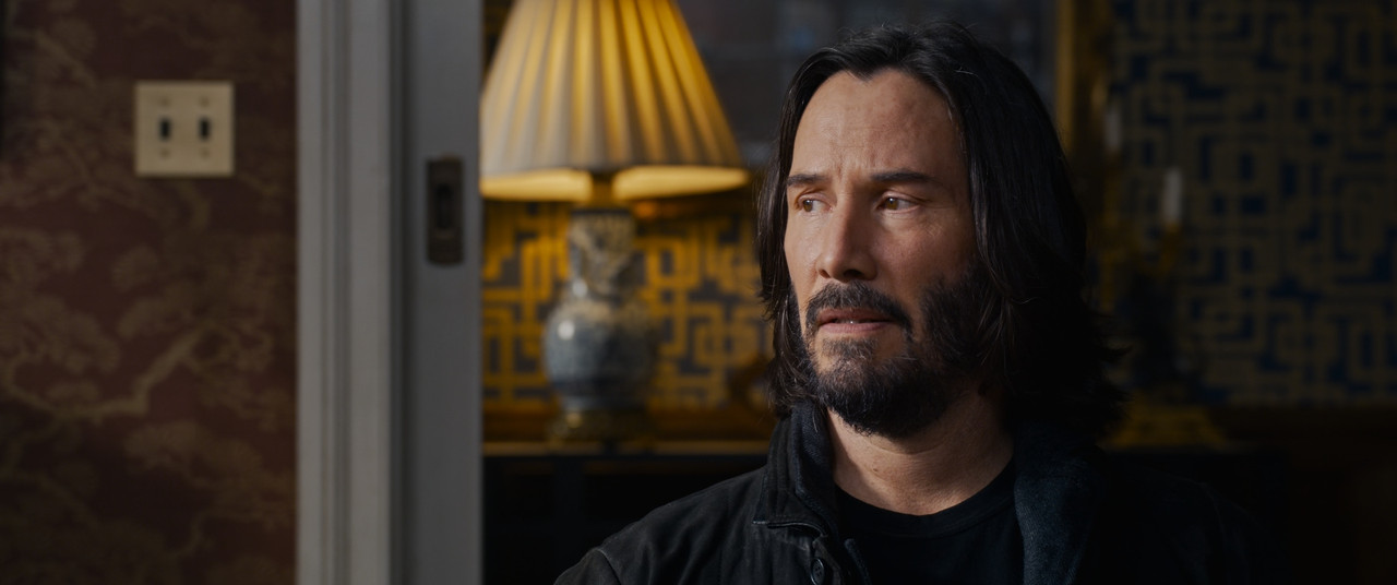
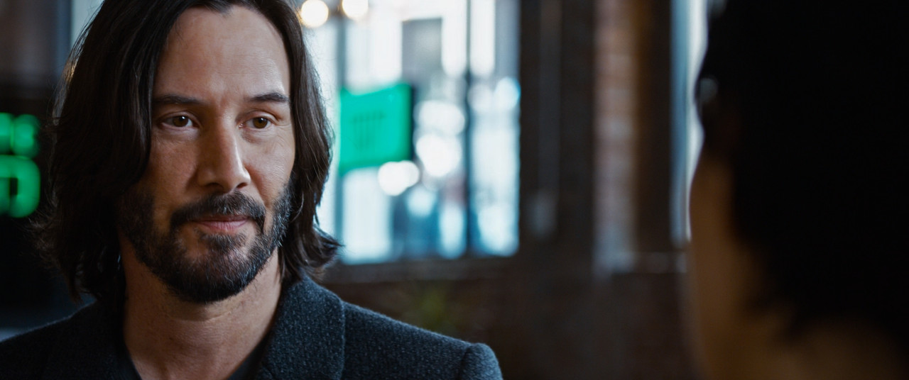
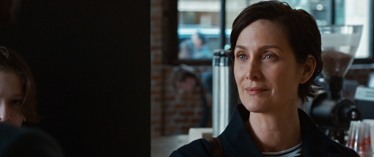
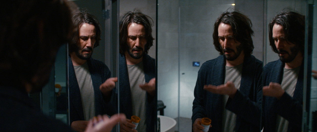
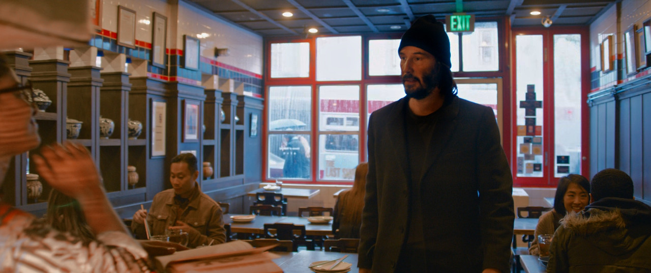
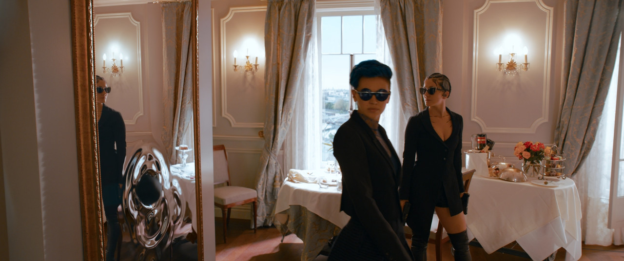
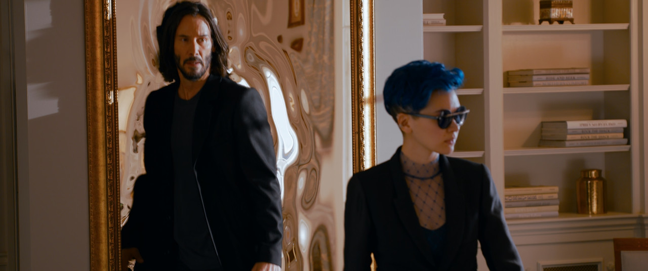
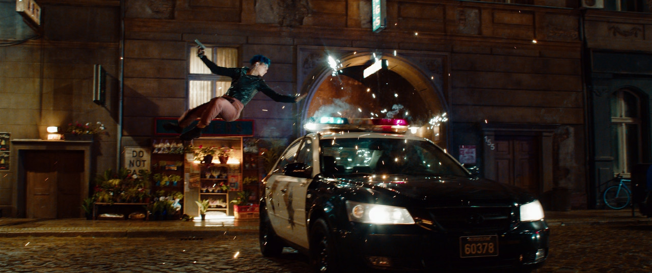
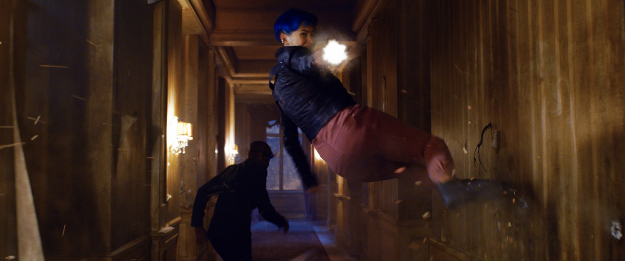
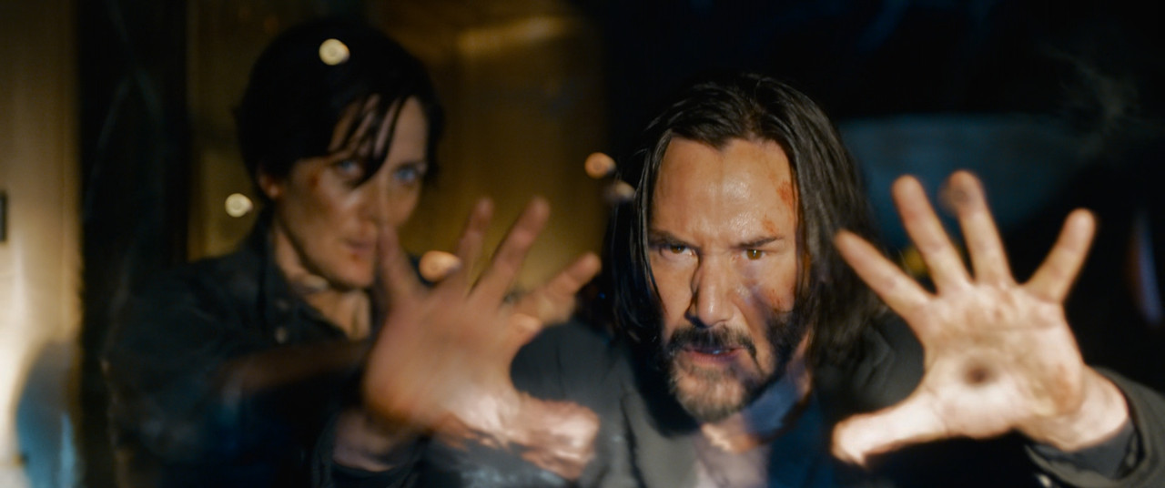
Same with this one:
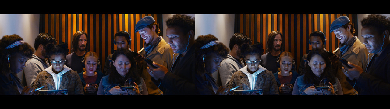
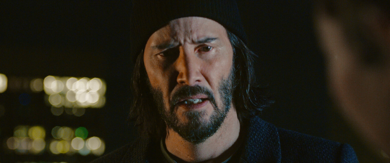
On the left, Keanu's face gets overly saturated by the tungsten lights while the two women in the middle have their faces going extremely pink. And the wooden bars behind them stand out for no apparent reason because the tungsten warm tones bleed them into oblivion. Compare that to the right image where those extremes are gone. You might be able to push saturation a bit more even on those right images, but extreme looks rarely work in cinema compared to short clips on YouTube, commercials, and music videos. People are gonna sit for over two hours looking at this and it's tiresome to see people looking unnatural like that. Balance is key.
Here are the two images in higher resolution.
https://i.postimg.cc/vQbc8SkD/Matrix-Re-Grade-Neutral-1.jpg
https://i.postimg.cc/VYg5JWPg/Matrix-Re-Grade-Neutral-2.jpg