Welcome to our community

Be a part of something great, join today!

  • Hey all, just changed over the backend after 15 years I figured time to give it a bit of an update, its probably gonna be a bit weird for most of you and i am sure there is a few bugs to work out but it should kinda work the same as before... hopefully :)

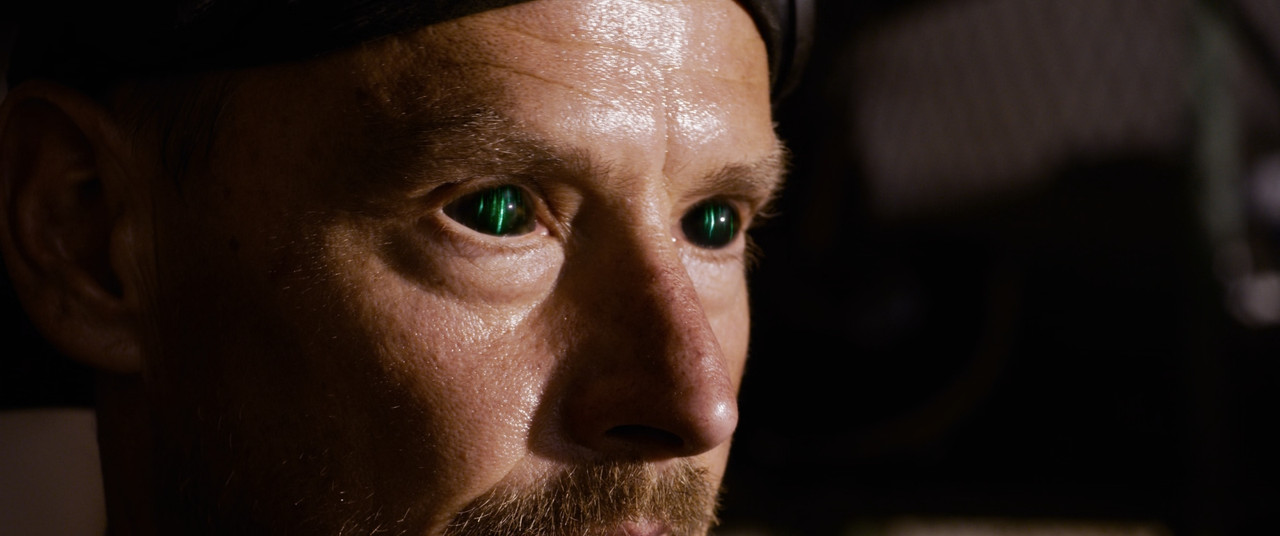
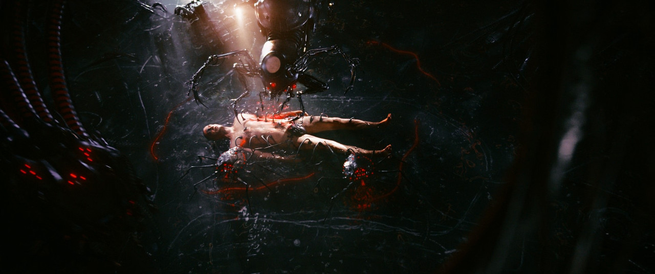
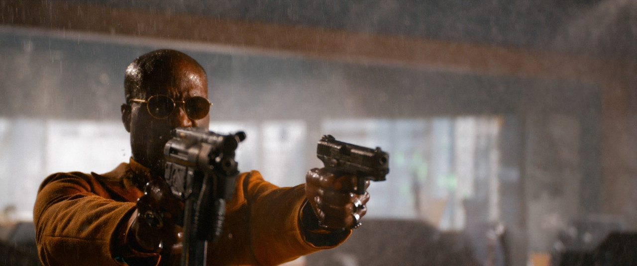
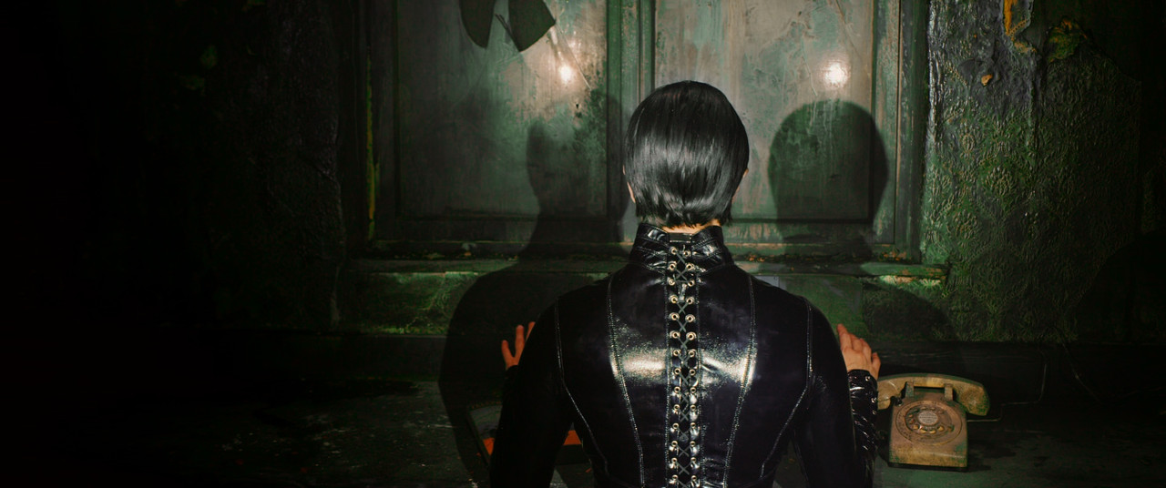
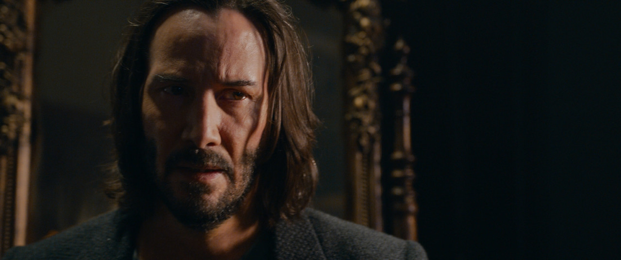
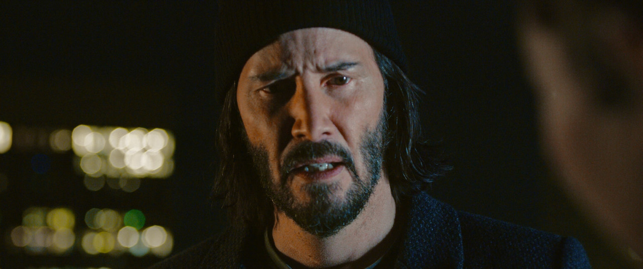
Matrix Resurrections

Thanks for updating your version of the grade Christoffer, I got what you were saying/pointing out before, but those latest examples show more clearly the look you were going for compared to the originals.

I could be wrong, but it also makes me more certain the makers of the movie were in fact going for a more colourful and saturated look than the 'normal' one that can be seen in your grade.

Do you think it is possible to make the image more punchy and saturated without going out of gamut or messing up the skin-tones?

Well, this is essentially what I did on the previous page (page 6). Since I got a more high-quality version now, the qualifiers work. The biggest problem when people think of "more saturation", is that just increasing saturation creates that look, but that's not how we perceive "more saturation". A highly saturated image needs to have the saturation high in the art direction first, then lighting, and last in grade. This movie has a lot of that, but just increasing saturation on top of a digital image, especially Red material, introduces a lot of weird bleeding effects, especially in warm tones. Tungsten on Red has always looked a bit contaminated by green, there's something oversaturated from the start with those yellows that never look really good. Compare that to the more balanced and real-looking yellow that Arri produces. I believe it's exactly this that makes people like Arri color science more than Red. As long as we're not working in any tungsten or warm yellow tones, Arri and Red looks very similar, but as soon as we start using 4000 kelvin on the camera with tungsten lights, we get this weird yellow tones and if we push saturation in post with the current transforms we get these weird yellow tones that look far from real or pleasent.

So, on the previous page I kept the look of the film but aimed to fix the problems with these things. Cannot fix out of gamut stuff due to not having the R3Ds or LOG, but it's only the extreme ends of unnatural colors that I've pushed back on, the rest is as vivid as before and it hasn't lost the original look, just the "bad looking" parts are gone. And of course, we can argue to the end of the world about "good" vs "bad" and yes, it is subjective. But the fact is that plenty have pointed out that it looks bad and going by statistics of such response, there's something people don't like about the images. The first thing that hit me when watching this was that it would never leave my grading suite like this. As a colorist, I would have argued against pinkish skin tones and unnatural tungsten/warm tones. What I see in the trailer is the basic Red transform with pushed saturation and I've never seen good results with that. This is why I don't use Red's transforms and instead made my own using some of the same techniques I applied here.

The key thing when doing pushed saturation is to keep track of how the skin tones look. There's a lot of things happening when increasing saturation, most notably our brain starts to compensate colors, so if you get a lot of one color in the background, our mind pushes against that on the colors breaking against it. So even if you balance your grade and skin tones first and then push saturation, you can make it so our minds perceive the colors you already balanced, totally wrong. If going for an extreme look, I would push saturation first and get the environment looking as it's supposed to, then fix the skin tones to have saturation and balance that looks natural against the environment.

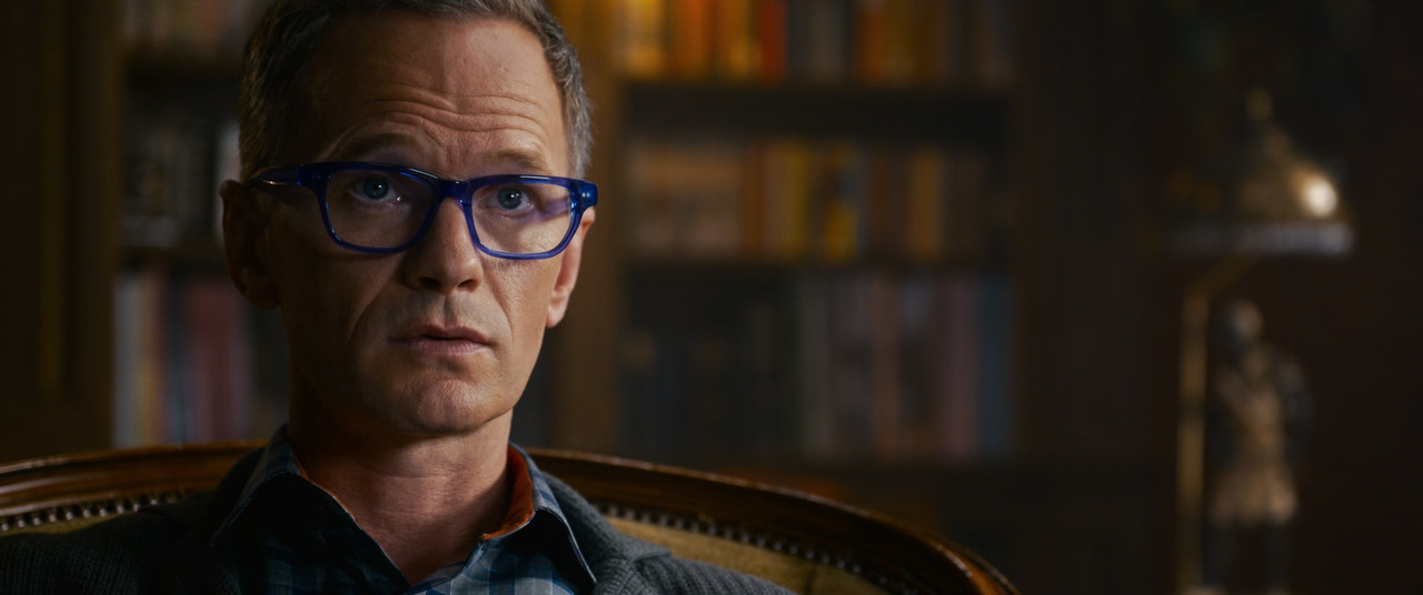
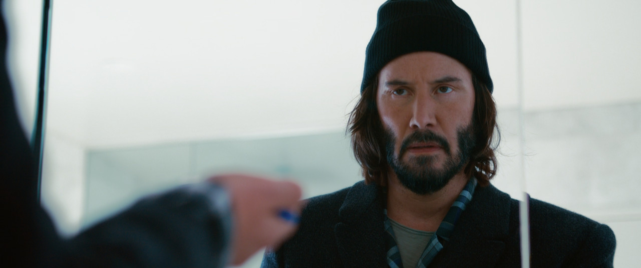
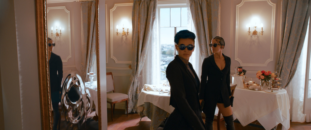
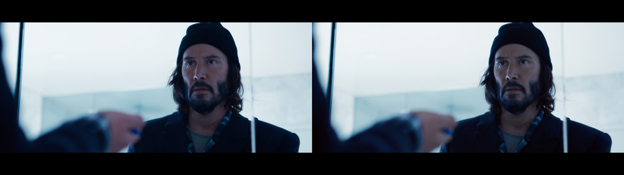
This is most notable in this shot:
Matrix-Re-Grade-Neutral-1.jpg


You see how the left image (original) looks like he's been struck by lethal doses of radiation or been out in the cold so long his blood vessels cracked. This is not a good skin tone balance and it's very distracting to see this level of pink in his skin. Never make people look sick if they aren't in the scene.

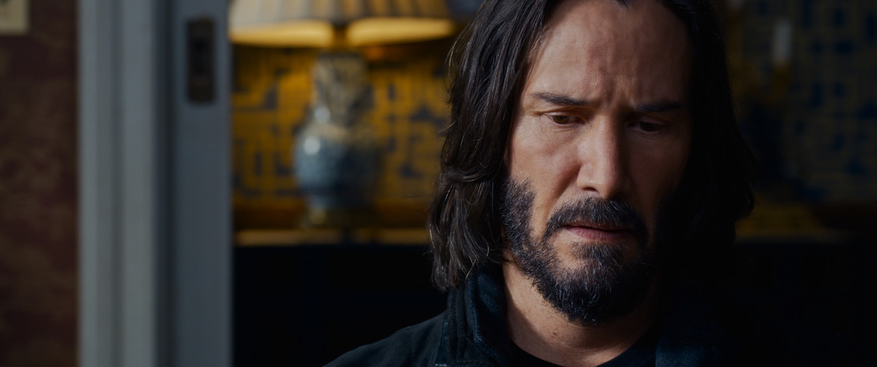
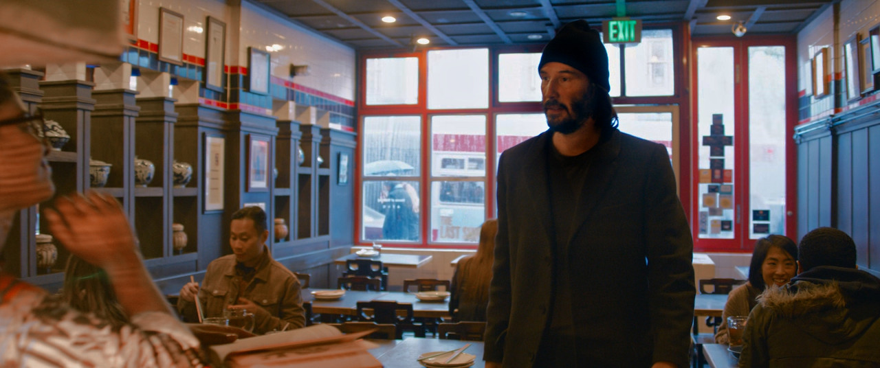
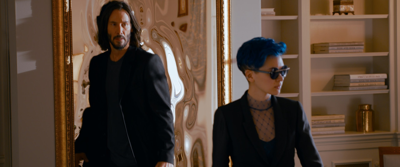
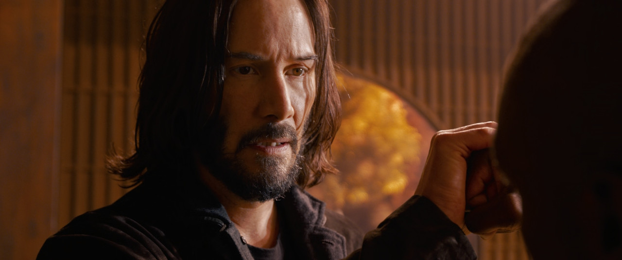
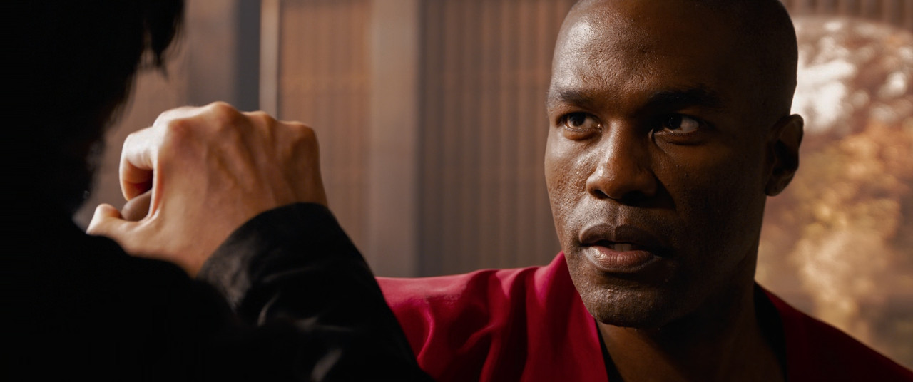
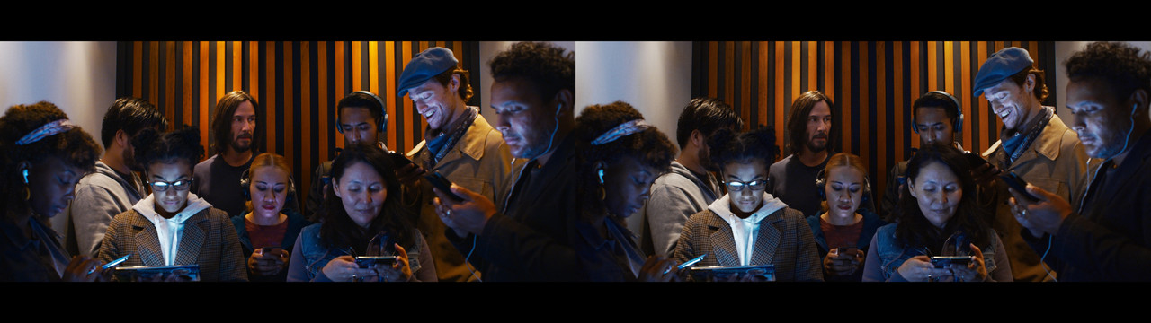
Same with this one:
Matrix-Re-Grade-Neutral-2.jpg


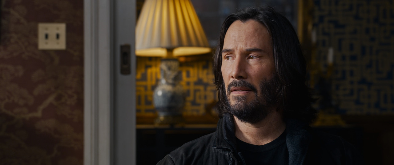
On the left, Keanu's face gets overly saturated by the tungsten lights while the two women in the middle have their faces going extremely pink. And the wooden bars behind them stand out for no apparent reason because the tungsten warm tones bleed them into oblivion. Compare that to the right image where those extremes are gone. You might be able to push saturation a bit more even on those right images, but extreme looks rarely work in cinema compared to short clips on YouTube, commercials, and music videos. People are gonna sit for over two hours looking at this and it's tiresome to see people looking unnatural like that. Balance is key.

Here are the two images in higher resolution.

https://i.postimg.cc/vQbc8SkD/Matrix-Re-Grade-Neutral-1.jpg
https://i.postimg.cc/VYg5JWPg/Matrix-Re-Grade-Neutral-2.jpg
 
So, basically, yes, they can still get a colourful modern-looking image without it looking un-natural if they want.

I can relate to what you say about there being a limit to how much of those richly saturated images an audience can sit through though. Have experienced an almost visceral reaction to a similar look when watching a movie once, where it ended up like the visual equivalent of being force-fed icing-covered donuts.
 
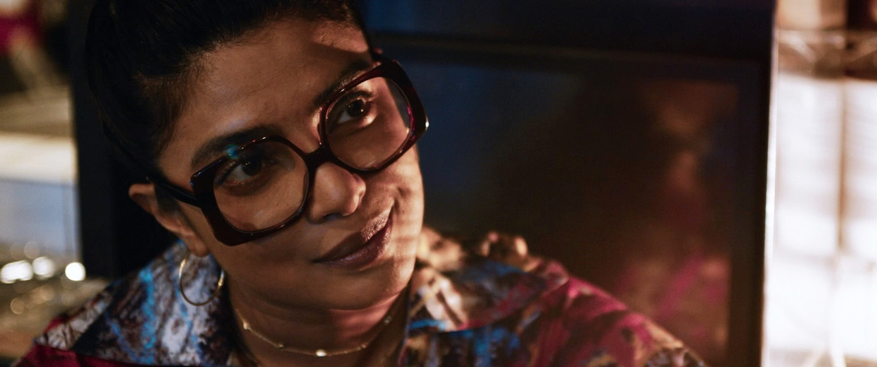
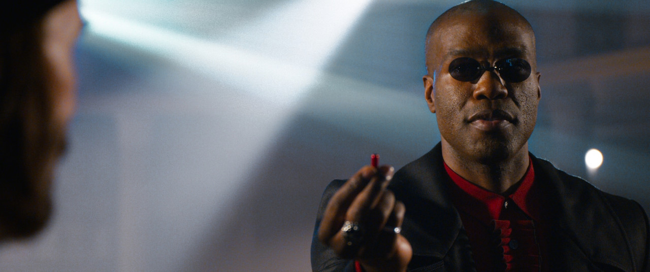
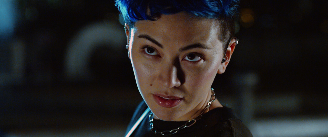
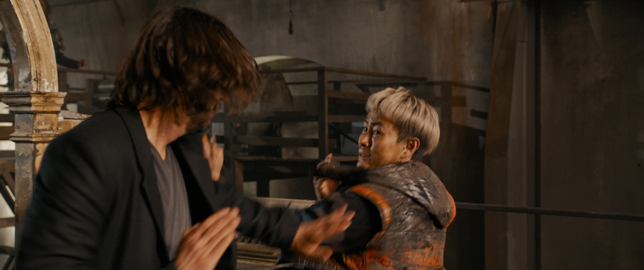
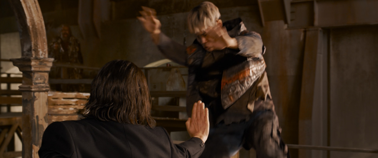
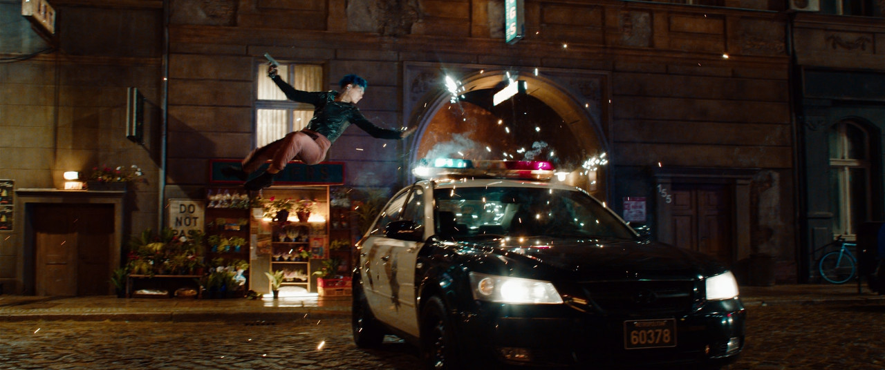
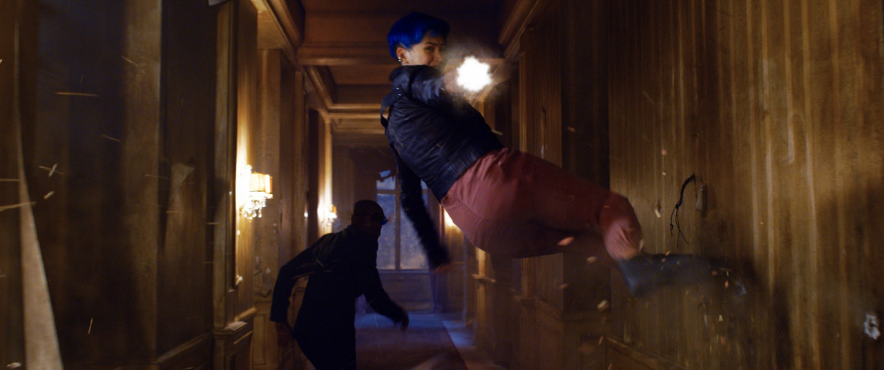
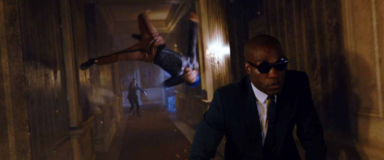
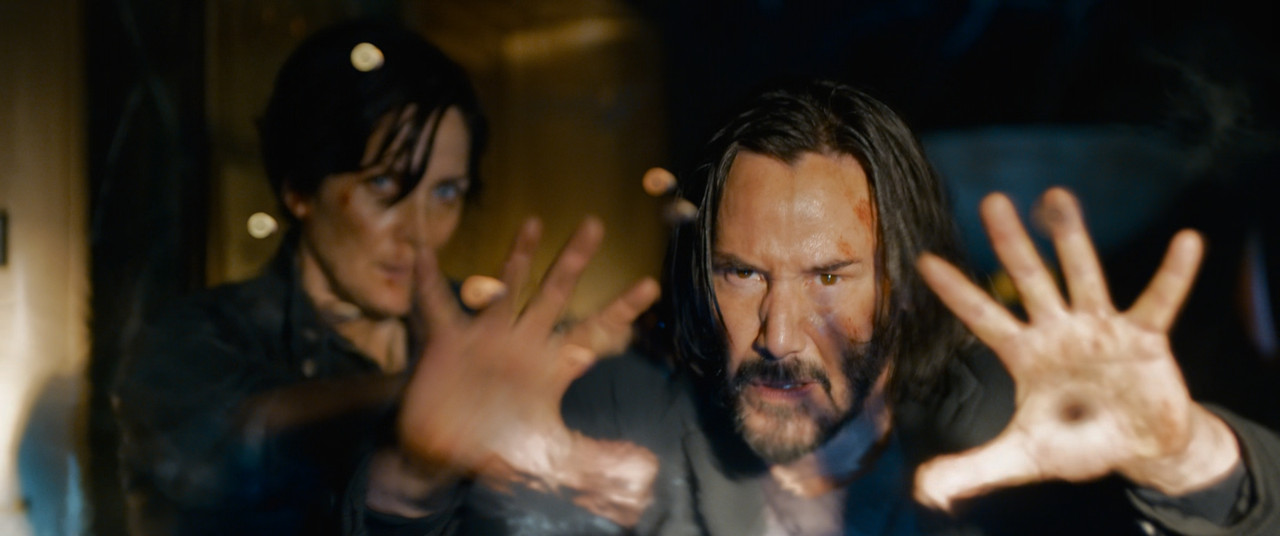
I personally never really liked the strong Green or Blue grades from the original 3 movies, but I see there are a lot of fans that don't share my opinion. In the stills below I mainly removed excessively greens or blues from the image. I didn't really touch saturation except for the Asian Female talent at night. I also just mainly watched that I kept the Skintones near the "Skintone Line" in the Vectorscope in Resolve, I didn't adjust for saturation. I also brought down the highlights in some of the skintones and in general.


gr25-1-17-1.jpg


gr63-1-22-1.jpg


gr40-1-26-1.jpg


gr61-1-36-4.jpg


gr64-1-41-1.jpg


gr42-1-6-2.jpg

gr56-1-41-6.jpg


gr26-1-42-2.jpg

gr23-1-43-2.jpg
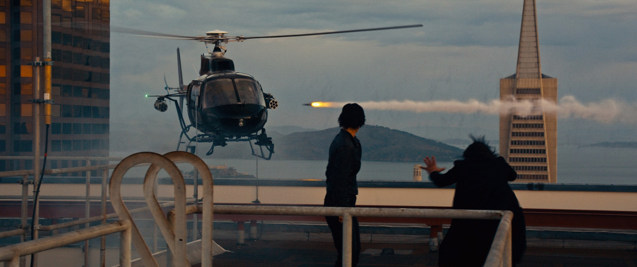

gr-27-1-44-2.jpg
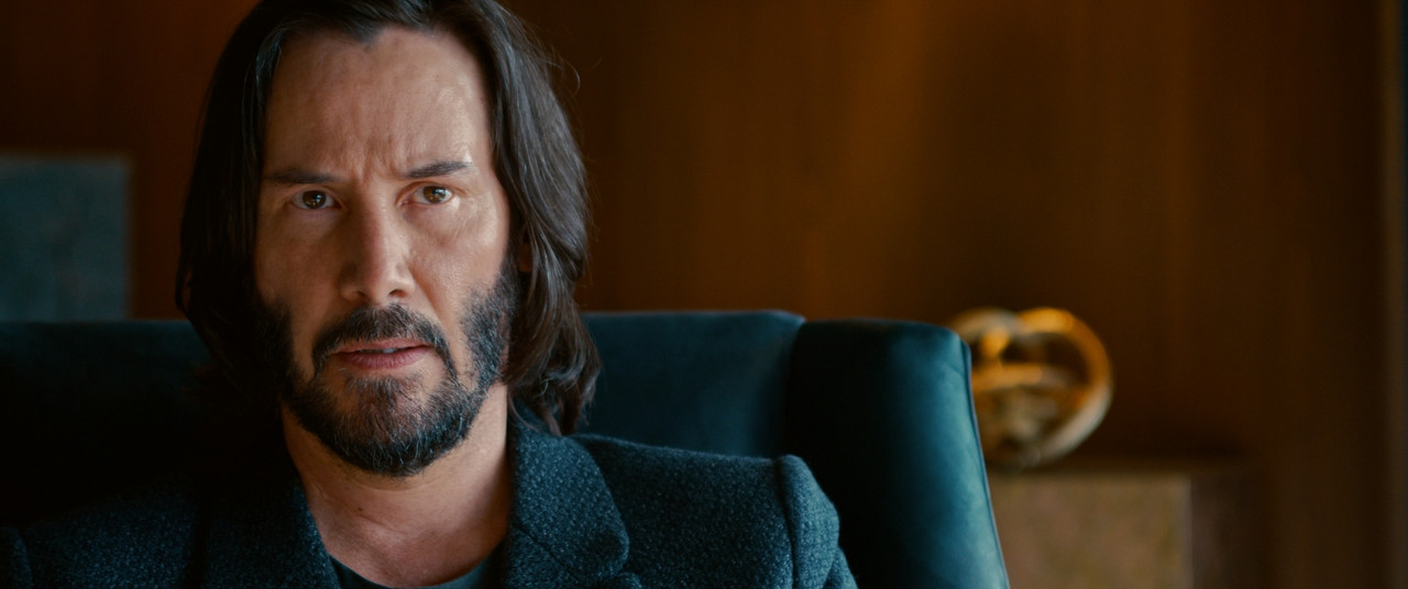

gr1-1-54-1.jpg
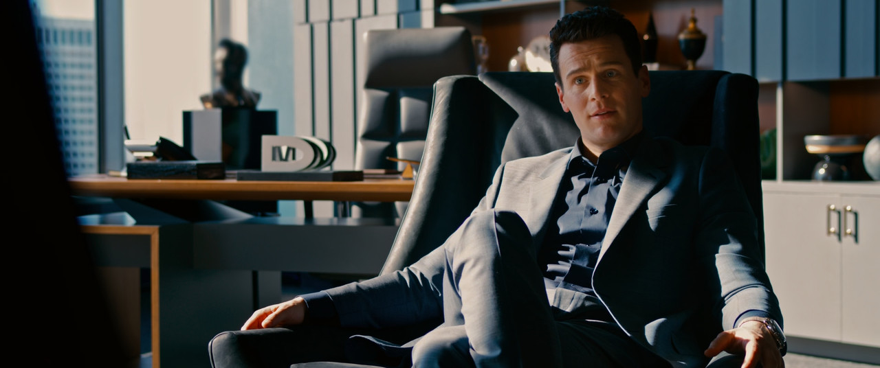

gr2-1-55-1.jpg


gr4-1-58-1.jpg


gr24-1-62-2.jpg


gr66-1-67-2.jpg


gr39-1-81-3.jpg


g22-1-92-3.jpg


gr62-1-112-4.jpg


1-114-32-1-114-3222.jpg


1-117-1-1-117-1.jpg


1-118-2-1-118-2.jpg


1-119-1-1-119-1.jpg


gr20-1-122-2.jpg


gr19-1-123-1.jpg


better-3a-1-127-4.jpg


better-4b-1-128-2.jpg


gr33-1-154-1.jpg


1-155-1-1-155-1.jpg


gr34-1-197-1.jpg


gr36-1-198-1.jpg


gr48-1-207-1.jpg


gr31-1-212-3.jpg


gr30-1-215-5.jpg


gr-50-1-223-3.jpg


gr15-1-237-1.jpg


gr5-1-241-1.jpg


gr21-1-242-1.jpg
 
Last edited:
Phil said it best in my opinion.

We are talking about a multi million dollar studio film. One of the biggest film franchises in the World.
As Red owners or people that have worked with Reds, and knowing this was shot on Monstro, we are all quite aware the image can look much more natural than what we see in this trailer.

My take? This is 100% intentional. Its part of the storytelling.

This is when I clearly stand with the filmmakers. If this is to benefit the story and add an extra layer to it, I'm all for it.

The previous films from Lana and her brother already showed they know and USE color to add layers to their stories.

So, personal taste aside , I want to judge this picture as a whole experience. From the trailer, I'm really, really excited. And from what we see, the cameras delivered the versatility for the look they were looking for. Can't wait!
 
Yep. I sincerely think the trilogy is something people will need to watch again and revist, specifically how things were "left" as it literally explains possibly the general feel of the world and look they are achieving. That was my immediate first thought regarding the bolder approach here.

If you are merely comparing this to the first film, you're doing this wrong. First film is obviously iconic and wonderful, but not exactly how we got to this film. You need to look at the last one. And not even carefully.

Short summary, I suspect this actually good filmmaking rather than digesting common popular or preferential looks in comparison. And I'd like to hope so.

Oddly at this point though, I really want to forget the trailer the most before watching the film in theaters. First watch made me chase a few ideas regarding the plot and I want it to have more of an impact upon first viewing.

There's two films, rather different types and in quality that completely took me by surprise due to the original trailer not saying much or simply not knowing much going into it. The original Matrix was one of those and I think a key reason for it's commercial success. The concept of well written dialogue that doubled as perhaps and lead to word of mouth marketing on that film is a bit of lightning in a bottle. If you didn't know much about the film, the quote "Unfortunately, no one can be told what The Matrix is. You'll have to see it for yourself." was beyond brilliant and kinda explains a great deal why you even need to watch the film.

Without full deconstruction, this trailer is about nostalgia leading to questions on just exactly how we got to here and what can be done given the current world presented. For fans of the films, that's more than enough to get a ticket sale.
 
My take? This is 100% intentional. Its part of the storytelling.

I would say there are too many inconsistencies and general Red color science issues to be 100% intentional. If the intention is to not do much to counter these bad artifacts, then I'm with you. But I don't think it's intentional to leave a big bright blob around Keanu's face as an obvious tracked window when pulling down the mids would have countered that problem. I don't think people realize that "multi-million dollar studio film" doesn't really mean much and it could be argued that there are plenty of "multi-million dollar studio films" that because they are just that, have too many cooks or have too much pressure on the schedule compared to passion projects and smaller films where people pull some hours of their free time to fine-tune things.

"Multi-million dollar studio film" is not a fairy tale castle on a hill where the magic happens, it's just another film. The problems during these productions are just the same as smaller films, only at a larger scale. There seem to be some ideas that studio films, especially big franchises, mean that everyone involved are pitch-perfect filmmakers that never make mistakes, but none of us are such people. And with the pressures of being a "multi-million dollar studio film", it's even harder to act "pitch-perfect".

I've consulted enough here in Sweden to know that "big-budget" rarely means anything in this regard. Pink skin tones, floating window orbs, and bleeding over-saturated colors does not look intentional, it looks like Red color science problems when not addressing them properly and general grading mistakes.
 
Yep. I sincerely think the trilogy is something people will need to watch again and revist, specifically how things were "left" as it literally explains possibly the general feel of the world and look they are achieving. That was my immediate first thought regarding the bolder approach here.

If you are merely comparing this to the first film, you're doing this wrong. First film is obviously iconic and wonderful, but not exactly how we got to this film. You need to look at the last one. And not even carefully.

Short summary, I suspect this actually good filmmaking rather than digesting common popular or preferential looks in comparison. And I'd like to hope so.

Oddly at this point though, I really want to forget the trailer the most before watching the film in theaters. First watch made me chase a few ideas regarding the plot and I want it to have more of an impact upon first viewing.

There's two films, rather different types and in quality that completely took me by surprise due to the original trailer not saying much or simply not knowing much going into it. The original Matrix was one of those and I think a key reason for it's commercial success. The concept of well written dialogue that doubled as perhaps and lead to word of mouth marketing on that film is a bit of lightning in a bottle. If you didn't know much about the film, the quote "Unfortunately, no one can be told what The Matrix is. You'll have to see it for yourself." was beyond brilliant and kinda explains a great deal why you even need to watch the film.

Without full deconstruction, this trailer is about nostalgia leading to questions on just exactly how we got to here and what can be done given the current world presented. For fans of the films, that's more than enough to get a ticket sale.

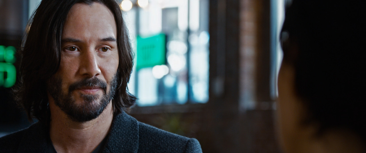
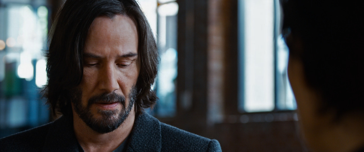
I don't have any problems with anything I've seen in the trailer except the grade. I think that's why I'm really concerned about the grade because I'm a hardcore fan of the Matrix movies, even the 2nd and 3rd, so I care for it to be free from problems that are extremely easy to remedy. I mean, the shot in the restaurant, with Keanu's face being lit up by a tracked window orb is clearly not intentional, clearly not a story thing. It's a basic lift up of his face because it was probably underexposed, but it's done so poorly that we have this bright gamma orb following his face.

If we can't accept that obvious problems like these exist, then we're no better than people afraid to speak their minds around heavy filmmakers who may very well want feedback. Just because we look up to them like I look up to Lana as being a tremendous philosopher and filmmaker, it's just bad if we can't point to a problem and say, "I think that looks weird." Imagine how things would be if you shot something and no one said anything and later down the line you get this weird criticism when it's already released and out in the world. You wonder why no one said a word before you let it out the door. I certainly wouldn't like things to be that way, I'm not a perfect filmmaker, no one is and all of this is to help each other. That's my philosophy.
 
I think it all looks fine and they're going to do extremely well with it, financially. I don't think the audience necessarily should get to vote on color -- it's purely the decision of the filmmakers. The saturation was noticeable but didn't bother me. I also think it's insulting to the filmmakers for armchair critics at home to regrade the material in the way they think it should look, as if their opinion is worth more than that of the director's or the cinematographer's. Think of how you would feel if some self-appointed internet expert took a project you did and changed the color, altered the mix, or re-edited it in an attempt to make it "better." This is a very, very subjective area, and the only absolute is what the director wants. The audience's opinion doesn't count, except at the box office.

BTW, I wouldn't necessarily judge the quality of the online trailer as being an accurate example of the finished film. I know more than a few cases where the trailer and the movie looked different, because the marketing department made decisions outside the director and producer.

Ehm, the "armchair critics" in here are professionals who are probably just as much experts on Red color science as the people working on the film. Discussing problems with color grading when they show up in official major releases shot on the very cameras that this very forum exists for, is absolutely valid, and pointing out problems with the color science when doing a breakdown of these images is also valid. I've stated numerous times in here that I don't have a problem with the grade choices, it's the artifacts and problems spotted that I'm wondering how they've made it into this. What do you think happened when lots of colorists went together and told Netflix that the release of Annihilation on Netflix was screwed up in its HDR values? It got fixed fast. Much of what I pointed out here has to do with things that look like shit in Red color science, problems and artifacts that gets ignored far too much on many productions shooting on Red. For example, increasing saturation on Red material without being careful around certain values can create a lot of weird things in warm colors and skin tone balances.

As I've also pointed out, all of this is subjective. But the issues with the color science, issues I've brought up in a whole other thread about that specifically, show up in this trailer very obviously. I don't speak for others, but for me, I respect the vision they have, but I seriously doubt that the extremely pink skin tones, visible tracked windows due to lifted gammas, contaminated tungsten lights with detail killing bleed, out of gamut values etc... are intentional. But hey, let's just ignore talking about things like these? Advanced critique, from other professionals in a field, seems to be less favorable today than people just blindly cheering on or completely trashing on the work that is being released. So... maybe think of how you would feel if everything that's being discussed around your work is either people completely trashing on it or just blindly cheering on? Or are you the happiest when there's an advanced discussion about the result of your work, going into details, finding the really good parts, while pointing out problems with a level of depth that generally helps people grow? I certainly think that's preferable over the masses of pointless empty comments that fill up internet servers on a daily basis these days.

But mostly I don't really get how you conclude this discussion being made from the perspective of the audience? I've been breaking apart Red's color science for over ten years of practical work and I see color science behavior in this trailer that I think needs to be discussed and critiqued in more depth than the "self-appointed internet experts" you talk about, do. If you think it's insulting breaking down a color grade of a major motion picture like in this thread, I find it more insulting to be called a "self-appointed expert" for doing it on a forum for the very cameras the movie was shot on. Check the discussion, not just the headline, is my recommendation.
 
Holy fuck the moment I saw the title of this thread I immediately thought it’s going to be him complaining about it isn’t it. And well here we are.
 
Holy fuck the moment I saw the title of this thread I immediately thought it’s going to be him complaining about it isn’t it. And well here we are.

What a fantastic contribution to this discussion.
 
Holy fuck the moment I saw the title of this thread I immediately thought it’s going to be him complaining about it isn’t it. And well here we are.
Exactly: a lot of armchair critics who've done very little with their lives, but still have the time to nit-pick others' work. It's always a lot easier to complain than it is to actually create something new themselves.

For the record, I had nothing to do with The Matrix, though I casually knew some of the people who worked on the original films, and they worked tirelessly to give the filmmakers the precise images they wanted to see. There's a disturbing trend these days of crazy, obsessed, toxic fans who believe they know more than the actual filmmakers. I think if they just thought about it for more than a minute or two, they might eventually grasp how rude and arrogant it is for them to give speeches on how they know more than the actual people who created the film in the first place.

Why do you keep going on like this? Giving critique like in this thread is totally valid, especially when actually working with this shit for a living! And you calling us who gave this critique crazy obsessed toxic armchair critics who know nothing and have done nothing with our lives. Who is actually the arrogant rude one in here?

Working with color and giving a critique on official releases is totally valid, it's about digging deep into the color science. But you defending other people you don't actually know while calling out other people you don't know for being toxic armchair critics... who's really the toxic one?

The problems with the color science, the problems with the grade are so obvious and pointed out that if you were actually looking at the proof in the pudding you would see it for what it is. But you seem to ignore all of that because you feel the need to call us out like this? Seriously, if you have nothing to contribute, dispute, counter-argue, or anything that revolves around the subject, get out. What you are doing is gatekeeping bullshit.
 
It's just a discussion on saturation levels, why be so fearful?

ps - I think most filmmakers have more self-confidence than is suggested here. I suspect most would be curious to come across a forum discussing their work and, I dare say, quite a few might even be flattered. They certainly wouldn't be threatened by enthusiasts tweeking a few of their images online to further a positive discussion.

It's just gatekeeping, people who have achieved moderate success in the industry and now need to punch downwards and pointing out that people under them "should know their place" and that they don't know anything more than they do as they defend people they don't even know.

I agree with you, I don't think any of the filmmakers would come in here and be intimidated by any critique. How would they handle normal film critics then? The type of critique in here comes from people who actually work with Red material. I've seen tons of problems, I've troubleshot tons of productions, consulted colorists, DPs, directors, producers, I've pixel peeped Red material and done tests since the dawn of Red One. If I cannot point out problematic color things in official releases shot on the very cameras I've worked with for so long... then who are "allowed to" according to the gatekeepers?

Sure, we can all just shut the fuck up, but I don't believe that is especially good for anyone. It leads to everything being sterilized behind a veil of fake smiles and no one ever expands their knowledge. Maybe this is why constructive critique is so hard to come by, everyone's just silent because they don't want to deal with gatekeepers and people like that. And then the problems I see so often in film/series shot on Red show up over and over... because no one cares to ask the questions "why?"

If the actual filmmakers were to enter this discussion, that would be wonderful. It would be as much praise for the vision as there would be questions about the problems mentioned in here. It's actually possible to like something and still criticize it, even if that seems totally out there for some people. If they were here, it would probably clarify some things, but could also help them out. As I've mentioned numerous times, we are all just people working in the industry and we all have different expertise. Obsessive focus on "status" in this industry ruins creative/constructive talk and I seriously hate it.
 
When I first saw this thread I was a bit taken aback by the seemingly unprofessional and arrogant criticisms of the images in the trailer, from Redusers self-confessed pain-in-the-arse complainer about all things image-related.

I also didn't have a problem with the look of the trailer, assuming they were deliberately going for the look they were presenting.

When the technical issues with the images were pointed out, with much respect expressed towards their creators, I realized there was more to it than some whinger self-aggrandizing at someone elses expense, and was glad the subject had been raised, seeing it more as an opportunity to learn more about the RED specific (and more general) image capturing and creation process than as an opportunity for 'what's-he-on-about-now' eye-rolling.

The red orbs someone else pointed out, and the post-processing colour issues (as well as some other things) reminded me of technical issues I've seen elsewhere in other films and movies that are considered classics made by the best of the best. Seeing what even the most capable and masterful image-makers and story-tellers have to deal with helps me understand what I'm dealing with in my own efforts, so I appreciate some of those things being pointed out.

Shit happens. Decisions, choices and compromised are made, it's no big deal. Nothing that needs to result in character bashing and personal attacks.

And to help keep the discussion in perspective, this thread has had about 4200 views. With repeat views, that could add up to just a few hundred individuals seeing it here on some far-flung corner of the internet. I think it's more about what we here can learn from it than any influence, good or bad, that it might have outside of Reduser.
 
When I first saw this thread I was a bit taken aback by the seemingly unprofessional and arrogant criticisms of the images in the trailer, from Redusers self-confessed pain-in-the-arse complainer about all things image-related.

I also didn't have a problem with the look of the trailer, assuming they were deliberately going for the look they were presenting.

When the technical issues with the images were pointed out, with much respect expressed towards their creators, I realized there was more to it than some whinger self-aggrandizing at someone elses expense, and was glad the subject had been raised, seeing it more as an opportunity to learn more about the RED specific (and more general) image capturing and creation process than as an opportunity for 'what's-he-on-about-now' eye-rolling.


Thank you for reading more than the headline as so many others seem to do these days. For anyone who's read my other thread about the problems with the IPP2 transforms reacting weirdly with shadows and gamut will spot similar things in this trailer. Thing is that we're not on Facebook here, not on Reddit, most of us are professionals who take on this subject with that experience. I wouldn't have made this thread if there wasn't more to it than my personal opinion. I've mentioned similar stuff with things like stuck pixels on shows like Stranger Things and Queen's Gambit, as well as sparkly noise with gamma lifts etc. that should have been seen but seemingly wasn't. Just giving praise to everything shot on Red just undermines any effort to spot issues and problems. I'm thinking that nowadays, we won't be able to catch issues like the red orbs issue introduced in the Dragon days, which lead to it being fixed in Komodo and Raptor. Because nowadays no one seems to bring such things up, maybe in fear of being attacked by other people on this forum that just make shallow ad hominems for some reason.

As I've mentioned, I made a subjective correction, but the point was to shine a spotlight on the issues. One of the major issues is that saturation levels seem to be increased without balancing within those saturation levels. Red color science behaves very weirdly when increasing saturation, it starts to "bleed" and this "bleed" can be corrected without losing the overall intention of the grade.
 
No worries Christoffer.

Don't mean to de-rail the thread, but what was the "...sparkly noise with gamma lifts..." issue? Just curious if it's the same thing I've been seeing with high-frequency specular highlights on hair etc.
 
No worries Christoffer.

Don't mean to de-rail the thread, but what was the "...sparkly noise with gamma lifts..." issue? Just curious if it's the same thing I've been seeing with high-frequency specular highlights on hair etc.

No prob, I understand how things look when starting to read the thread, changed the first post to be more focused on the rest of the discussion.

The "sparkly noise" was from Queen's Gambit, in, I think the first scene when they argue in the trailer park, there's a very low-key shot with extreme white sparkly noise. This happens if you try to lift things up from beyond the DR floor. It's understandable to push it like that to focus the viewers attention, but then it needs fine-tuned noise reduction or crush away the noise and be ok with the darker look. Leaving the "sparkly noise" seriously pulled me out of that scene as it looked super weird. As I don't know the procedures at Netflix, maybe they have fine-tuned the masters now, but like the release of Annihilation which had HDR levels off the chart, after a couple of colorists mentioned it to Netflix, they updated the master (or changed the flags on the metadata).
 
Back
Top