yann LHENORET
Well-known member
Like what you did here... good job and appreciate the effort. UI feedback input is welcome right now as I am torn between a few different overall directions. So speak up...
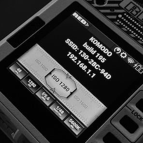
I personally like the UI as it is:
-Skeuomorph "buttons" for the functions you need to access to.
-Classic symbols and fonts for what you only have to read.
In my opinion, if both are treated the same way, it tends to make the UI "safe", it takes all the personality out of this display.
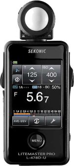
Other companies do that for all their products: sleek design and sleek UI. I don't think RED should.
They work a lot on the design of their cameras, their interface should also reflect this requirement and singularity.
Komodo is not a ultrasonic rangefinder, a robotic drill, or a a stealth warplane. Let it be fun!
PS: I would just like to be able to get a % number next to the batteries, that's all.