Christoffer Glans
Well-known member
I apologize in advance, but I need to chime in.
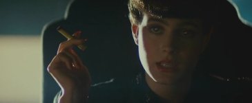
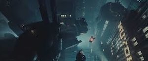
Far be it from me jumping in and discussing anything about this, but at it's core the reason the orange/teal look has grabbed hold as something creators aim for is squarely due to color theory.
Orange and teal are complements of each other and therefore provide a high level of color contrast which essentially helps focus the viewer. It's as simple as that.
There's nothing truly unnatural about it. It is an enhanced version of reality. Sometimes pushed to interesting extremes. I find it interesting that during magic hour if you beef up the saturation of the last light as key on the subject you get something familiar in relationship to this look. If you look at various Maxfield Parrish paintings for instance you will see even larger extremes. Some chase natural images, some chase a surreal quality. There's no "wrong" way in reality, though there are of course technical and subjective "best practices". Heh. If you guys read Sargent's painting notes on skin tones it might drive you insane.
Back when I was a Digital Colorist I worked on about a dozen or so films that desired a similar look. Interestingly enough however, usually for scenes here and there and not throughout an entire project. Though I've seen a motivated effort on some films to become more "uniform" in their grades. Personally I don't think "uniformity" to the palette is always the best way to go, but to each their own. That's their vision and take on the story.
Side note. While everybody is entitled to their own opinion do acknowledge that their of REDusers and shooters working on these films who visit these boards. Often times, especially on projects of this scale, you are looking at a year or more of work.
From a creators perspective influences and inspiration can be found anywhere. Like the look or not, the creators of this project did. Commercial success or not, it's what was decided on. Be critical of what you like and don't like, but certainly be open minded about the concept that there is certainly more than one way to go about things. Especially when relating to color theory and composition. Otherwise you'll be trapped in a tiny box full of other people very excited to be locked up in there with you oblivious to the spectrum of wonderment outside those confines.
I'm with you on this, but what I think you refer to is the subtlety of it's use. The "teal/orange" I'm refering to as a sickness is the plastic and unnatural look that destroys the colors and look of the locations in favor of that extra "zing". Of course my opinion is my opinion and I think everyone is more or less used to community forums and the fact that there are opinions expressed and people agree or disagree with each other... just like in real life

But once again, I think this quote says it all: a cinematic equivalent of compressing the dynamic range of recorded music for extra kick-ass loudness; both add extra zing, producing a product that's superficially exciting, at the cost of subtlety.
That says it all, this over the top use of teal/orange makes the images pop out, but the substance is reduced. If you think about it, it's the equal of taking a colored image and make it black and white, just the other way around. You pop out those real colors to such an extreme that they loose their fidelity. The richness of an image is lost just to create that "zing".
Colors is another tool in storytelling, just like camera moves, composition etc. If you squeeze colors into a box of constant teal/orange, you aren't working through the story being told. It might be good for commercials and posters to get people's attention, but I think it's on the lazy side of storytelling. Productions use it to stand out, to be seen, that's why it's used so much. Simple as that... commercial.