Welcome to our community

Be a part of something great, join today!

  • Hey all, just changed over the backend after 15 years I figured time to give it a bit of an update, its probably gonna be a bit weird for most of you and i am sure there is a few bugs to work out but it should kinda work the same as before... hopefully :)

Ask David Mullen ANYTHING

David,this may sound dumb, but I was looking into the human eye wondering how to have a small set of rules for going in and out of realism. I found that the eye can adjust the pupil from about f/8.3 to about f/2.1, and that got me thinking. A simple way to augment the expressionism as we cover the supernatural aspects and characters in our story would be to use smaller and larger apertures than the ye can manage. On the flip side, I am thinking that I may want to try to make the supernatural aspects more realistic by keeping their coverage within the scale, and towards the f-stop that the eye would likely be around given the brightness of the scene... if it were a sunny day and we wanted to avoid making our supernatural stuff seem fake we should try to use f-stops nearing f8.3 while if it were dark we'd want to be close to f2.1.

I am thinking that this could help bring it home for the audience. Perhaps I should say avoid making it feel more like a fairy tale than a documentation of an occurrence... I see this as a possible guide or tool that could help us push the feel towards terror rather than horror. I hope I am making myself clear, and apologize if my wording of this idea isn't perfect.

I'd love to hear your thoughts on this sort of practice, or tool... not sure what to call it.
 
You absolutely have to test flashing levels before a production -- the numbers thrown about like "10%" are meaningless. It's a pretty simple thing to test though. You just have to remember that the flash is most visible in the blacks, so your flash level will probably be lighter for a night scene than a day scene, for example, and probably lighter for a smoked/hazed scene than one without that haze.

At some point when I shooting, I did have to go by my gut when using smoke and diffusion, which looked heavier or lighter depending on the focal length and camera angle relative to the light. So while I knew what a certain flash level would give me, if the shot seemed low-contrast enough, I lowered the flash level or turned it (the Panaflasher) off completely.

Thanks. :)
 
Horror movies can either be grounded in realism or Expressionism, or move from realism to Expressionism...

I think super deep-focus compositions ala "Citizen Kane" would lend itself to creating that odd nightmare feeling. Super shallow-focus may too, but that tends to be so subtle since many movies today are shot at wide apertures that the viewer might not notice anything unusual about that. Plus whereas a deep-focus image would play even on a small TV screen, a shallow-focus image may not be as noticeable on a small screen.

You don't want your visual game plan to be simultaneously too hard and clever to achieve and yet too subtle to notice -- it becomes a waste of your effort, energy and time.

David,this may sound dumb, but I was looking into the human eye wondering how to have a small set of rules for going in and out of realism. I found that the eye can adjust the pupil from about f/8.3 to about f/2.1, and that got me thinking. A simple way to augment the expressionism as we cover the supernatural aspects and characters in our story would be to use smaller and larger apertures than the ye can manage. On the flip side, I am thinking that I may want to try to make the supernatural aspects more realistic by keeping their coverage within the scale, and towards the f-stop that the eye would likely be around given the brightness of the scene... if it were a sunny day and we wanted to avoid making our supernatural stuff seem fake we should try to use f-stops nearing f8.3 while if it were dark we'd want to be close to f2.1.

I am thinking that this could help bring it home for the audience. Perhaps I should say avoid making it feel more like a fairy tale than a documentation of an occurrence... I see this as a possible guide or tool that could help us push the feel towards terror rather than horror. I hope I am making myself clear, and apologize if my wording of this idea isn't perfect.

I'd love to hear your thoughts on this sort of practice, or tool... not sure what to call it.
 
david thank you for your time
i will be a keen observer from now on
i have just finished my first feature after 15 years in commercials
a great experience with dp lance gerwer from totsi the oscar winning south african film
great experience with lighting for the red

i dont joke
need a red dit
just call

regards
warrick:gun:
 
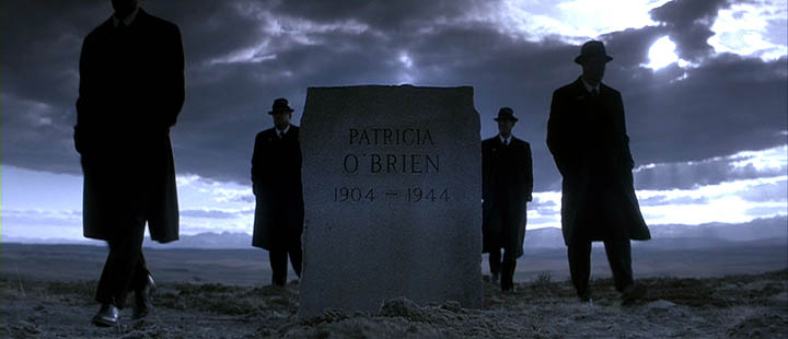
In my case in "Northfork", the ground was so barren that it was usually more interesting to frame more sky in.

Hi David, quick comment / question....

I noticed in No Country For Old Men, Deakins and the Coens chose to split the horizon showing more of the barren Texas landscape

NC1a.jpg


NC2a.jpg


NC3a.jpg


I figure (and just a guess really) the reason for them doing this was because the barren, raw landscape is more in step with the overall mood of the book and film.

So my questions is this....

When shooting these type of shots, what do you think holds more weight? Pure visual "interesting-ness" or the emotional landscape of the story / characters within the story? My guess would be that its a combination of the two but I'm curious to hear your views on this.

Thanks!
 
It's a mix of what's visually interesting and what tells the story -- the truth is that when setting up wide landscape shots, half the time you pan around a little and tilt up and down until the frame "feels" right, trying out difference balances in the frame... Composition is not a completely intellectual exercise, it's also an application of personal taste.

When I set up this shot in "Northfork", quickly as the sun was going down, the camera on a sandbag... I originally planned on putting the headstone on the right and the men walking from right to left, but in the last minute I centered the headstone because it seemed more powerful:

northfork36.jpg


It was just a gut feeling that it felt better to center everything.
 
Jacob, "No Country for Old Men" was composed to be cropped from Super-35 to 2.40 : 1, so using 16x9 full-frame transfers as a basis for judging how much sky or ground they intended to use in the composition is not going to be accurate -- you need to go to the letterboxed version on DVD/Blu-Ray.
 
David:

Have you worked with the Kelvin Brick or similar LED lighting which offers the ability to dial in any Kelvin color temperature? What realistically is the value of getting, say a color-temperature correct highlight light shining on the talent instead of a 5600 or 3200 light (which drives me crazy when I see a pure white light reflecting off a guys bald head when the ambient lighting in the scene is a totally different color). Also, what role do you think LED lighting in general will have in the future? Thanks
 
No, I haven't used those types of LED's yet. So far, my experience with LED's has been my Litepanels Micro which I use over the lens as an eyelight, and I once used the LEDZ Brute 6 or 9 for a car mount.
http://www.filmtools.com/litepanels-lp-micro.html
http://www.led-z.com/

It would be an interesting light to try out, one that can be dialed to any color temp, though I find that can be hard then to match with gels on other units, as opposed to, let's say, putting 1/4 CTO on a bunch of 3200K lights. Having a light that can be any color would probably be more useful in a situation where you find yourself working around a lot of mixed sources, like on an urban night exterior with a wild mix of color temps to match to.

It's certainly possible or probable that a certain percentage of what we currently use fluorescents for will be replaced by LED units, though there will always be cases when a fluorescent tube will be the most convenient way of lighting something. Both fluorescents and LED's have certain weaknesses compared to tungsten, though I suppose once most households no longer have tungsten bulbs, perhaps we'll be used to the way skintones look lit by compact flos and LED's. Right now, though, skin tends to look more attractive lit by tungsten.

As for replacing the powerful tungsten and HMI's we now use, like the 20K tungsten and 18K HMI... it depends on how bright these LED's can get.
 
Dear David Mullen,

I have a question for you regarding something you experienced on Manure:

Then I noticed again something I noticed the day before, that by the end of the day, it seems that the image on C-camera (our main “B” camera for the shoot since Day One) is slightly yellower than A or now-returned B camera. We thought it was just a monitor/output/cabling issue but at the end of Friday, Conrad looked at the RAW files and we saw that the yellowish difference is in the original recordings. It’s a simple color-correction fix but the question is what is causing it. We’ve been doing a black shading every morning but we may try doing it twice a day to see if that helps. It’s like the old days when you used a lens that was warmer than another lens, annoying in color-correction later when you’ve got a lot of intercuts in a scene, but workable. Maybe there are slight differences between digital cameras of the same model that only become visible when doing RAW recording where you don’t have a lot of electronic adjustments happening to the recording to match signals between multiple cameras.

Did you find any solution or answer to this? We are in the middle of a two camera production and just discovered that one of the cameras are yellower/warmer than the other. We have tried to black shade twice, but the results are consistent.

Thank you in advance,
Fredrik
 
The folks at RED looked at our "yellowish" camera, but they will ask you to shoot a chart with both cameras so they can examine the R3D files.

I can't recall if they were able to fix the mismatch. In the end, I believe we just fixed it in color-correction later.

I also noticed, by the way, that the RED can clearly see that an Ang. Optimo zoom is warmer than a Zeiss prime lens. So some of the mismatching was due to the fact that B-camera often had the Optimo zoom on, or at least, it made the difference more pronounced.
 
Hi David! what do you think of Lost in Translation movie by Sofia Coppola? Is it possible to achieve its lighting effect and global movie feeling with an HD camera and without expensive lighting gears?
 
Sure, use really fast lenses, shoot in available light. I don't think that movie used a lot of big lights anyway. It takes skill, of course, to create artful shots in available light (or extremely low artificial light). Now when you say "HD" just remember that "Lost in Translation" was shot in 35mm using a very low-contrast 500T color negative, no longer made. So you'd probably want to use a 35mm sensor camera to match the shallow-focus look. The one area that would be hard to match is the wide dynamic range that the color negative stock provided (especially that unusual low-con stock they were using.)
 
hey david, was wondering if you can advise me on the best way to light a particular scene im working on, any advice will be appreciated.

we are trying to light a front porch at night, the front porch has 2 lights on both sides (out door victorian lanterns) and a ceiling light above.

what would you suggest to get a believable night scene on a semi well illuminated porch.

heres what i am using to light the set only.

Moonlight: currently i have a 1k with a full ctb pointing down at a 45 degree angle ( i think this is incorrect as its giving my blue too much directionality. We did not build a real roof but had we built one i assume it would have obstructed the directionality of the moonlight and all we would see is bounce.

2 practicals (lanterns) (these are 120 watts but are blowing out the highlights completely)

and a 2 500w chimeras to add bounce.

thank you for reading this and i hope to learn from your experience.
your night scenes are fantastic.

i hope you dont take this as a "light it for me via this forum", but more of a
what am i missing or what am i doing wrong.
 
It sort of depends on your camera angles and what you feel you should be the dominate source -- the overhead? The spill from a window light? A wall lantern? The moon? You don't want the effect of several lights hitting the subject at near equal intensity. The first rule is to simplify -- one main effect with everything else play subordinate roles.

Maybe in the wide shots, it's an overhead effect from the ceiling light, or maybe it's the light spilling out from the house through the doors and windows.

Then when the actors stand at the railing at most of these sources are behind their heads, backlighting them, you can rake some dim moonlight across their faces. Maybe the moonlight is just a soft blue side-light, or maybe it's hard but broken up with tree branches, creating shadows.

If the light from the porch is warmish, like 1/4 CTO kind of warm, then you can make the moonlight half-blue and it will seem blue enough in comparison to the warmth.
 
thanks david!
in terms of the moonlighting though, what would you use as the light source
and would you use diffusion fabrics etc. or bounce it

(this is all a set built in a stage)

It sort of depends on your camera angles and what you feel you should be the dominate source -- the overhead? The spill from a window light? A wall lantern? The moon? You don't want the effect of several lights hitting the subject at near equal intensity. The first rule is to simplify -- one main effect with everything else play subordinate roles.

Maybe in the wide shots, it's an overhead effect from the ceiling light, or maybe it's the light spilling out from the house through the doors and windows.

Then when the actors stand at the railing at most of these sources are behind their heads, backlighting them, you can rake some dim moonlight across their faces. Maybe the moonlight is just a soft blue side-light, or maybe it's hard but broken up with tree branches, creating shadows.

If the light from the porch is warmish, like 1/4 CTO kind of warm, then you can make the moonlight half-blue and it will seem blue enough in comparison to the warmth.
 
Well, whether the moon is soft or hard is a creative choice and whether you bounce it or use a diffusion frame is a logistical choice, just depends on what is easier, it can look similar.

I tried to find some porch shots in my work. Here's some from "Solstice" - a wide shot of people on the porch (the moonlight is stronger here because I wanted the house to read better in the wide shot), a closer shot of the people on the porch, lit mainly from light spilling from a window, and then a close-up from another scene of a person outside of the porch on the ground, but lit from the house.

solstice3.jpg


solstice4.jpg


solstice5.jpg
 
wow thanks for the quick replies david, its tough for me to relearn all the techniques to lighting, all my work has been CG and theres alot we take for granted...

i saw your site and saw this image
page11_3.jpg
how did you achieve this glowing look on the girl? was this done in camera or in post?

i ask cause in my world....everything is post :)

you rock
M
 
That was post mostly -- I used a 1/8 ProMist for that scene since it was a flashback, but in editing, it became a fragmented flashback scattered throughout rather than one long flashback scene in the movie, so I felt justified making it look more stylized in post -- so we did a diffusion pass in the D.I., some sort of gaussian blur overlay.
 
Back
Top