Stanly ok
Member
Let's discuss ways menu design can improve quality of our lives!
I'll start with attaching all of my previews in one post, starting with the latest:
Video on settings menu mechanics, part 1:
Video on settings menu mechanics, part 2:
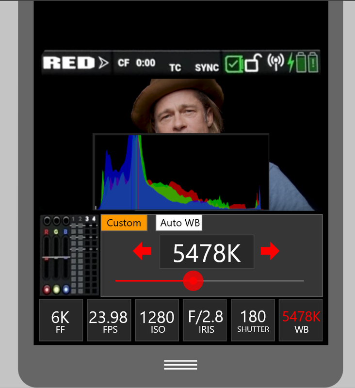
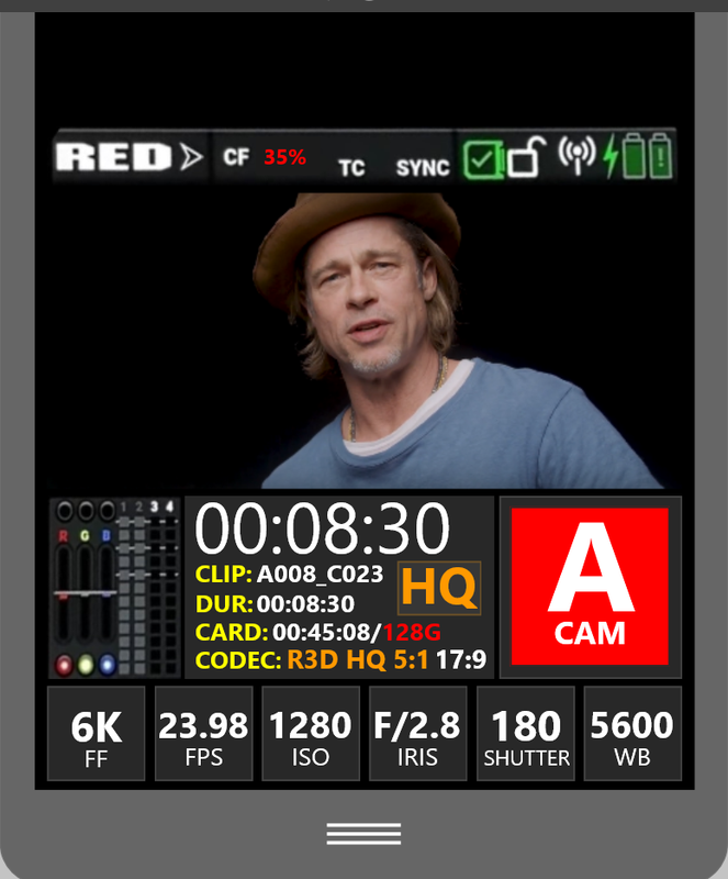
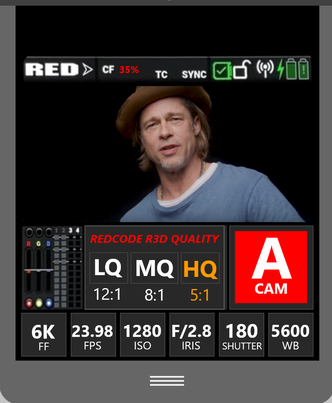
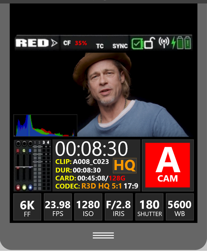
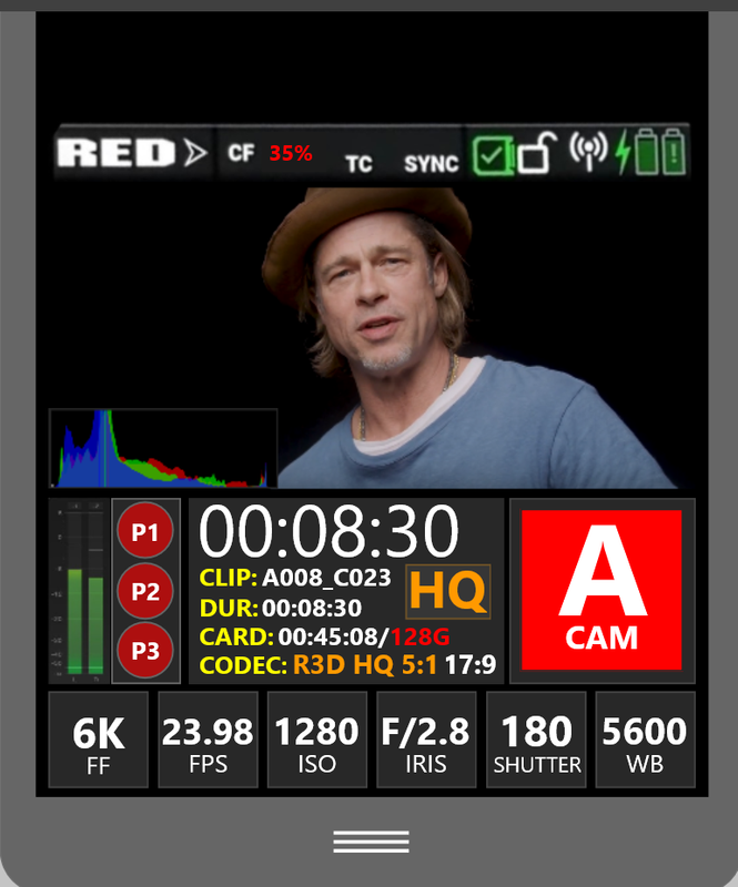
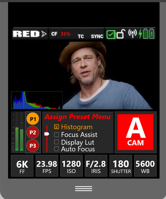
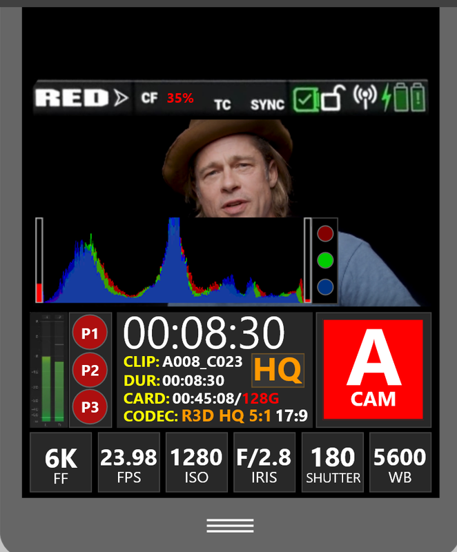
A couple of still images with settings hierarchy:
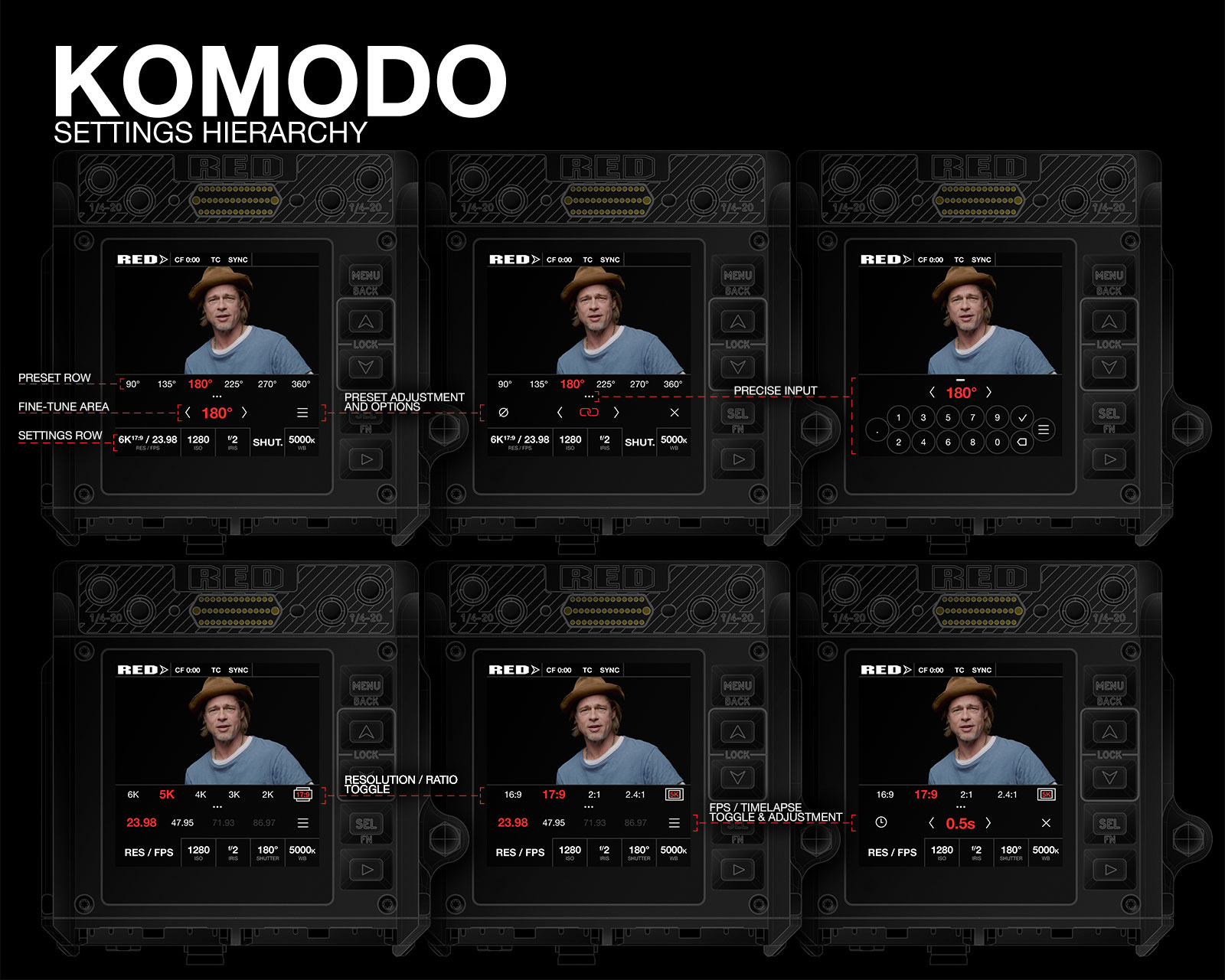
All of the interactive elements are in the bottom area, to keep smudges away from video feed preview.
Touch areas are large enough to be ergonomic, graphics are contrasty to be easily visible at a glance.
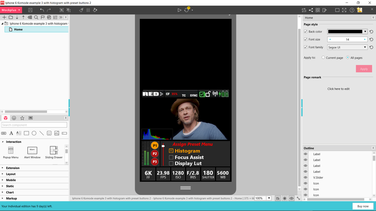
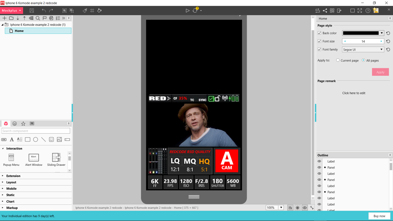
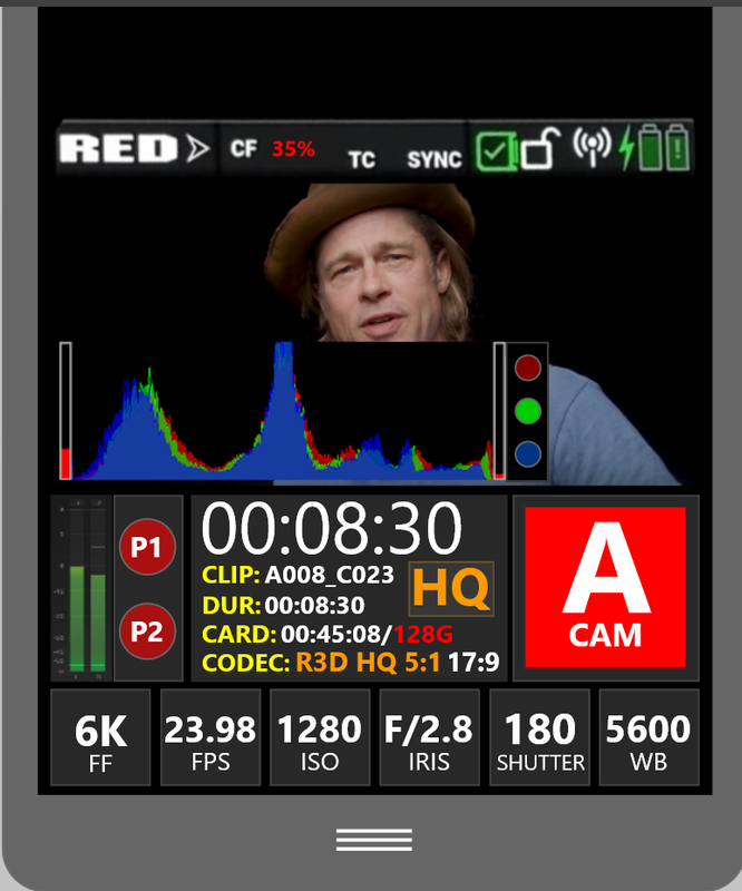
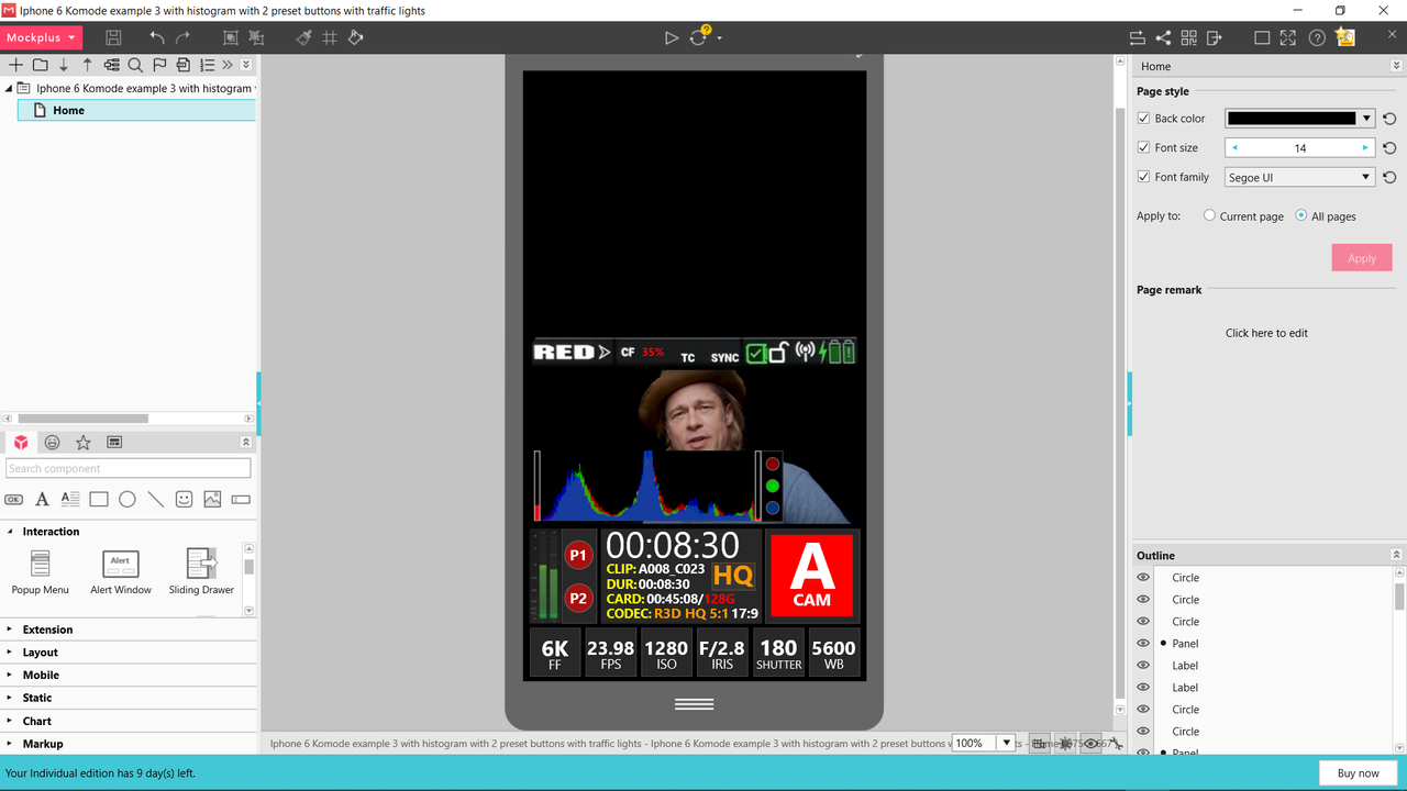
As a reference point, KOMODO's screen is about the same width as iPhone 6:
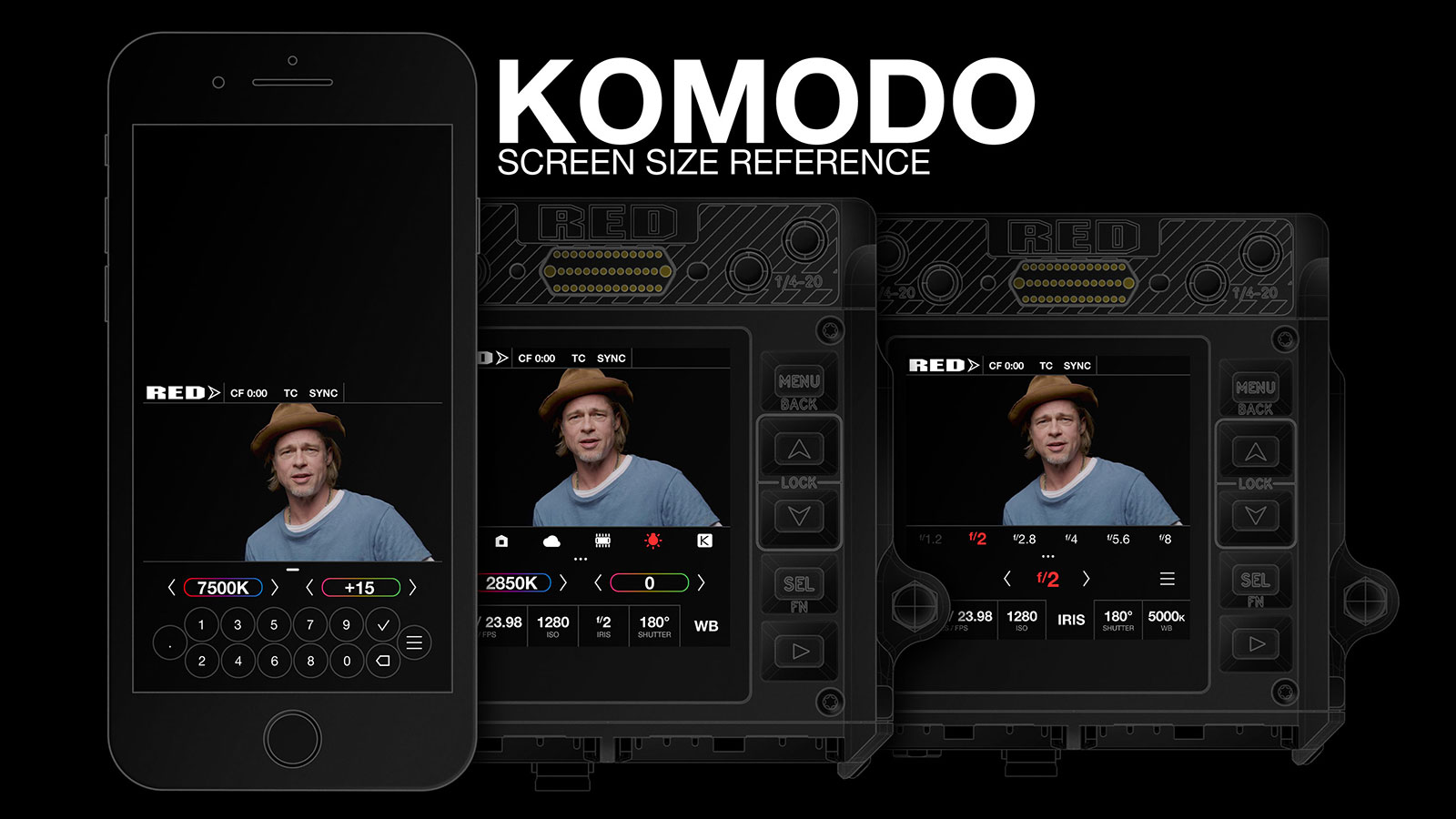
Can't wait to know more information about monitoring options and rest of the camera possibilities to come up with designs for that
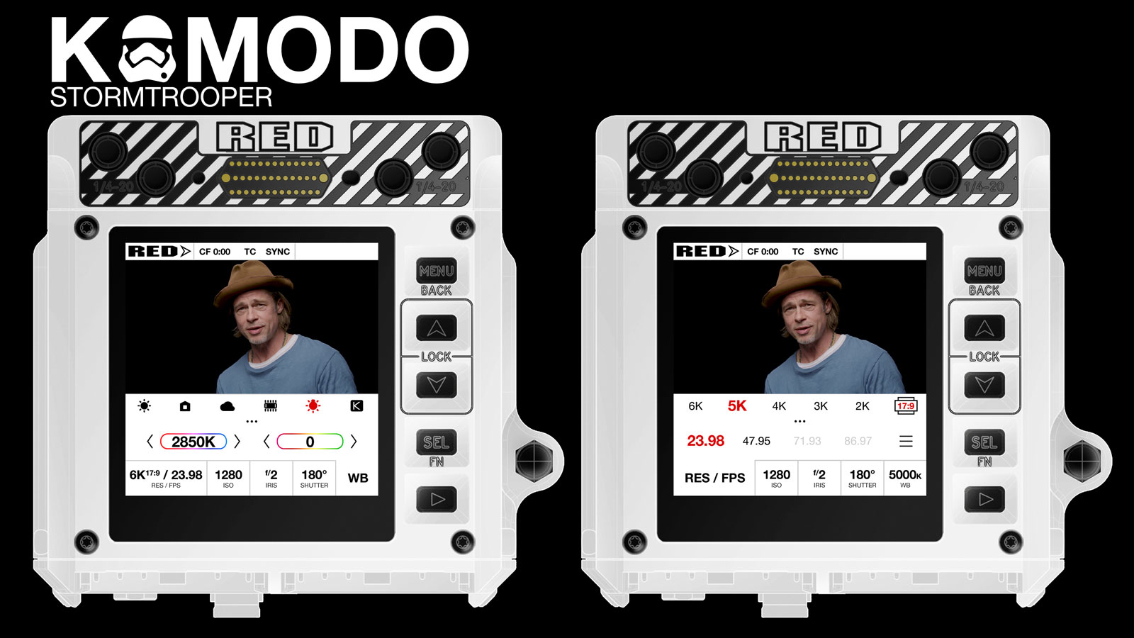
But for now ... here's a light mode UI version for Stormtroopers!
I'll start with attaching all of my previews in one post, starting with the latest:
Video on settings menu mechanics, part 1:
Video on settings menu mechanics, part 2:
A couple of still images with settings hierarchy:
All of the interactive elements are in the bottom area, to keep smudges away from video feed preview.
Touch areas are large enough to be ergonomic, graphics are contrasty to be easily visible at a glance.
As a reference point, KOMODO's screen is about the same width as iPhone 6:
Can't wait to know more information about monitoring options and rest of the camera possibilities to come up with designs for that
But for now ... here's a light mode UI version for Stormtroopers!
Last edited: