Welcome to our community

Be a part of something great, join today!

  • Hey all, just changed over the backend after 15 years I figured time to give it a bit of an update, its probably gonna be a bit weird for most of you and i am sure there is a few bugs to work out but it should kinda work the same as before... hopefully :)

UI & UX ideas

Back in the days of the 5DMK3 with magic lantern installed, the electronic data from the lens was passed through to the UI and a focus distance was displayed. I always thought this was really useful for self-shooting and would be a great addition to the Komodo UI, especially with all the EF and RF glass available.

I would expect it. DSMC2 has this feature.
 
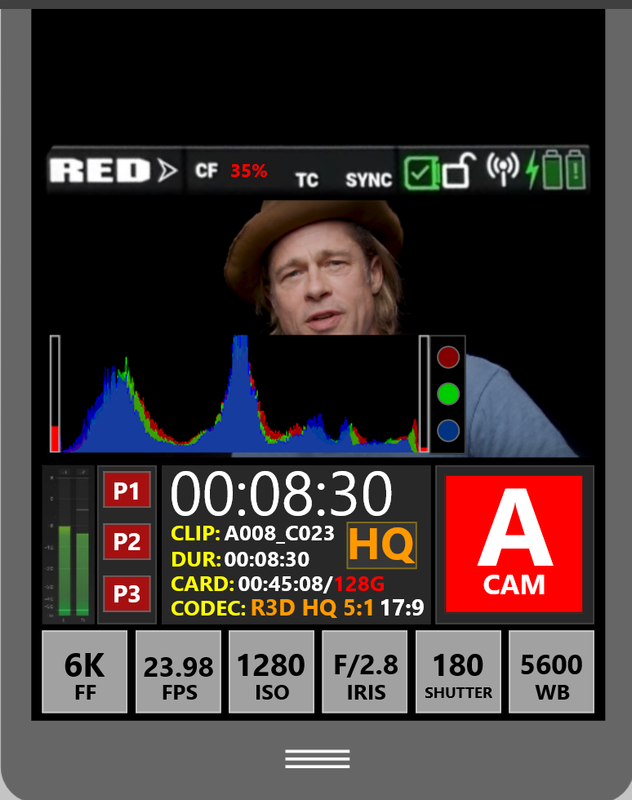
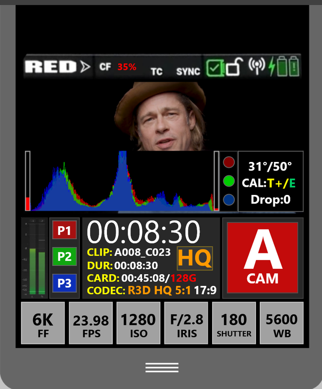
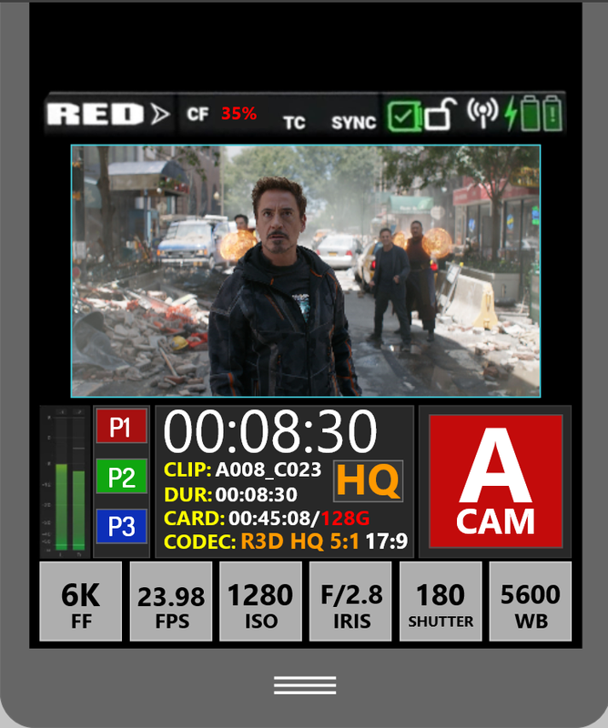
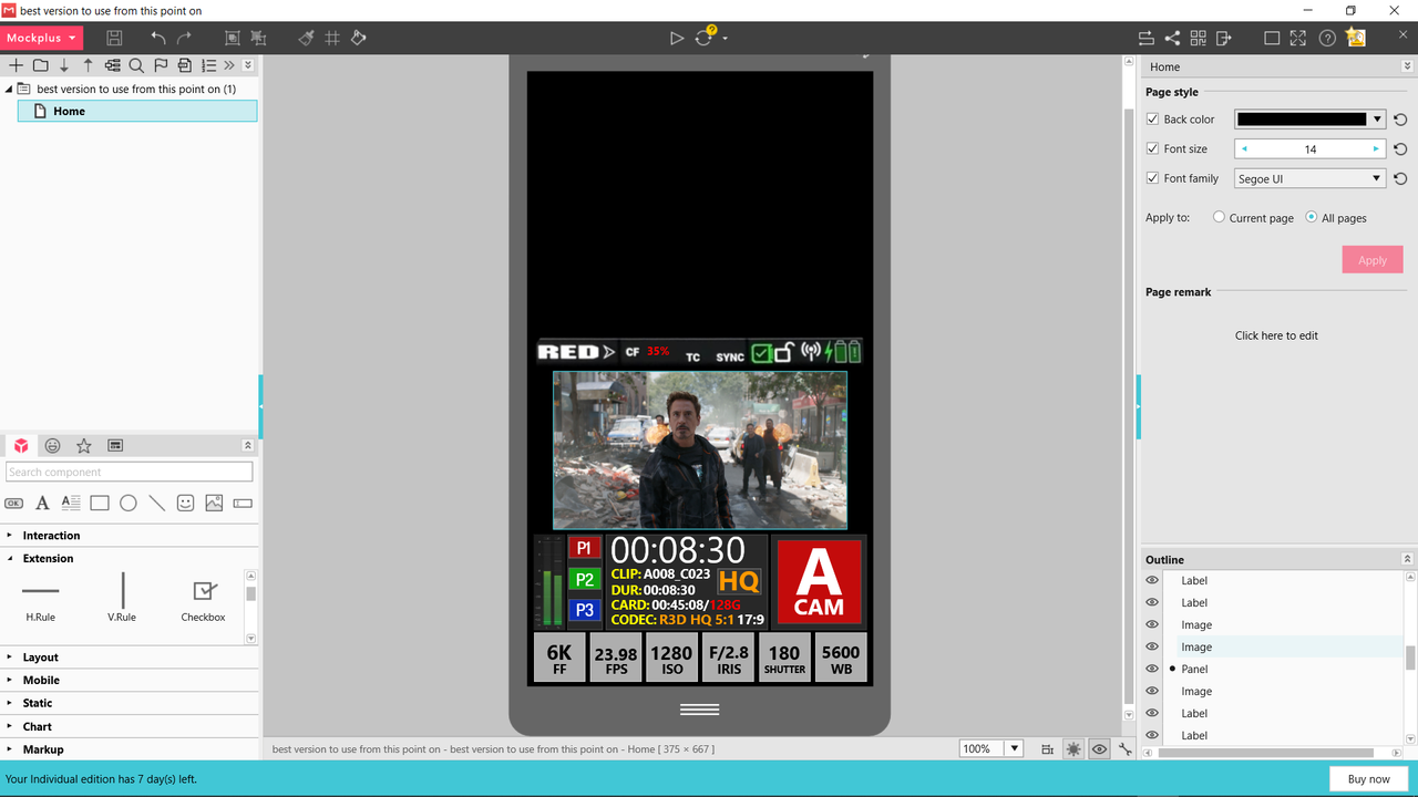
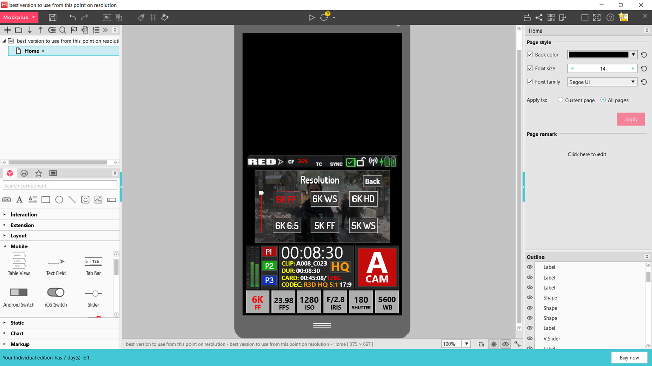
3 presets are back with square buttons and better spacing, still don't know if it's enough. Last preset button moved away from "6K FF" button. Plus buttons get a more distinctive look.

Screenshot-1370.png


Screenshot-1371.png
 
Last edited:
Next Idea,


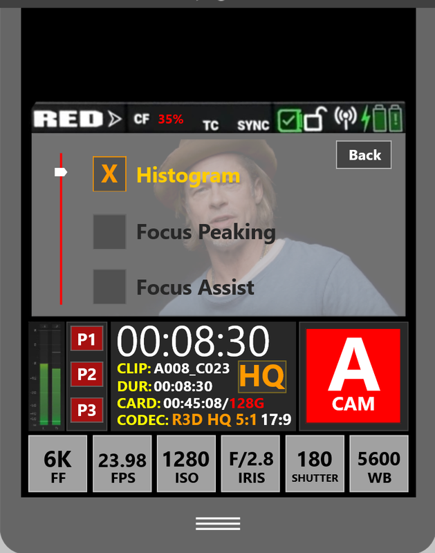
If the Preset buttons don't work out, maybe set things up so that if you place a finger on a certain part of the screen or the entire screen itself for longer than 3 or 4 seconds, a transparency screen would show up with different features you could enable or disable. And the lettering would change as appropriate for different lighting situations. If the Presets 3 or 2 works out, maybe pressing the Preset button for 2 or 3 seconds would also bring up the transparency screen to choose the setting you wanted assigned to the button.

Screenshot-1375.png


Screenshot-1376.png
 
Last edited:
Hi redusers,

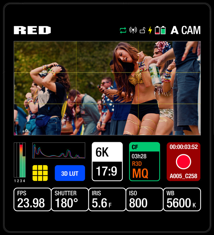
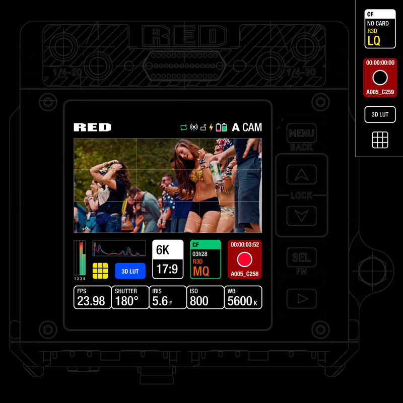
I submit below my vision of our possible future UI.

I am aware that everything is not possible but I loved the previous idea of having lut and grid so I kept this.

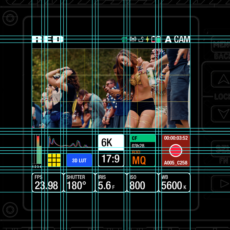
I'm really attached to extra clean design who respect branding. So I tried to keep the original RED color as much as we can. Respect the typeface used on Red web and try to match the feeling the Red Branding reflect.
I also tried to keep all the Design extremely organize and ergonomic for a nice user experience. Build a design who interact easily with what user do. If you connect a card for example the card button / quality selection become green ... Simple stuff, but just to keep logic everywhere.
Tap to zoom feature and simple focus peaking can also appear automatically when you rotate the zoom ring on a lens but this is not needed to present here. I'm happy to hear your feedback. If you like it I will build more pages and transition in between pages.

Speak soon guys.

KOMODO-UI-IDEAS-JCW-2.jpg


KOMODO-UI-IDEAS-JCW.jpg


Capture-d-cran-2020-04-21-15-59-22.png
 
Very nice Jean-Charles. I like the cleanliness and bold colours (but perhaps they could be greyed out when rolling). For me personally, I'd prefer the histogram larger and I don't mind luts and grid lines being hidden away in the RED menu. Does the res and aspect ratio need to be that large? Usually that's something that gets changed only occasionally.
 
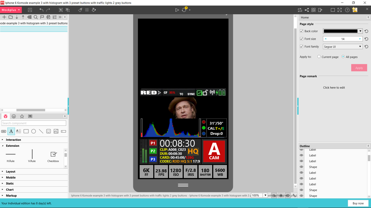
With slight changes and info included with Histogram/Goal Posts/Traffic lights/Temp/Cal.


Screenshot-1378.png


Screenshot-1379.png
 
Last edited:
Tightened up horizontally, slightly bigger preset buttons, Histogram toggled off with one of the Preset buttons and more accurately approximating the actual viewable image.


EDIT:

The screen size is actually "taller" than I depicted earlier. Had to find an actual 1.9:1(17:9) aspect image to be truthful.

Screenshot-1407.png


Screenshot-1406.png
 
Last edited:
Very nice Jean-Charles. I like the cleanliness and bold colours (but perhaps they could be greyed out when rolling). For me personally, I'd prefer the histogram larger and I don't mind luts and grid lines being hidden away in the RED menu. Does the res and aspect ratio need to be that large? Usually that's something that gets changed only occasionally.

Thanks Robert, why not greyed everything when it start rolling or even 30 % opacity to keep attracted to the framing. Histogram larger I also agree. Res / Aspect Ratio can definitely be smaller we can imagine a version that the histogram go one block more on the right and all the res menu lower totally. I have a lot of work during these weeks. But I will maybe check with my team and the designer who work with me to produce something more interesting in term of motion and pages system.

EDIT : Finaly its good if the 6K / RES button is still big cause maybe we don't need to clic on everything to open another pages. Why we don't have a UI who is like the apple Touch Bar. You know when you have the sound or brightness you can just slide fast your finger multiple time on it to go up or down. Same can happen here.
 
Last edited:
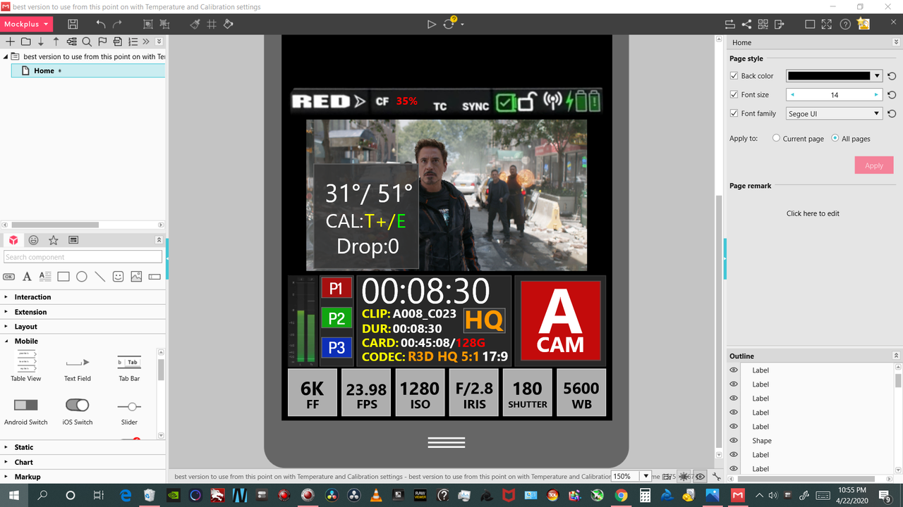
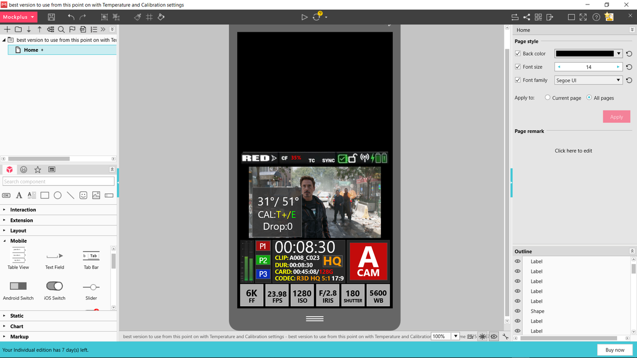
Temperature and Calibration info screen toggled on by one of the three preset buttons


Screenshot-1508.png


Screenshot-1507.png


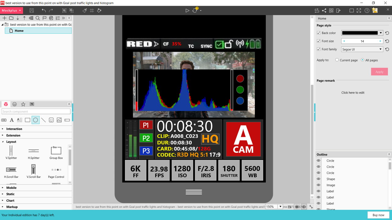
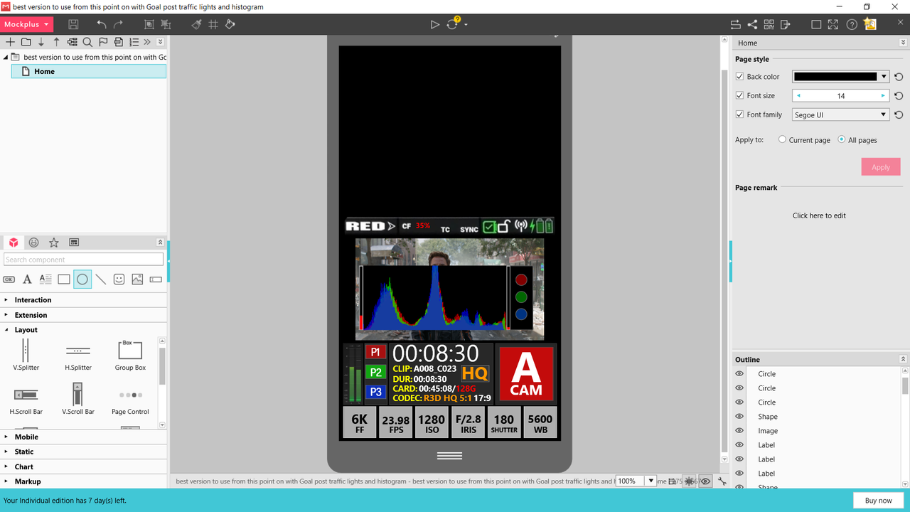
Histogram/ Goal Posts / traffic lights toggled on by one of the three preset buttons


Screenshot-1503.png


Screenshot-1502.png
 

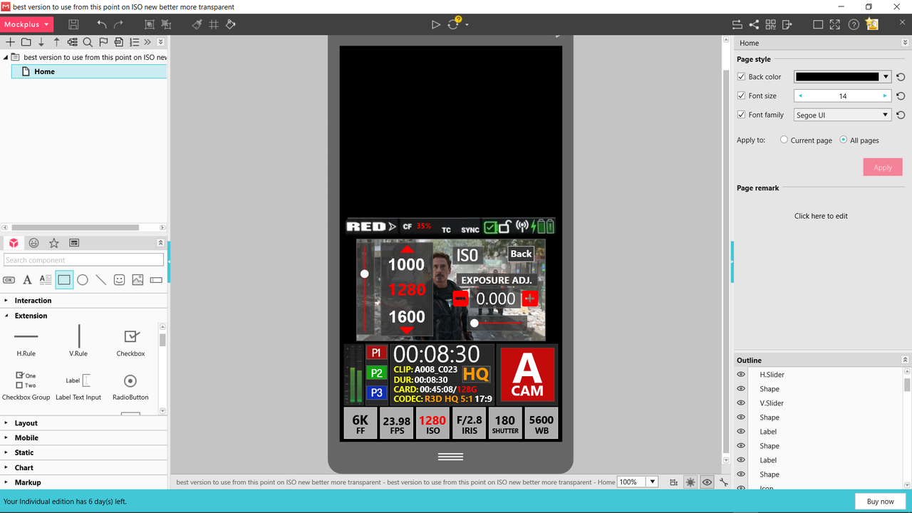
I'm not sure about this one Rand. Would prefer to see the image when adjusting exposure. And the histogram if possible. Also, how do I tab between the iso and exposure adjust when operating using the physical buttons? Quite a few of the interfaces posted have multiple options in the overlays that appear when adjusting a setting. This works well for the touch interface but it's not clear to me how this will function when using the buttons. Perhaps a different, simplified overlay when it is activated using the buttons? Or maybe that would be more confusing. Or press for common settings, press-and-hold to fine tune?
 
Robert,


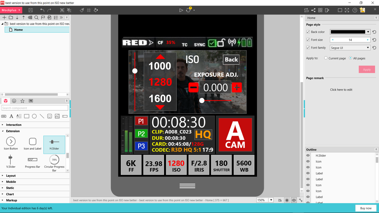
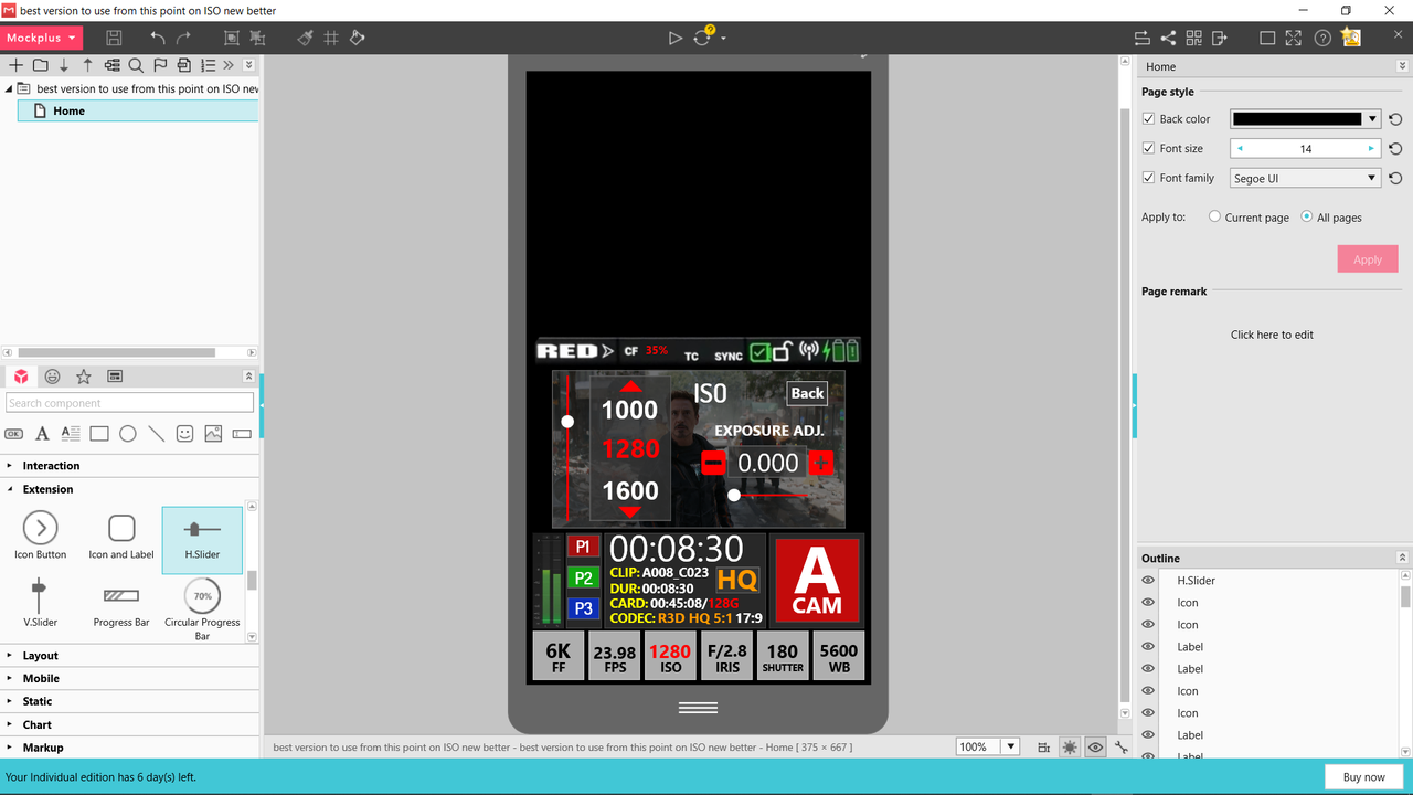
Yeah, Me also. It's just that the room you have for controls below the primary Display are so confined I moved them up to the display. Robert you just gave me another great Idea! Let me rework the ISO menu. Thanks!
 
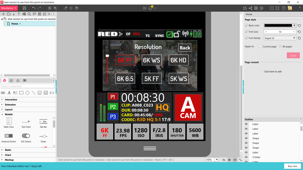
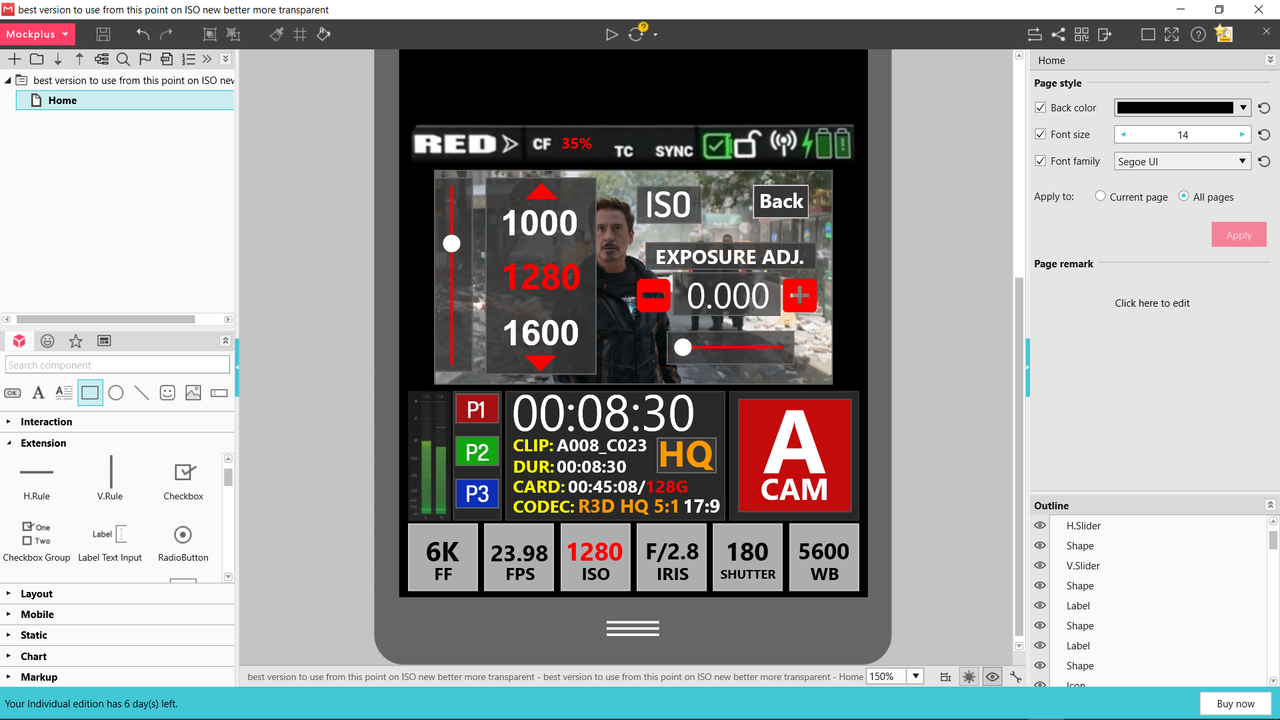
All the controls that require the image to be properly seen for accurate adjustments will look like this. No need to toggle between the two, they both will be active. Choose the ISO you want and it turns "Red", then make the Exp. ADJ. then press the "back" button.


EDIT:

Also you will be to adjust the transparency of the menus from 100% solid to 100% transparency in the main menu under the "RED" emblem.

Screenshot-1552.png


Screenshot-1551.png
 
Last edited:
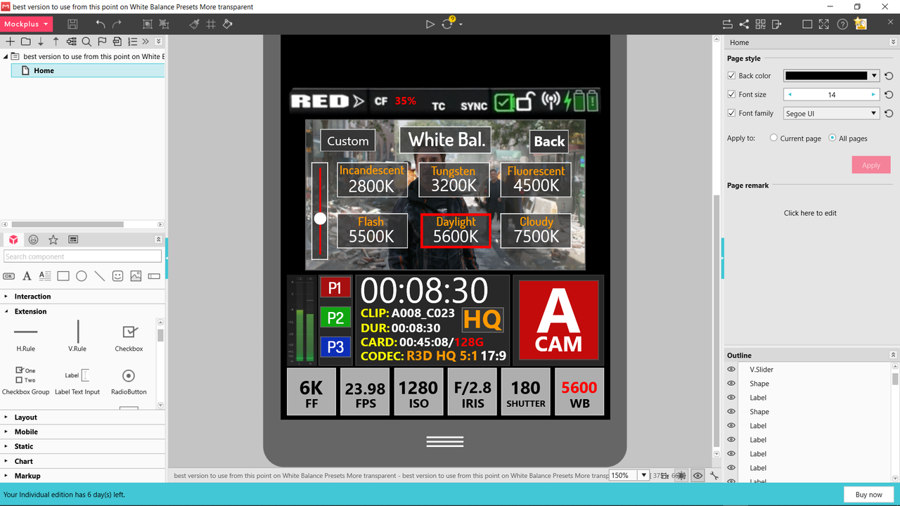
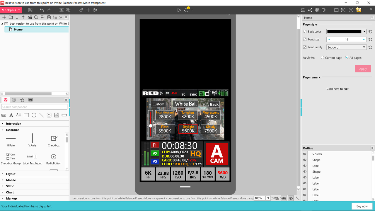
White Balance Part-1 The Presets


Didn't have enough room to put "SHADE", which is "9000K, on the this menu. Let's pretend it's at the very end of the slider.


Screenshot-1570.png


Screenshot-1569.png
 
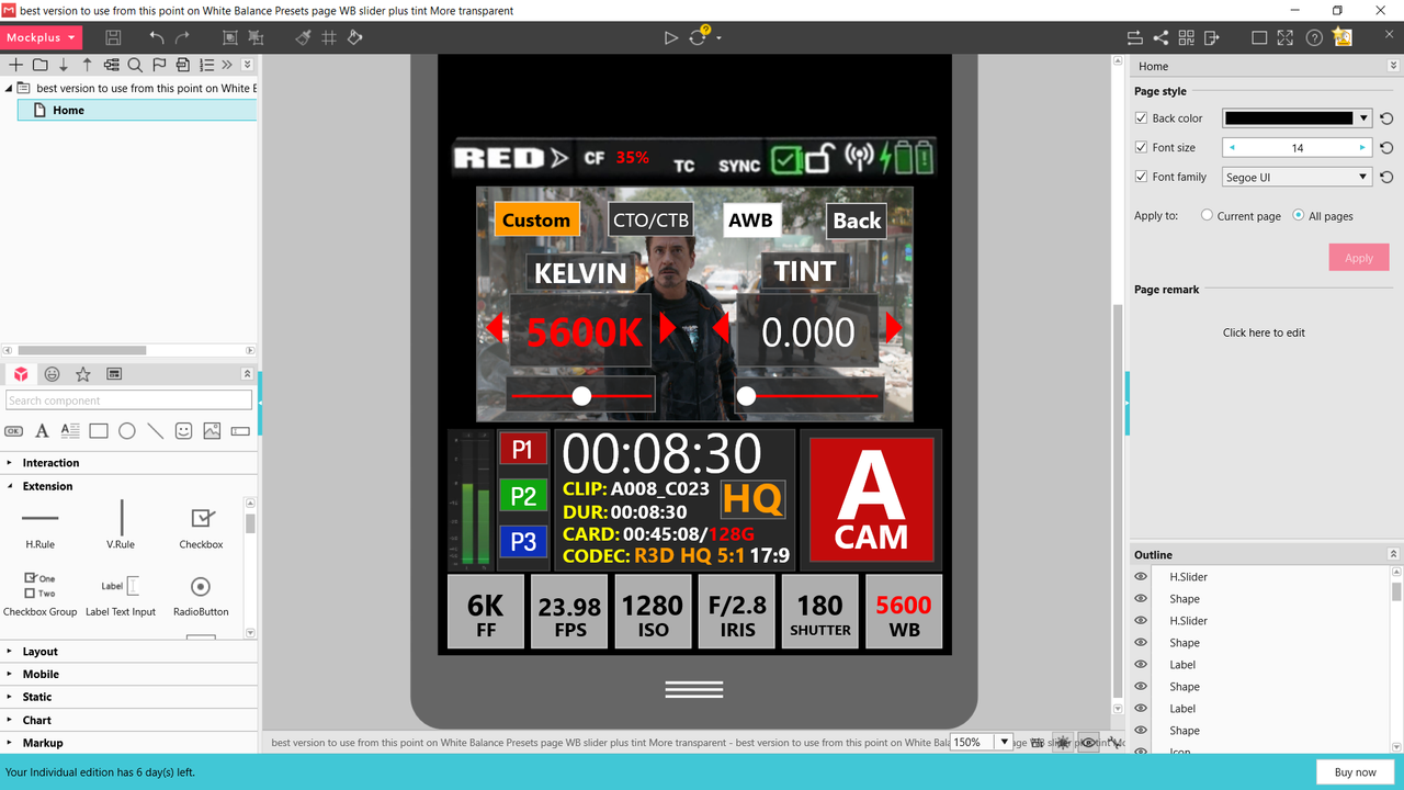
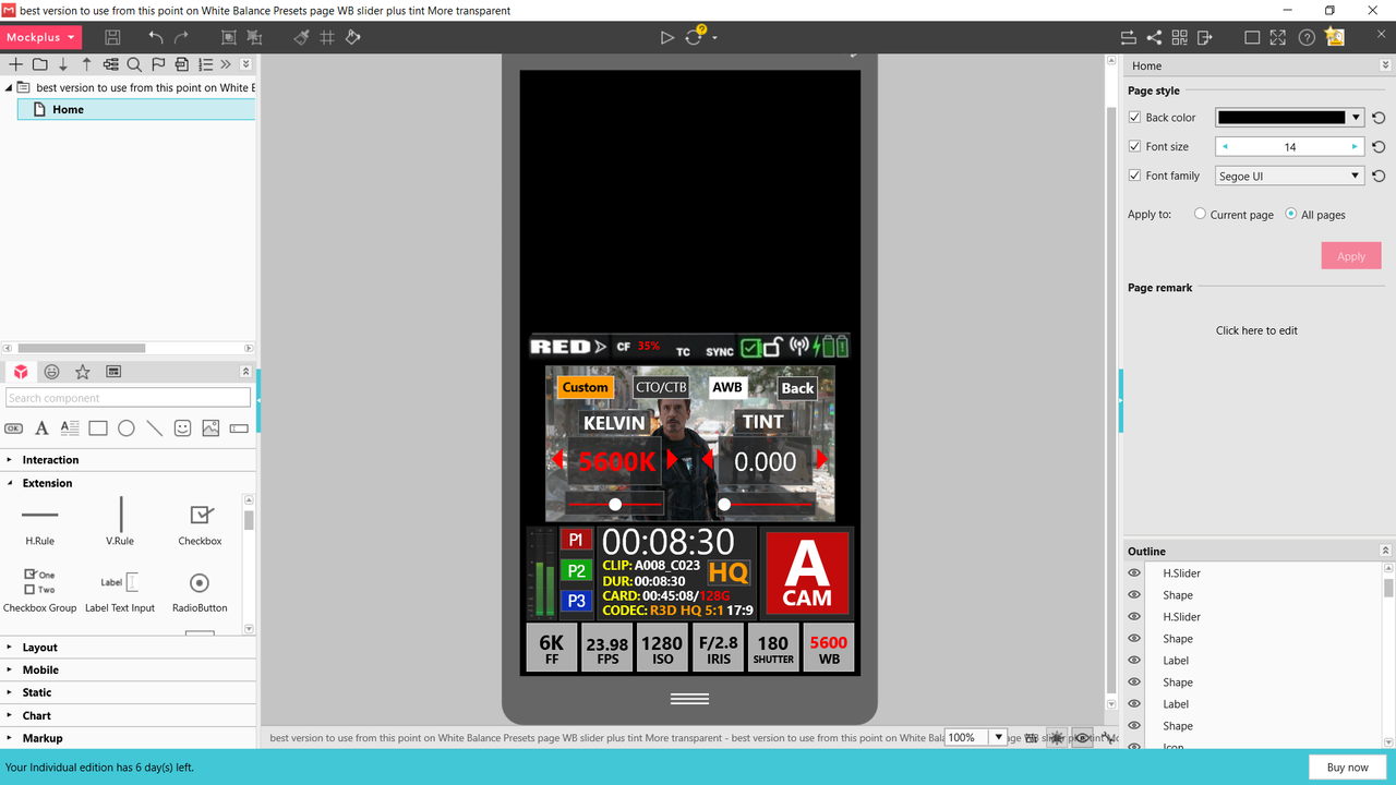
White Balance Part-2 Custom WB (Kelvin and Tint)


I forgot to adjust the Slider in the "Tint" which would be located in the center for "0" or Neutral.

Screenshot-1576.png


Screenshot-1575.png
 
Last edited:
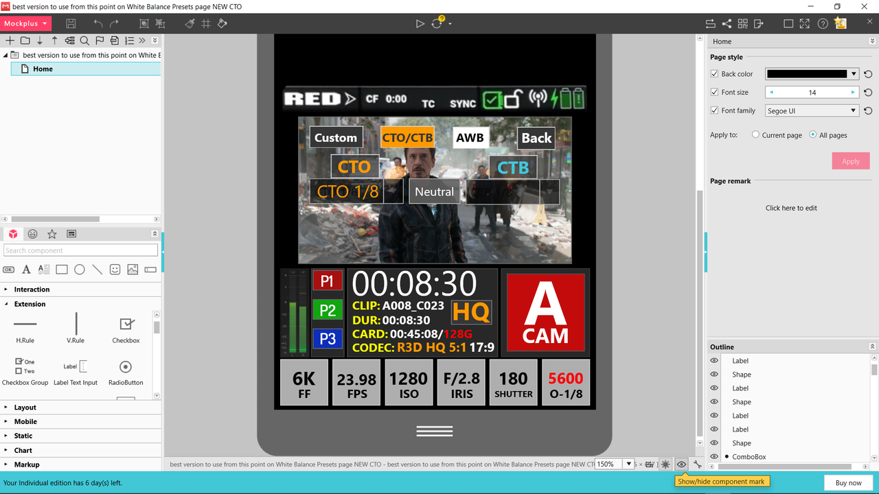
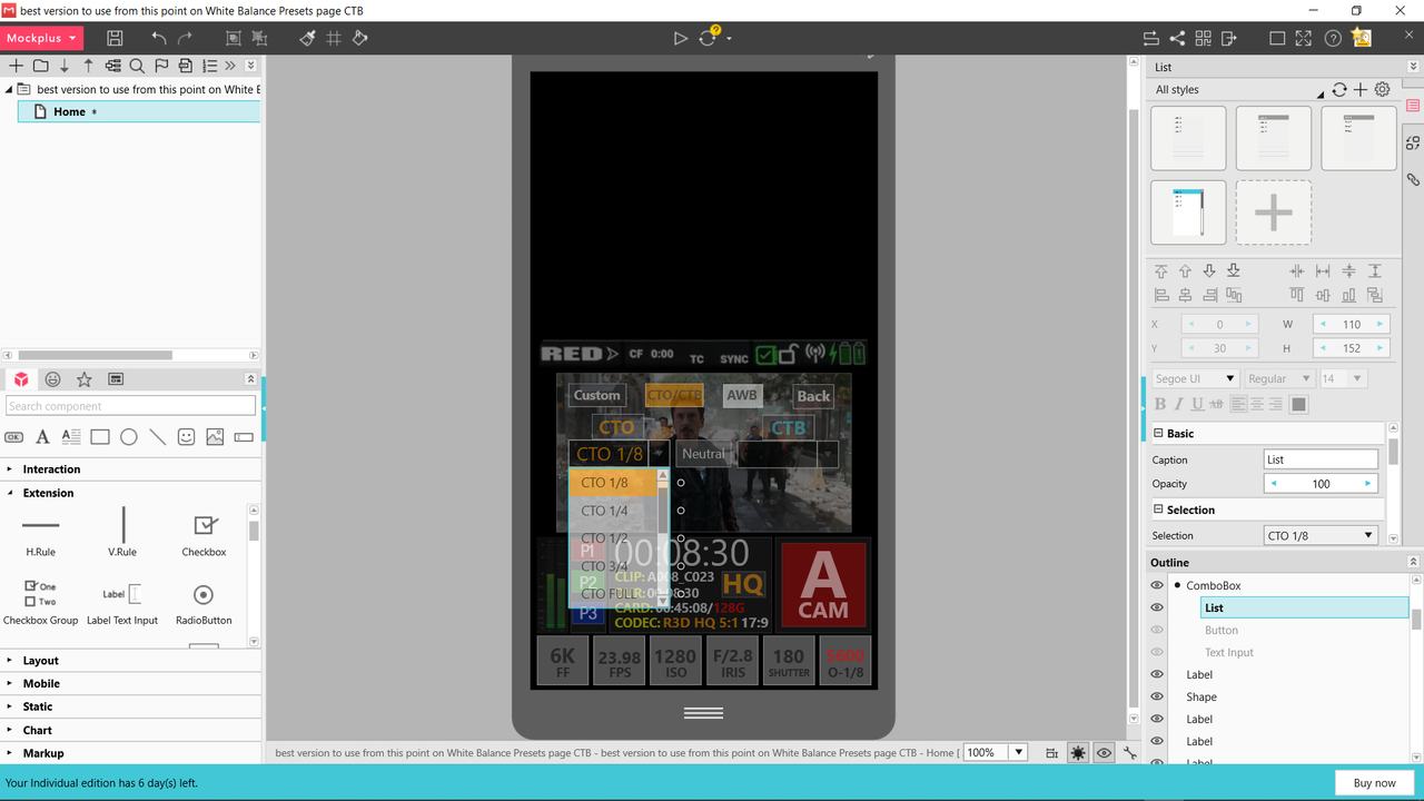
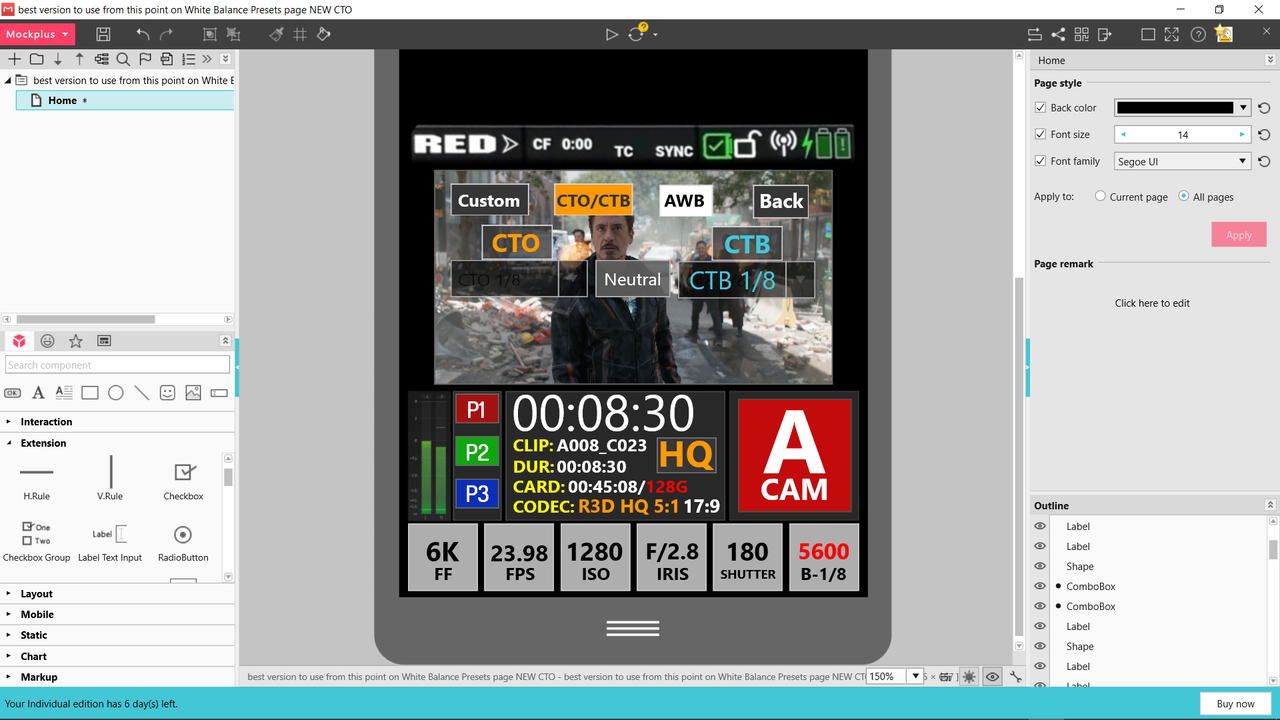
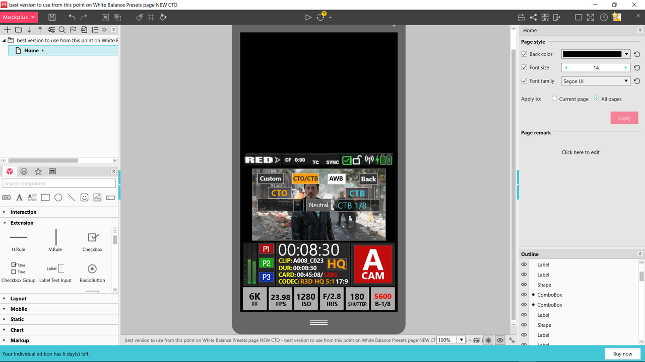
White Balance Part-3A (CTO)


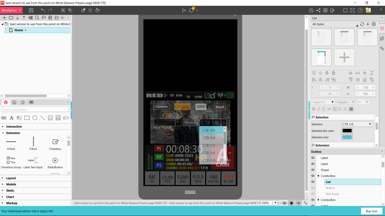
And before anyone says anything, I know they are used to correct lighting sources. The 80, 81, 82 A,B,C are mostly used in photography to Color Balance images. But since this is a camera meant for digital Cinema, I thought the CTO and CTB gel filters would feel more familiar. They can be used creatively or to actually color balance.

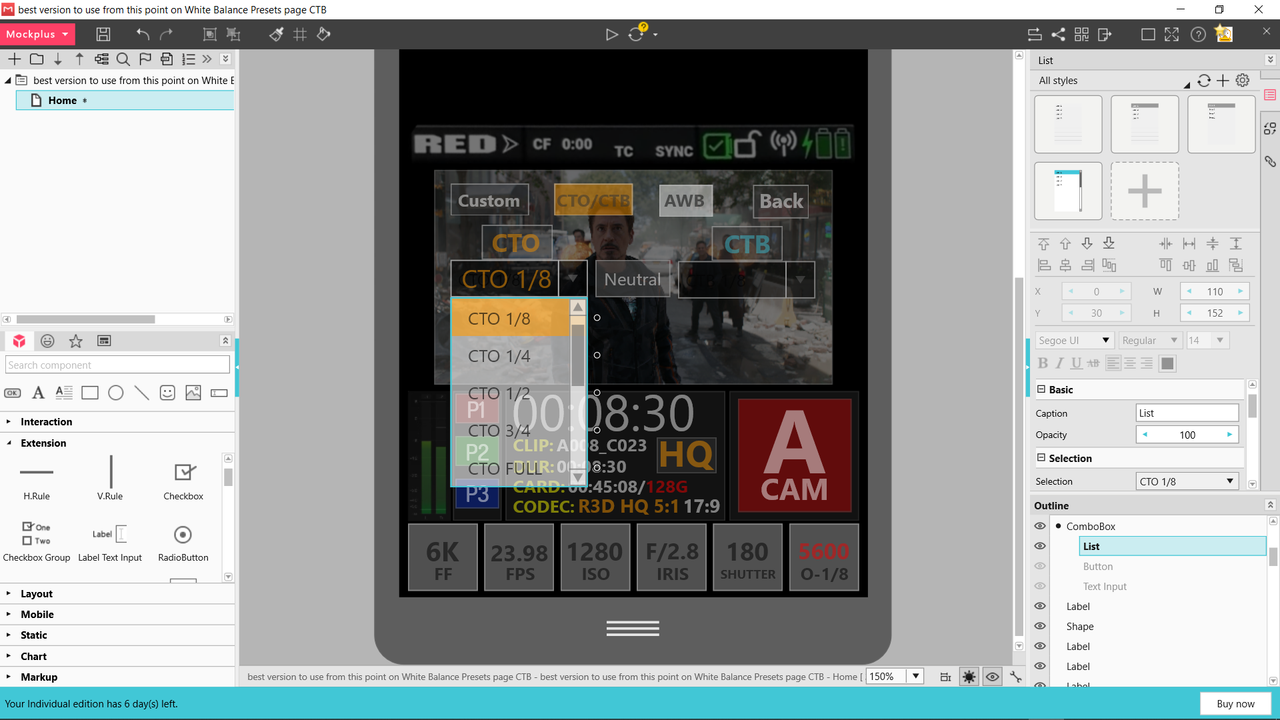
The sub-menus in this and the CTB example would be contained within the confines of the Display and wouldn't cause a transparency to the whole screen. The "Drop down" menu element was the only element within the program I could find to convey the way the CTO/CTB menu would function.


Instead of "TINT" with "Green" and "Magenta" to help correct for "Kelvin" , I thought it would be fun to use "Orange" and "Blue" to help correct for "Kelvin". The "White Balance" Button would indicate the CTO or CTB strength selection you chose along with the intial "Kelvin" setting.


Screenshot-1579.png


Screenshot-1560.png


Screenshot-1563.png


Screenshot-1562.png
 
Last edited:
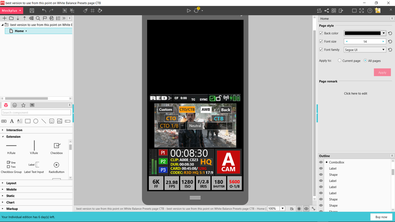
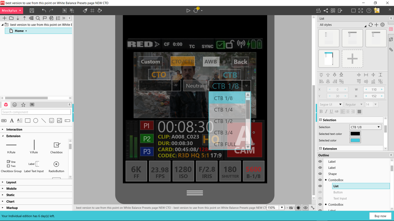
White Balance Part-3B (CTB)


Same info applies from the CTO post.


Screenshot-1565.png


Screenshot-1564.png


Screenshot-1567.png


Screenshot-1566.png
 
White Balance Part-4 Auto White Balance


BTW,

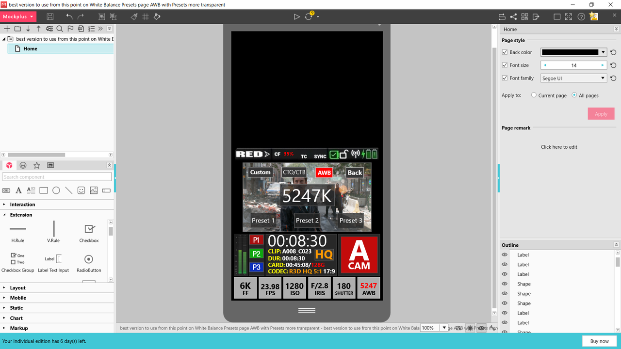
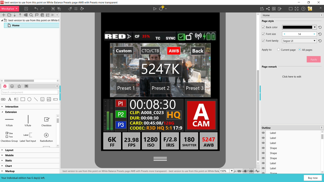
Each Color balancing correction type would negate the settings from the previous method going from left to right. Only the initial "Preset" WB chosen from the "Preset" page would be carried forth. But that will change in after "Auto white balancing" in the last mode. you press the "AUTO WB" button for 3 seconds until it turns Red then you save that as one of the "Preset" buttons by holding it down for longer that 2 seconds.


Screenshot-1573.png


Screenshot-1574.png
 
White Balance Part-3A (CTO)


And before anyone says anything, I know they are used to correct lighting sources. The 80, 81, 82 A,B,C are mostly used in photography to Color Balance images. But since this is a camera meant for digital Cinema, I thought the CTO and CTO filters would feel more familiar. They can be used creatively or to actually color balance.

The sub-menus in this and the CTB example would be contained within the confines of the Display and wouldn't cause a transparency to the whole screen. The "Drop down" menu element was the only element within the program I could find to convey the way the CTO/CTB menu would function.


Instead of "TINT" with "Green" and "Magenta" to help correct for "Kelvin" , I thought it would be fun to use "Orange" and "Blue" to help correct for "Kelvin". The "White Balance" Button would indicate the CTO or CTB strength selection you chose along with the intial "Kelvin" setting

This is way too complicated for me. All I want is to adjust kelvin, and maybe some presets like "sunny", "shade" etc. And I want the preview to be visible as I make changes. And how do you navigate this with the physical buttons? Say you use the MENU button to select WB, then you click SELECT to open the overlay. You make adjustments with UP and DOWN, then you click MENU to hide the overlay. All good and well. Now you want to set AWB. So you click MENU till iso is highlighted, then click SELECT. Then SELECT again to cycle thought the buttons. Once you have AWB highlighted, what do you use to press it?
 
Back
Top