Welcome to our community

Be a part of something great, join today!

  • Hey all, just changed over the backend after 15 years I figured time to give it a bit of an update, its probably gonna be a bit weird for most of you and i am sure there is a few bugs to work out but it should kinda work the same as before... hopefully :)

Matrix Resurrections

You and me both. The same thing happens in commercial photography. The looks that once cost you thousands of dollars (yes, NPC photographers actually pay good money for presets) look terrible and dated. They don't last long, and for good reason. They even apply those stupid looks to inanimate objects like watches and cars. It's all masturbation.

I will always love the color of films like Rear Window or Wizard of Oz or North by Northwest, etc.

The irony of it all is that filmmaker veterans spent hundred years of trying to increase clarity and remove as much as possible of things like grain/noise, unnatural color tints, even short DOF, but when we entered digital cinema, everyone keeps either bitching about needing the "film look", using anamorphic lenses to get the "authentic cinema look", apply a lot of digital grain, overly color grade images to look like worn down polaroids etc.

I'm no different, I usually like to experiment with balancing grain, film curves etc. except I think it needs to be done in moderation. It should be used to mitigate some of the digital artifacts introduced by digital cinema, not being a damn film emulation process.

This is all part of a philosophical concept known as "Hauntology". Mostly in the Mark Fisher interpretations. We strive to relive the past instead of building the future. While previous generations of filmmakers tried improving the clarity of film, we stopped and started moving backward, reliving artifacts of the old and even degrading it to look like an actual artifact, like we found old footage today. Most notably when people use looks that aren't what old photographs looked like, but instead what they look like after 40-50 years of degradation. Like finding your parent's old photographs, not like they were when they were new.

Here's a deep dive into Hauntology, which I think is interesting for filmmakers to be aware of. Instead of just following other "look trends" blindly.
 
It's the Matrix after the last reboot. It has to be saturated and vivid, it's narratively driven by the last scenes of The Matrix Revolutions.

From a neutral point of view, half the shots are indeed better looking with more green, less saturation on your adusted grading, but... we can't say the original is ugly.
It's a commercial look, from a world build to be perfect. I'm sure we'll see a transition to a more grounded look during the movie, just like inside The matrix, and out of the Matrix, in the first installment whether it's the grading palette or the production design.

Already answered this point earlier. Yes, it could be the world after the third movie ended, but that doesn't excuse it looking bad. There are many examples of vivid colors in films that don't look like people have pink skin and go in and out of being extremely uneven looking. This could be because the first movies were made with just the lab process in mind and not the allure of digital color grading. It's easy to overdo if you can, but master filmmakers live on restraint and keeping things balanced.

It doesn't have to be tinted green. In this image I reduced the green tint, but balanced it from the pinkish skin tones. You can still have a balanced color palette through the art direction, it doesn't have to be done in the grade and it risks introducing a lot of digital artifacts with colors.

Matrix-Corrected1.jpg


And no, I don't think it will change over the course of the movie. We see both the real world and knowing trailer editing, there are lots of shots probably from much later on in it. I feel people are making somewhat of excuses to justify the color grade. In a world where Mission Impossible trailers get released without the sound mix and films like Annihilation gets improper HDR levels on the Netflix release, being a big movie does not mean things get done correctly. The grade for this movie is not good and I hope they realize this or we will end up with a look that people will be a bit disappointed by. It's gonna be interesting seeing people discuss the movie when it's released. I don't think the color grading look will be much appreciated. Some people will probably say it looks bad, without knowing why they feel like that (we've already seen those kinds of comments) and I think it's frustrating that improper color grading balancing alone creates this response.
 
After watching the trailer itself I couldn't help but feel like something was visually off.

After this thread I don't feel crazy.

I miss the green shift of the originals but will be excited to see if it's a choice relevant to the story.
 
The green shift was addressed with the remastered 4k release. I've viewed the 4k bluray on a 65" OLED in Dolby Vision and the presentation is natural and well balanced IMO. Skin tones are nuetral and life like and as we all know it was shot on film. Agree with Christoffer here and it brings to mind the difference between the Lord of the Rings (film) and the Hobbit (epic mx). Rings is well balanced and natural and Hobbit is over saturated and garish. There just seems to be a tendency with digital capture and post to overdue it when it's not necessary.
 
It looks awesome.

Better than the desaturates green shit..

The desaturated green shit doesn't have to be green, it can be normal balanced skin tone shit as well. As long as it's not pushing those unnatural digital color shit that pressing max on saturation levels does to a digital image as well as making sure the shit is balanced between scenes and shots. But it's subjective shit as well, if people like pink shit, then pink shit faces is good shit I guess. :tongue_smilie:
 
The green shift was addressed with the remastered 4k release. I've viewed the 4k bluray on a 65" OLED in Dolby Vision and the presentation is natural and well balanced IMO. Skin tones are nuetral and life like and as we all know it was shot on film. Agree with Christoffer here and it brings to mind the difference between the Lord of the Rings (film) and the Hobbit (epic mx). Rings is well balanced and natural and Hobbit is over saturated and garish. There just seems to be a tendency with digital capture and post to overdue it when it's not necessary.

There's also the issue with colors going neon. There's a really nice neon suppression when grading in Resolve that push back on the overly extreme ends on certain colors. I mean, even though I mentioned the "Hauntological" aspect of emulating film, some film curves are actually making images more pleasant to the eye. There have been over a hundred years of science going into creating film stocks for them to look good so just disregarding that because we're not working with film is just pissing on the legacy of all the work put into researching film stocks. Understanding the color balance in these stocks is crucial for getting to a pleasant end result. I think this is one of the reasons why HFR didn't catch on as well as Hollywood had hoped, they thought it would work to just improve on all aspects, but cinema has come to be a certain aesthetic that the general audience expects. So it can be pushed but pushed too far and people think something's wrong. I've read enough comments and opinions on this trailer to be certain that the grade is a real issue here. People think the cinematography is bad but can't put their finger on what it is that makes it bad, but for industry folks I think it's quite obvious. The extreme push on saturation levels without regard for balancing is a trend going on with a lot of YouTubers. I don't think professionals should cater to that level of quality.
 
Yes, graded some s-16mm film scans, color and b&w recently and it was a pleasure. That said, the.point is digital is not the problem - it's the trend to this approach and application and the acceptance of it, even in high end productions like the Matrix as Chrisroffer has pointed out thats the problem.
 
My guess... They did the trailer grade in HDR and then bumped it down to 709. I seen that process gone wack I dont know how many times lately. Its like if you got to much colors to play with, then after a while in the grading room all including the colorist tend to go somewhat colorblind.
 
My guess... They did the trailer grade in HDR and then bumped it down to 709. I seen that process gone wack I dont know how many times lately. Its like if you got to much colors to play with, then after a while in the grading room all including the colorist tend to go somewhat colorblind.

I don't think so. Since it looks so close to how Sense 8 is graded, I think this is it. As long as they don't like, read this forum thread, this is the grade we're gonna see. I've seen so many big productions fail miserably the last couple of years with some basic stuff so I wouldn't be surprised if the grade we see in the trailer is the grade we get. The frustrating bit is that all of this is fixable, just do another grade pass, bring in some other pair of eyes, and so on. Retouching grade before theatrical release should be the easiest fix among all possible problems that could occur during production. As long as the narrative/writing isn't Jupiter Ascending level etc. we're just talking minor touch-ups here, to fix a thing that could, unnecessarily, pull the rug out from under a good foundation.

Maybe it's just me being worried for a franchise continuation that I actually care a lot about. Don't make it ok, make it superb.
 
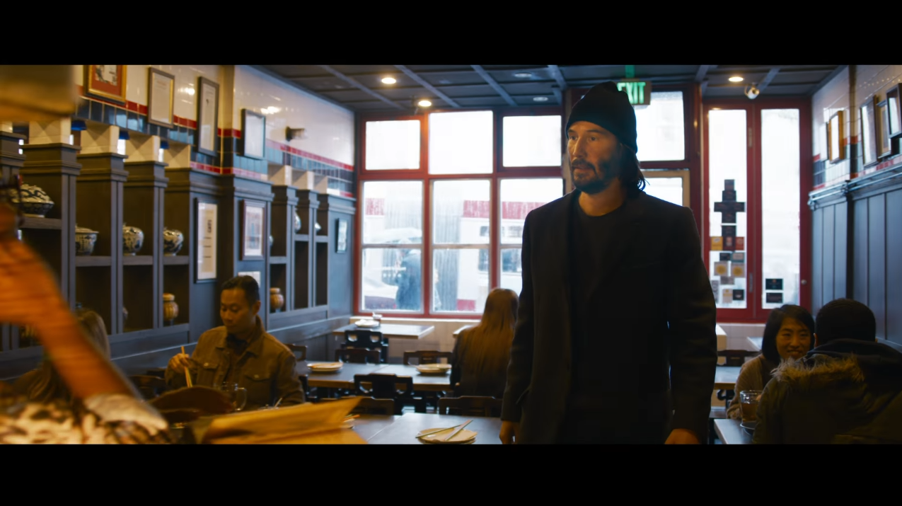
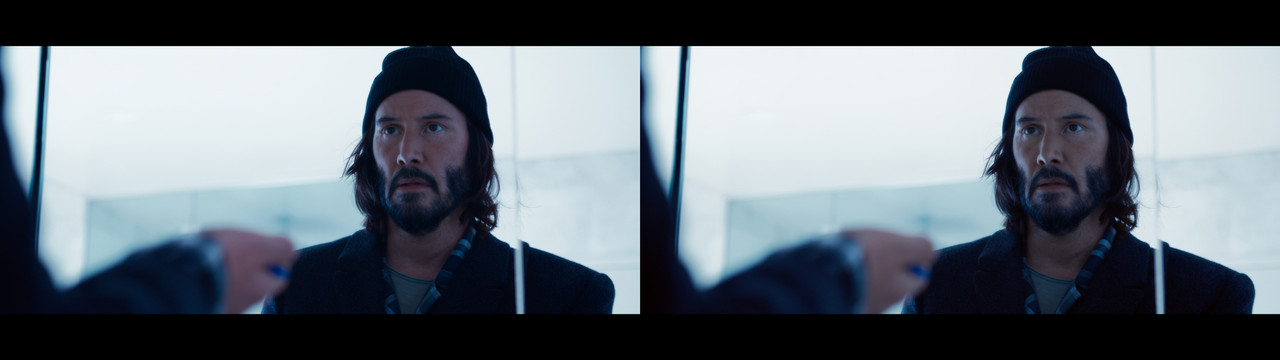
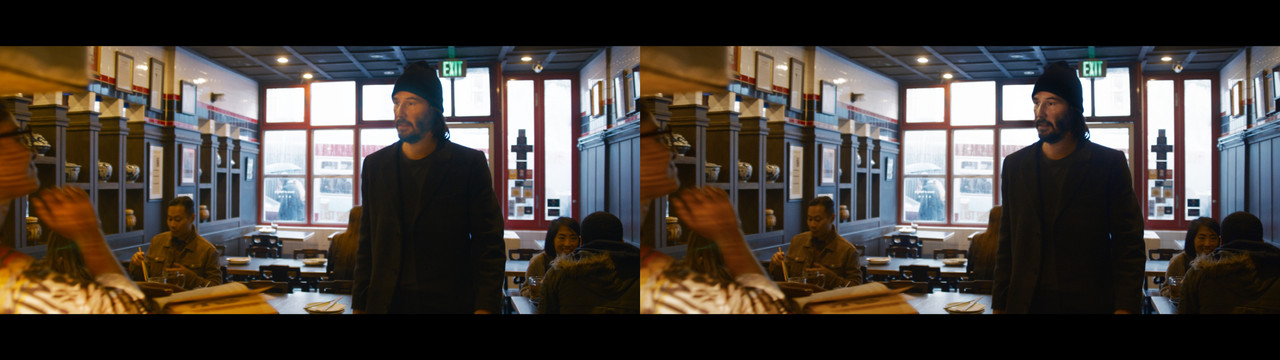
Ignoring how bad the grade is overall, did anyone else notice the very obvious power window here on Keanu's face?

Matrix-Power-Window.png


It jumped out to me immediately, and I was watching it on my phone...
 
Do you mean that his skin tones in the left image look natural?

I mean, yes, you can say that you don't prefer the more green-tinted version, but the adjusted version is just an overall change on top of the entire trailer. To make a point. If I were to actually adjust the balance correctly, I'd isolate colors and adjust because in some shots the skin tones look like pink trash. That's a color grading sin.
yeah its all down to personal preference. i like the original grade because it gives it a perfect clinical look. juding by what the trailer showed and the matrix films before the machines think their creation of the matrix is perfect so i think the original grade suits this better :)
 
Ignoring how bad the grade is overall, did anyone else notice the very obvious power window here on Keanu's face?

It jumped out to me immediately, and I was watching it on my phone...

With the rest of the grade issues, it's not surprising.


yeah its all down to personal preference. i like the original grade because it gives it a perfect clinical look. juding by what the trailer showed and the matrix films before the machines think their creation of the matrix is perfect so i think the original grade suits this better :)

I don't see what you mean about it being "perfect". If we back up a minute and think about this. Grading needs to support the story, so, if the story is that this is a "perfect" world, then we either have an option to go with vivid colors and an almost unnatural clean look to the world around Neo. Or we think about it as being perfect as being very balanced and clean, i.e no contaminated colors or strange looks, just clean natural, balanced light and colors. In both of these scenarios the grade fails. In the vivid colors scenario, there are colors vivid within the environment, the art direction, but most of the colors come from over-saturated base colors, i.e colors that to our eyes should look natural but don't. Going vivid colors means it should be there around the people while the people look natural, there are plenty of examples of this in other movies, keeping natural and well-balanced colors between scenes. In the second scenario we look for a clean and balanced look that does not push things in either direction but instead tries to keep things as perfectly balanced to how our world actually looks.

It does neither of these two scenarios and fails in the attempt according to the scenario you point out. I can't see anything perfect about the look, it sometimes look sick, skin tones that come off as unnatural, environments that lack logic in light colors and so on. I also don't see what you mean by "clinical". Clinical looks usually just means that the colors, sharpness and fidelity are so clean from chemical film artifacts that it feels void of artistic interpretation, that it just shows things as they are, without the influence of any kind. Pink skin and overly saturated green contaminated yellow bleed does not look "clinical" at all, it looks like bad grade decisions.

Of course, it's subjective, but if a director came into my office and wanted either vivid colors that look unnatural as an environmental feature or wanted a clinical look, this trailer does not in any way represent what I would try and accomplish towards that director's request. I would either increase the vividness of the colors in the environment but be very careful about the balance between shots and skin tones in general or for a clinical look, I would create clarity that is almost a 1:1 representation of the real world as we see it with our eyes. I would never sign off on the grade that this trailer has, it doesn't have any purpose outside of looking exactly like a spin-off of Sense 8. Which makes sense since it's the same cinematographer, but the failure seems to be that just continuing doing the same thing as Sense 8 instead of actually putting in the work of managing the cinematography for an entirely different franchise.
 
I'm sure it will probably be explained as the Matrix getting better at simulating the real world to better fool humanity, a more "natural" expectation or "feeling". Whether that translates to the audience or not is the question or if it's just going to simply be a style change or "lack of style" shift with the sequel(s) that ends up bugging only filmmakers and film historians.
 
was this better? Felt like toning down some of the look. Though to be fair, I was just making a slight change, not a huge change. Downloaded the 1080p trailer from Apple. Couldn't go extreme on it. Recommend opening the original trailer on another window for comparing. Also youtube compression is terrible and there seems to be a difference even in aspect ratios from the Apple trailer and Warner Bros Trailer. Wish I could have graded from the raw footage. Also I love John Toll's work, so this was just for fun.

https://www.youtube.com/watch?v=qCi-asjSPKI
 
Last edited:
was this better? Felt like toning down some of the look. Though to be fair, I was just making a slight change, not a huge change. Downloaded the 1080p trailer from Apple. Couldn't go extreme on it. Recommend opening the original trailer on another window for comparing. Also youtube compression is terrible and there seems to be a difference even in aspect ratios from the Apple trailer and Warner Bros Trailer. Wish I could have graded from the raw footage. Also I love John Toll's work, so this was just for fun.

https://www.youtube.com/watch?v=qCi-asjSPKI

Yes, that is much better. I guess you rolled back on the pinkish tones as I see a slight push towards the green, but not as much as I did. I mean, it's possible to go in many directions, and one thing I think is important if we were to actually do a proper regrade would be to keep the bluish tint since blue seems to be a thematic color that is important throughout everything. So the proper way to do a regrade would be to desaturate, neon suppress (in order to lose digital color artifacts), and isolate skin tones to roll back the pink while not adjusting too much of the overall tint levels. And of course, do it per shot and not just on top of everything.

I actually hope that Toll/Lana/colorist sees this or other comments online about the grade. They can do whatever they like, but I hope they sit down and think about another pass on this. Digital cinema looks great today but increasing saturation on digital cameras rarely looks natural or good, especially on Red. If increasing saturation, it needs to be treated before it is applied.

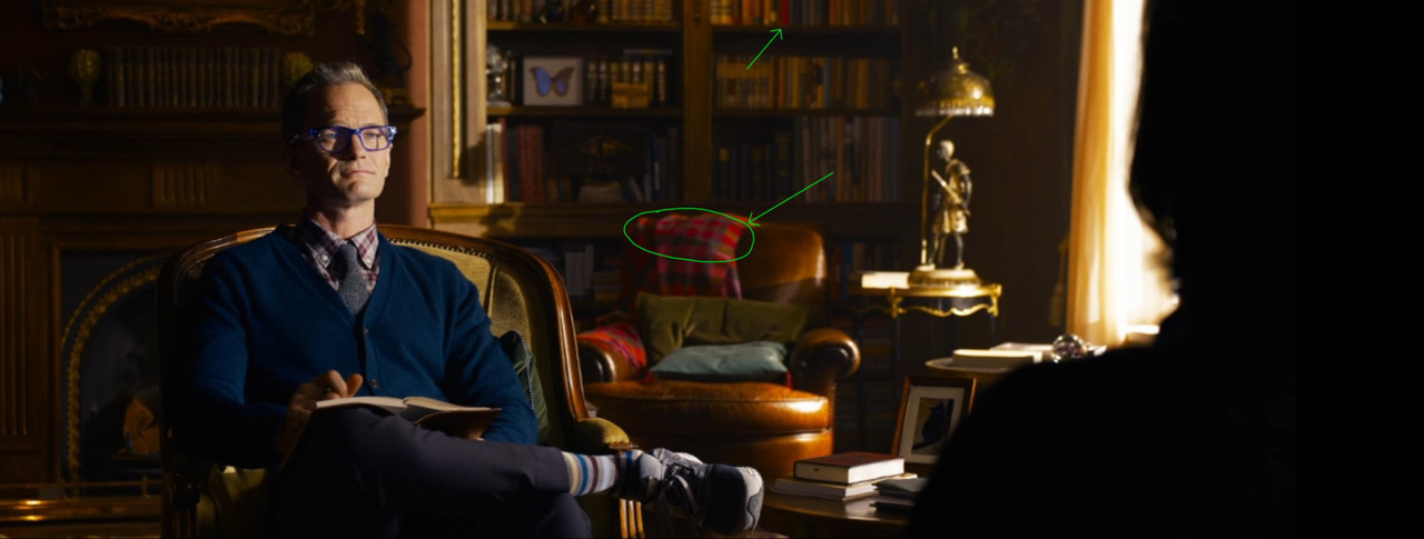
Here's an example of where colors go to shit if not properly cared for. Red cameras sometimes have a problem with things like this and things can get out of gamut wack.

Colorartifacts2.jpg
 
With the rest of the grade issues, it's not surprising.


I don't see what you mean about it being "perfect". If we back up a minute and think about this. Grading needs to support the story, so, if the story is that this is a "perfect" world, then we either have an option to go with vivid colors and an almost unnatural clean look to the world around Neo. Or we think about it as being perfect as being very balanced and clean, i.e no contaminated colors or strange looks, just clean natural, balanced light and colors. In both of these scenarios the grade fails. In the vivid colors scenario, there are colors vivid within the environment, the art direction, but most of the colors come from over-saturated base colors, i.e colors that to our eyes should look natural but don't. Going vivid colors means it should be there around the people while the people look natural, there are plenty of examples of this in other movies, keeping natural and well-balanced colors between scenes. In the second scenario we look for a clean and balanced look that does not push things in either direction but instead tries to keep things as perfectly balanced to how our world actually looks.

It does neither of these two scenarios and fails in the attempt according to the scenario you point out. I can't see anything perfect about the look, it sometimes look sick, skin tones that come off as unnatural, environments that lack logic in light colors and so on. I also don't see what you mean by "clinical". Clinical looks usually just means that the colors, sharpness and fidelity are so clean from chemical film artifacts that it feels void of artistic interpretation, that it just shows things as they are, without the influence of any kind. Pink skin and overly saturated green contaminated yellow bleed does not look "clinical" at all, it looks like bad grade decisions.

Of course, it's subjective, but if a director came into my office and wanted either vivid colors that look unnatural as an environmental feature or wanted a clinical look, this trailer does not in any way represent what I would try and accomplish towards that director's request. I would either increase the vividness of the colors in the environment but be very careful about the balance between shots and skin tones in general or for a clinical look, I would create clarity that is almost a 1:1 representation of the real world as we see it with our eyes. I would never sign off on the grade that this trailer has, it doesn't have any purpose outside of looking exactly like a spin-off of Sense 8. Which makes sense since it's the same cinematographer, but the failure seems to be that just continuing doing the same thing as Sense 8 instead of actually putting in the work of managing the cinematography for an entirely different franchise.

yeah personal preference i think im my vision it looks good sorry english is my main language but sometimes i tend to use the wrong words to describe things properly!
 
here is better quality

Thanks for that.

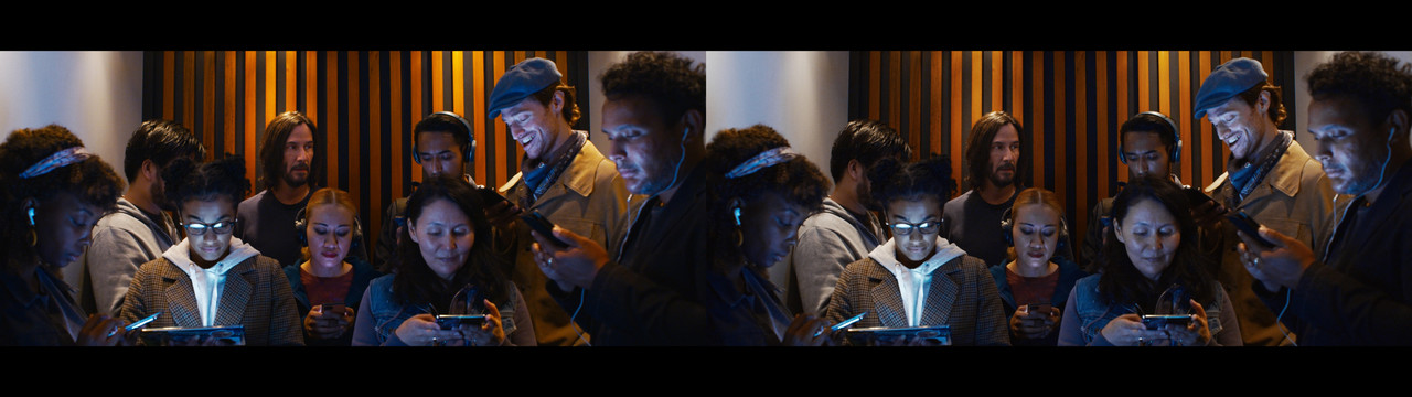
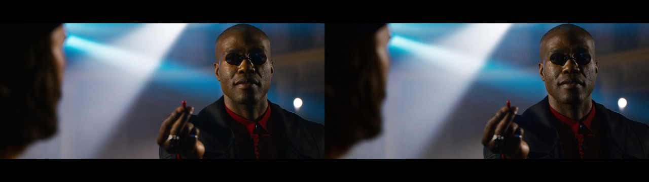
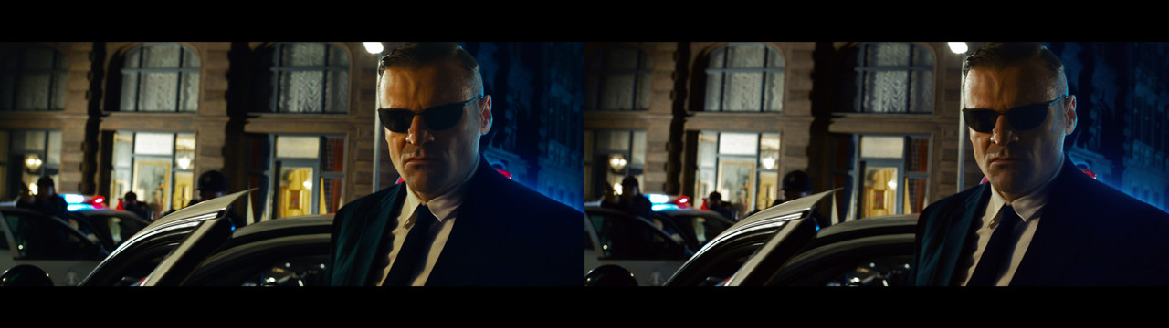
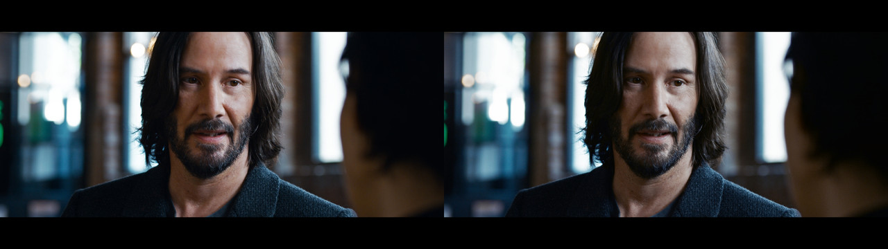
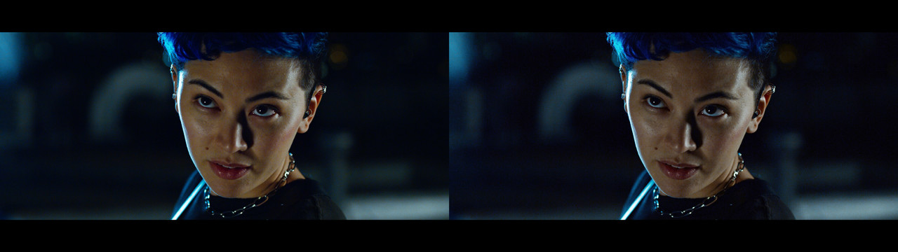
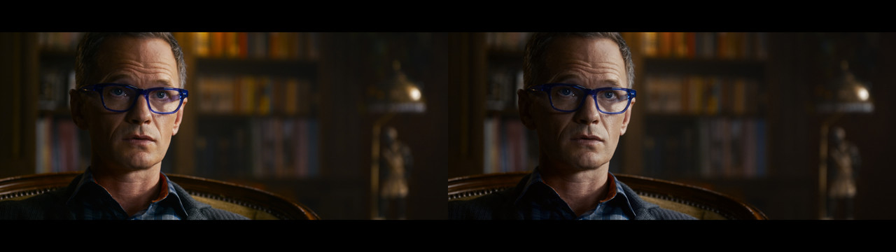
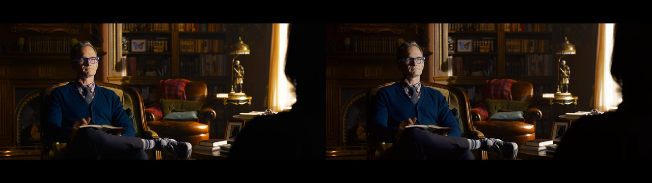
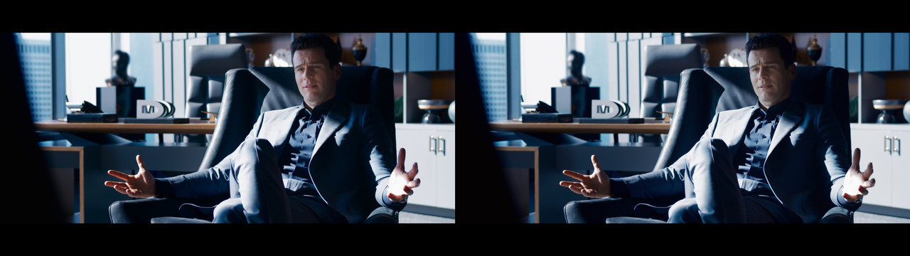
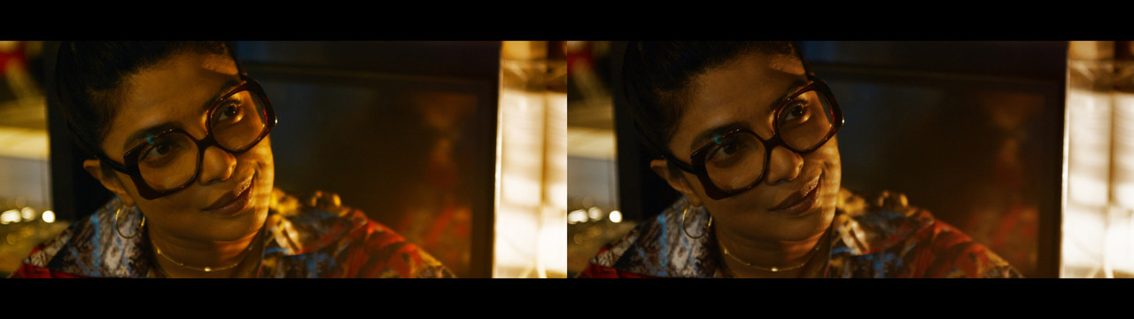
I did another pass with these higher-quality shots and I did these a bit more per shot than slapping it on the entire trailer. This time I kept the blue tone, instead of moving things over to a more green tint. But I suppressed colors bleeding into unnatural territories. Most notably pink and yellow tones don't look contaminated and are more in line with how tungsten renders on film and Alexa (which I believe is one of the reasons some like Arri over Red, the tungsten warm tones never really look good on Red if not treated in the grade). Now the pinkish skin colors are gone, but not as green as before.

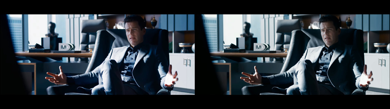
Then there are some color artifacts that are out of gamut errors with some Red transform LUTs, most notable in the scene with Neil Patrick Harris. This cannot be fixed without having access to the original R3D files and doing the LOG to REC709 transfer myself. It was these out of gamut errors that I had big problems with when doing my own Red transform LUT for Rec709.

And of course, the bright blob around Keanu's face in the restaurant is now gone.

So here's the result:

Matrix-Re-Grade-Neutral-1.jpg

Matrix-Re-Grade-Neutral-2.jpg

Matrix-Re-Grade-Neutral-3.jpg

Matrix-Re-Grade-Neutral-4.jpg

Matrix-Re-Grade-Neutral-5.jpg

Matrix-Re-Grade-Neutral-6.jpg

Matrix-Re-Grade-Neutral-7.jpg

Matrix-Re-Grade-Neutral-8.jpg

Matrix-Re-Grade-Neutral-9.jpg

Matrix-Re-Grade-Neutral-10.jpg

Matrix-Re-Grade-Neutral-11.jpg


These are closer to keeping the intended look of the trailer, but fixing a lot of the problems that the extreme saturation does to Red colors, especially pink and yellow.
 
Thanks for updating your version of the grade Christoffer, I got what you were saying/pointing out before, but those latest examples show more clearly the look you were going for compared to the originals.

I could be wrong, but it also makes me more certain the makers of the movie were in fact going for a more colourful and saturated look than the 'normal' one that can be seen in your grade.

Do you think it is possible to make the image more punchy and saturated without going out of gamut or messing up the skin-tones?
 
Back
Top