Welcome to our community

Be a part of something great, join today!

  • Hey all, just changed over the backend after 15 years I figured time to give it a bit of an update, its probably gonna be a bit weird for most of you and i am sure there is a few bugs to work out but it should kinda work the same as before... hopefully :)

Matrix Resurrections

There's also some really weird trailer editing at the beginning of the trailer, right after the side-shot of Neil Patrick. A straight cut to a double exposure that goes into a crossfade. It looks straight up like an editing error. It's really weird.

Going on a limb here, but..... moments before that you see a black cat and there's an audible cue tied to how that is done...... Might be time to rewatch the first film. I agree it's a bit abrupt. But it's also giving one of the larger hints to what I think the film is about.
 
Going on a limb here, but..... moments before that you see a black cat and there's an audible cue tied to how that is done...... Might be time to rewatch the first film. I agree it's a bit abrupt. But it's also giving one of the larger hints to what I think the film is about.

Yep. These trailers go to like edit 70 revised version B or whatever. Totally agree with Phil it's likely not a "mistake"!

You guys know I work in marketing so can't write about current stuff no matter how excited I may be.

In general for trailers, the color goes through the same people who do the feature. I didn't work on this trailer so can't speak to it but that's generally the rule.

I mean, if this was the OG Matrix right now all of you would be bitching about the skintones:) not knowing what is to come.

But that's actually an interesting point!

I know everyone remembers the Matrix as super green but originally it was not as much. I believe it became more so in subsequent remasters :)

Original trailer: https://www.youtube.com/watch?v=vKQi3bBA1y8
If you look beyond the SD quality and a few dodgy VFX shots, the skintones are (most of the time) quite natural and posess a nice filmic rolloff, no?

Sure there are a few odd-looking shots, but considering how primitive the color grading tools were at the time it's impressive. Guess they shot on a good camera :P

Interesting comparison between film scan and remaster:
https://vimeo.com/485733095

Also love the old practice of shooting full aperture and protecting for scope, ha! They were clearly thinking ahead for that Instagram version!

Bruce Allen
www.bruceallen.tv
 
I know everyone remembers the Matrix as super green but originally it was not as much. I believe it became more so in subsequent remasters :)

Original trailer: https://www.youtube.com/watch?v=vKQi3bBA1y8
If you look beyond the SD quality and a few dodgy VFX shots, the skintones are (most of the time) quite natural and posess a nice filmic rolloff, no?

Sure there are a few odd-looking shots, but considering how primitive the color grading tools were at the time it's impressive. Guess they shot on a good camera :P

Interesting comparison between film scan and remaster:
https://vimeo.com/485733095

Also love the old practice of shooting full aperture and protecting for scope, ha! They were clearly thinking ahead for that Instagram version!

I think most of what we see today of the old matrix trilogy is a remaster/regrade of the original. The original mostly used a lab process for getting the green and blue tint. As for the print negative, I would love to see them remaster the movie to IMAX in IMAX format, totally possible with the larger negative.
 
I just don't know... why it looks so bad.

They shot on a Monstro and Komodo... the film just looks really video-y. Those action shots of her jumping over the car just look cheap.

Why is this?

Difficult to judge cinematography from a trailer.

Trailers are typically telling a different story than what the script and film makers design, and the cinematography could be exactly right for the story and exactly wrong for the what the trailer is trying to sell.
 
Difficult to judge cinematography from a trailer.

Trailers are typically telling a different story than what the script and film makers design, and the cinematography could be exactly right for the story and exactly wrong for the what the trailer is trying to sell.

We're speaking of the grading more than the cinematography. The cinematography for this is superb, there's nothing wrong with it in my opinion. It's just a bit ruined by too much saturation and weird-looking colors.
 
A cool little thing is that one scene takes place in a theatre/cinema showing a projection of the movie "The Matrix". So , maybe Lana went all-in with the Jean Baudrillard philosophies in a more contemporary approach in that media/social media creates a simulacrum and that we cannot see the difference between the real world and the media representation of the world. Cinema, TV, YouTube, our online personas etc. all constitutes a fake reality that we cannot separate from the real one.

If this is the case... which I sincerely hope it is... then it might be an impressive philosophical u-turn in the storyline of the Matrix movies. It would be so bonkers that I don't think people are really ready for it. People criticize the second two movies of the original trilogy, but the philosophy of the entire trilogy as a whole is vastly more complex and interesting than just the Hero's Journey cartesian junior level philosophy it presented. The sum of the trilogy has always been misunderstood and plenty of people criticized it without ever even analyzing what they've seen. I really hope this new one goes all in and through the damn wall with its philosophical concepts.
 
We're speaking of the grading more than the cinematography. The cinematography for this is superb, there's nothing wrong with it in my opinion. It's just a bit ruined by too much saturation and weird-looking colors.

Can't really say too much to what the grade will look like in the theater, but I can agree, that I personally prefer your take on the grade watching it on a computer screen. In the side by sides, I'd say you went a bit too far in desaturating everything, rather than being more targeting, but as a concept, I prefer your take, based on the trailer.


Where we might disagree is the idea that the grade is separate from the cinematography. As I don't think of cinematography as only being a camera thing, or even just a camera/lighting thing. It is the overall visual aspects of a film. You can't have superb cinematography and a bad grade and bad set design. That could be superb lighting, maybe, but the whole image is the cinematography, I assume.

Yes, saw it on my calibrated grade screen and... doesn't look good in my opinion. If it looks bad there and on normal screens and on phones I'm not so sure it will be so much different on the big screen. It might, due to different aspects of P3 grades and differences in projector quality etc. Some projectors comes of as very green so maybe it get "auto-corrected" in theatres, I dunno, but generally when I see something like the Dune trailer, it looks close to that in the theatres as well.

But I disagree with the cinematography/grade thing. I can take absolutely beautiful naturally looking shots that use composition, lighting, camera movements etc. and be totally ruined by bad color grading. We've just been doing actual creative color grading for about 20 years, before that it wasn't even a thing in cinematography, outside of lab adjustments and special effects. So by your argument, how could they shoot things before the age of creative color grading if it's not able to be separate? I've also worked on so many projects where a bad colorist ruined good cinematography because scheduling made it impossible for the cinematographer to be around during the grade.

Personally, and speaking as one doing color grading myself, I'm sick and tired of the overly graded looks that films have pushed for 20 years. There have just been trends of different really shitty-looking grades going in and out over the years. Most masterpieces made have almost never done extensive color grading outside of how things are lit and done on set. You can't "cheat" color in grade and get away with it without anyone noticing, even if it's unconsciously. The teal/orange looks of the 2000's early 2010 just cascaded into an avalanche of everyone doing it and as a counter-reaction to it, we saw movies almost looking like they left LOG mode throughout post into cinemas. Nowadays we have these overly saturated colors everywhere that makes everything look unnatural, probably just to pop as much as possible in order to let the kids notice it in all the chaos. Maybe it's the Fortnite and Overwatch games that made their cartoonish look spill over into cinema and creating a trend affecting movies not even aimed at those age groups.

I really dislike extreme grades. It's a relic of the times when digital color grading swept over the industry and everyone got so hard thinking of all the possibilities these new fantastic tools will enable them to do. Restraint and balance are well-known features of master artists in any form. The ones trying too hard to make a splash usually just create noise.

All in all, I just think Matrix Resurrections has way too much saturation. They can easily just push it down a notch and it will be light years better than it looks now. The cinematography suffers from it, the compositions, lighting etc. all look really good, but the colors look terrible in some places.
 
Good observation and agree with your comments, Christoffer.

It looks like it was graded for an HDR delivery. Keep in mind that a separate company was probably employed to cut and
prepare the trailer.

If they feel that this is the big-budget look in 2021, then that's what they would convince the Warner Desk Jockeys.
 
Judging by everything I've seen you say on this thread alone, I suspect you've already made up your mind and nobody is going to change it.

Having said that, do you remember the ultra-saturated and multi-colored sunset in the final shot of Matrix Revolutions? Is it possible they decided to go with that iteration of the Matrix from a color grade perspective? That's certainly, 100% what my first thought was when I saw the opening shot of the trailer this morning: "oh damn, it's picking up where it left off, color-wise: with colors that suggest something un-real and overly saturated". In my mind, it tied in very well with the final scene of Revolutions.

You don't have to like the grade, but if logic is what you're trying to follow, why not follow that one?

Can't figure out how to make these screenshot images show up properly, so here's links:
Last shot of Revolutions: https://ibb.co/DkCZ26N
First shot of Resurrections trailer: https://ibb.co/jbJT7pM
 
Last edited:
Judging by everything I've seen you say on this thread alone, I suspect you've already made up your mind and nobody is going to change it.

Having said that, do you remember the ultra-saturated and multi-colored sunset in the final shot of Matrix Revolutions? Is it possible they decided to go with that iteration of the Matrix from a color grade perspective? That's certainly, 100% what my first thought was when I saw the opening shot of the trailer this morning: "oh damn, it's picking up where it left off, color-wise: with colors that suggest something un-real and overly saturated". In my mind, it tied in very well with the final scene of Revolutions.

You don't have to like the grade, but if logic is what you're trying to follow, why not follow that one?

DkCZ26N

jbJT7pM

I also mentioned that I have no problems with the base grade of it. The problem is the saturation level. If you look at that scene at the end of the trilogy, it's colorful, but it's still natural colors that feel like they come from the sky. Look at the entire scene and the Architect and Oracle looks well-balanced with even looking skin tones and so on.

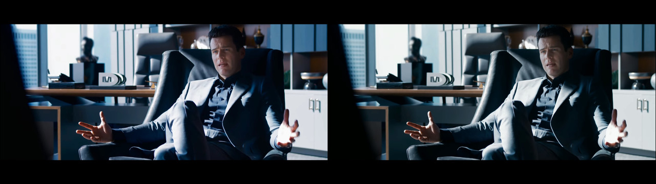
I absolutely get that "the matrix" in this movie could probably be the untainted version as we see it at the end of the trilogy, but that is not an excuse for making it look like post-processing over-saturation. You can still film something and get a high color fidelity that looks more natural. The problem is how uneven it is, some skin tones look pink, that's just plain bad in color grading methods. It's one of the most basic things to avoid, unhealthy-looking skin in any color direction. As long as it's not pink light sources, there shouldn't be that much pink in Jonathan Groff's skin. A look of a film comes from internal logic. Sure, you can go the video-art route and go bonkers, but for this movie, it doesn't make much sense, through storytelling or the art of cinematography. What I mean is that the grade doesn't seem connected to the rest of the art direction. Having a non-tainted neutral look for the "new matrix" world is absolutely valid, but making it look bad in technical terms is not.

But then again... are you sure it's that version of the matrix? Since they're watching the movie "The Matrix", inside this movie, what does that mean? ;)
 
Personally I am going to be seeing this in the cinema opening night... come on it's the frikkin' MATRIX.

Keep in mind that a separate company was probably employed to cut and prepare the trailer.

Yes, a trailer house cuts it. But the color grade / online is 90% of the time done by the post house who are doing the movie.

In general this is graded on a big screen in the theatrical color space, then they do a trim / translation to the Youtube version.

It's not like they just hand the R3Ds to a trailer house to muck with. Hope this is useful info!

Anyway, see you guys in the theatre, let's have a drink and chat about it afterwards :)

Bruce Allen
www.bruceallen.tv
 
It looks freaking amazing. I love the look, everything in this trailer. Day one cinema watch for me. Stunning, and the story really looks intriguing. I'm a fan of the Wachowskis - yes, even Jupiter Ascending- and really don't think they've made a single bad film. Its just the socio-political messages they carry alienate people. I like thought provoking, outside of the norm storytelling.

Cant wait for this!
 
i love the original look much better than your corrected version. the matrix world is clean and perfect... too much so ;)
 
i love the original look much better than your corrected version. the matrix world is clean and perfect... too much so ;)

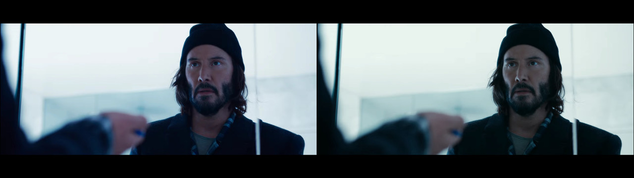
Do you mean that his skin tones in the left image look natural?

Matrix-Corrected1.jpg

Matrix-Corrected2.jpg


I mean, yes, you can say that you don't prefer the more green-tinted version, but the adjusted version is just an overall change on top of the entire trailer. To make a point. If I were to actually adjust the balance correctly, I'd isolate colors and adjust because in some shots the skin tones look like pink trash. That's a color grading sin.


yes, even Jupiter Ascending- and really don't think they've made a single bad film. Its just the socio-political messages they carry alienate people. I like thought provoking, outside of the norm storytelling.

I'm also a fan of the Wachowskis, I think Cloud Atlas is underrated. But Jupiter Ascending was trash and it had nothing to do with any socio-political messages, for which I fully support. Jupiter Ascending was a badly acted, poorly written mess. Even in terms of socio-political messages, it fails miserably by making a cinderella story about a damsel in distress who's never actually doing anything but get saved over and over while effectively telling the audience the old cliché of class fantasy of moving from low class to wealth by pure luck. It's mind-boggling to me that the Wachowski's with their clear insight into advanced philosophy produced such a mess of a message to an audience. Catering to the individualistic millennial mentality of "everyone can become a president", while at the same time, accidentally or not, not ever really criticizing the class divisions that the world-building set up. It's a real mess in both effective storytelling and what it actually "teaches" the audience, intentionally or not. Here's a good video to sum up the failures of the storytelling:


People give Cloud Atlas harsh criticism, but that one is wonderfully told in how it intercuts between the different time periods through the actual thematic connections they have while seriously telling the audience a message that feels extremely poignant in today's world; that we are all connected and divisive actions and not caring or empathizing eventually destroys us. That the same people go from that underrated movie to making Jupiter Ascending is for me one of the worlds greatest mysteries.
 
Parts of the trailer are interesting, parts of it are not and look to exaggerated. I look forward to it, anyway.

I mean the opening shot, the composite, is alluding to a very surreal vision of this world.
Yeah I really don't like that opening shot. Yuck.

What's John Wick doing in Matrix?

Wait.. OMG, is Neo in John Wick 4?
Pretty much what most people are thinking!

Personally, and speaking as one doing color grading myself, I'm sick and tired of the overly graded looks that films have pushed for 20 years.
You and me both. The same thing happens in commercial photography. The looks that once cost you thousands of dollars (yes, NPC photographers actually pay good money for presets) look terrible and dated. They don't last long, and for good reason. They even apply those stupid looks to inanimate objects like watches and cars. It's all masturbation.

I will always love the colour of films like Rear Window or Wizard of Oz or North by Northwest, etc.
 
It's the Matrix after the last reboot. It has to be saturated and vivid, it's narratively driven by the last scenes of The Matrix Revolutions.

From a neutral point of view, half the shots are indeed better looking with more green, less saturation on your adusted grading, but... we can't say the original is ugly.
It's a commercial look, from a world build to be perfect. I'm sure we'll see a transition to a more grounded look during the movie, just like inside The matrix, and out of the Matrix, in the first installment whether it's the grading palette or the production design.
 
Back
Top