Bastian Meier
Well-known member
I like the Menu design Ideas.
Maybe it would be nice to have a a own thread with the suggestions.
Maybe it would be nice to have a a own thread with the suggestions.

Follow along with the video below to see how to install our site as a web app on your home screen.

Note: this_feature_currently_requires_accessing_site_using_safari

My first impression of this was "Yuck! Too much like my Panasonic GH5s!!". What I don't like about the Panasonic menus is that there are too many of them, strangely organized, and they try to do too much.
To me, things like base frame rate, format, shutter angle are very much project and/or scene specific. Good to know what universe we are living in, but not things I want to change willy-nilly. Iris, ND, WB, and maybe ISO are things that need to change on the fly.


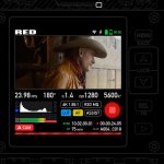
Here's my attempt. First image is interface while recording. Second is in standby (with a subtle functionality hint.

These seven boxes at the bottom are buttons, right?
Aren’t they too small? too many?
Soon, we gonna need a stylus to use Komodo!
I like your multi-purpose REC button very much.

Hasselblad X1D UI is my favourite amongst photo cameras! I only wish the scrolling (for ISO etc.) was more robust.Just make it like the Hassleblad X1D it’s perfect.
Absolutely! Soft design is the current trend (flat-looking with softened edges and less contrast, like one of the images you attached). But it is much less readable so not as useful for mainstream interfaces (OSes, cameras, cars, gaming etc.).there are old "flat and clean designs" as well as there is a new "skeuomorphic designs"
Hello fellow John Gruber follower! I do agree that iOS7 was a bit too much for a phone, draining all the joy and colour. But that doesn't apply for any UI, for example cars (especially head-up display) and cameras could always benefit from the consistency and readability of flat UI. You have to always be context-aware. And besides, there's that sweet 6K image preview for all the joy you may needthe fundamental weakness in post-iOS-7 look-and-feel is simply that it’s been drained of joy.

having multiple skin options for a camera is like grabbing a guitar that is tuned differently. You have to instinctively remember the look of the menu, it has to be recognized even with a short peek. It is also part of the brand and should contribute to the iconic style. Everyone recognized first iPhones for the home button AND apps grid with a dock.allow people to upload skins
Hi everyone! Happy to see so many mock-ups!
There are a bunch of things that I would also love to see easier access to. But for now – made the video about UI & UX ideas just for the bottom section of the main screen based on the official UI (same font size, elements and general layout). Kept all of the interactive bits below the image preview, to keep fingerprints and smudges away from that section of the screen. Mechanics can be extrapolated to other sections of the main screen as well as other menus. Minimalistic UI helps make everything consistent and eases the complexity of settings.
Wish I could come up with more stuff, but there is not enough info about the camera tech specs, what is possible and what MUST be in the menus.
Hasselblad X1D UI is my favourite amongst photo cameras! I only wish the scrolling (for ISO etc.) was more robust.
Absolutely! Soft design is the current trend (flat-looking with softened edges and less contrast, like one of the images you attached). But it is much less readable so not as useful for mainstream interfaces (OSes, cameras, cars, gaming etc.).
Hello fellow John Gruber follower! I do agree that iOS7 was a bit too much for a phone, draining all the joy and colour. But that doesn't apply for any UI, for example cars (especially head-up display) and cameras could always benefit from the consistency and readability of flat UI. You have to always be context-aware. And besides, there's that sweet 6K image preview for all the joy you may need
having multiple skin options for a camera is like grabbing a guitar that is tuned differently. You have to instinctively remember the look of the menu, it has to be recognized even with a short peek. It is also part of the brand and should contribute to the iconic style. Everyone recognized first iPhones for the home button AND apps grid with a dock.

A Custom layout would be awesome, you could pick which buttons you want on the screen?

"Jarred wants nobody to mistake the camera for somebody else's."
Then why u all trying to make it an android UI, cheap, flat. Please give me the EXTRA looking drop shadow which screams fun and expensive camera.
Please include a copy of mock up pro for anon users like "Stanly" and everyone else so they can make whatever the h-ll they want.


Adding a few ideas in ; ) What do you think? More to come!
- Adding a recording status bar on the bottom. On standby it becomes green
I like the Menu design Ideas.
Maybe it would be nice to have a a own thread with the suggestions.
Did they shoot colour for that purpose? I have not seen any, but I'm willing to be surprised!As a child, my parents kept telling me that color blindness was not a handicap. As proof, they kept telling me that during WW2, the allies had aerial photos inspected by color-blind people because they were the only ones who could distinguish enemy camouflage.