Welcome to our community

Be a part of something great, join today!

  • Hey all, just changed over the backend after 15 years I figured time to give it a bit of an update, its probably gonna be a bit weird for most of you and i am sure there is a few bugs to work out but it should kinda work the same as before... hopefully :)

Kinefinity MAVO Edge

@Rand
This is pretty much my conclusion every time I see these kind of comparisons.

The Mavo LF, like many modern cameras does extremely well within it's range. Manufacturer's are really optimizing what they have (Fuji I am looking at you). Outside that range there is often however, a pronounced drop in quaity.

The great problem with Red is that it doesn't hold highlights or do roll-off well enough. On foreheads/faces this can be a disaster. Even as shown here with the Monstro. It's latitude is in the shadows, not the highlights. So it doesn't matter how much you pull the exposure back to pick up those highlights, the result is often either too much contrast in the total image or less nuances in the face, which can tend to look wooden very quickly. Invariably you have to go towards secondaries to compensate.

And the Alexa's great difficulty is that while it often does hold better DR than everyone else (as witnessed by the extra detail in the window of your pix), there is frequently a color cross over between magenta and green. So what this means on a practical level, is for instance on a cold day, a subjects hands might be a little rosier than normal, and this is amplified by the camera, while at the same time the face which was neutral goes green if you try to correct for the hands. This is not a saturation issue, it's a sensitivity one. (Greater sensitivity in certain part of the color spectrum than others). So you end up doing a lot of secondaries to compensate for that issue, either by desaturating or CC'ing local areas of the image. This may be down to the Arri LUT which everyone uses, but it is a pain in the butt for a colorist. However, to Arri's credit I have always found that there is so much information there underneath, that you can almost always recover what you need, even if it takes some extra effort, and the "grain" structure (texture of the image) remains quite pleasing.

End of the day, as we all know, no camera is perfect (don't get me started on Blackmagic - which often make images that to me look like black and white photographs which have been colorized), but it really does mean that you have to have command of the whole chain of your visual capture from beginning to end in order to achieve consistent results.
 
Last edited:
And the Alexa's great difficulty is that while it often does hold better DR than everyone else (as witnessed by the extra detail in the window of your pix), there is frequently a color cross over between magenta and green. So what this means on a practical level, is for instance on a cold day, a subjects hands might be a little rosier than normal, and this is amplified by the camera, while at the same time the face which was neutral goes green if you try to correct for the hands. This is not a saturation issue, it's a sensitivity one. (Greater sensitivity in certain part of the color spectrum than others).

Sensitivity affects saturation. : )


So you end up doing a lot of secondaries to compensate for that issue, either by desaturating or CC'ing local areas of the image. This may be down to the Arri LUT which everyone uses, but it is a pain in the butt for a colorist.

There is no issue when the signal is properly normalized.
 
End of the day, as we all know, no camera is perfect , but it really does mean that you have to have command of the whole chain of your visual capture from beginning to end in order to achieve consistent results.

Good boy. I like this comment. ;)
 
Pretty bad those saturated highlights in the Alexa pictures. Not natural. Rand did you saturate them?

BTW I'm impressed by the Mavo (is it Edge?).
 
@Rand
This is pretty much my conclusion every time I see these kind of comparisons.

The Mavo LF, like many modern cameras does extremely well within it's range. Manufacturer's are really optimizing what they have (Fuji I am looking at you). Outside that range there is often however, a pronounced drop in quaity.

The great problem with Red is that it doesn't hold highlights or do roll-off well enough. On foreheads/faces this can be a disaster. Even as shown here with the Monstro. It's latitude is in the shadows, not the highlights. So it doesn't matter how much you pull the exposure back to pick up those highlights, the result is often either too much contrast in the total image or less nuances in the face, which can tend to look wooden very quickly. Invariably you have to go towards secondaries to compensate.

And the Alexa's great difficulty is that while it often does hold better DR than everyone else (as witnessed by the extra detail in the window of your pix), there is frequently a color cross over between magenta and green. So what this means on a practical level, is for instance on a cold day, a subjects hands might be a little rosier than normal, and this is amplified by the camera, while at the same time the face which was neutral goes green if you try to correct for the hands. This is not a saturation issue, it's a sensitivity one. (Greater sensitivity in certain part of the color spectrum than others). So you end up doing a lot of secondaries to compensate for that issue, either by desaturating or CC'ing local areas of the image. This may be down to the Arri LUT which everyone uses, but it is a pain in the butt for a colorist.However, to Arri's credit I have always found that there is so much information there underneath, that you can almost always recover what you need, even if it takes some extra effort, and the "grain" structure (texture of the image) remains quite pleasing.

End of the day, as we all know, no camera is perfect (don't get me started on Blackmagic - which often make images that to me look like black and white photographs which have been colorized), but it really does mean that you have to have command of the whole chain of your visual capture from beginning to end in order to achieve consistent results.

I hear yah!,

I have run into all of the issues you have mentioned above from grading multiple footage from different camera companies. Luigi gave some really challenging images in his download and I had to use some extreme measures that I wouldn't advise using to get the results I got. I believe Hrvoje's Primers would have gotten better initial results from which to start from. When you use any of the cameras out there for cinema or for other professional usages, there will always be trade-offs. The best you can possibly do if you are going to purchase one of theses cameras, is to choose the camera whose issues you can handle and deal with the best. However, if you are a colorist, which I am not,
you can only find the best generalized approach to color correcting/grading that works for all cameras, then learn how to tailor it amongst the many specific cameras.

I think if you have good basic "color-correcting" skills, and I don't mean just throwing a Lut from generalized Lut pack on footage and calling it done. I mean actually being able to diagnose what actually the cause of the problem and find the best remedy that you know of to fix it. If you only know how to color correct one camera from one of the major camera companies well, you're naturally going to have problems fixing problem footage from others. So if you continually work with footage from many different types of cameras you'll eventually find some common denominators which will help you with all of them.
 
Patrick,

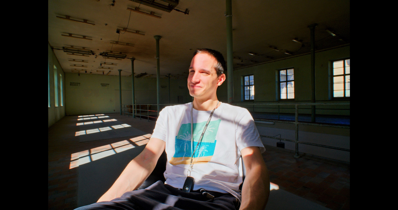
When I recovered the highlights on the Arri footage, it brought back the blues in the sky. In the Arri footage of the guy against the green wall, I had to push saturation really hard to just get a hint of skin color. However, if you downloaded the footage from Luigi , you can see that it had little to no color at all in them, hence why I used an amount of saturation that I wouldn't advise using in any other situation.


The Mavo footage from Luigi was from the Mavo LF.
 
I'm really surprised how many colorist don't know the workflow needed to process the picture of the main camera brands out there. I know one that only knows how to correct Arri footage.
Thanks Rand. (RU of the year ;-) )
Pat
 
Thanks for that Pat!! HaHaHaHaHa, And I can think of a lot of other people on this forum whom would deserve that title much more than I ever would.
 
Here is a video made from 7 of the clips from Kristian Thuesen's Mavo LF


Redo, I forgot a clip that wasn't included in the other one.

829MB
https://we.tl/t-I1Cx5aw55e
 
Last edited:
Arri

3-1-26-1.jpg


4-1-25-1.jpg


5-1-29-22.jpg


2-1-28-1.jpg


5-1-24-1.jpg

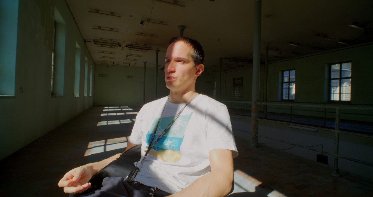
The highlights retention is so amazing with this 10 year old sensor tech (Mini LF is still using ALEV III right?).. Almost looking like HDR bracketing tone mapped image!
 
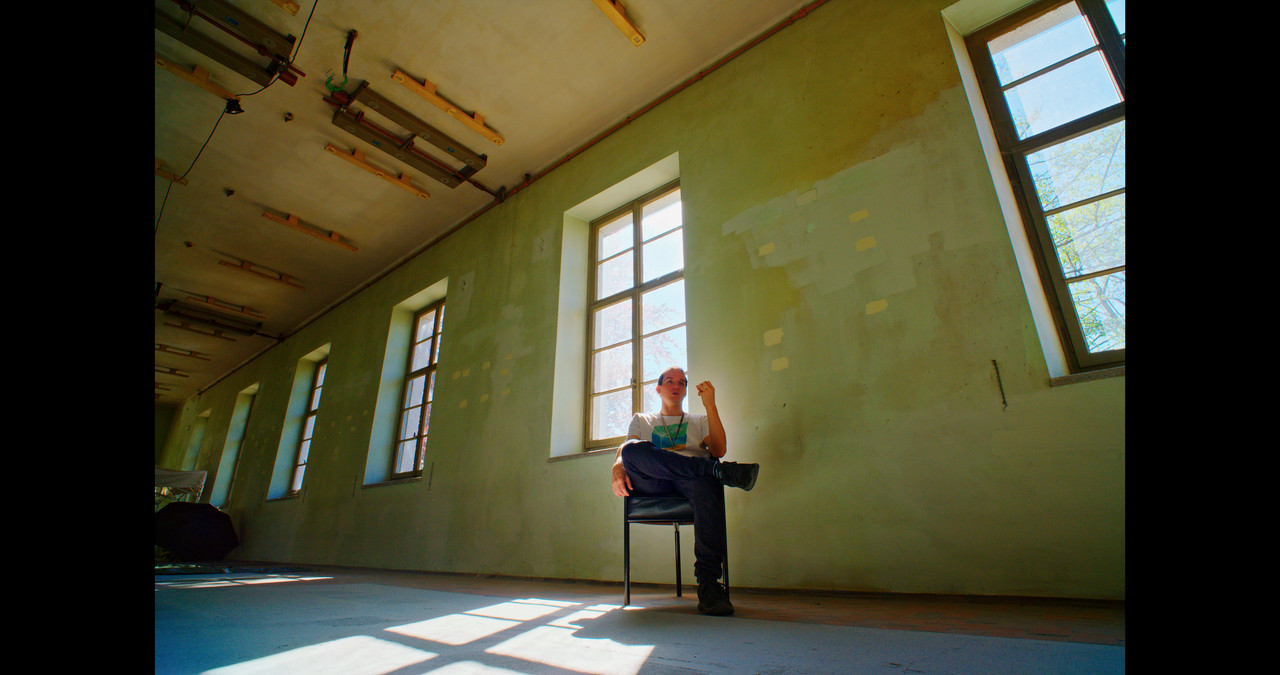
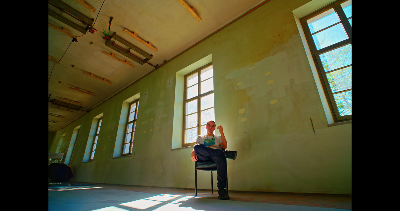
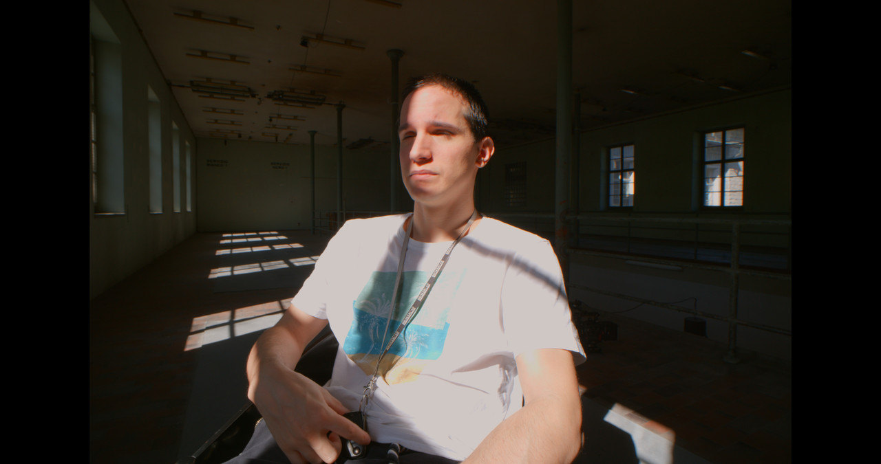
Here are a few of the Mavo LF first. The highlights are gone!!, I really want to see how ProRes Raw in the Mavo Egde would handle this. I put them in a 4096x2160 project hence the black bars.

3-1-7-3.jpg


monstro-1-14-22.jpg


5-1-29-22.jpg

Looking at these three images, Mavo has most pleasing skin tone. Maybe because Rand did not tweak too much to recover highlights? (somehow I cannot load original Mavo and LF files from Luigi into latest version of Premiere. Do you need Resolve for this?)
Yes, highlights on the T-shirt are gone on Mavo, but if you compare to Monstro, not by much. Maybe 1/3-1/2 of a stop which is impressive considering Mavo (Edge) is 5 times less expensive than Monstro. Then skin tone on Monstro is off IMO.

And Mini LF, this looks weird. Like an HDR image which I totally hate. Yes, there is a lot of highlights and shadow detail, but the image as such is not pleasing.

What does this tell us, even though Monstro and Mini LF have better highlight retention than Mavo, one still needs secondary mask to make the best out of such a challenging shot. But I am not a colorist.
 
Last edited:
Looking at these three images, Mavo has most pleasing skin tone. Maybe because Rand did not tweak too much to recover highlights?

And Mini LF, this looks weird. Like an HDR image which I totally hate. Yes, there is a lot of highlights and shadow detail, but the image as such is not pleasing.

You are looking at a creative choice in image shaping.


What does this tell us, even though Monstro and Mini LF have better highlight retention than Mavo, one still needs secondary mask to make the best out of such a challenging shot.

If by the "best" you mean some specific look creation.

If by that you mean a natural looking image, no secondaries and masks are needed. This is a matter of transformation and image balance.
 
And Mini LF, this looks weird. Like an HDR image which I totally hate. Yes, there is a lot of highlights and shadow detail, but the image as such is not pleasing.

One of the important things to understand about pulling back in highlights on faces is that it is going to affect saturation. Typically, for instance I would not even use the Arri LUT on images like this because it would be like using a sledgehammer to pound a nail. I would correct up slowly from the base image, equalizing first the blacks, then whites and then playing with the midtones on a global basis. Only after I had my density levels properly set, would I consider adding in saturation. And then I would re-equalize again. It's a delicate balance.

The other key to remember is that human beings spend their lives looking at faces. Therefore we all are far more sensitive to the color of skin than anything else. Even minor shifts of a couple of points in magenta or yellow are noticeable to the average Joe. Which means for me that faces always come first. We can deal with walls and even skies that shift in color, because we have no objectivity concerning those elements in a scene. Heck even middle grey is difficult to be objective about. I know from experience that I often tend to make it too blue, because my idea of grey is cold. But if I look at an 18% grey chip on a densitometer strip, it is typically warmer than my inclination. So I know that I have to be careful about that when working with a client.

All of this to say that the wise manufacturer's are spending a great deal of time optimizing their cameras color palettes for faces, not just objective standards. However, we have no measure for this. When is the last time you heard about this in the specs for the release of a new camera ? Never. But everyone knows which brands of camera they prefer and 90% of the time it has to do with the way faces are rendered.
 
Last edited:
All of this to say that the wise manufacturer's are spending a great deal of time optimizing their cameras color palettes for faces, not just objective standards.

It is not mutually exclusive. : )

The conception of "standards" leads to misconception of dichotomy.


Regarding "pulling back highlights" the result greatly depends on the route, order and quality of operations/operators to achieve that.
 
It is not mutually exclusive. : )

The conception of "standards" leads to misconception of dichotomy.

By objective standards, I mean the typical measure which we speak of on spec sheets. Quantifiable numbers.

But I sure would like to see a standardized nuance test around the tonal values of faces for every camera (at their maximum quality level) for the average buyer, because even though many cameras all fall within a common spectrum of colors where flesh tones are concerned, not all of them are as sensitive to the nuances of faces when it actually comes to shooting. This also has to do with bit depth, codecs, "grain" structure, the coatings on lenses, etc. Which is why it is so much more difficult than saying a camera is 8K or has great new Stupid Raw Lite. It is astounding to me for instance how few cameras are actually sensitive to the natural blush in a person's cheeks at wider angles. Sure if you use an 85mm or longer focal length, you will see it. But go wide and you will instantly see how that kind of nuance falls through the cracks in the image pattern of many, many cameras. No amount of secondaries will be able to recover it. The result is wooden looking faces.

Most people are obsessed with a brand name and a dominant color they attribute to it. "Canon has redder faces", etc. Blah, blah. But that's mostly nonsense. Dominances can easily be corrected out. What is more difficult is when you go to work on a face and discover there are no internal color nuances, detail or contrast to work with. I have even seen this from cameras that supposedly had a ton of bit depth. It shifts from one dominance to another, but there is no blush in the cheeks or the kind of color seperation which creates dimensionality.
 
Last edited:
A lot of people look for those wooden uniform skin tones and call it beautifull.
I hate this low color fidelity vision of the world wich too often are clamped down to brown and blue.

Or they call it orange and teal. :-)
 
An example of wooden colors and some of the worst colorist work I have seen for a major motion picture.

212.jpg


That's a pretty orange looking face. Wouldn't you agree ?
I ask you does it look like it has nuances ? Does it look natural ? Does it make sense in the context of the image ?

Here is the interesting part. It was shot on film.
What a waste of Imax 65 quality.
So these questions are not just limited to digital cameras.
The work of the colorist is primordial.
Whoever corrected this and whoever approved it, should both be hauled off to the gulag.
 
Last edited:
You are looking at a creative choice in image shaping.


If by that you mean a natural looking image, no secondaries and masks are needed. This is a matter of transformation and image balance.

You are right Hrvoje. I am referring to the most natural looking image.

One of the important things to understand about pulling back in highlights on faces is that it is going to affect saturation. Typically, for instance I would not even use the Arri LUT on images like this because it would be like using a sledgehammer to pound a nail. I would correct up slowly from the base image, equalizing first the blacks, then whites and then playing with the midtones on a global basis. Only after I had my density levels properly set, would I consider adding in saturation. And then I would re-equalize again. It's a delicate balance.
Absolutely, this does not differ much from how I used to process RAW photos many years back (and still do from time to time).

An example of wooden colors and some of the worst colorist work I have seen for a major motion picture.

212.jpg

Funny you bring up this example. This was exactly what I thought when I saw that picture. Ugly skin tone.
 
By objective standards, I mean the typical measure which we speak of on spec sheets. Quantifiable numbers.

Got it. You are right.
In the first part. : )

Regarding quantifiable...nope.
But it's immensly complex to get there due to a number of variables and context.

But I sure would like to see a standardized nuance test around the tonal values of faces for every camera, because even though many cameras all fall within a common spectrum of colors where flesh tones are concerned, not all of them are as sensitive to the nuances of faces when it actually comes to shooting.

Log image face tonality test doesn't reveal much because colours are not yet fully defined, and gamma & gamut transformed image test which defines them doesn't test the "camera" ( sensor + base CS performance) alone but the sensor + base CS + transformation all together.

Isolated transformation test is practically useless because it depends on the input and output context and while output is standardized, the input - sensor performance + base CS is not.

It is astounding to me for instance how few cameras are actually sensitive to the natural blush in a person's cheeks at wider angles. Sure if you use an 85mm or longer focal length, you will see it. But go wide and you will instantly see how that kind of nuance falls through the cracks in the image pattern of many, many cameras. No amount of secondaries will be able to recover it. The result is wooden looking faces.

This may be related to light, optical and perceptive factors. Pixel properties and camera CS do not alternate throughout the sensor coverage and if light and optics are consistent, same post route should yield same tonal results.

I've had some bizzare cases where same scene had weird tonal offsets betwen shots as if camera was left to auto WB and post was a mess, so that is also a factor to consider, especially with burned it codecs and camera auto-algorythms messing up the original tonal response.


What is more difficult is when you go to work on a face and discover there are no internal color nuances, detail or contrast to work with. It shifts from one dominance to another, but there is no blush in the cheeks or color seperation which creates dimensionality.

If optical variables are removed, that happens due to:

a) base CS mapping judgement calls each camera maker has to make based on a sensor-given starting point and look priorities. What you said about sensitivity per light spectrum, but it is also related to tonal mapping (not just a sensor thing) The outcome you get in post is not just a product of sensor performance but the specific tonal mixture through luminance range which the camera maker designed. Their "special sauce". Each "special sauce" (base CS design) has advantages and drawbacks.

b) DoP calls (exposure/light) - based on gamma/gamut corrected image preview or understanding of log preview

and

c) Post manipulation - transformation/ basic CC route.

Shooting factors under b) and post under c) come with many misconceptions which often leads to results inferior to what is possible to achieve.

With newer and higher quality cameras issues you mention are mostly avoidable. Even starting from log supporting stills cams in the last few years.
 
Back
Top