Brandon Veen
Well-known member
I’ve been testing the Fujifilm’s Eterna F-Log LUT on some footage and have really been enjoying the look. Due to it being strictly a Log LUT, it doesn’t work with IPP2. The best Legacy combo I’ve found to get closest to the F-Log profile seems to be REDWideGamutRGB and RedLogFilm.
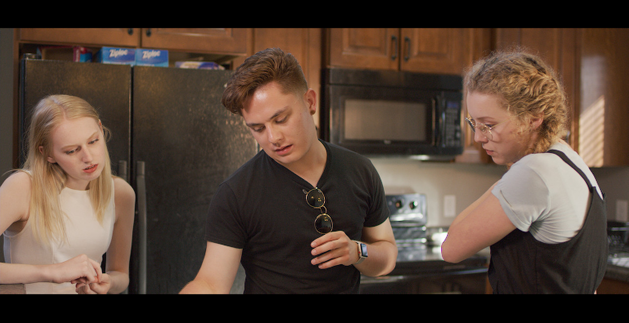
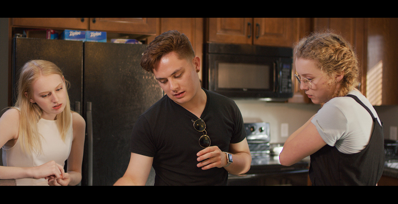
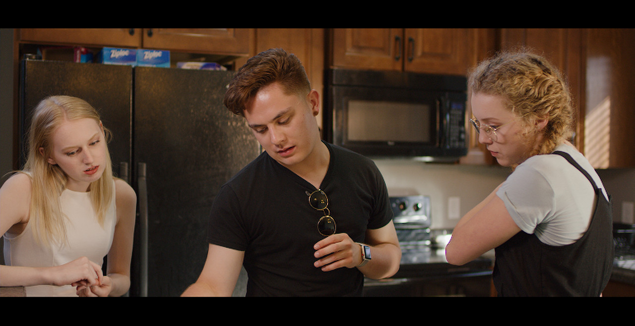
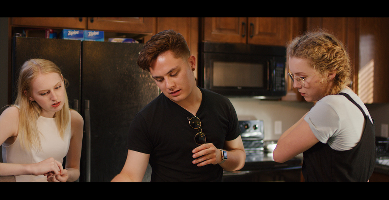
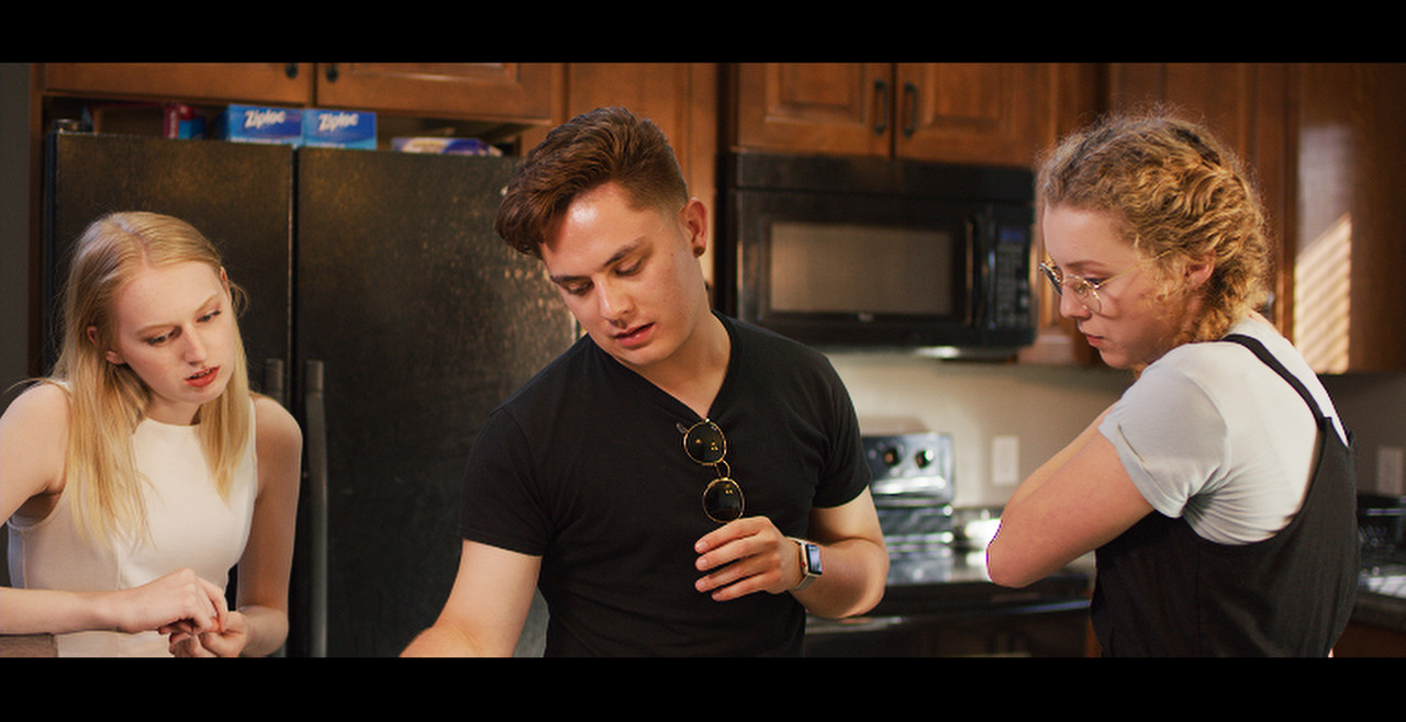
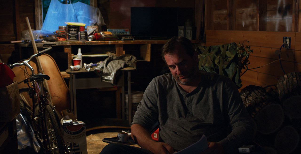
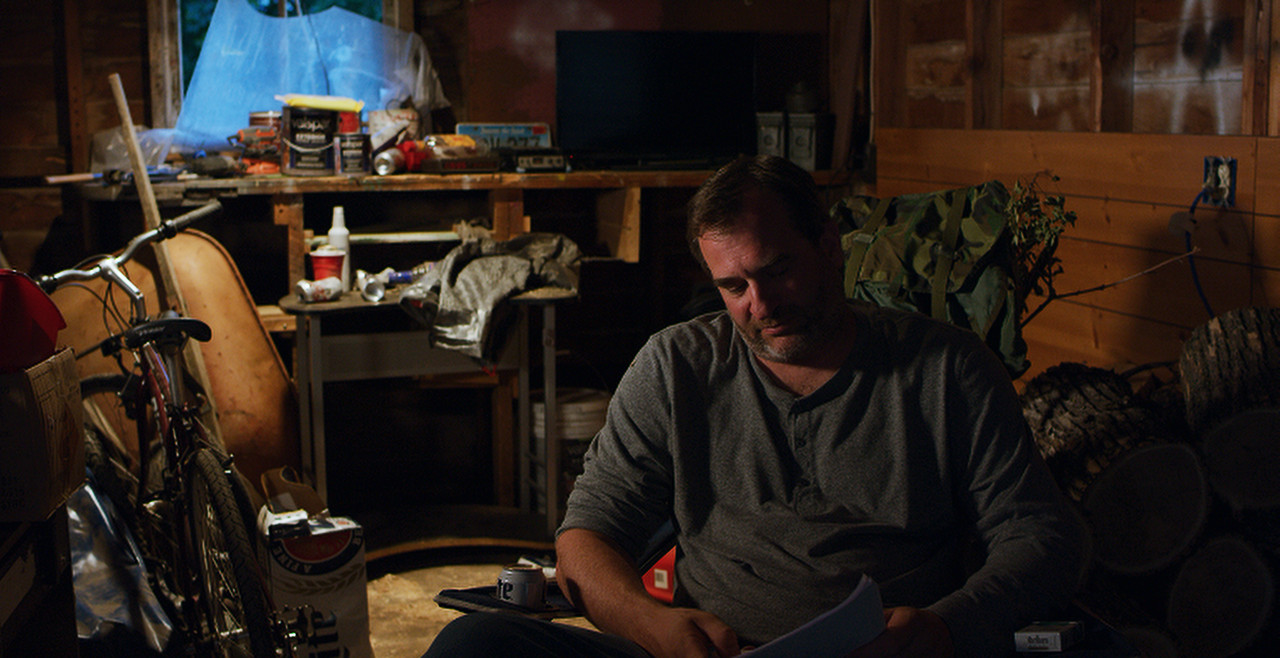
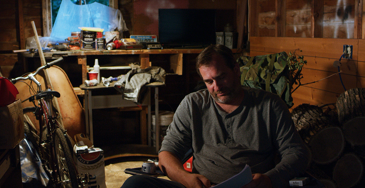
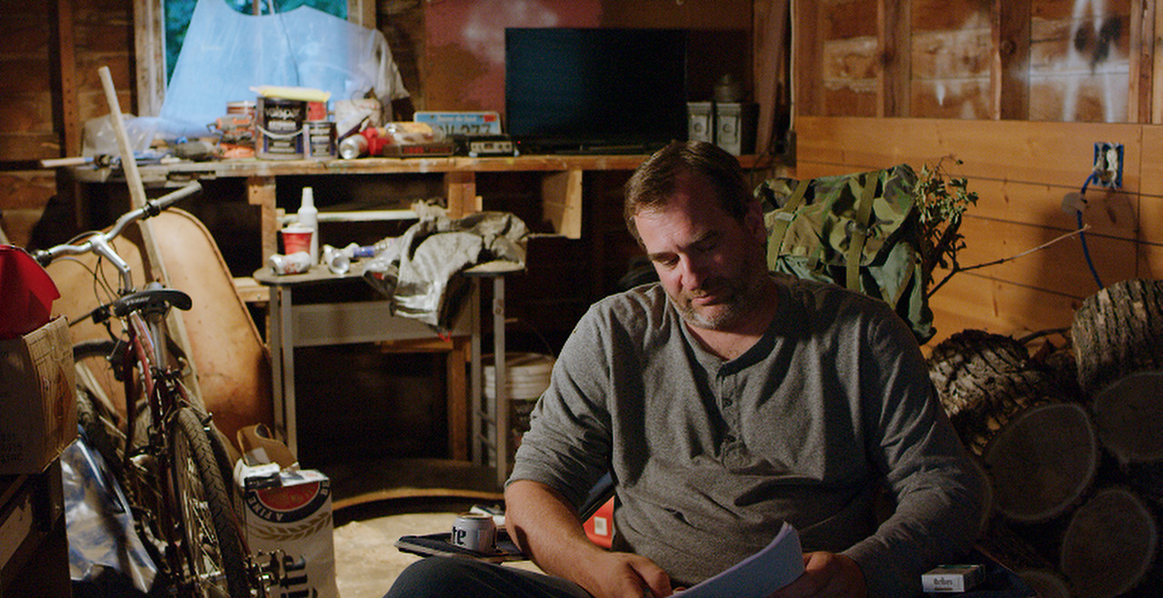
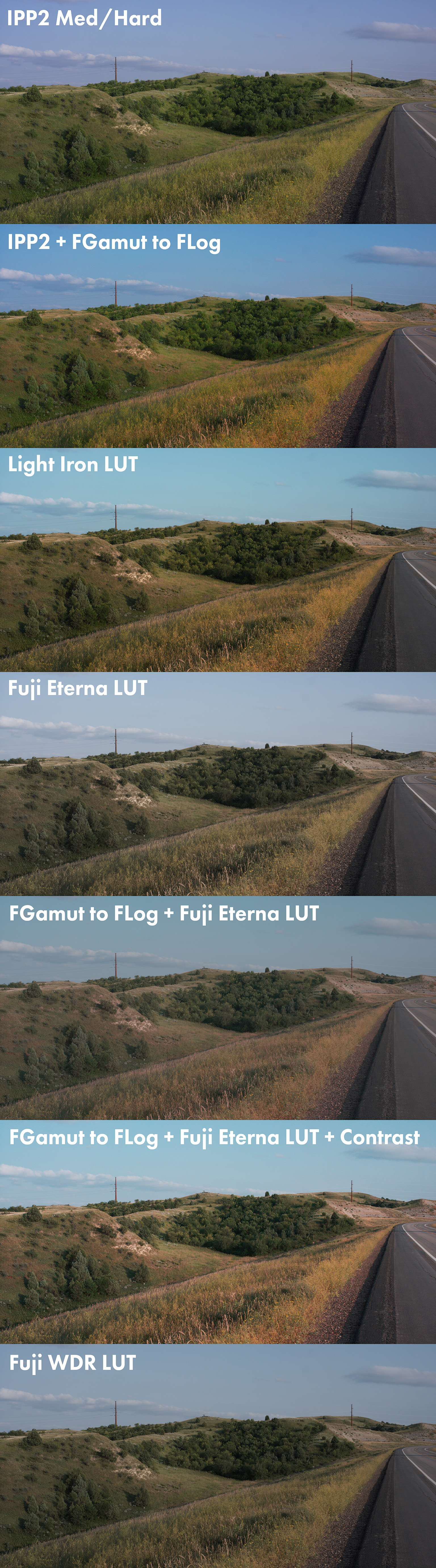
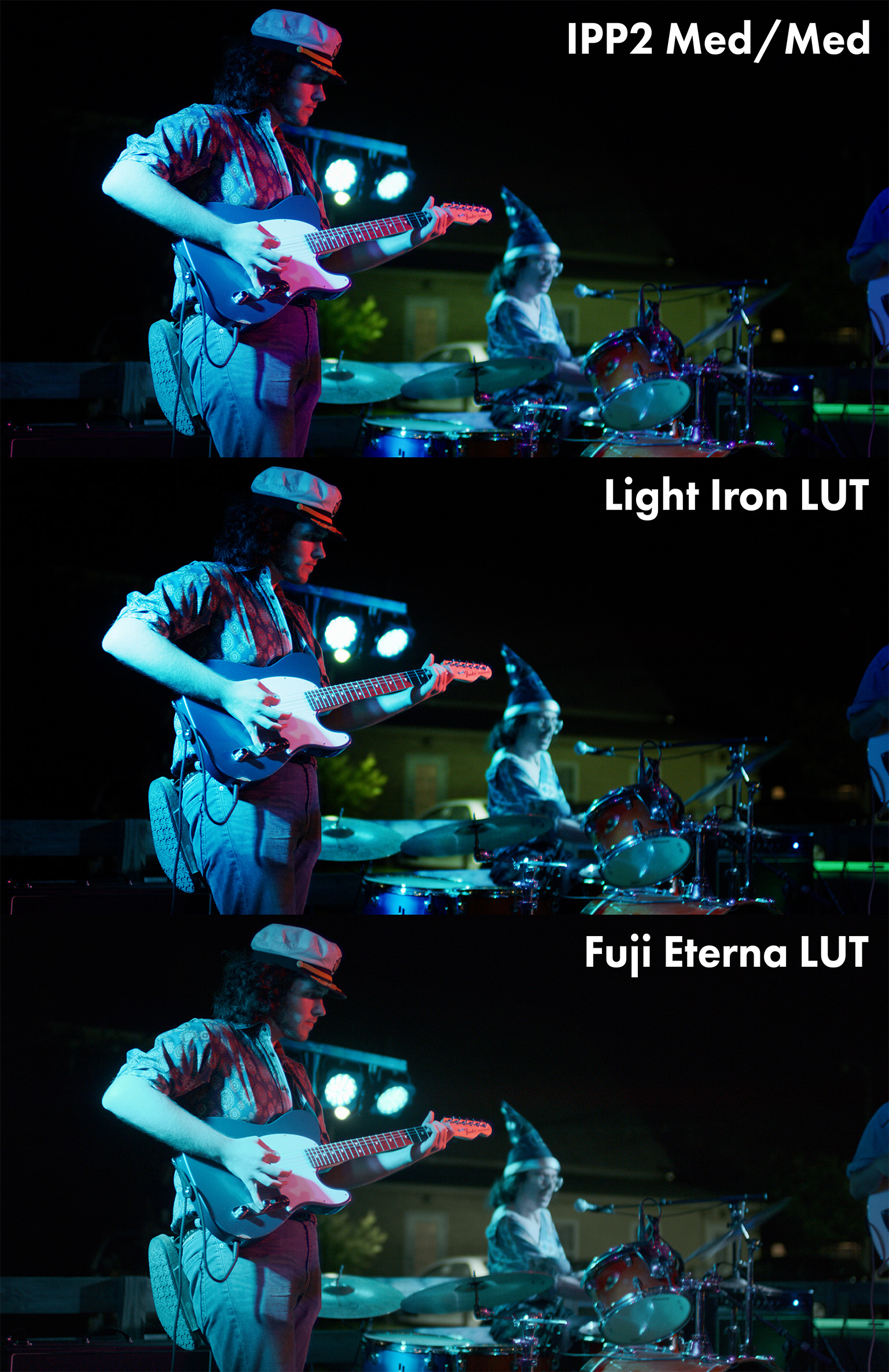
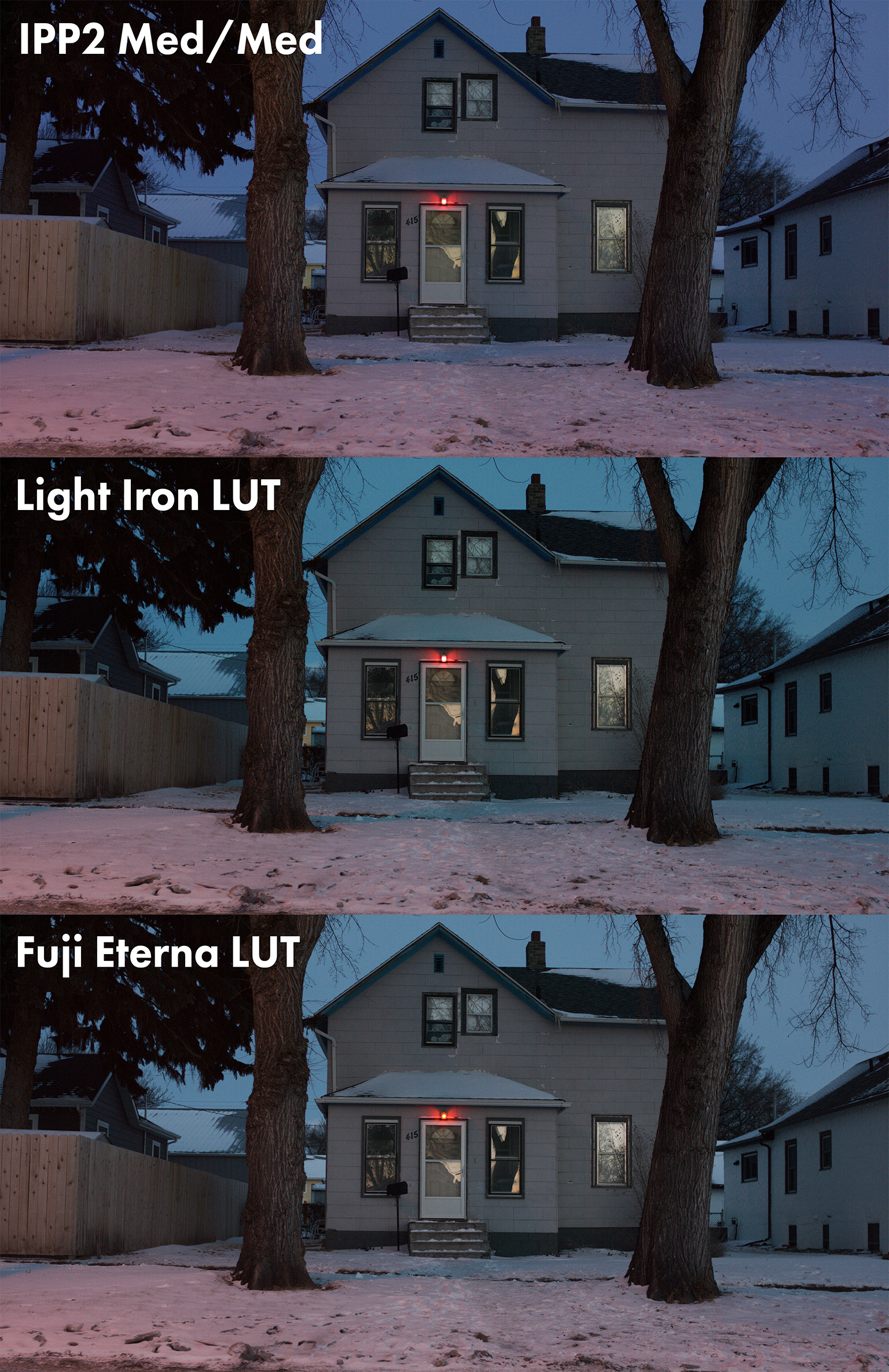
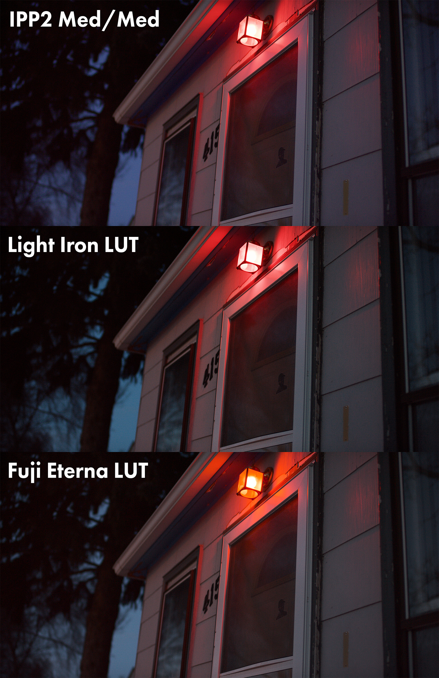
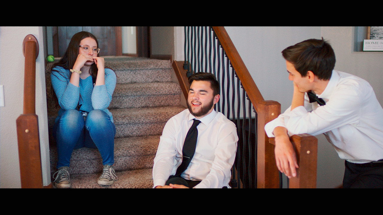
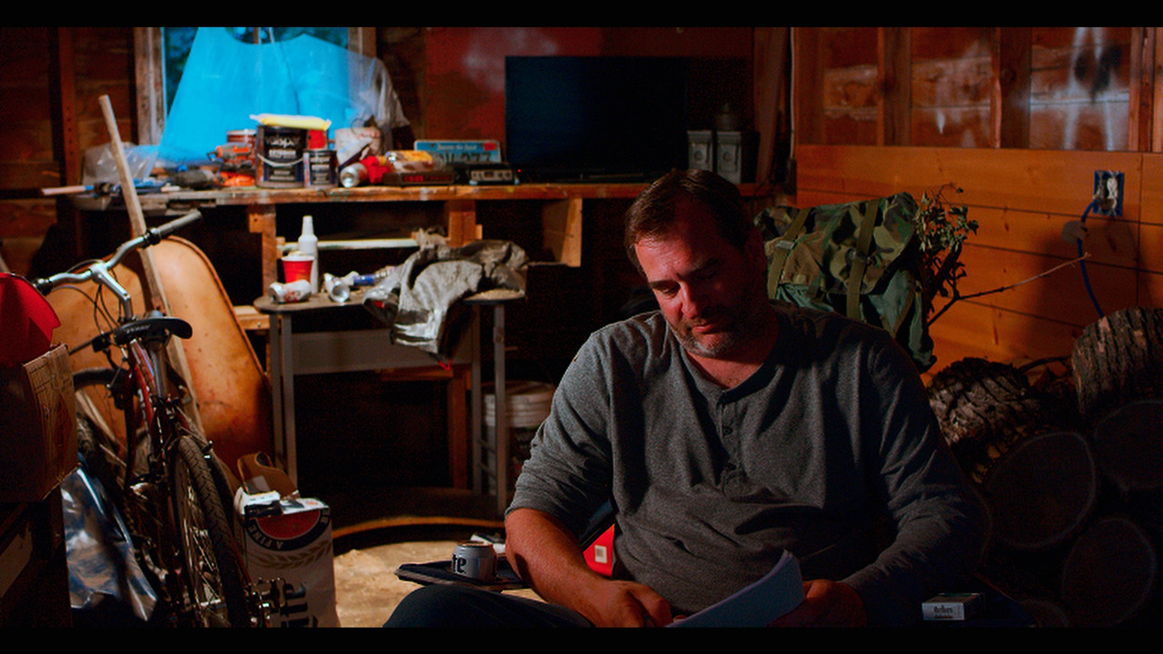
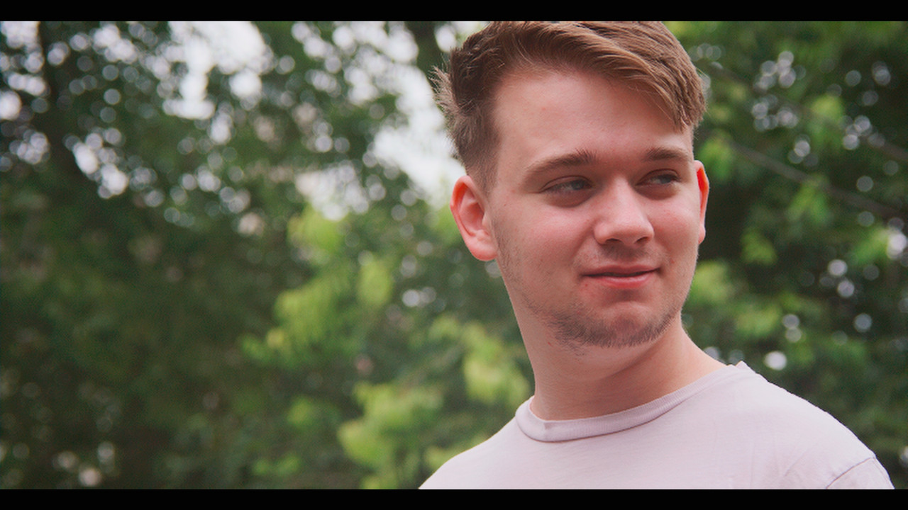
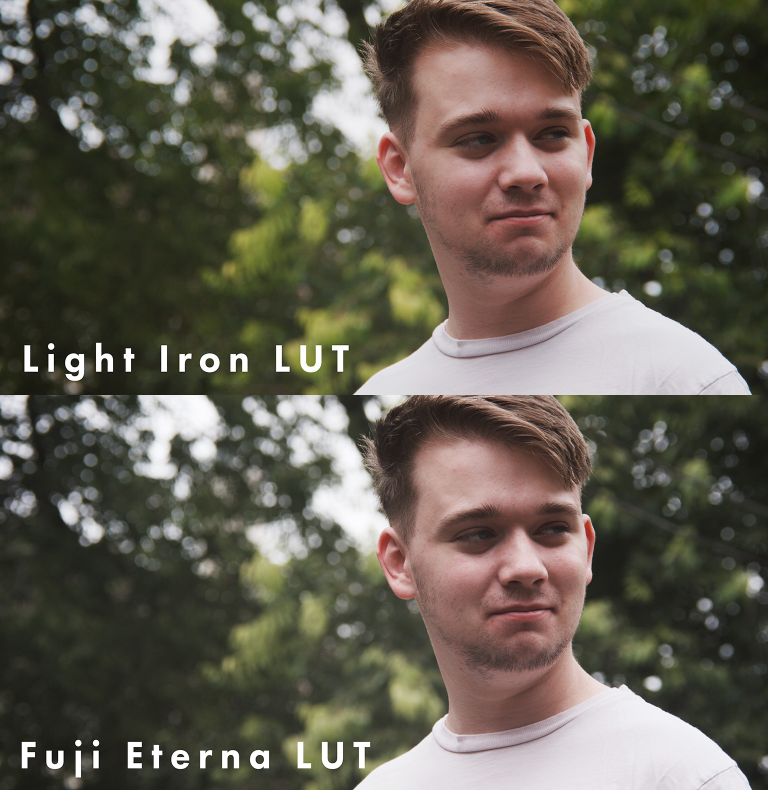
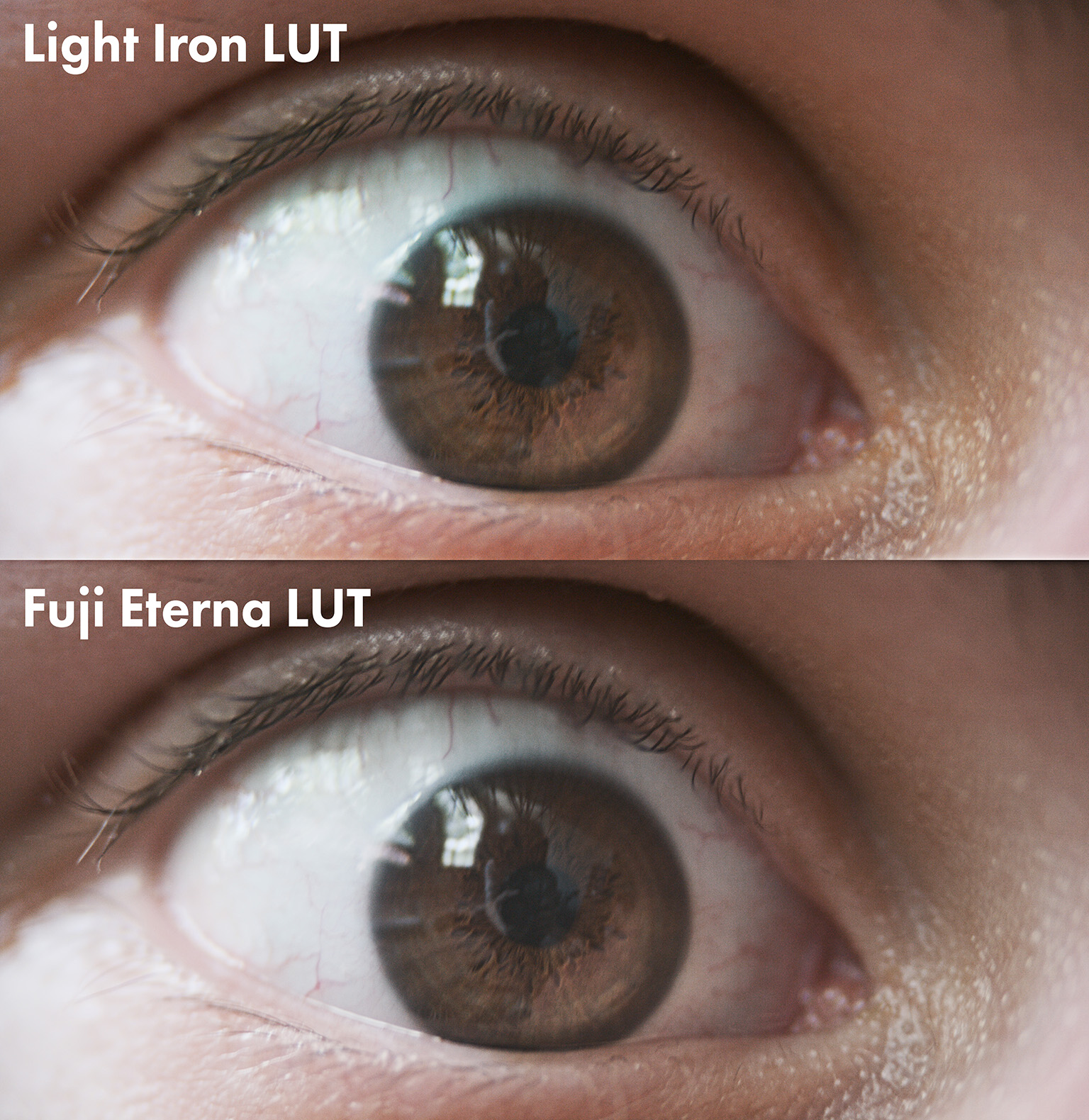
Another LUT I really like is the IPP2 Light Iron LUT that James Miller shared earlier this year and seemed like a good one to compare this to. And boy was I right, in some of the shots the differences are extremely subtle between the two. The two main differences seem to be with how they render cooler tones and warmer tones. Eterna's cool tones have a level of desaturation compared to Light Iron, and you'll find the biggest differences appear in exterior shots. The warmer tones of the Light Iron LUT shows primarily on skin tones, where they'll feel a bit more orange compared to Eterna.
To get the LUT's to match a little bit more in terms of contrast, I used the following changes in the Tone panel in Lumetri:
- Exposure: 0
- Contrast: 64
- Highlights: 26
- Shadows: -6
- Whites: 23
- Blacks: 0
Shot 5 shows the difference between those changes and what the LUT does by itself.
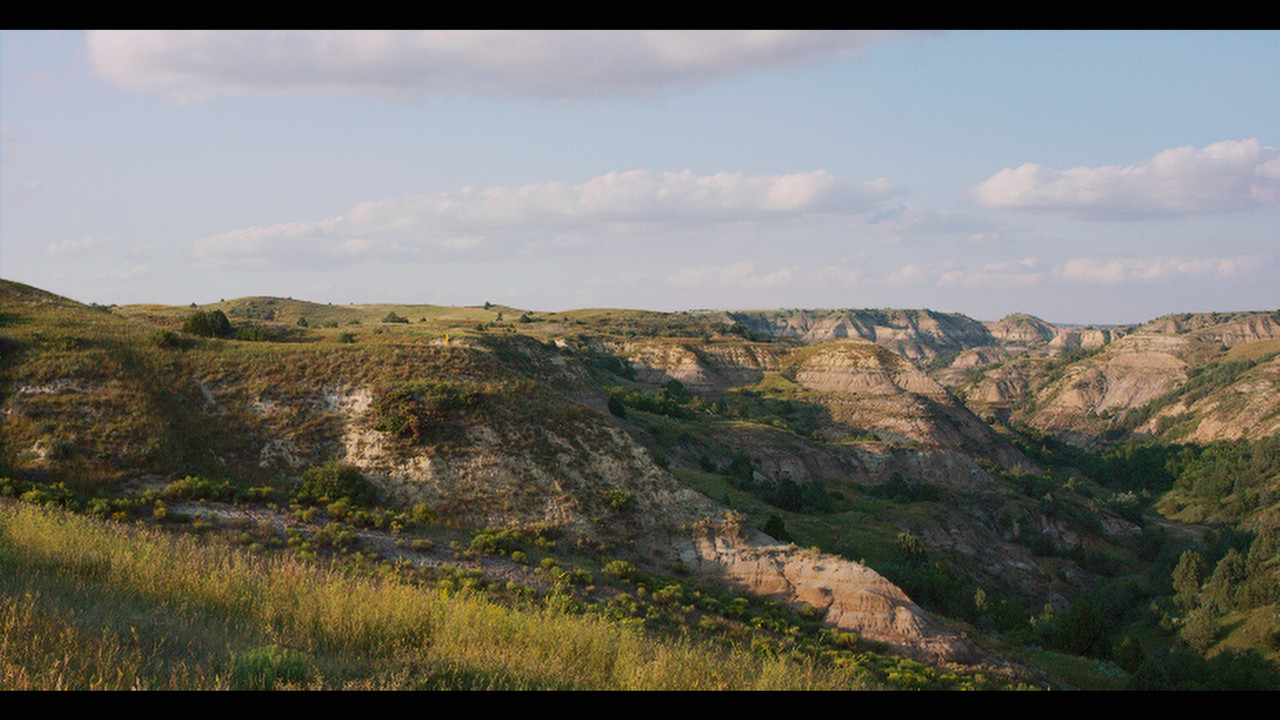
Shot 1: Exterior Test with Vivitar Series 1 90mm
STH, ISO 800, 5500K, 0 Tint, Medium/Medium IPP2 Settings for LI
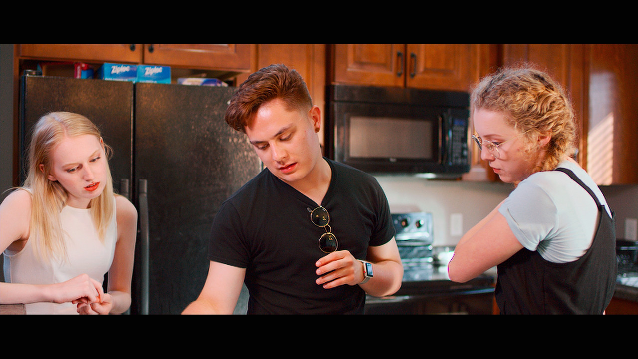
Shot 2: Interior Still with Zeiss CP2 35mm Super Speed
STH, ISO 800, 5309K, -7.952 Tint, Medium/Medium IPP2 Settings for LI

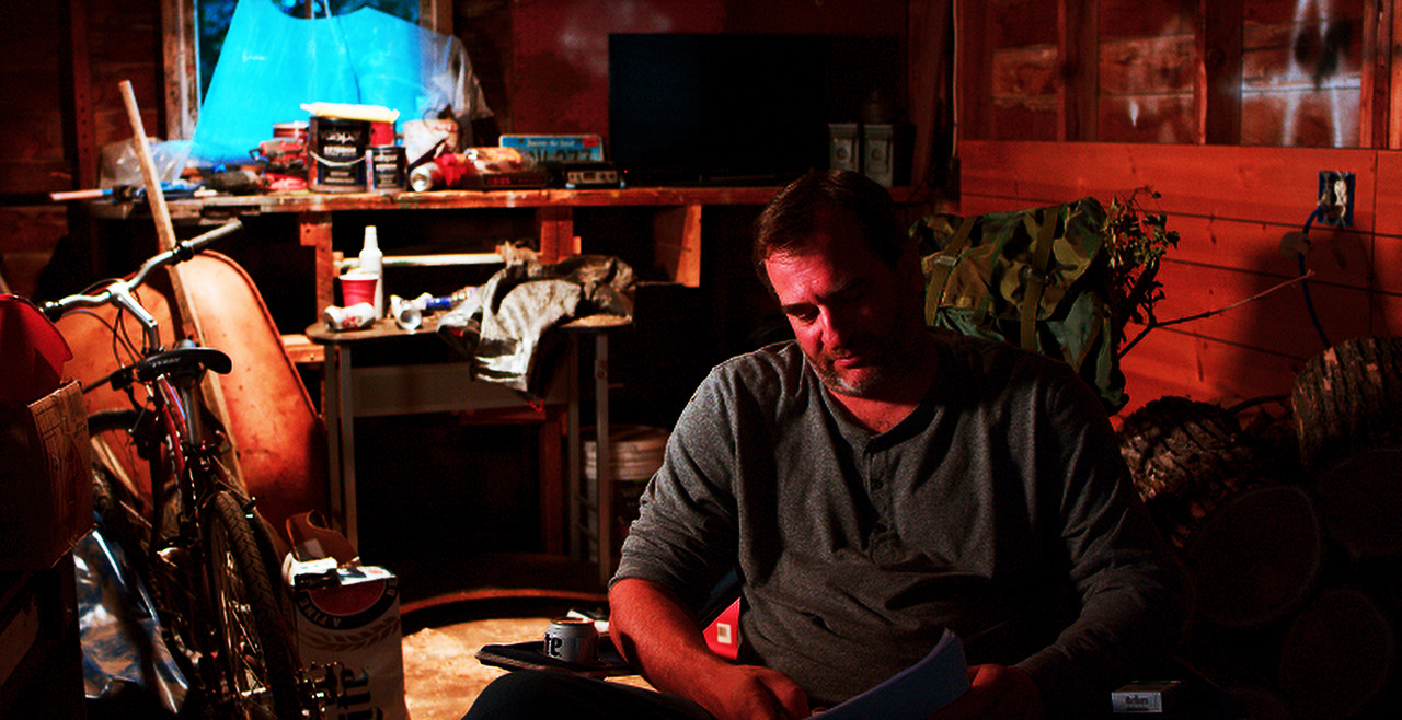
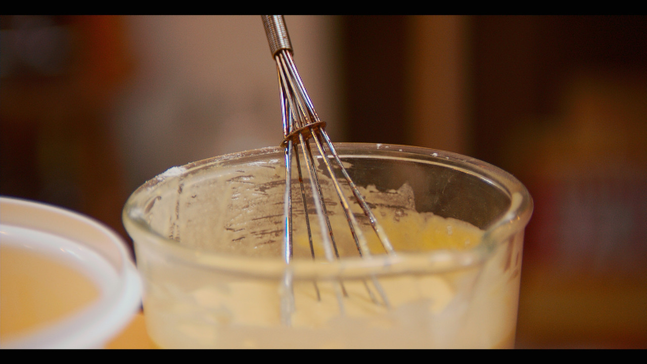
Shot 3: Interior Test with Vivitar Series 1 90mm (+ Macro)
STH, ISO 1600, 4500K, 0 Tint, Medium/Hard IPP2 Settings for LI
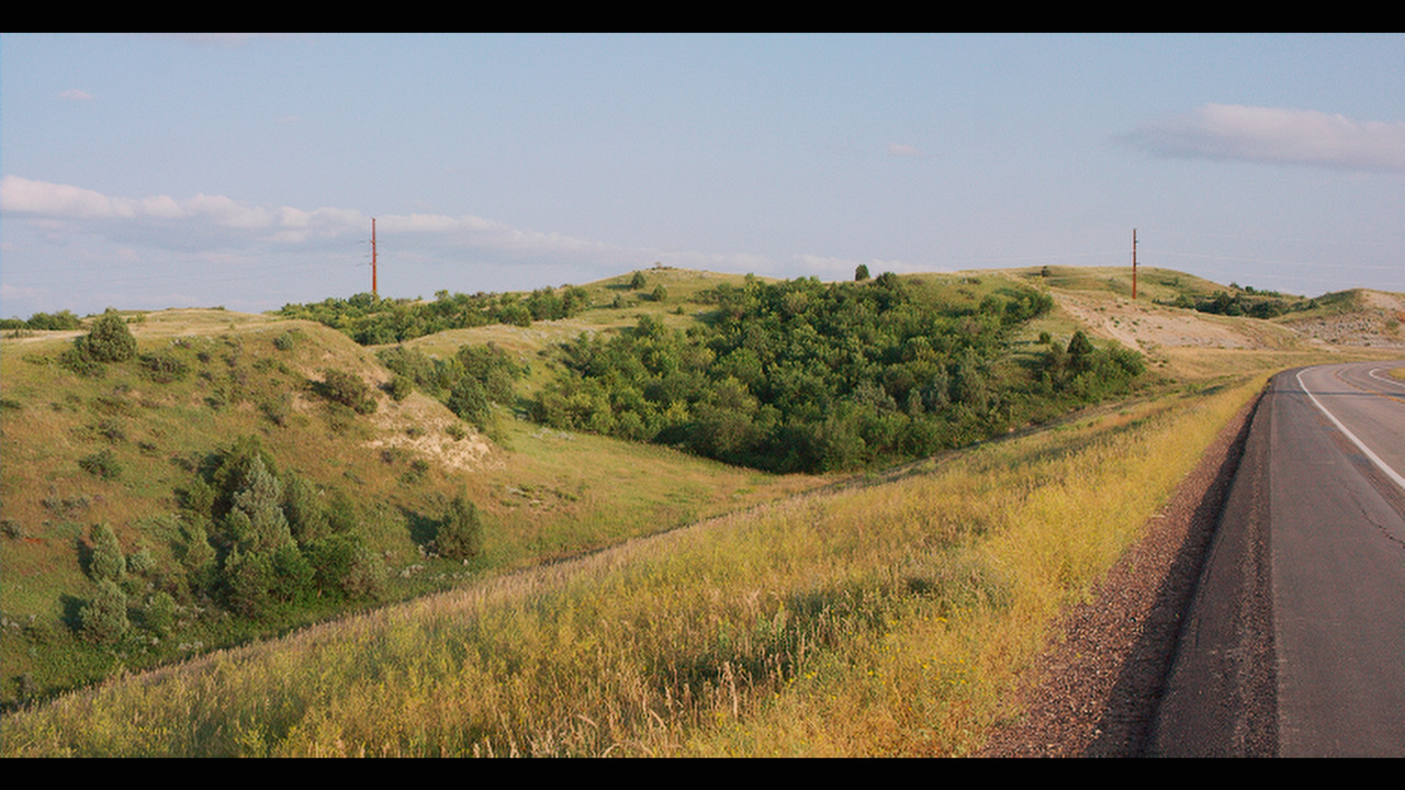
Shot 4: Exterior Test with Vivitar Series 1 90mm
STH, ISO 1000, 5500K, 0 Tint, Medium/Medium IPP2 Settings for LI

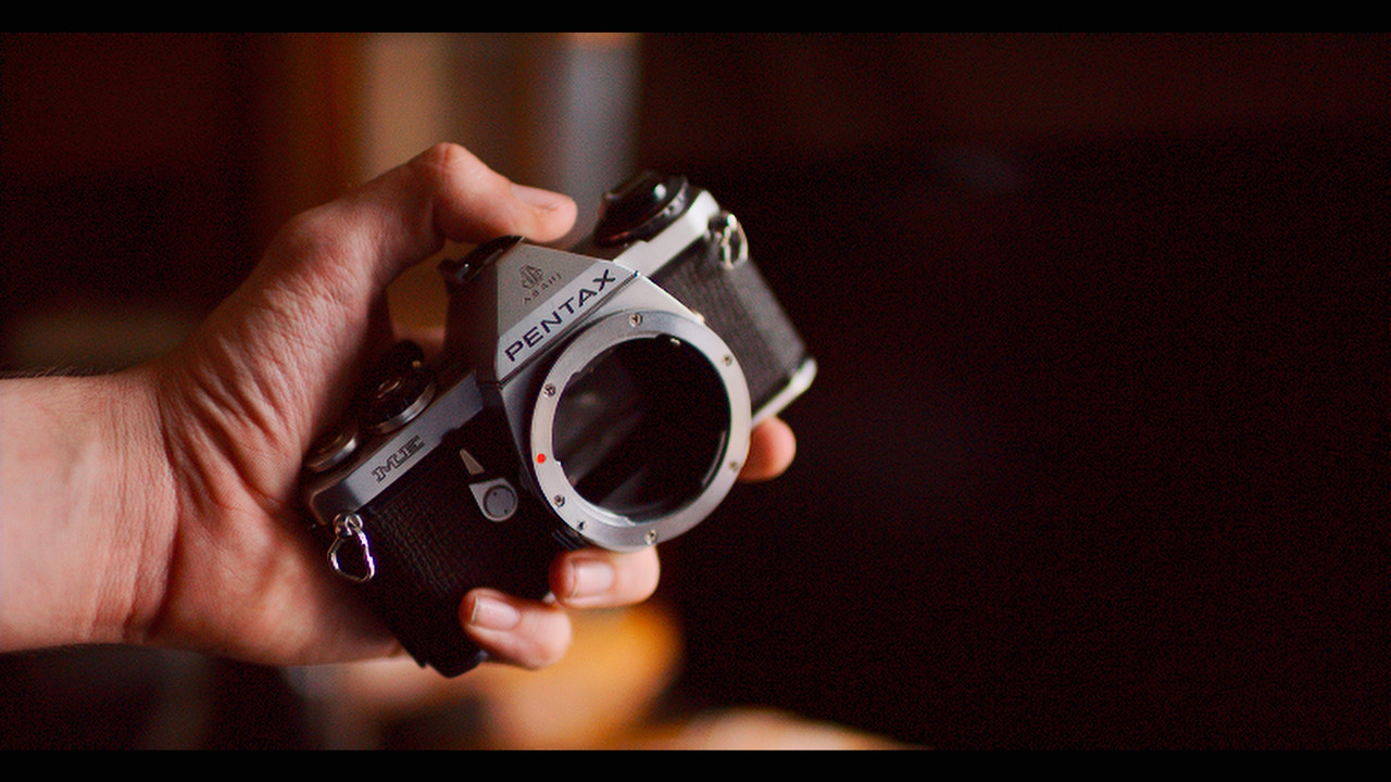
Shot 5: Interior Test with Zeiss CP2 35mm Super Speed
STH, ISO 1000, 5000K, 0 Tint, Low/Medium IPP2 Settings for LI

Shot 6: Exterior Frame Grab with Zeiss CP2 35mm Super Speed
STH, ISO 640, 5412K, 1.640 Tint, Medium/Medium IPP2 Settings for LI

Shot 7: Interior Lighting Test with Zeiss CP2 35mm Super Speed
STH, ISO 1000, 3300K, 0 Tint, Low/Hard IPP2 Settings for LI

Test Shots are just different things I had on my portable drive due to being on vacation right now.
I'll likely add more in additional posts if I find they showcase it differently than these, some RGB lighting shots could make a good addition if anybody wants to post some.
That being said, I think a lot of it comes down to intent of the shot for which works better. Panavision and Fujifilm clearly both put a lot of work into their color sciences, and got fairly similar results.
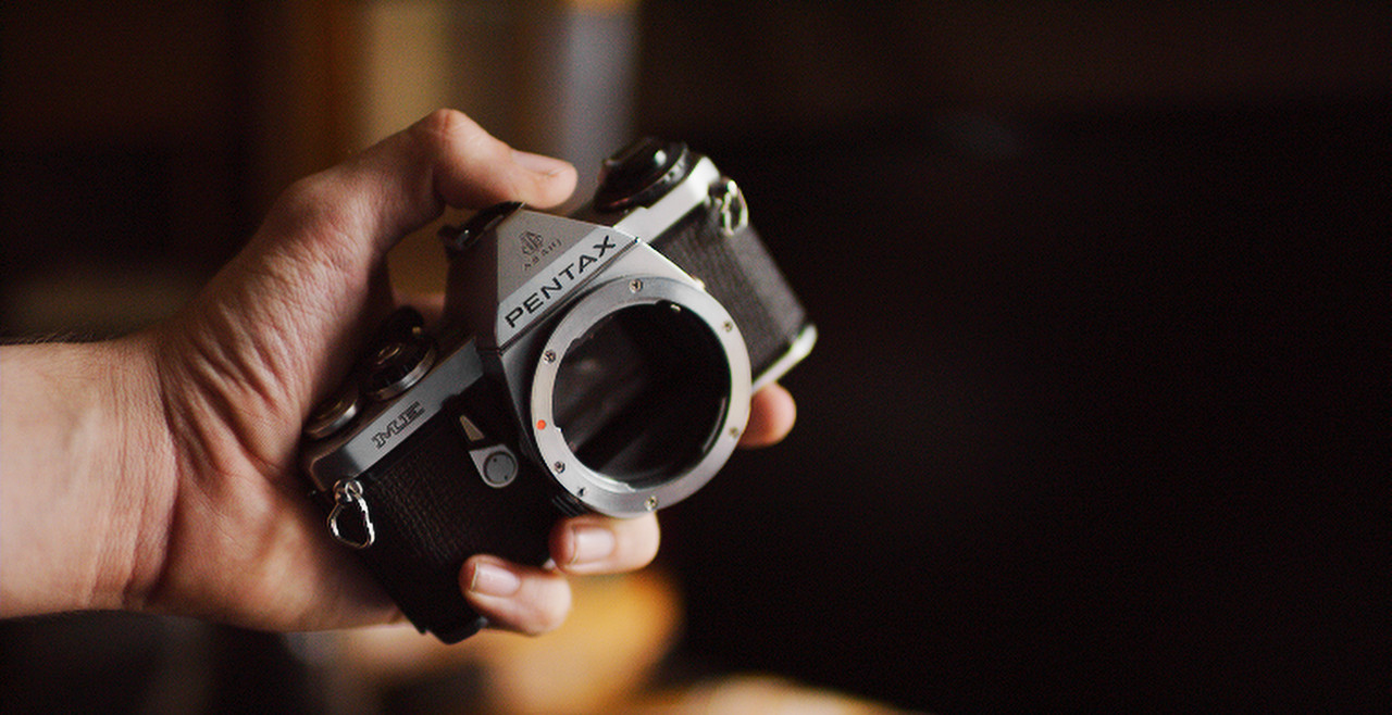
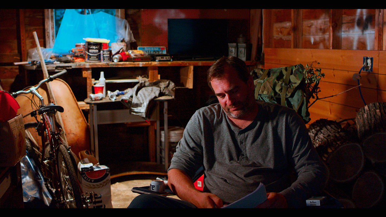
Shot 5 shows this best with everything feeling almost identical between Light Iron, Fuji Eterna, and even to an extent IPP2. The biggest difference seems to be how they handle the blue tone on the silver parts of the camera (in that specific shot).
I'd recommend you try out the LUT on some of your own footage to see if you like it or not, and definitely feel free to post your findings.
It's free and is in .CUBE format: http://www.fujifilm.com/support/digital_cameras/software/lut/
EDIT: For anybody who wants any of the .R3D's to mess around with I just uploaded frame grabs to Google Drive here: https://drive.google.com/open?id=1teMukI4SFe37CBw2OLBPk5Bdf7cao-sI
Another LUT I really like is the IPP2 Light Iron LUT that James Miller shared earlier this year and seemed like a good one to compare this to. And boy was I right, in some of the shots the differences are extremely subtle between the two. The two main differences seem to be with how they render cooler tones and warmer tones. Eterna's cool tones have a level of desaturation compared to Light Iron, and you'll find the biggest differences appear in exterior shots. The warmer tones of the Light Iron LUT shows primarily on skin tones, where they'll feel a bit more orange compared to Eterna.
To get the LUT's to match a little bit more in terms of contrast, I used the following changes in the Tone panel in Lumetri:
- Exposure: 0
- Contrast: 64
- Highlights: 26
- Shadows: -6
- Whites: 23
- Blacks: 0
Shot 5 shows the difference between those changes and what the LUT does by itself.
Shot 1: Exterior Test with Vivitar Series 1 90mm
STH, ISO 800, 5500K, 0 Tint, Medium/Medium IPP2 Settings for LI
Shot 2: Interior Still with Zeiss CP2 35mm Super Speed
STH, ISO 800, 5309K, -7.952 Tint, Medium/Medium IPP2 Settings for LI
Shot 3: Interior Test with Vivitar Series 1 90mm (+ Macro)
STH, ISO 1600, 4500K, 0 Tint, Medium/Hard IPP2 Settings for LI
Shot 4: Exterior Test with Vivitar Series 1 90mm
STH, ISO 1000, 5500K, 0 Tint, Medium/Medium IPP2 Settings for LI
Shot 5: Interior Test with Zeiss CP2 35mm Super Speed
STH, ISO 1000, 5000K, 0 Tint, Low/Medium IPP2 Settings for LI
Shot 6: Exterior Frame Grab with Zeiss CP2 35mm Super Speed
STH, ISO 640, 5412K, 1.640 Tint, Medium/Medium IPP2 Settings for LI
Shot 7: Interior Lighting Test with Zeiss CP2 35mm Super Speed
STH, ISO 1000, 3300K, 0 Tint, Low/Hard IPP2 Settings for LI
Test Shots are just different things I had on my portable drive due to being on vacation right now.
I'll likely add more in additional posts if I find they showcase it differently than these, some RGB lighting shots could make a good addition if anybody wants to post some.
That being said, I think a lot of it comes down to intent of the shot for which works better. Panavision and Fujifilm clearly both put a lot of work into their color sciences, and got fairly similar results.
Shot 5 shows this best with everything feeling almost identical between Light Iron, Fuji Eterna, and even to an extent IPP2. The biggest difference seems to be how they handle the blue tone on the silver parts of the camera (in that specific shot).
I'd recommend you try out the LUT on some of your own footage to see if you like it or not, and definitely feel free to post your findings.
It's free and is in .CUBE format: http://www.fujifilm.com/support/digital_cameras/software/lut/
EDIT: For anybody who wants any of the .R3D's to mess around with I just uploaded frame grabs to Google Drive here: https://drive.google.com/open?id=1teMukI4SFe37CBw2OLBPk5Bdf7cao-sI
Last edited: