Hans von Sonntag
Well-known member
Hi,
in another thread we had a discussion about Red's colour sciences, film, green casts, Alexa etc....
Ok. Since I was not too overwhelmed by the noise floor and sensitivity when I got my Epic back dragonised I checked the new colour science. I was positively surprised and must say that Red got a lot right. With the extra DR, 5KHD being 3-perf S-35 with a meaningful 2.5 factor to 1080p and the new colour science the upgrade is a big leap forward. A no-brainer for Epic owners.
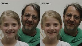
Ok. To share my findings I shot a picture that shows the porcelain skin tones of a 10 year old blond kid and the tanned skin of a grumpy old filmmaking daddy. The lens is a 16-42 Optimo @ T8. Setting was DragonColour and RedColour3, Gamma RedLogFilm. For viewing reasons (we don't talk DR here) I added a friendly S-Curve and adjusted the saturation to my personal liking. The exposure was more on the thin side, camera set to ISO 800, so was RedCineX. The light source was a cloudy sky, no sunlight or blue sky involved. The surrounding environment is a white backyard, no WB applied, Kelvin set to 5600.
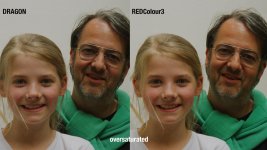
The second picture shows the same content but with an exaggerated saturation to make the differences more obvious. The nuances are subtle and hardly visible on a normal laptop. However, in a postproduction suite they are obvious, to say the least.
My findings:
The overall colour rendition of DragonColour is subjectively more pleasing to all the folks in my company I showed the pictures, including my self. As one can see, the saturation appears slightly less compared to RedColour3 but mainly in the red/orange/yellow realm, green seems to be a tad warmer, albeit keeping just about the saturation level. The skin tones in Dragon Colour are more subtle, less "carrot-ish" leaving more room to all the colour nuances mankind has in hers/his skin tones.
Lowering in RedColour3 the saturation about 1 or 2 percent does not lead to the same appearance of what DragonColour is doing. There is much more to it than just saturation level or an over-all decrease of warmth.
The whole thing is a gourmet topic. One can state that talking about such nuances is crazy stuff for crazy people. But then the differences are there and they matter, at least to me.
Hans
http://www.reduser.net/forum/attachment.php?attachmentid=52708&stc=1&d=1400690312
http://www.reduser.net/forum/attachment.php?attachmentid=52709&stc=1&d=1400690365