Welcome to our community

Be a part of something great, join today!

  • Hey all, just changed over the backend after 15 years I figured time to give it a bit of an update, its probably gonna be a bit weird for most of you and i am sure there is a few bugs to work out but it should kinda work the same as before... hopefully :)

Ask David Mullen ANYTHING

I don't think it matters so much for a talking head interview, but as to whether you get better skin tones in tungsten light versus other sources, it depends on the other sources. Tungsten is pretty bullet-proof but a good daylight source works fine.
 
Here is the Vimeo link to a rough camera test I shot last night. I didn't keep the first one I made for some reason so I did a quick and dirty one so you can see how it looks. This test is basic in every way and is the worst it could possibly look. Shot in 720P with an EX1 in low light and because of the snow thats hanging around here, I couldn't get the projector back far enough to fill the glass. I shot it through some light diffusion with a 3,000 lumen LCD with a bad panel so it has a purple hue. I am not happy with the lightning sequence and timing but one can adjust that to taste any way you want, including colour of the lightning.

https://vimeo.com/64531949

Thank you Larry. I'm sure I can make this setup work within my own shot. It looks convincing enough for the short amount of screentime it is given.
 
There are basically two 35mm release print formats used today, both 4-perf with the area on the left side of the print used for the soundtrack. They are called "flat" and "scope". You can also call them "matted widescreen" (usually masked by the projector to 1.85) and "anamorphic widescreen" (the image has a 2X horizontal squeeze and the projector gate/mask is 1.20 : 1, and an anamorphic projector lens stretches this out to 2.40 : 1 on the screen).

So if you shoot in 35mm spherical and compose for cropping to 2.40, that area off of the negative will have to be converted in post to 4-perf 35mm anamorphic.

In pre-D.I. days, you would use an optical printer. Most common approach would be to make a color-timed contact printed interpositive off of the Super-35 negative after answer printing was done. The positive would be loaded into the optical printer and a 2.40 area off of the image would be extracted and squeezed horizontally by 2X with an anamorphic lens on the optical printer, recording the image to a dupe negative, which would get contact printed for scope release prints.

With a D.I. you just have to crop the digital master to 2.40 and use a laser recorder to transfer this to 4-perf 35mm, the recorder doing the squeeze by essentially recording every horizontal pixel row twice so that the image fills a 1.20 area.

Digital projection uses spherical lenses so the DCP file is just 2.40 : 1.
 
Okay - So in Silver Linings:

"35 mm (anamorphic) (Kodak Vision 2383)
D-Cinema"

The film prints need a 2x projector lens, but D Cinema doesn't?

This has no bearing on the lenses used to film it? Are any or all of these anamorphic?

"Arricam LT, Zeiss Master Prime and Angenieux Optimo Lenses
Arricam ST, Zeiss Master Prime and Angenieux Optimo Lenses"

Those are spherical lenses. Unless you plan on doing a photochemical post and contact print each generation, you don't have to shoot with anamorphic lenses to end up with an anamorphic release print. It's easy when doing a digital intermediate to crop a spherical image to 2.40 and record that to 35mm film with an anamorphic squeeze.

Digital Cinema projection uses spherical projector lenses; a 2.40 release is already 2.40, not 1.2 with a 2X squeeze. If you had shot with 2X anamorphic lenses, the squeeze is just taken out of the digital image.

Vision 2383 is a print stock.
 
Hey David, I have a question about light levels when shooting night/dark. I was recently talking to the director of a project I shot a few months ago and he was talking about how dark I had lit a night scene. His issue wasn't that it didn't look good in the grading suite, it was that the project is going to be shown on consumer TV's/projectors/the web and those all crush the image way down. Because I had lit things so dark, there wasn't a ton of info to bring it up without the image falling apart. So I was wondering how you approach night shots in terms of level? I am afraid to light things too bright simply because I don't know exactly how they can be pushed down some in the grading suite, but I am thinking that more can be done to darken it in a controlled fashion.
 
Well, it's easy to bring things up or down a little in post and obviously if you exposed more fully, you'd have more shadow detail information to work with, but less overexposure information. When shooting film, this is less of an issue because film negative has such tremendous overexposure latitude so it never hurt to err on the side of more exposure. On the other hand, with digital, you do get more noise as you lift up an underexposed image but generally it's less bad than when lifting underexposed film and seeing more grain.

As for the fact that very dark images don't play well on a TV set or computer monitor in a room with general illumination, that's true -- very dim images play better in a dark theater where the screen image is the brightest (and largest) thing in the room. So if you are shooting for release on TV and the internet, it probably would be a good idea to not time something too dark.

I tend to be conservative with exposing night scenes, though I admire DP's who push things more to the edge. It's just that attitudes may change by the time you get to final correction in terms of how dark to play a scene.

A common scenario I run into is that on the set, the director complains that the lighting is too bright, partly because the light levels look bright to his eyes. So you fudge things a bit maybe and push the light levels lower than you feel comfortable with, but you make the director happy. And then in the final color correction, he now complains that the image is too dark to see the actors' expressions clearly and when you try to lighten everything, there is noise, grain, and/or a lack of detail.

So all I can do is tell the director on the set that I need to give the image enough exposure to work with it in post. Maybe I'll crank down the brightness of the monitor to make him happier, or maybe switch the digital camera to a lower ISO setting so that the recorded image is darker-looking but it is also less noisy, giving me a little more flexibility in post.

Now you can overdo it, overlight & overexpose things so much that darkening them in post doesn't help much because your key-to-fill ratios are all wrong and by the time you make things look dark enough in post, it also looks artificially crushed. So there is a happy balance somewhere in there. I tend to light and expose for how the scene should look but lean in the direction of giving the recording a bit more information.
 
Hey David, I have a question about Double Fog filters. I've been reading up all your posts on filtration, and I'm really interested in the 70's and 80's use of Double Fogs. I'm intrigued by their combo of "Low Con" and a light "Fog". What strengths would you recommend for a light, subtle look? For example, to match what they did on E.T.

In the end, does Double Fog look that different from say Smoque? Does Double Fog bring something unique/new to the table?

Lastly...I saw JAWS on HBO last night, and I noticed right away that they seemed to be using Low-Con filters (they really were popular back then huh?). I did a search on the internet, and of course found a post from you talking about it!

Thx again.
 
Smoque creates more of a hazy effect, there is less halation concentrated right around the source, it's more spread out, and Smoque doesn't impact sharpness much. But the effect tends to disappear when something temporarily blocks the light source in the frame.

Double Fog is more like a Regular Fog, you get the blue-ish glow right around light sources. It's just a bit less soft than Fogs, but a bit milkier.

I would use the lightest grade, a #1/8 Double Fog, maybe a #1/4 at the heaviest. I just used an old #1/4 Regular Fog for a flashback scene and though that would have been considered very subtle by 1970's standards, it was fairly obvious to me (strange thing is that "Star Trek IV: The Voyage Home" was mostly shot with a #1/2 Fog and it doesn't look that heavy.)

The older design of the Fogs (and maybe the Double Fogs and Low Cons) is that the dispersion of mist particles in the laminate doesn't have enough clear spaces between particles to allow a sharp image to pass through... so depending on the amount of halation in the shot, there can be some loss of sharpness compared to a ProMist for example. But if you use a #1/8 Double Fog, it shouldn't matter because the filter is so light to begin with.

Thanks David!
 
Hi David (or anyone who might feel inclined to reply!)!!!

I`m currently on the prep for a short film that will be shot in june and there are a few moments on the script that requires the mixing of two different color temperatures as the main character (a 10 year old boy) must be in a dark room where the only light is juts a ambiente blue light, and the he turns on a pratical. Whe he does that, his face needs to be lit with a warm light but the blue ambiance needs to stay present. This is because in the script, the color blue is related to his fear of being alone.

I was doing a small test to see how I would aprocah this scene, but I couldn`t get the results I was hoping for.

I created the blue ambiance by bouncing a 2K fresenel with a full CTB on the celling, and then I tried to simulate the pratical light with a tungsten softbox + full CTO

When I had each one of the diferent lights turned on separatly, the result I got was satisfatory, but when I turned the on at the same time, the result was poor.

The main problem is that everything became too bright, and the mixing of the two color tempearatures actually gave me a white light on the walls.

here you can vizualize the results:

http://www.flickr.com/photos/rodrigoprata/8756141206/in/photostream

http://www.flickr.com/photos/rodrigoprata/8755020289/in/photostream

http://www.flickr.com/photos/rodrigoprata/8755021279/in/photostream


If you (or any one) would like to vew the original files, here are the R3Ds:

http://we.tl/0X5uZ6eihR

I shot with a low ISO to get a cleaner dark image, but I was carefull not to clip raw.


Do you have any sugestion on how to mix better the two different color temperatures? I discarted the possibility of lowering the blue light level, because there is a particular moment, when the only light is the blue ambiance, and this moment is somehow long, and we need to be able to see the action properly.

Thanks very much for your attention and your help! I have learned so much in this thread!!!
 
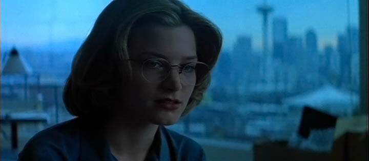
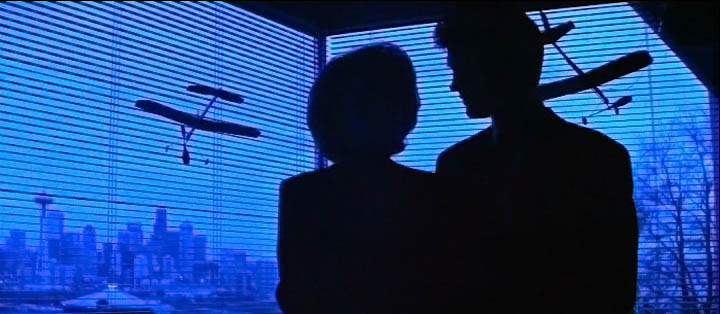
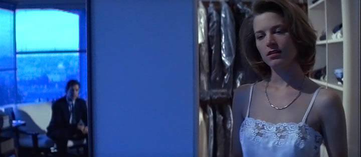
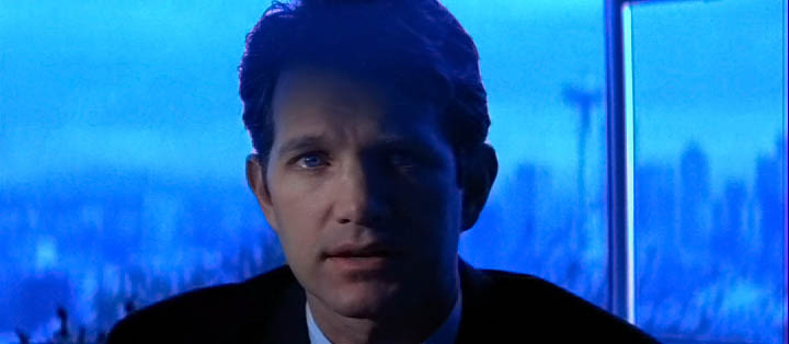
Here's a similar situation in "Northfork", I had a blue dusk effect in the room but a tungsten practical next to the bed:
northfork32.jpg


I'd say that it would help to design the shot so that most of the soft blue light is a backlight so that the tungsten isn't just covering the same places that the blue is lighting. Also I'd make the tungsten even dimmer so there is just a hint of warmth from it in the room if you want the blue to stay dominant. I'd also get the actor away from the white wall (which is another problem, white walls pick up all the light in the room) so that at least you can flag the tungsten light off of the the white.
nice shot David can you tell how you got the bluish dusk effect here? What units if any are outside the window or elsewhere and what color temp was the camera/film stock?
 
Just returned from the David's ASC Breakfast event. It was a real treat hearing some insight to his process, technique, and journey.

After finishing up what I would describe as heroic run on Smash, I'm really looking forward to what David captures next.

Thanks again for contributing here and abroad David.
 
nice shot David can you tell how you got the bluish dusk effect here? What units if any are outside the window or elsewhere and what color temp was the camera/film stock?


This was shot during the daytime -- I basically put some 12'x12' black solids outside the windows to darken the view but angled back so that soft daylight leaked over the top and down onto the blinds. Then in the room above the windows I hung a row of daylight Kinos. The scene was shot on 3200K film stock uncorrected, so basically as if I had Full Blue on tungsten lamps. I had to time it a bit bluer in post which is why the tungsten practical lamp is not warm, just white. Today I probably would have added half blue to the daylight fixtures to get that blue and a half twilight look... but that would have made it harder to use the trick of letting the real daylight just leak into the room unless I gelled the windows too.

I find that today with digital cameras like the Alexa and Epic, I have to use bluer lights when I want that deep blue look than with film where an uncorrected HMI was enough for a strongish blue effect. In other words, whereas I used to make moonlight effect lighting half-blue on something shot on film, today I use full-blue for the same effect.
 
You should take a look at the "blue" sections of "Little Buddha", shot by Vittorio Storaro, for a good example of how to make a visual statement with blue (also look at the movie "Blue" of course).

Here is a late afternoon, dusky scene, probably shot with no gels on the windows, just uncorrected daylight, with the light on the face just slightly warmer than the background:
littlebuddha4.jpg


Then there is a twilight scene, probably with blue gel on the window to strengthen the effect even more (though since this scene has no interior lights on, the extra blueness could have been done through printing or with a camera filter instead of gel on the windows):
littlebuddha5.jpg


The actors move into another room with some tungsten practicals on and probably blue-gelled windows, so you get the combination of the deep blue background with the pale white light on the faces:
littlebuddha6.jpg


littlebuddha7.jpg
 
You see Storaro use a similar approach in the Japanese occupation sequence in "The Last Emperor":
lastemperor4.jpg


So the blue visual statement is conveyed with the large flat blue patch created by the windows, then in contrast is a white light on the faces.

Same in "Tucker":
tucker8.jpg


tucker9.jpg
 
Just returned from the David's ASC Breakfast event. It was a real treat hearing some insight to his process, technique, and journey.

After finishing up what I would describe as heroic run on Smash, I'm really looking forward to what David captures next.

Thanks again for contributing here and abroad David.

I wanted to go to this so bad, unfortunately something came up that I couldn't miss.

David , are you planning on attending Cinegear. I would love to get a chane to meet you in person?
 
Back
Top