Welcome to our community

Be a part of something great, join today!

  • Hey all, just changed over the backend after 15 years I figured time to give it a bit of an update, its probably gonna be a bit weird for most of you and i am sure there is a few bugs to work out but it should kinda work the same as before... hopefully :)

What Charts is Shane Hurlbut Using?

Nick Morrison

Well-known member
Joined
Nov 9, 2011
Messages
9,141
Reaction score
50
Points
48
Location
Brooklyn
Website
www.smallgiant.tv
Anyone know what charts Shane is using in this camera test below?

https://www.youtube.com/watch?v=yxBxopihaiA

These look ideal for what my team needs, and am having a hard time finding them on B&H, etc.

If anyone has any specifics as to who makes these, would greatly appreciate it!!

thanks
 
Just to add a note. Each side is reversable. One color side and one grayscale side.

Ha! Ive been using this chart for months and never knew it was reversible.

Thanks.

BTW- it has a built in 1/4 20 thread (male on one side fm on the other) to make it easy to mount on a tripod or stand. Its a great color chart for a small kit. I use it with my still camera and LR to create profiles. It folds and has a hard outer cover, and easily fits in a small bag.
 
I think the ColorChecker Video is a better chart for post than the Passport, simply because it's bigger:

CCV_M2.jpg


I would also recommend pulling the actor completely out of the frame and shoot the chart full on if possible. In truth, the XRite charts are not as accurate as the DSC Charts, particularly for saturation. They're close for hue, though.

The DSC One-Shot (which was based on some suggestions by Art Adams) is pretty darned good:

R-DSC-34986.1.jpg


I believe there are going to be more choices for on-set camera color charts introduced at NAB.
 
i like the one shot glossy. Glossy black is important so you know you are capturing the right saturation and exposure. not halations.
 
For what it's worth I use typically these:
- Passport ColorChecker (both classic and Video Variants and the full size chart, almost always have one on me)
- Datacolor SpyderCheckr (often in my kit)
- DSC Labs Chromamatch (new to my family of charts, but important to have for matching)

You can see the top couple in the tests I've done in the last few years.

And of course, I still have the class Macbeth Style charts around.
 
BTW- it has a built in 1/4 20 thread (male on one side fm on the other) to make it easy to mount on a tripod or stand. Its a great color chart for a small kit. I use it with my still camera and LR to create profiles. It folds and has a hard outer cover, and easily fits in a small bag.
There is a nice accessory that you can mount to the top 1/4 20 that will give you a reference black and chrome ball for specular highlights called the Spyder Cube. You can see it in some of the test images that Phil has posted.

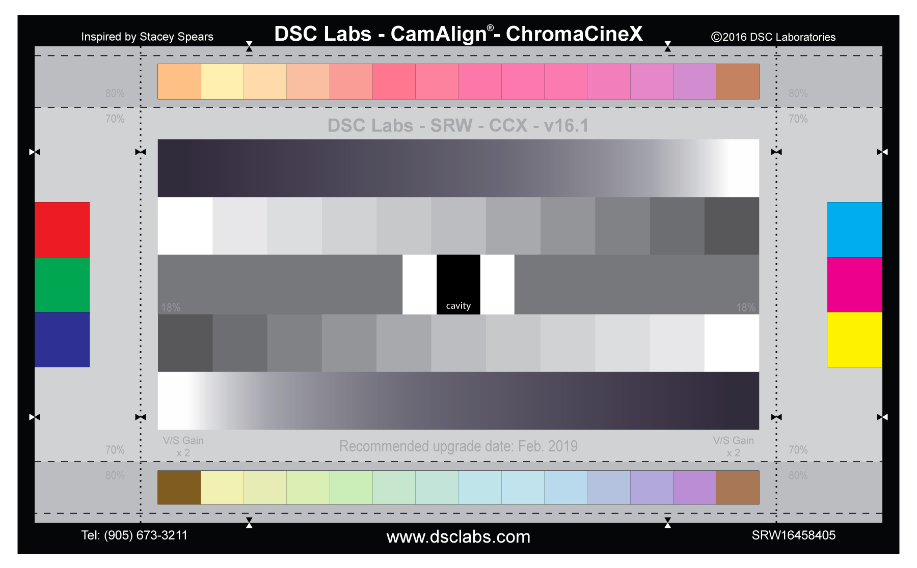
And if we are going to talk about cool charts, I like the DSC Labs ChromaCineX that I helped create. :) (Shameless plug)
SRW84-ChromaCineX-v16.1-HighRes.jpg


The colors on the to and bottom form a hexagon on a vectorscope. The steps and ramps for an X on a wave form monitor. There is a nice 18% gray down the middle for white balance. The center is a hole with the black velvet box for a reference black. Six wide gamut (As wide as they can print) patches on the sides. Working on an underwater version now.
 
biggest problem with DSC is that they don't provide the XYZ/Lab ref targets of the patches... I've contacted them directly and they don't wanna release them to the public... doesn't make any sense... various of their charts feature a variety of skin tone patches... I guess u just ballpark with your feet where that goes on the vector scope... ;-))))

but hey, that's how most RED productions are graded anyways ;-)))))

now in professional application, you gotta do your own assessment of those targets anyways, as those ref values are somewhat suspect anyways as charts drift and the print accuracy (unit variation) is what it is, but for faster productions that bought brand new charts at the start of the production, those ref values are often usable (within the degree that one sets the bar of quality)...

Datacolor values are available. As they should be.

Stacey's chart is cool, easy to align on the usual scopes... IF... the chart is still (or ever was) accurate...
 
biggest problem with DSC is that they don't provide the XYZ/Lab ref targets of the patches... I've contacted them directly and they don't wanna release them to the public... doesn't make any sense... various of their charts feature a variety of skin tone patches... I guess u just ballpark with your feet where that goes on the vector scope... ;-))))
I think the charts are only made for Rec709. Everything else you're gonna have to guess.

I'm fine with the ChromaDuMonde chart for normal Rec709 jobs. It would theoretically be possible to figure out a DCTL equivalent that would solve the P3 or LAB issue, but it'd take some pretty serious color science to work it out.

the color science is not the problem, the problem is not knowing the exact starting point, as it will throw everything off...

point is though that it makes ZERO sense to release color ref charts when the targets are unknown... especially at those rip-off prices... good thing is, there are plenty of alternatives
 
Back
Top