Welcome to our community

Be a part of something great, join today!

  • Hey all, just changed over the backend after 15 years I figured time to give it a bit of an update, its probably gonna be a bit weird for most of you and i am sure there is a few bugs to work out but it should kinda work the same as before... hopefully :)

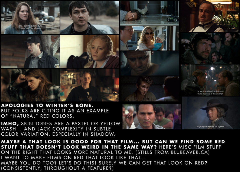
RED - examples of natural, "filmic" color?

The same people that have argued that 35mm film has true 4k also argue that Alexa is great is soft like film. At the same time, I've heard the same people argue that 2k from Alexa is plenty.

Technical correctness and personal taste are not necessarily the same thing.
 
Last season's episodes of Burn Notice (that is, the ones shot in 2010) were shot on Sony PDW-F800 XDCam. All seasons prior to that were on S16 film.

Having worked a bit with that show in the first 2 seasons, I would say that it still maintains many elements of the look that was developed for it by Roy Wagner in the first season - very saturated, very warm (some would say very red), "enhanced" reality. This was toned down a bit in later seasons that were shot by Bill Wages, but a lot of those elements remain. It has never been about a "realistic" look, but it is, well, somewhat unique. The story I got about Red on that show is that it was going to go to Alexa, but Jeffrey Donovan (star and a producer) directed the "prequel" movie about Bruce Campbell's character in Colombia that was shot on Red, liked it, and suggested it. They also hired Denny Hall as DP, who worked on "The Cleaner" and "Franklin and Bash," so there was likely some familiarity there.

Thanks for the info. Definitely agree with it having a very rich saturated color look to it. Good example of how the post production has more to do with the overall look than the camera choice. Be interesting to compare how the move to a 35mm format affects their general composition and depth of field style compared with the smaller formats.

If Scarlet can produce footage of equal or better quality to the F800 I will be a very happy camper. That class of camera has always been a bit out of reach financially but it is what I have longed for.
 
Thanks for the info. Definitely agree with it having a very rich saturated color look to it. Good example of how the post production has more to do with the overall look than the camera choice. Be interesting to compare how the move to a 35mm format affects their general composition and depth of field style compared with the smaller formats..

I wouldn't necessarily say that post production had that much to do with it. I would say that production did, particularly production design, lighting, wardrobe, and stylistic choices. Those elements were all established by Roy and the production designer right at the beginning, starting with the pilot. They've been largely maintained over the years, but the show's look was never a creation of post production. It was created by the production team.
 
To answer the original question there are lots of images here http://www.motionfx.gr/client-work.html from movies that went to film...

On every movie there are tech specs, search for REDONE (most of them they are) there is also a film shoot sample (not extensive though).

Use Chrome to browse there might be some problems with other browsers... not always though.
 
Code:
The most naturalistic color in a major Red production? Winter's Bone.

Beautiful skin tones, striking landscapes and neutral tonality--seeing it printed and projected, I didn't even know the origination format was Red. Others might say it was desaturated, but the DP has expressly stated otherwise.Down in the hollers and valleys of the Appalichian region, muted light looks just like Winter's Bone.

And that was Red MX.

What he said.

Check out Winter's Bone if you haven't done so already. "Natural" colors and skin tones.
 
saw it on bluray and looks bad..not even sharp as DSLR

Definitely disagree. Saw it in the theater. It has a very smooth organic film look to it, but it is not soft. The color is very natural and characteristic of winter light in the mountains here. Haven't been very impressed by much of anything from a DSLR, but then I'm not that interested in extreme shallow dof.
 
Definitely disagree. Saw it in the theatre. It has a very smooth organic film look to it, but it is not soft. Haven't been very impressed by anything from a DSLR.

bluray bitrate is 18.03 Mbps which is way too low for bluray!
you can check screenshot from here http://www.cinemasquid.com/blu-ray/...ers-bone/89a62d1b-3b67-4976-989f-317a36094997
this doesnt look like framegrab from 4.5K camera --> http://media.cinemasquid.com/blu-ray/titles/winters-bone/15711/screenshot-lrg-12.png
 
Don't have much to add here except THANK YOU so much for the fascinating discussion! And sorry for not being concise.

M Most - "Conventionally beautiful images (think Conrad Hall here, or Gordon Willis, or Caleb Deschanel, or Vittorio Storaro, for starters)"
Julio - "He's not necessarily trying to make the RED look like film. He's asking for specific examples of RED movies with NATURAL color reproduction, as in, replicating what we see with our eyes."

...sums up what I meant!

I obviously need to check out "Undercovers", "Rizzoli and Isles", "Insecurity", "Detective Dee and the Mystery of the Phantom Flame", "Splinterheads", "Leaves of Green"

"Winter's Bone" - I saw the trailer not knowing it was RED and halfway through I said "RED colors". The colors were actually what made me not want to see the film - "not another movie with those RED colors" was my reaction... Again, need to watch the movie on BluRay.

"Certified Copy" - in the trailer at least, it looks like the skin tones do not have subtle color details, sorry. Will try to get the film on BluRay.

"Social Network" - it was my favorite film of the year. And looks great BUT not the natural colors I want, sorry. I think that filming on RED and going with the "RED look" perfectly fit the themes of the film.

What I like about film is that it can have quite a strong color cast... yet somehow magically the subtle shades and colorations of the face "shine through" in a natural fashion...

I would like to achieve something similar with RED.

EG like looking through tinted glasses in real life - the color tint gets absorbed into your mind and becomes an overall mood... but I can still see natural, subtle tones. Even if I was watching a heavily green-colored film, you get the feeling that if something really red comes into the frame, you could tell it is red.

Whereas with digital - and especially RED features for some reason - it feels like it has been through some sort of process where colors are just lost or merge into one and subtle hue / saturation changes across a face get lost. Want to avoid that.

RED_colors_1.jpg


Bruce Allen
www.boacinema.com
 
Lower noise on Epic - yes. Better colours no. Colorimetry is the same for M-X and Epic using the same chip. Sitting in the audience means you're watching the result of the entire process from lens through to screen. Sitting looking at the set, the R3D files and the finished production like Deanan and myself do gives us a better perspective. Most of what you see on screen (in terms of colour) is dictated by factors other than camera choice.

Graeme

Sure, but...

I have over the last month shot both tests and practical side by side shots with R1 mx and Epic, and to say that they look the same, is an exaggeration.

In a controlled studio situation, they look more like eachother, but I dunno which factors contribute the most

Higher bit-depth, lesser compression (even though that seems to bevthe least factor, as that is something I can controll for), more computing overhead, AD, OLPF... Simply don't know, but even with same length masters on both, they do look very different and behave very differently in grading.

Which is good, expected, wanted and why we all wantnour Epics...

It is not a big equalizer just to set them with same gamma/color in post.

That said.
R1 M, is still a wonderfull camera, even with tye initial colorscience.
Was just a bit harder to understand, but still very good.
And the images were/are very gradeable.

.
 
Winter's Bone on Blu-ray is not a good advertisement for Red. (I'll have to take people's word that it looked good in the theater.)
 
Hmm, first I'm a huge fan of Red. I love the philosophy of the company and the huge step in digital cinematography it has made possible. That being said, I agree on the sentiment coming forward in this thread. My eyes has some resentment to the look from the camera. Last time I visited a rental shop, I overheard a conversation about the digital cinema cameras - and one of DP's uttered that the Alexa had a much "prettier" image - I think everyone in the room agreed, even though most of us were Red-campers, including the DP.

In the beginning it was all about creating a true digital cinema camera. Now - we have come to the time of sentiments and nuances in 4K images. I guess this shows how far RED has brought the art of digital cinematography.

BTW:
I LOVE the look of the images in this thread: http://reduser.net/forum/showthread.php?63432-EPIC-RESOLTUION&highlight=sharpness

Which brings things back to photography, lighting and practical color-knowledge, where it is all really at.

I don't deny, though- that some cameras give you more for free than others.
 
Code:
The most naturalistic color in a major Red production? Winter's Bone.

Beautiful skin tones, striking landscapes and neutral tonality--seeing it printed and projected, I didn't even know the origination format was Red. Others might say it was desaturated, but the DP has expressly stated otherwise.Down in the hollers and valleys of the Appalichian region, muted light looks just like Winter's Bone.

And that was Red MX.

Just a small correction to this, Michael McDonough shot Winter's Bone on Red M not MX. His first MX shoot was Vera Farmiga's Higher Ground.
 
Remember the 1980's when digital signal processing became common place in recording studios and every album had crazy over-the-top reverb and effects?

It seems to me we are going through the same in regards to moving pictures. Everyone has access to equipment that can manipulate imagery and thus it is being over-used.

Personally I think the best looking films were shot in the 1980's.....skintones looked great back then

477_9_large.jpg

477_7_large.jpg
1465_8_large.jpg
 
what scenes of Super 8 were shot on the RED? very curious here.
 
Alexa, if it looks "filmic" at all is due to the soft contrast filter it has built in (and adds to the softness), and the blue badge that says "Arri". When you do a blind test, or even a good, well controlled test RED doesn't look less filmic - it just doesn't look out-of-focus on the big screen. The REDs are a very neutral canvas to work with. I don't really think a camera should be anything but a neutral canvas to work from either...

Graeme

Sorry if this has been covered as I rarely post here. I've shot spots on 35mm for the last 11 years. An agency forced me to use a Red last year against my will. I enjoyed it and switched to digital mostly using the Red M-X (Anyone want to buy my ARRI 235?). That being said, I've done my own tests between the ALexa and Red M-X (Not Epic since it wasn't out) and put it in my DaVinci. In a nutshell, I get a much cleaner, smoother, "Sexier" result from the Alexa (Blacks were richer, colors thicker and more true). That being said I kept shooting Red M-X. I have since purchased an Epic-M last June and have shot spots with it all summer. I haven't had a chance to A/B it to Alexa yet like I did the Red-MX. But when agency people ask me if I like the Alexa over my Epic, I have to tread lightly because I still think the Alexa looks like celluloid out of the gate far more than the Epic. I say, "Alexa looks like film, Red looks like Red". I really love my Epic and plan to use it all the time, but secretly I want it to look more like the Alexa. I've recently in DaVini Resolve 8 have used it's new advanced color curves to create LUTS I call "Alexa Look" and I put them as my first node before I color the rest of the Epic stuff. I know there are a ton of devout followers here and what I am speaking is blasphemy, but at the end of the day, a cam is a tool and I just want an honest discussion. You said, Alexa look is from a soft contrast filter built in. Is that only it? Can I stick a similar filter in the Epic matte box and get my dream of owning an Epic but looking like an Alexa? If so, then I'm happy and I can move on. But if it's something else, I would love to know what that can be to get to that dream point where I can have the Alexa look in an Epic body. I REALLY want to invest more into Red as I believe in the products and direction, but there seems to be a bit of arrogance (too strong?) on the part of Red and followers to deny that the Alexa simply looks closer to film and the Red always looks like a Red. I would love the option to switch between those preferences. I can watch spots on TV and have a hard time nailing all Alexa vs film challenges (like the recent Porsche ads) but you can always spot a RED spot a mile away. I would love to change that. Last thing I want to do is start a ridiculous war, just want to state my peace from a guy who really could almost care less about this camera war, I just want the best tool which is far as I can tell would be an Epic with the look of Alexa. (On another note, colorists all summer have been complaining about the out of control yellows in Epic, not sure what that implies).
 
Well Chris - there's lots of parts to answer your question. The bit you can't easily do in post is the soft/low contrast filter as they have one built in and post filtration never looks the same.

As for the rest - I've measured Alexa colorimetry and found their hues to be pretty true (once they turned the matrix on, before, when it was off, the colours were all over the place), but that's the same with Epic - with the matrix on the hues are true.

Their Log C curve is not the standard cineon curve - it's a lower gamma with less contrast. REDLogFilm meets the spec exactly so it's really easy to use for grading or VFX workflows.

But Log C has no blacks that are black - it's a grading curve, so are you talking about the REC709 output? Indeed that will crush blacks and highlights and give you a contrasty / saturated image on Alexa, but that's not the kind of image you taking into grading... If you want that look on an Epic put a curve that does that on top of REDLogFilm and grade accordingly.

As for colourists - we have a good relationship with some top (and indie too) colourists and take their feedback seriously. There's a number who's fed their feedback into the programme and you're now benefiting from their eyes on the footage and what they see and us observing what they do. So.... If a colourist you know has an issue (any issue) with RED footage, they need to contact me and get me involved. It's no point them complaining otherwise. It could be as simple as an incorrect workflow or setting. Or it could be something wrong with how we're doing things, and in that case we fix it as we've done in the past.

With all our cameras, it's very much a goal to offer a neutral canvas to build upon with a base of accurate colorimetry and neutral tonality. If you're finding we're deviating from the goal we need to know so we can do something about it. On the other hand, you need to realize that's the goal and it could very well be up to you to use luts or otherwise to get the precise look you're going for.

Graeme
 
Back
Top