Welcome to our community

Be a part of something great, join today!

  • Hey all, just changed over the backend after 15 years I figured time to give it a bit of an update, its probably gonna be a bit weird for most of you and i am sure there is a few bugs to work out but it should kinda work the same as before... hopefully :)

RED Dynamic Range & Latitude Above and Below 18% Gray

Phil Holland

Administrator
Staff member
Joined
Apr 19, 2007
Messages
13,390
Reaction score
793
Points
113
Location
Los Angeles
Website
www.phfx.com
By request as this style of graphic is useful to some.


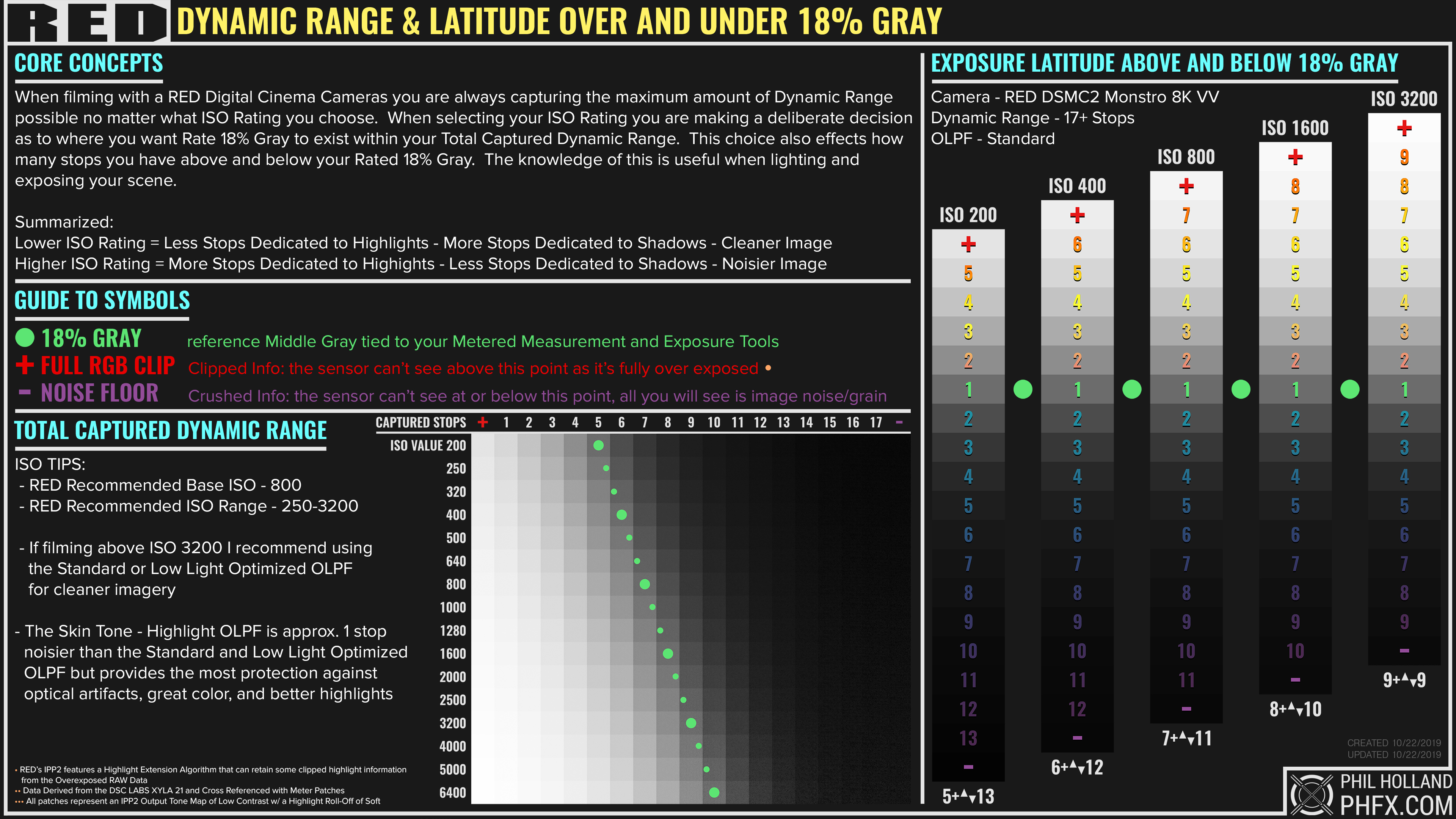
Data derived from the Xyla 21, cross referenced with measured patches and metered.

This chart is focused on DSMC2 Monstro 8K VV, but the general concept applies to the various other cameras and sensor technologies.

The most interesting thing here is this is all where the camera reports clipping, but with IPP2's Highlight Extension Algorithm you do indeed get more usable information beyond that. I mention that in a note, but these patches reflect full RGB Clip as reported by the camera, scopes, etc.
 
Very helpful! But also helpful to remember that dynamic range of luma values is just a piece of the puzzle. If you are shooting color, and you want accurate colors, at a range of exposures, a different setup is needed. I'm not knocking this graphic at all, which is excellent for the question it answers. I'm just pointing out that there's at least one other very important question that is not easily answered by this graphic.
 
Lovely chart, Phil, as always, but shouldn't the middle gray 1 be a 0 on the chart?

As in, middle gray cannot be 1 stop above middle gray.
 
  • Thread starter
  • Moderator
  • #5
Lovely chart, Phil, as always, but shouldn't the middle gray 1 be a 0 on the chart?

As in, middle gray cannot be 1 stop above middle gray.

It is one on the chart just like every other chart of this style out there (Arri's, Canon's, etc), they actually just show gradients generated in Photoshop, but they are counting the stop for sure. 0 makes no sense. That is indeed a captured stop of light. The the broad full ISO spread I've noted 18% Gray by the green blob as that generally shows what and where those stops land.
 
It is one on the chart just like every other chart of this style out there (Arri's, Canon's, etc), they actually just show gradients generated in Photoshop, but they are counting the stop for sure. 0 makes no sense. That is indeed a captured stop of light. The the broad full ISO spread I've noted 18% Gray by the green blob as that generally shows what and where those stops land.
That makes sense and doesn't make sense at the same time. :-P

That's crazy DR, BTW. Holy shit. When Dragon was the new thing, it impressed a lot of people. This is a step up for sure.
 
0 makes no sense.

It would make perfect sense to me, if you want to count 'over' and 'under' stops in relation to that.

This way, the same stop also seems to be counted twice: once going up and once going down. You do say 17 stops but adding your numbers above and below gives us 18. Most charts from other manufacturers that I've seen have the over/under add up to the total amount of stops, like this one adding up to 13.1:

bmpcc4k-iso-chart-02.jpg


I don't think I remember seeing other manufacturers label their stops this way?

As long as everything is clearly labelled, I guess...? But it does leave that slight aftertaste of snake oil, which I'm pretty sure isn't your intention.
 
  • Thread starter
  • Moderator
  • #8
17 stops but adding your numbers above and below gives us 18.

RED states "17+ stops" for Monstro. In my tests I've pretty clearly shown that in triple checked measurement a couple times, 3rd time here publicly.

Where it gets sticky is the various OLPFs and different colored light sources. Some sensors do slightly better at certain color temperatures than others, which hints towards a sensor's native "preferred white balance". Way too deep to go into that here, but it's a subtle thing.

The additional chaos comes in the form of a good feature from the newer IPP2 Pipeline with the Highlight Extension Algorithm. In reference to the charts shown here, though they are shown clipping in camera, none are actually clipping w/ IPP2 due to this new Algorithm and that's fun to check against w/ the older color science. So yes, in effect you could add 1 anyways to all of this. I've noted about the HEA via a bullet point at the bottom of the graphic.

Monstro actually can see 19 stops, but those noisiest stops nobody cares about. They are mostly apparent in motion anyways and people already have a good healthy discussion about what a Usable Stop is. Expanding on that depending on your material, how you grade, etc. that all means different things. Even the concept of 18% Gray gets fuzzy for some depending on the final look or even shooting LUT.

My core hope for a graphic like this is to guide people towards a better understanding of the dynamic range they have access to and how best to use this knowledge towards their exposure methods. This is basically a pretty safe representation actually.

And yes, the BMD PCC4K chart is counting the 18% Gray stop as well. It's just not being visualized this way.
 
  • Thread starter
  • Moderator
  • #10
This is a step up for sure.

Monstro is special for sure. The improvements in the shadows in particular, color response, and color linearity are all very noticeable.

I'm a fairly demanding DP and I sort of know what I want more of from every manufacturer out there. After I get my initial rounds of testing done I always have a list of questions I ask manufacturers really. Whenever RED moves onto the more advanced future sensor technologies that more or less nobody is using yet, it will hopefully check off those few other tick boxes many filmmakers have. In the meantime, the current sensor lineup in particular compared to M and MX are pretty advanced and better in every category. Monstro is a tough sensor to go up against still despite being a couple years old now, especially if you know how to get the most from it.


More expanded stuff on OLPFs while I'm here. It's pretty common to favor super clean images these days, especially if filming for HDR. I meet a lot of people who just use one OLPF and go with it. Typically Standard or Low Light Optimzed OLPFs. Most of the Panavision DXL2 productions to date have been LLO for instance and it's crazy how clean material can be off of Monstro with that "thin" filter.

My last 4 shoots now have all been STH OLPF shoots at ISO 800-1600, not for everybody, but if you like the texture you get with that. Even even gotten some nice ISO 3200 material w/ Monstro and STH.

Generally though, I think if cleanliness is a goal, stick with the Standard OLPF. I've mentioned it before, but the transmission difference between the Standard and LLO is about 3%. Pretty subtle when it comes to image noise.
 
And yes, the BMD PCC4K chart is counting the 18% Gray stop as well. It's just not being visualized this way.

Well, when considering the whole range of the sensor, there will surely be a stop of light around 18% gray. But when talking about latitude in terms of over and under exposure it makes a lot more sense to me to use the reference point as zero. Because when you increase exposure 1 stop, well... you describe it as "one stop over". On your chart, 4 stops over is labelled '5'.

But... you know your own methodology, and I do appreciate all your charts and tools. I don't feel the need to debate this. I'm sure there are those that agree with me and yet others might find your visualisation more appropriate.
 
It is one on the chart just like every other chart of this style out there (Arri's, Canon's, etc), they actually just show gradients generated in Photoshop, but they are counting the stop for sure. 0 makes no sense. That is indeed a captured stop of light. The the broad full ISO spread I've noted 18% Gray by the green blob as that generally shows what and where those stops land.

"Zero" makes sense if your chart is labeled "RED Dynamic Range & Latitude Above and Below 18% Gray", because for something
to be 1 stop above middle gray it needs a 0 as a starting point.
 
  • Thread starter
  • Moderator
  • #14
"Zero" makes sense if your chart is labeled "RED Dynamic Range & Latitude Above and Below 18% Gray", because for something
to be 1 stop above middle gray it needs a 0 as a starting point.

I "might" add some additional terminology or just update the graphic. The other charts don't count stops because they are just using a gradient and a value. The patch of 18% Gray represents the full stop of what's found in that range. I can easily just make a line and count it that way, but then we get into a weirder space of is it above or below when it comes to that stop and what precisely 18% Gray is, which I have answers for, but is another weird thing people would on about. This at least shows you where 18% Gray actually lands in the equation. In many of the charts the stop is pushed upwards and counted towards the highlights, in others it seems they are spreading it on either side. In my case, I show you the 1 stop where it exists.

I'll mull it over a bit. Nobody has had an issue really on the studio side of things with the patches. It's pretty straight forward and based on captured material. Very easy to "see" and understand.

I think the answer is that you should have TWO charts.

The one that you have just posted should be labeled "RED Dynamic Range", and then
a new one with zero for middle gray called "RED Latitude Above and Below 18% Gray". :)
 
  • Thread starter
  • Moderator
  • #16
I think the answer is that you should have TWO charts.

The one that you have just posted should be labeled "RED Dynamic Range", and then
a new one with zero for middle gray called "RED Latitude Above and Below 18% Gray". :)

Maybe. Since my 18% Gray is the low side of the range, basically you'll be seeing that "1" as an extra stop leaning towards the highlights and it would be counted as that even if I put that precise line in like the other charts. I'll mull it over.

I'm in the edit bay all day today. I'll have time to render mentally some stuff in the background :)
 
  • Thread starter
  • Moderator
  • #18
Adding additional terminology will just add a point of confusion and contention to the claims. And RED is already massively muddled by that kind of stuff. That it seems necessary to add caveats and clarify these things in further detail, usually is *not* a good sign.

Case in point, is that ISO3200 At ISOCal2? Because if so, to get that even over/under on ISO Cal 1, you’d have to be at ISO6400 (aka absolutely unusable ISO on anything other than Monstro and Gemini *with* LLO). As an active REDuser, I *presume* that because it’s Monstro it’s using ISOcal2... but I don’t know for sure, and I certainly don’t think most working DOPs would even know about the ISOcal switch. So if they’re rocking any Dragon based cameras, or any camera set to ISOCal1, everything in this chart would be off (even though IPP2 suggests they should be the same with varying degrees of noise, like how it is with the different OLPFs [which is another point of muddling]).

Also with every other one of these over/under charts (from Arri and BMD anyway) are comparatively more conservative... For example, when Arri says +7/-7 at ISO800, it’s seems to refer to colour accurate DR (aka useable DR) and regardless of the light temp/Kelvin (because when those are ideal, it’s actually *more* than +7/-7). This chart is the reverse of that - most ideal circumstances/b&w Xyla results with 5000k light - and the “1” starting point makes it seem more disingenuous/confusingly inflated.

Just my two cents/take it with a grain of salt.
 
Last edited:
  • Thread starter
  • Moderator
  • #20
This chart is the reverse of that - most ideal circumstances/b&w Xyla results with 5000k light

Xyla by default is tungsten and should be white balanced as such, I have seen that not done plenty of times. I also test DR across 5 major kelvin landmarks so when RGB clip occurs its relevant, but that's that's not really the point.

In terms of a color stable stop, this chart is showing that, it's the stop before the +. IPP2 clouds things up a bit because of the Highlight Extension Algorithm, but I'll be on the conservative side here. But yes, if you bring that exposed stop down there is color in it like anything else, just shot a watch campaign where that was incredibly important.

ISO Cal 2 has been on be default via firmware ages ago. And yes this is ISO Cal 2 as it's been the default for a long while now as well.

I would go back and remake all the charts from the beginning for all the cameras RED through others, but times move on, color science advances, even subtle changes in manufacturing things pop up for a couple of long running models from other brands. In the RED world many of my OG DR tests were mostly displayed at REDLogFilm or Linear, but IPP2 and RWG/Log3G10 is "the way" these days.

If my numbers don't differ than Arri's, which they don't really, I don't think I'm doing anything weird. But people will always have something to jump on and I'll happily receive the criticism. The values and measurement are correct as possible, in this case triple checked from the Xyla, individual patch readings, and metered as well. My margin for error is low, like 1/16th of a stop low, across these tests. So if something is off I sniff it out.

But yes, if we're talking older models or things that don't use ISO Cal 2, this is a bit different. But you've also scene Dragon 6K material from me on the air shot at ISO 5000 without noise reduction as well.

phfx_hotPatch.jpg


There's an example of a hot patch near clip, i.e. the last stop before clipping, with accurate color brought way down via metadata.

Most that hire me to do these tests, including other camera companies, would likely say I don't do confusing or inflated, I am literally showing the data as I have been during the 2000s and 2010s. I'll take the criticism, but the point of making these graphics is to simplify really. I'm literally putting numbers on it so you can count samples, but if I just did the Photoshop gradient and slapped a couple numbers on there it looks like people would be content too.
 
Back
Top