Welcome to our community

Be a part of something great, join today!

  • Hey all, just changed over the backend after 15 years I figured time to give it a bit of an update, its probably gonna be a bit weird for most of you and i am sure there is a few bugs to work out but it should kinda work the same as before... hopefully :)

Matrix Resurrections

Christoffer Glans

Well-known member
Joined
Jun 11, 2007
Messages
4,993
Reaction score
36
Points
48
Age
42
Location
Stockholm, Sweden
So this dropped...


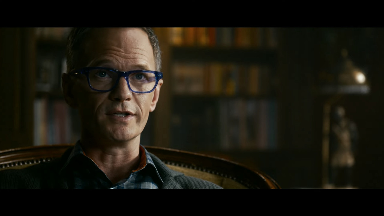
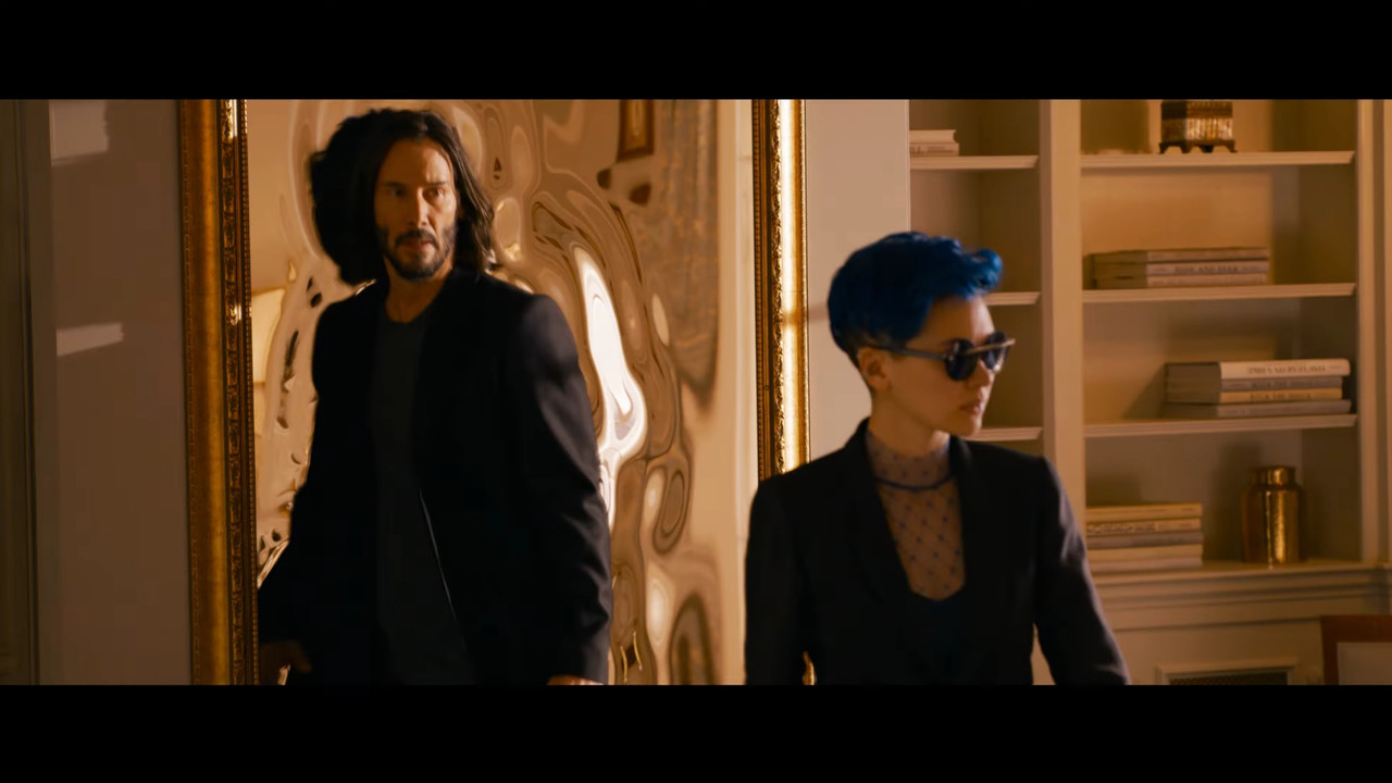
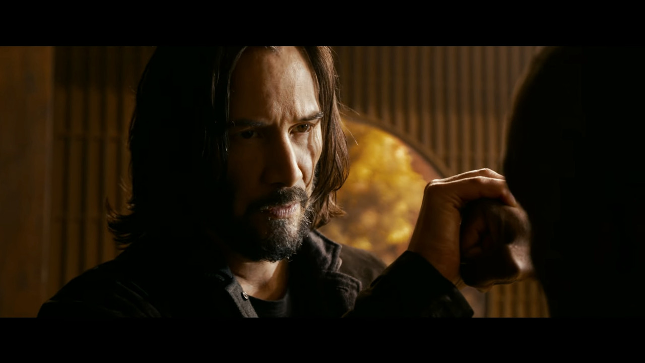
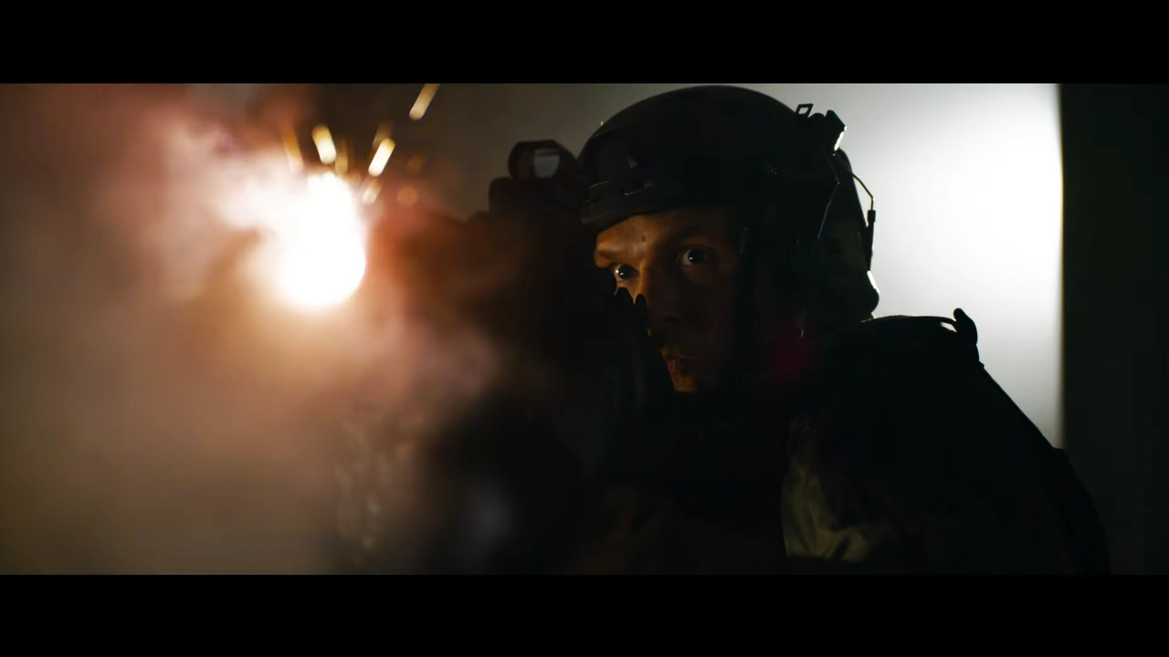
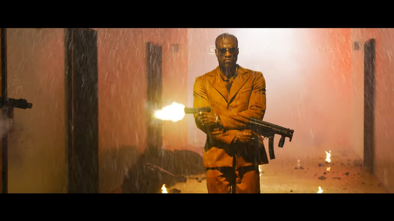
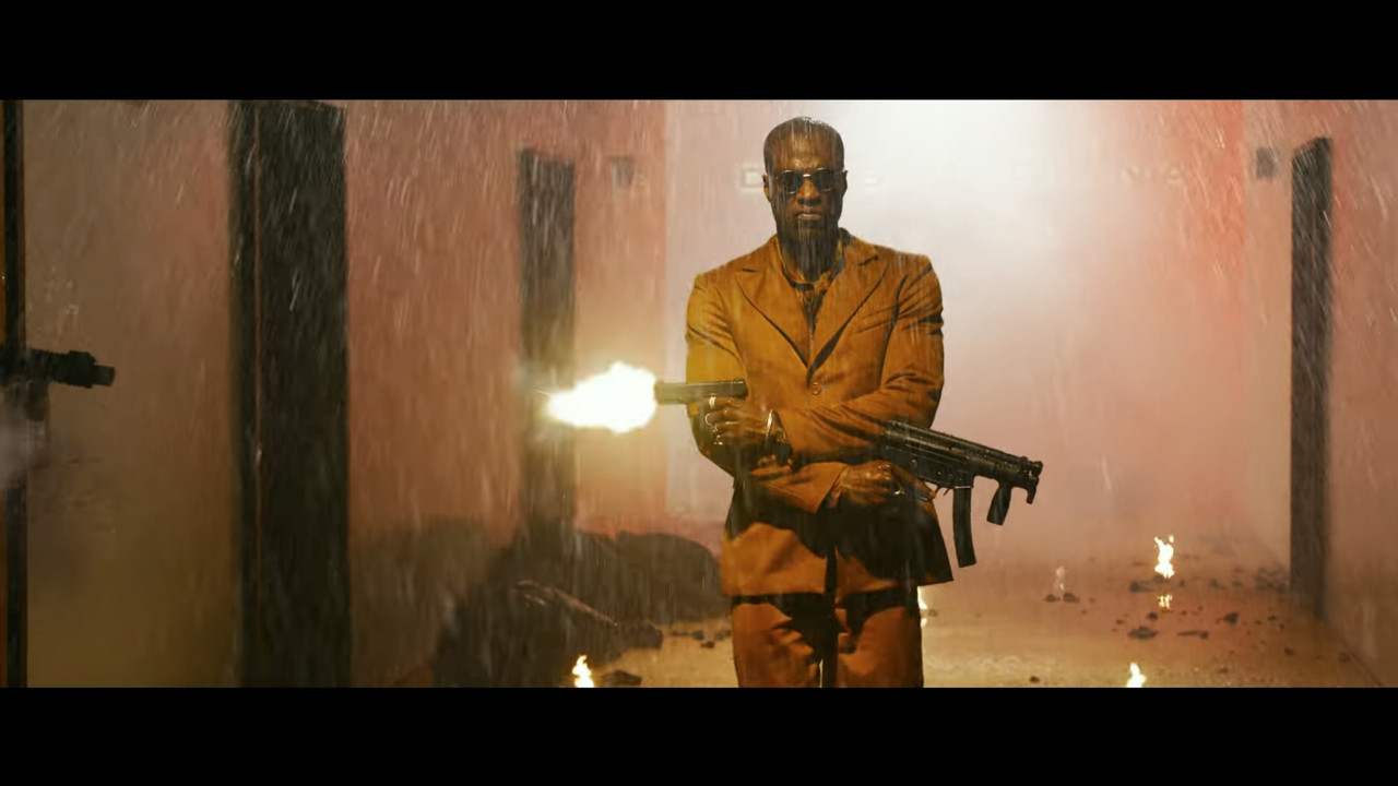
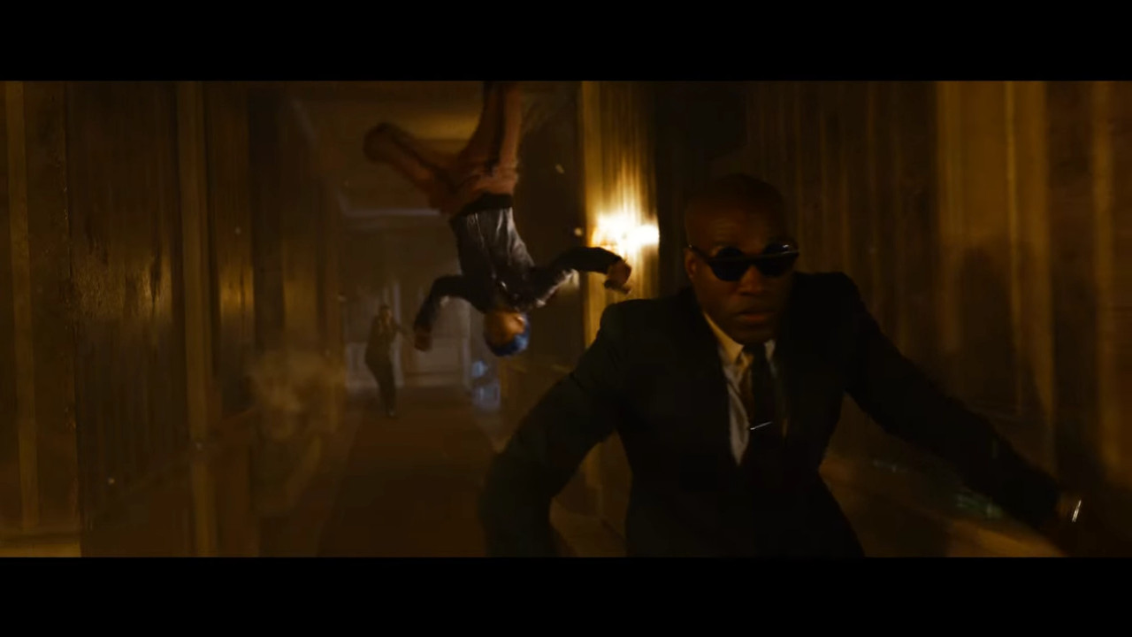
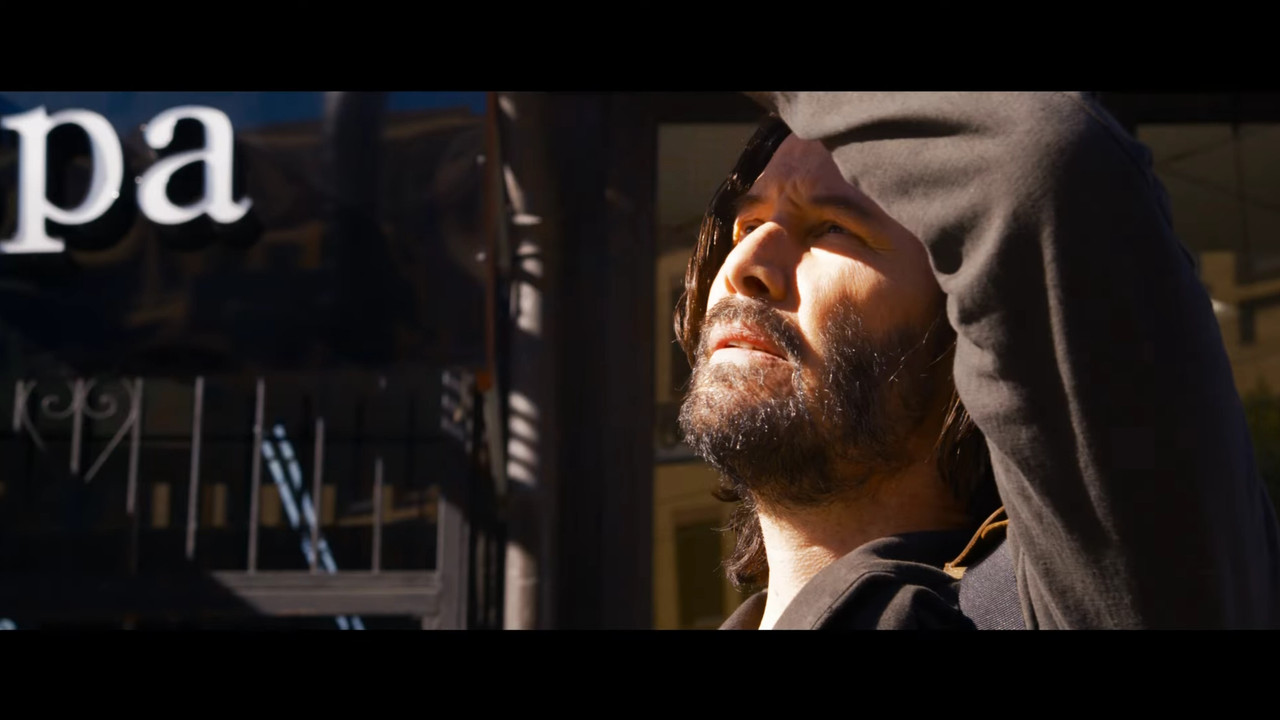
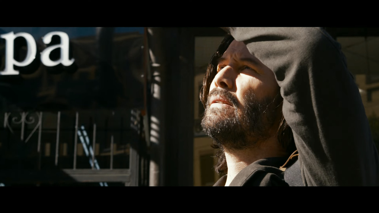
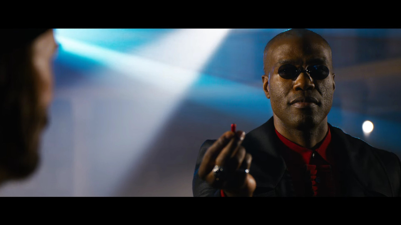
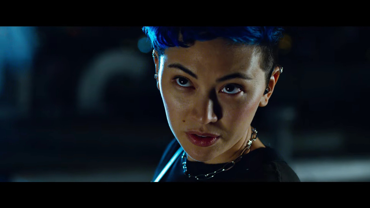
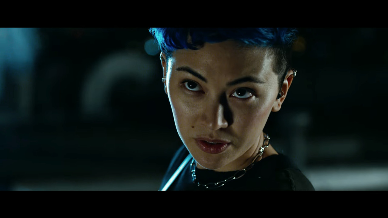
While I'm excited to see one of my favourite franchises ever come back. Why is it so saturated? Feels so pushed to the limit of being pleasant looking sometimes?


EDIT: Seems that many people just read the headline and don't dive into the details of the discussion here. To them, I'd recommend reading through or skimming through for context, or just getting some basic context before judging the intent of the discussion.
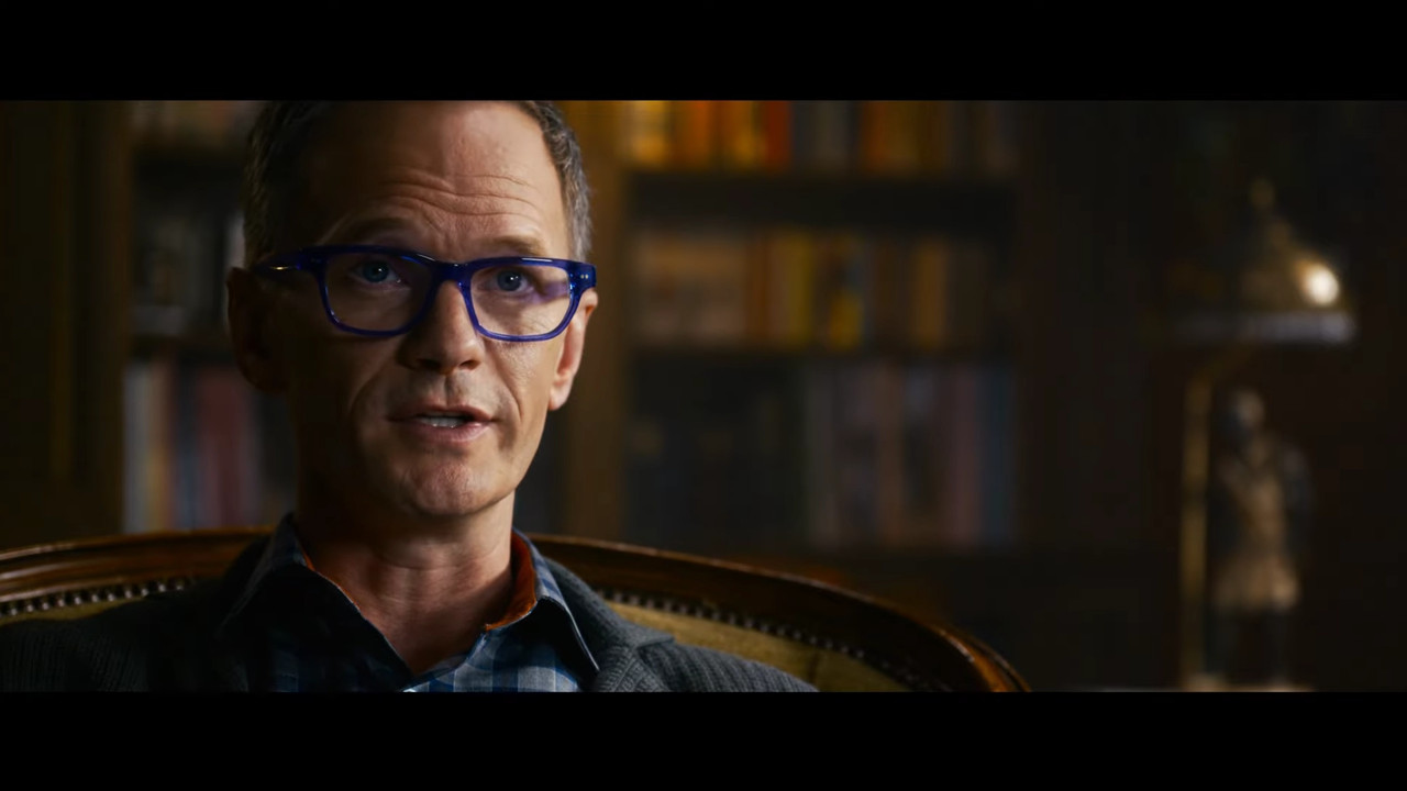
 
While there might absolutely be reasons for the grade to be what it is, I don't get the feeling that it is even close to both the aesthetics of the old matrix movies or has a good balance.

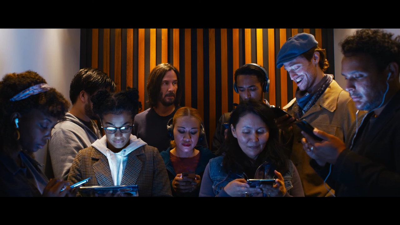
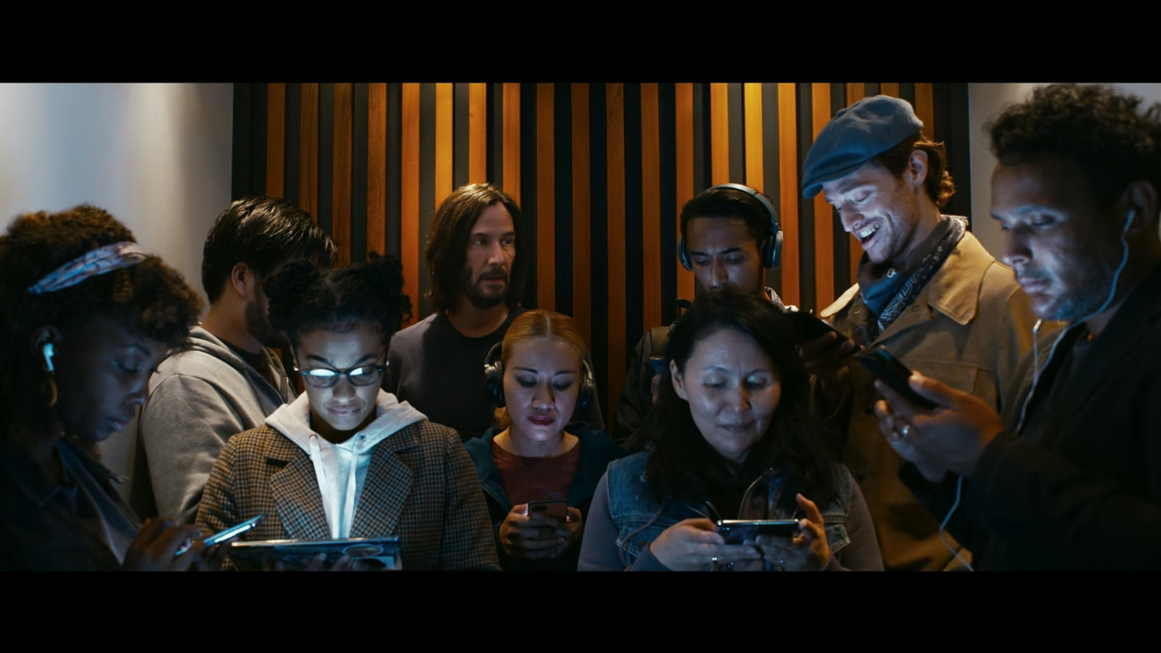
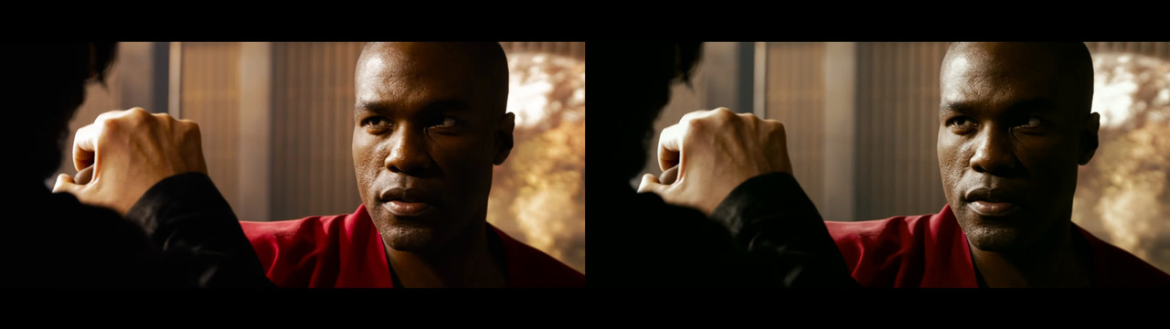
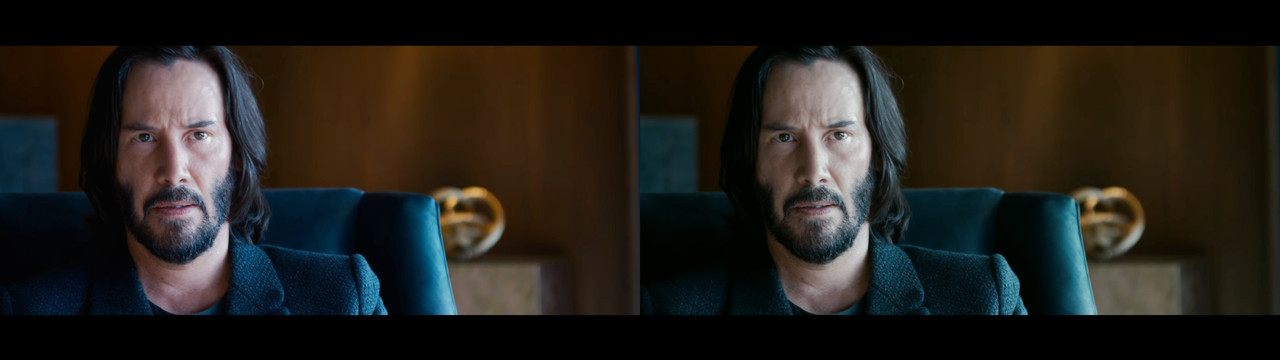
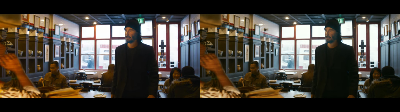
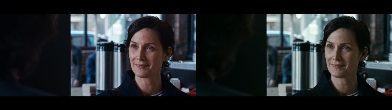
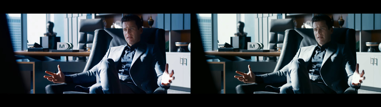
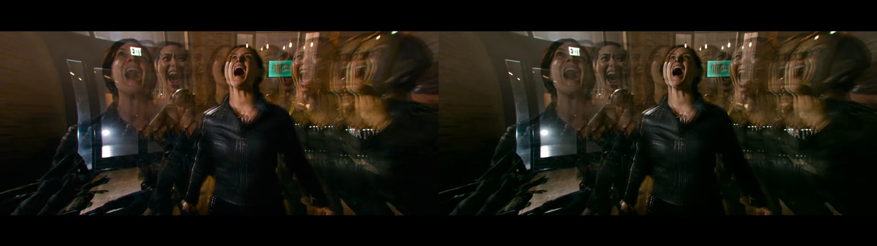
Tried an overall offset balance shift and just pushed down the saturation a notch and that's almost all needed to make things easier on the eyes. Of course this is subjective, but if it's supposed to be within the same story as the Matrix trilogy but expand on the look, then the grade shouldn't also push it, otherwise, it might end up being too much of a "new thing".
I dunno, what do you all think?

Matrix-1-1-1.jpg
Matrix-1-1-2.jpg

Matrix-1-1-9.jpg
Matrix-1-1-10.jpg

Matrix-1-1-11.jpg
Matrix-1-1-12.jpg

Matrix-1-1-13.jpg
Matrix-1-1-14.jpg

Matrix-1-1-15.jpg
Matrix-1-1-16.jpg

Matrix-1-1-17.jpg
Matrix-1-1-18.jpg

Matrix-1-1-3.jpg
Matrix-1-1-4.jpg

Matrix-1-1-5.jpg
Matrix-1-1-6.jpg

Matrix-1-1-7.jpg
Matrix-1-1-8.jpg

Matrix-B-1-1-5.jpg
Matrix-B-1-1-6.jpg
 
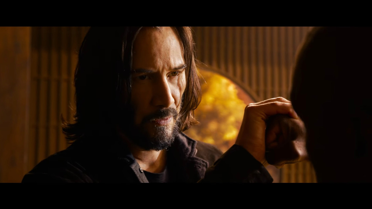
I think its the yellows ( warm tones ) that are a bit saturated, but personally it doesn't bother me at all. It sure has the RED look.

If the "Red look" is the old unbalanced colors of the MX sensor, that was the one thing people wanted to get rid of back then and what the Dragon essentially did. It looks unnatural in a way that isn't pleasing in my opinion.

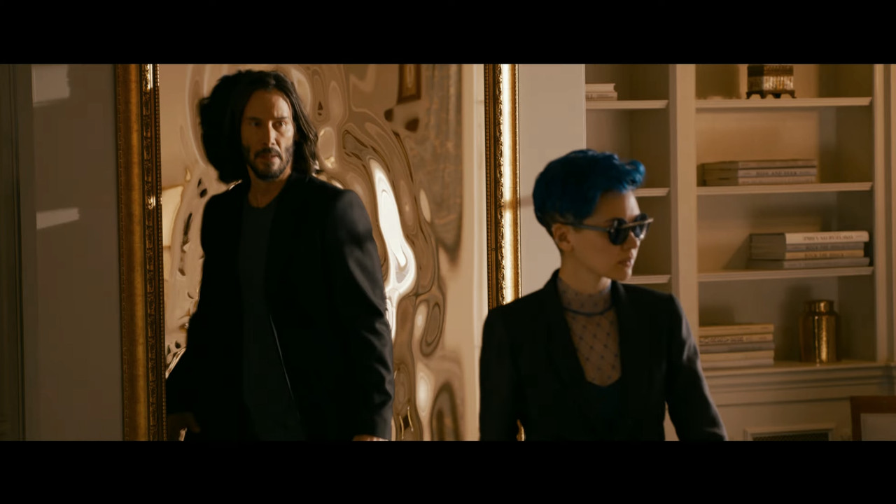
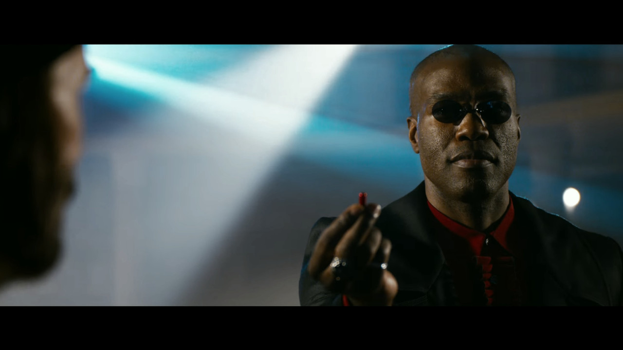
Here's a corrected version. I just did an overall correction (the images above) and in my opinion, it keeps the essential look and feels but without the over-the-top saturation and weird colors. (gets a bit compressed since it's a compressed video of a compressed video, but anyway)

UPDATED THE VIDEO
 
A little desaturated looks good too, but I am sure the saturation level is an artist choice, it should make sense when we see the context of the storytelling, I mean, he took the blue pill so everything should look hyped no?
 
A little desaturated looks good too, but I am sure the saturation level is an artist choice, it should make sense when we see the context of the storytelling, I mean, he took the blue pill so everything should look hyped no?

Sure, but saturation in of itself is just splotching colors together. That's what I think is the problem here.

Šabović Adis;1938215 said:
Chris, I think the blacks got crushed somehow.

Yeah, but the images shows what I mean.
 
Very excited for the film.

I'll think we'll all pick the image apart a bit. It's a pretty hot and contrasty grade. Nothing subtle about it, especially in the matrix itself. Some interesting decisions that I'd be looking forward to hearing about down the line. Will be interesting to see this in HDR.

Kind of interesting there's warm palette going on rather than what we've known regarding "being in the Matrix" or the real world. Perhaps even plot related.

Agree though, pretty "different looking" from the first through third films, second and third are also pretty different looking in my mind too. But perhaps so for reasons. Hard to know.

I don't have a problem with the grade or cinematography, I think they're great, but the overall intensity of saturation kind of screws around with everything. I just did a very slight adjustment towards "matrix green", it's no way near how the original trilogy looks, but I feel the desaturation makes things more balanced and the slight greener tint makes it more consistent with the originals.

What I fear here is that the cinematography and grade was "just done" without the clear goal it had in the original trilogy. It doesn't need to look the same, but as it looks like now I feel just pushes things over the edge. We get those ugly color shifts that were very common back in the MX days. In my opinion, it doesn't require much to fix things for the better. But the grade, as it is right now, fits more in line with a romcom than Matrix. And this is, in my opinion, a problem with the look. We can all say it's all just subjective, but even among common people, there's a lot of people not liking the look of this movie and it's so frustrating that a slight adjustment makes things look much better and more in line with expectations without changing the basic art direction of this film.
 
I just don't know... why it looks so bad.

They shot on a Monstro and Komodo... the film just looks really video-y. Those action shots of her jumping over the car just look cheap.

Why is this?
 
I mean this is the trailer. Do we know for sure the film will look exactly like this? It's not out for another 3 months.
 
I mean this is the trailer. Do we know for sure the film will look exactly like this? It's not out for another 3 months.

The level of change that happens between trailers and full releases these days is not that big. It's probably gonna look very close to this. I would hope that they did another pass in the grade and put some thought into the saturation levels one more time. It's like they just copy-pasted the Sense 8 look over to Matrix. That's not how you do grading. They are two different projects and story worlds. I don't mind changing up the look from the old matrix through art direction, but to almost directly copy/paste the look from a TV show that is very different from the Matrix source material is really not a good approach.

Really hope they took a breather and thought this through.
 
Šabović Adis;1938215 said:
Chris, I think the blacks got crushed somehow.

Fixed the upload now... this would be my signoff on a grade. Closer to the story world of the matrix, without removing the look and feel of the art direction. It's suppressing the awful color bleed from over-saturating the grade and people don't get as pinkish in their faces.
Of course I had to grade on the compressed youtube image, so naturally, it's not as good as it would be with the original files, but I honestly think it becomes a lot better with this very slight adjustment to the overall look.

 
I think the critical thing everybody needs to be aware of is everything you see at this point surrounding a film of this caliber and budget level is intentional. Meaning the grade and look were developed, decisions were made regarding camera and lighting on set. We don't know if the bloomy, contrasty, somewhat saturated look isn't a part of the dreamlike feel or not. Or if that even switches up at some point even considering the history of this franchise.

I mean, if this was the OG Matrix right now all of you would be bitching about the skintones:) not knowing what is to come. Millions were bamboozled the first time around. Curious if this is in the same vein or not. But mostly curious why all the decisions were made after I figure out if the film was good or not.
At the moment I'm squarely hoping the film itself is entertaining.

I mean the opening shot, the composite, is alluding to a very surreal vision of this world.
 
I think the critical thing everybody needs to be aware of is everything you see at this point surrounding a film of this caliber and budget level is intentional. Meaning the grade and look were developed, decisions were made regarding camera and lighting on set. We don't know if the bloomy, contrasty, somewhat saturated look isn't a part of the dreamlike feel or not. Or if that even switches up at some point even considering the history of this franchise.

I mean, if this was the OG Matrix right now all of you would be bitching about the skintones:) not knowing what is to come. Millions were bamboozled the first time around. Curious if this is in the same vein or not. But mostly curious why all the decisions were made after I figure out if the film was good or not.
At the moment I'm squarely hoping the film itself is entertaining.

I mean the opening shot, the composite, is alluding to a very surreal vision of this world.

Matrix Resurrections looks exactly like Sense 8. I doubt this look has to do with something surreal. It's already there in the art direction, it doesn't need to be pushed in the grade so that the entire thing looks like bad digital saturation push. It reminds me of the early days of grading when people pushed things into oblivion just because they could. The look is already in this movie's art direction, the color grade makes the skin tones look unnaturally pink.

Big budget movies absolutely have things thought through, but even the biggest movies in the world are also prone to stress, scheduling errors, too many cooks, and some occasional bad eye sights. Just remember the trailer for Mission impossible where they released it in the wrong mix. We are all people working with these things and it doesn't really matter what level of budget something is. We have all seen bad grades on mega productions and I don't think this grade can be attributed to some story point, not with the obvious similarities to the look of Sense 8.
 
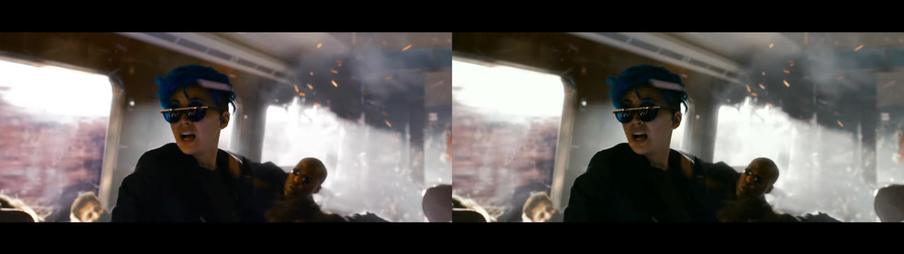
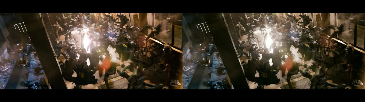
Here are some more comparison shots with some basic adjustments. Doing the fourth film in a series requires some similarities to the originals, it's just storytelling logic. And here I haven't even come close to the original Matrix green tint, which was extreme with a purpose. This tint gives it more of the "Matrix" look without losing the art direction foundation as well as mitigating the pink skin tones back to something less weird. We also see shots of the "real" world in the trailer, and the saturation is off the charts there as well, not at all in line with how it looked in the originals.

Matrix-R-1.jpg

Matrix-R-2.jpg

Matrix-R-3.jpg

Matrix-R-4.jpg

Matrix-R-5.jpg

Matrix-R-6.jpg

Matrix-R-7.jpg

Matrix-R-8.jpg
 
After watching the trailer, and thinking a lot about the color choices, I feel like Christoffer and Phil are always arguing even though they usually agree with each other.
 
There's also some really weird trailer editing at the beginning of the trailer, right after the side-shot of Neil Patrick. A straight cut to a double exposure that goes into a crossfade. It looks straight up like an editing error. It's really weird.
 
Did a direct comparison video as well

 
Back
Top