Welcome to our community

Be a part of something great, join today!

  • Hey all, just changed over the backend after 15 years I figured time to give it a bit of an update, its probably gonna be a bit weird for most of you and i am sure there is a few bugs to work out but it should kinda work the same as before... hopefully :)

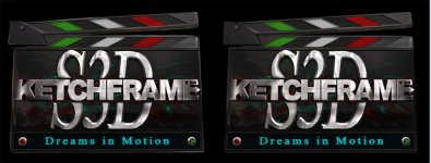
KETCHFRAME prepares to go public with a new LOOK!!

Hi Ketch, I´ve been lurking in this post... I must say your logo has come a long way since the first version, looks very good now.
I think you should take the final plunge and loose the rec/play buttons, oh and Love the slogan "dreams in motion"!
 
Hi Ketch, I´ve been lurking in this post... I must say your logo has come a long way since the first version, looks very good now.
I think you should take the final plunge and loose the rec/play buttons, oh and Love the slogan "dreams in motion"!


Thanks Eirik, it sure has, you don't like the buttons? They are so cute :)

Glad you do also Love my slogan "Dreams in Motion", they have been my all life.
 
MUCH more legible. Although the KE and last E are a bit too dark and could use a little PS touch up.

I would also add some highlights to better define the Clapper board. Just a little specular highlight or Photoshop touch up to help the silhouette stand out better.
 
MUCH more legible. Although the KE and last E are a bit too dark and could use a little PS touch up.

I would also add some highlights to better define the Clapper board. Just a little specular highlight or Photoshop touch up to help the silhouette stand out better.

Thanks Gavin.

Yeah it could use some highlights on the clapper, but the shadowing, contrast and texture darkness were created for the specific look wanted out of it, it does makes those letters suffer slitly in small avatars, I agree, but I'm okay with that, I just now really like what Manuele and I have done.
 
Here's a little mock-up of what I mean. (left being the paint-over).

K, got you now Gavin, yes infect I did apply it, but when posted it disappeared, also creating a minute imperfection on the edges, possibly how I compressed in CS4 to post.

But I do agree with you, and that little touch does makes a difference.

Edit: Okay I reloaded with higher image quality and made the highlights more evident to separate the Clapper.
 
Back
Top