Welcome to our community

Be a part of something great, join today!

  • Hey all, just changed over the backend after 15 years I figured time to give it a bit of an update, its probably gonna be a bit weird for most of you and i am sure there is a few bugs to work out but it should kinda work the same as before... hopefully :)

How do you colour grade your Red Raw IPP2 Footage?

Khurum Khan

Member
Joined
May 13, 2022
Messages
19
Reaction score
0
Points
0
Age
41
Website
www.khurumakhan.com
Hi all,

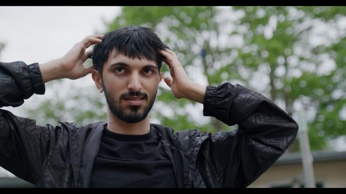
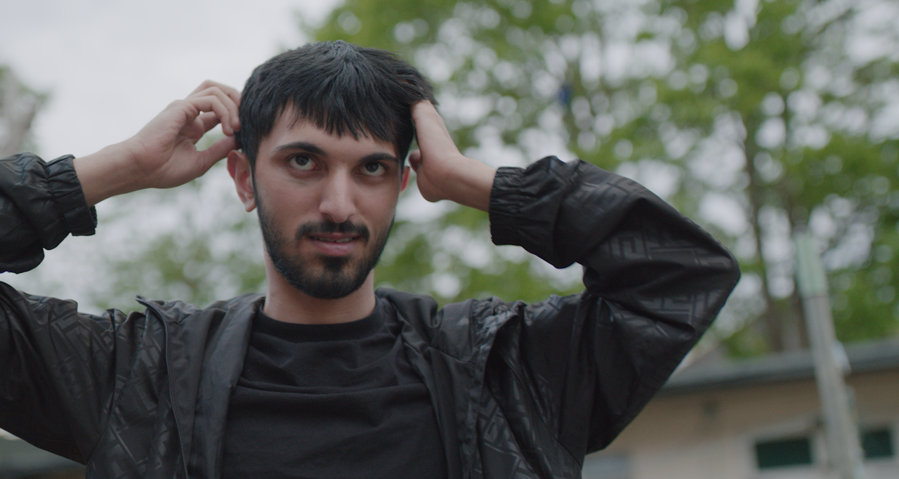
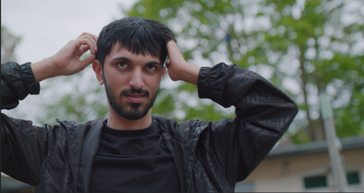
I'm curious to know how you color grade your Red Raw IPP2 footage?
I own a Red Komodo and as beautiful the colour science is of the IPP2, sometimes
I feel the footage doesn't look cinematic or kinda like film when applying LUTS etc.

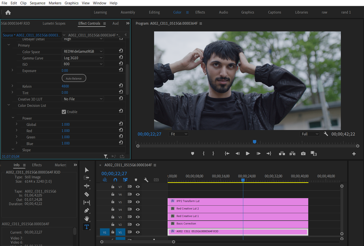
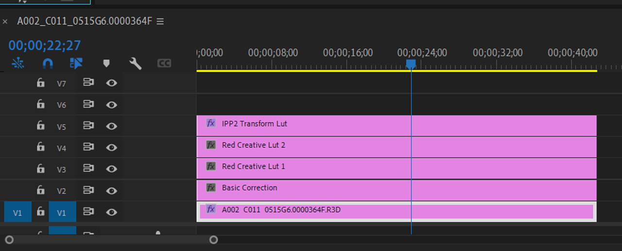
So my current workflow in Adobe Premier Pro is:
Adjustment Layer 1 - Basic colour correction
Adjustment Layer 2 - Red Creative LUT (from the Red website)
Adjustment Layer 3 - Another creative LUT from 3rd party and correcting the curve tool
Adjustment Layer 4 - Under Basic Correction I add the RWG Log3G10 to REC709

Is this the best method to colour correct? How can I make my footage look more cinematic?
As at the moment it just looks like footage colour corrected and straight out of the camera.

Any help would be much appreciated.

thank you!
 
Khurum,

I mainly use Davinci Resolve, but I have tried Premiere Pro from time to time. I don't know if you have seen this already but here is a video below from RED of what they feel are the best practices for the IPP2 workflow in Premiere Pro.


RED TECH | Post Workflow | Adobe Premiere Pro

by
RED DIGITAL CINEMA


thank you, I've seen that video and workflow before. I think it's fine to give you a basic colour correction.
But I want to learn and know a way were I can make my footage look more cinematic or film like.
Have you managed to achieve this through davinici? I also have this application as well, but not using it at the moment.
 
Khurum,

Okay sorry if you have already sent that. First I think it's important to better understand what you consider "Cinematic" and what you think isn't "Cinematic". Do you maybe have an example from a movie you liked or a still frame which you think shows a great example of the look you are trying to achieve?

Where you maybe going for a specific Film Look Emulation?
 
No don't be Rand, I appreciate your thoughts.
Find attached an example.
What I'm saying is what the Red Tech video teaches is a simple colour correction from Log to a usable image.
So I'm looking for something that emulates film, nothing in particular.
 

Attachments

  • photo116611.jpg
    photo116611.jpg
    70.7 KB · Views: 0
Khurum,

From looking at the image you provided above, it appears you prefer a slightly cooler overall look with not alot of contrast and with a nice HIGHLIGHT ROLL-OFF. Is that about right? Would you mind sharing a R3D frame of the image you're trying to grade and a sample jpeg of the look that you are dissatified with ?
 
How can I share the R3D frame with you? As It's not letting me upload it, saying its larger than 2mb.
 

Attachments

  • photo116612.jpg
    photo116612.jpg
    68.1 KB · Views: 0
khurum,

I'm really rusty in Premiere Pro but is this how you basically have it setup?

Screenshot-4902.png


Screenshot-4902-2.png
 
khurum,


here's a first attempt

Your original jpeg

image-116612-1.jpg


Slight grade in premiere

Screenshot-4905.png


With More Saturation

Screenshot-4906.png


With More Saturation and more contrast

Screenshot-4907.png
 
Last edited:
FORMULA I would use for a more CINEMATIC LOOK.

1) Always us a 180 degree shutter( If 24FPS 1/48th Shutter Speed, if 25fps 1/50th Shutter Speed.

2) Less bitingly sharp camera lenses( Modern Soft or Vintage lenses)

3) Lower Saturation ( I love saturated images, but that's not always a good look)

4) Lower Contrast ( Less crushed shadows, less clipped highlights)

5) More Agressive/ Smoother Highlight Roll-Off ( I personally prefer the MEDIUM/ VERY SOFT IPP2 Output Transform Lut, which is what I used in the images above, over the MEDIUM/ SOFT Output Transform Lut in most situations but not all.

6) Good Lighting

7) Good Framing and Composition
 
Last edited:
Hey Rand, thanks for that.
I usually have it setup the way you mentioned but the JPG I sent you I just put an Rec 709 Medium contract and soft highlights out on it.
Thanks for sending the examples and giving it a go. Agree with the points you mentioned but still missing the actual look and feel of it being cinematic.

I think this is a better example of a visual look I'm after https://www.youtube.com/watch?v=JYQHMUwTApg
So this was shot on Alexa mini with Atlas Orion lenses.

So I'm trying to achieve this kind of look and grade.

Khurum,

You're welcome! I think as you already know that most of the Character of the video link to above came from The Arri Alexa Mini , and I think More so, from the Atlas Anamorphic Lens. I tried my hand at the TAKING LENS( Lens attached directly to the camera ) and ANAMORPHIC Lens( Attached to the front of the Taking lens) combo craze from many years ago. I honestly did add another dimension to my images. I honestly think that is the secret sauce that you are looking for.
 
Green is the most problematic color for cameras today. Usually high green saturation is seen as yellow but leaves are actually more blue, Cyan. In the referece there are also missing a lot of colors. It's nealry teal orange. Perhaps you could try to lower color "accuracy" and saturation on some colors?
 
Khurum,

Here's a slighlty more aggressive blue/greem grade from Davinci Resolve with RAVENGRADE in an IPP2 Color Managed workflow.

1-1-6-1-1-6.jpg
 
I might comment that all the RED IPP2 options are variations of tone and contrast rolloff. As such, they're discreet and stepwise veriations. As a user of Resolve, I rarely use these RED optirons, preferring to set my own tone, contrast, saturation rolloffs to taste.
 
I might comment that all the RED IPP2 options are variations of tone and contrast rolloff. As such, they're discreet and stepwise veriations. As a user of Resolve, I rarely use these RED optirons, preferring to set my own tone, contrast, saturation rolloffs to taste.

Bill,

I use either an ACEScct Project or Node based workflow exclusively these days.
 
Back
Top