Welcome to our community

Be a part of something great, join today!

  • Hey all, just changed over the backend after 15 years I figured time to give it a bit of an update, its probably gonna be a bit weird for most of you and i am sure there is a few bugs to work out but it should kinda work the same as before... hopefully :)

Help with grading options

greg filipkowski

Well-known member
Joined
Mar 11, 2009
Messages
639
Reaction score
0
Points
16
Location
| LONG ISLAND | NEW YORK | MIAMI | EUROPE |
Website
www.vispol.tv
Your R3D link isn't working for me.

Also, I believe that was Šabović Adis who graded that example, so you could ask him what his process was.

Looking at your jpeg, I'm wary if it will ever quite look like that grade, because the background colors are quite different - the cold blue industrial setting isn't very similar to the warm wood colors and greenish walls.

I messed with the jpeg a bit in Resolve since I couldn't get the r3d to work.

uPQRIs7.jpg


Most of the heavy lifting here is coming from a white balance change and contrast adjustments -- your image was a bit too flat for me. Without seeing the R3D I'm not sure if that's a product of lighting or what you did in processing the image. But either way the skin lacks the 3-dimensional punch that the example grade has.
 
Greg,

I also couldn't get the .R3D to work and graded the jpeg as well. Until Sabovic comes here and shows you how it really was done, here's my idea.


new-5-1-1-6.png
 
Last edited:
Um, if I remember correctly, I sharpened that R3D in RCXP (OLPF compensation and unsharp mask), exported as a ProRes (RWG/Log3G10) and graded in my NLE. But yeah, as Aaron already has pointed out, your shot, Greg, has different light setup...I'll see what I can do when I'm back home, at my PC (mob. right now). :smile5:
 
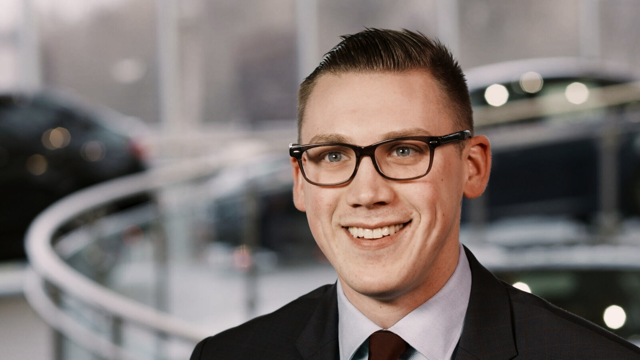
Got the PM Greg, it's a nicely lit and exposed shot, so you have a lot of flexibility. For me from a color perspective it's always good to know the general context and/or mood of what's going on, even for an interview.

In this case I see a general positive vibe, likely having something to do with cars, and possibly modern technology car related.

phfx_R3DGrade_gregFilipkowski_interviewSetup.jpg


This was a quicky, but here's the general process:
- had a quick look at levels and general frame tonality
- examined the palette in frame, you have a nice possible warm/cool complimentary scheme here that can work
- changed the Output Tone Map Contrast to Hard
- knocked the exposure down by one fifth of a stop
- loaded up philmColor:baseStock_harpyEagle - yep, totally cheating here, but not really :)
- tweaked the Tone Curve a smidge
- tweaked the Red and Green Channel Curves a smidge

And an extremely subtle thing, especially since it's well exposed, outside of RCX a very slight power window upper frame left and even more subtle lower to knock those highlights a bit down, I'm talking 1/2 a stop or less. Mostly to keep focus back on the talent and his relative mids to highlights.

Been a while since a Mysterium-X frame has crossed by bow, but you did a good job in camera as far as I'm concerned with your exposure method as well as lighting. Heck, it certainly doesn't even need a heavy grade. Just more where you want to direct the mood of the piece.
 
Yeah man I did! but I thought you guys would do a much better job at creating "looks" than I could. I'm terrible at creating "looks"
 
Getting the skin-tones in the same ball-park in RCX.


Probably takes the rest of the image too far from where you'd want it to be though.
 
Back
Top