Welcome to our community

Be a part of something great, join today!

  • Hey all, just changed over the backend after 15 years I figured time to give it a bit of an update, its probably gonna be a bit weird for most of you and i am sure there is a few bugs to work out but it should kinda work the same as before... hopefully :)

Composition

Do you think we'll need A lot of lights (like in the golden age of Holywood) for those deep focus movies (using RED)? I'd love to try and accomplish some of the inspired compositions using the traditional masters techniques with the digital medium. I know a lot of it is art direction, production design, location, and talented crew.
First time I've quoted myself , hehe, i'm not a 'quote yourself' virgin anymore.

Maybe i'm hijacking my own thread here, or it's a stupid question (quite possible) but if you don't mind, for David Mullen (or anyone familiar with highend digital).

1. Will I need a lot of lights if I want to shoot REDcode RAW 4K deep focus and low key/interiors/night exteriors ? I've read quite a bit about the Miami Vice shoot and it got me wondering. I'd probably just have the 18-50 (2.8) RED zoom and a 85mm (1.6) Elite prime lens.

If that's too general a question, or you'd need to test to know, then any advice on approaching the above would be appreciated.

Obrigado.

btw - have you seen Suzuki's film ? (it's bananas)

:beer:
 
The RED camera in 4K mode uses the whole 35mm-sized sensor, so you have 35mm-style depth of field characteristics, which is sort of the point... but it does mean using a lot of light to get deep-focus photography, depending partially on what ASA rating you wish to give it and how much noise you're willing to live with (obviously it's easier to stop down the lens if you're working at 1000 ASA, for example, compared to 250 ASA.)

If you're willing to live with more motion blur and smear, you could turn off the shutter and thus gain another stop of exposure.

The other option would be to use the camera in 2K "windowed" mode (don't know the official term) where you are extracting a 2K window from the 4K chip, and thus get the deeper-focus look of Super-16 or 2/3" HD photography.

There are also fake deep-focus effects possible with slant or tilt-focus lenses and split-diopter filters.

We just had this discussion on the CML, but deep-focus for me tends to look better in b&w -- it gets a little ugly in color unless you control your backgrounds more carefully, due to the distractions of colored objects in our tacky modern world. The best-looking deep-focus color movies tend to design the frame for a more monochromatic effect, pushing the image closer to b&w aesthetics.

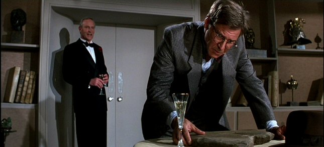
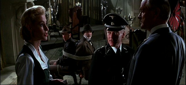
Probably one of the few modern cinematographers (though retired) who used deep-focus in both his color and b&w work was Douglas Slocombe, who often lit and shot interior scenes in "Raiders of the Lost Ark" and the sequels to deep stops. Even his period work in "Lady Jane" has a fairly deep-focus look using high light levels, rather than the typical low-light work employed in movies that have candlelight scenes. In these frames from "Indiana Jones and the Last Crusade" you can see the crisp old-fashioned hard-light style necessary for the deep f-stops, though appropriate for a somewhat retro look:

lastcrusade1.jpg


lastcrusade2.jpg
 
It's interesting how much you like deep-focus stuff, David. Are there any shallow DOF compositions you really like? Screencaps?

Obviously Barry Lyndon probably has the most shallow DOF of any modern movie, shot on special (something like) f/.07 lenses.

barry1dw2.jpg
:w00t:
 
Thanks a lot David. That's exactly the summation I was hoping for.

One of the short films i'm thinking of doing will reference that b&w deep focus, crisp (perfect word to describe it) aesthetic. I guess besides the tips you've given there isn't much way around a good lighting package for the look I want to achieve...

I agree with you about the difference in deep focus in color and b&w. I'm nowhere near as astute as you in cinematography, but when deep focus is used in color, it seems too artificial, or overly dramatic oft times.


Thanks for the tips, mate.


:beer:
 
Lol what are you talking about. I'm smoking weed and editing tonight, so don't mess with me! :)
 
Trying to pull frames from shallow focus movies, I tend to find they make less interesting still frames. When the focus is shallow, there tends to be more cutting and more movement to capture the action in the scene, which looks great in motion, but hard to extract into stills.

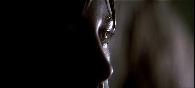
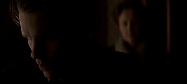
For example, one of my favorite movies of all time for cinematography is "Snow Falling on Cedars", shot by Robert Richardson in a very shallow focus style, with anamorphic lenses shot wide-open. So the camera is constantly roving and floating, with the focus shifting in a dreamlike pattern. So the wide shots, which naturally have more depth of field, are probably the prettiest static images, but most of the movie is shot tight, with the focus drifting in and out. Here are some of those tighter shots:

snowfalling1.jpg


snowfalling2.jpg


snowfalling3.jpg


snowfalling4.jpg
 
David, Oh how I miss the deep focus films of the yesteryear. I didnt quite realise it till you posted those stills.

For a few years now I had been noticing that films are getting less and less 'grande' in their backdrop and set design, which would be explainable by preference to shallow DOF shots.. Or maybe Im just seeing things.
 
Pitof's "Vidocq"
And a great movie composition-wise at least (shot on a digital cam)
448_1177289227.jpg

The curve of the window and the curve of her bare shoulder. I want to hire the colorist for this film but I know he's too expensive ;)

I bought this movie on DVD just because Ines Sastre is my favorite supermodel. It turned out to be a really good movie with some of the best color grading I have seen. Thanks for posting this. I'm going to watch it again today.
 
I used to think "oh boy, with these digital color-correcting tools, now I can do for theatrical features what I did for projects that went to home video" -- but I discovered that this wasn't completely true. Broadcast TV, particularly NTSC, hides a multitude of sins. Crushing blacks, cranking brightness, pushing colors, etc. -- common video color-correction tricks -- tend to create artifacts (like noise) that show up on a 50' movie theater screen, so you have to be more careful about using them, whereas you couldn't see half those problems in standard def video resolution.

This is a very interesting point, and I wonder if it will hold true with RED's higher 4K resolution. Would there be less artifacts when doing a 4K or downsampled 2K color grading online? Does this happen with DIs that originate on film, or only HD? I was considering shooting my upcoming movie with flatter lighting to give me more options for the "look" in post. But now I may have to reconsider.

By the way, this thread has been very informative and enjoyable!
 
Within limits, it helps to shoot a little flatter (a little more fill) so that you have more information to work with in color-correction, but that's not the same thing as saying that you can light a scene flatly and create the mood in post, unless you want an artificially crushed-looking shot.

It's always better to shoot close to the look you want, but build in some flexibility in tweaking the look to the final degree. But if the basic look in terms of lighting isn't in the footage, it can look artificial to add it in post.

For example, a scene in a dark moonlit basement as someone walks around in the dim light with a flashlight, sending a beam of light sweeping the room. Now you could light this flatly, not underexposed, and not even smoke the room, then darken the footage severely, add a bright flashlight flare in post, add the beam in post -- but it won't look as natural compared to just lighting it for that look. On the other hand, only underexposing it halfway and having some faint low-level fill isn't a bad idea just to make sure you record some detail in the shadows, even if you are going to darken it further in post.

What I was talking about wasn't a film vs. digital origination issue, it is a "color-correcting in RGB 10-bit Log space for a film-out and looking at the correction projected at 2K versus correcting in linear video for TV broadcast and looking at the correction on a CRT screen" issue.
 
Thanks David, that was the approach I was leaning toward (lighting a little flatter, but not completely flat). When I further darken that moonlit basement, I just don't want artifacts to show up on a 50' screen. I suspect the less you need to manipulate an image in post, then less chance of that happening. With a higher resolution source image, maybe there is more tolerance?

Gbabymogul, good point about producers. That won't be an issue for me, not initially.
 
This is a great thread, after all, cinematography is photography and photography is use of light, shadow and composition. I've always been fascinated with the old masters use of shadow and light and try to emmulate that in my work. One of my favorites is Vermeer. One of the excersises I had in a 16mm film class was to choose a masters painting and try to recreate it on film (35mm still). I chose "the guitar player" by Vermeer. Check out how the light is falling on her from the window (which you can barely see). I found that I could not exactly recreate the light that is falling on the scene because naturally the light would never fall like that to create the highlights and shadows that exist in the painting. As Vermeer painted this, it was over a period of many sittings where the light was constantly changing (as the sun moved). What we see is a composite of all those days, yet to our eyes it looks perfectly natural. I can't tell you how many lights I had going on the scene after about 3 hours (I was only given 3 hours for the assignment). This was a great lighting excersize. David, thanks for all the great screengrabs. I also love some of the film noir period stuff. Check out the lighting in "A Touch of Evil". It's fantastic stuff. Also I highly recommend folks check out the AFI film "Visions of Light". American Cinematographer used to advertise it but I haven't seen it recently so don't know where it can be picked up now. Maybe Ebay. But there are some really great images on there and terrific interviews with top DPs. Definitely worth the price of admission.
 
Speaking of old b&w noirs, I recently saw an oddball (but charming) movie called "I Wake Up Screaming", which is actually somewhat of a hybrid romantic comedy / film noir. Most scenes are lit rather high key but there are some classic noir lighting moments like this scene:

iwus4.jpg


iwus5.jpg


iwus6.jpg
 
I signed up on reduser to resurrect this thread!
 
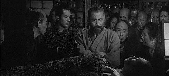
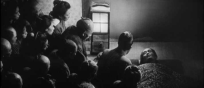
David, what lens length do you think these shots are? Are you saying that kurosawa would be at a long length but have a "small" aperture? with a long length lens, he'd have to back up, so how far would he have to be to get this kind of shot with so many people in it? i hope this make sense. thanks!

I'm a big fan of Kurosawa's widescreen deep-focus compositions using long lenses:

redbeard1.jpg


redbeard2.jpg
 
I seem to recall Donald Ritchie saying that many of these shots were made with a 500mm anamorphic lens, sometimes stopped down to f/22, which required a ton of light. Though I suspect that for more low-key scenes, perhaps it wasn't that extreme. These shots look like they were made with anamorphic lenses in the 100mm to 500mm range, at a deep stop.
 
This duel from Lyndon is about as close to a painting as you can get.

barrysr6.jpg


In terms of anamorphic, it's tough to beat Toll or Malick's work.

vlcsnap428320ro5.png


vlcsnap210943qw9.png


The isolation, fear and hopelessness in this shot is heart-wrenching. :(
 
Back
Top