
David Mullen ASC
Moderator
Pre-production
I arrived in San Francisco on Wednesday night after driving all day up the 101 in intermittent rainstorms (I have to say that the rolling green hills south of King City remind me of the Battle of Naboo in “Phantom Menace”… but I digress.)
I’m shooting a very small indie production for director Michael Polish based on the book “Big Sur” by Jack Kerouac. The story is basically autobiographical, about Kerouac’s attempt to escape the attention he was getting after the success of “On the Road” by leaving his home in Long Island, NY and going to a small cabin in the Big Sur area, in Bixby Creek Canyon, but finding himself unable to get away from his demons and drinking problems as he hangs out with his old pals from the San Francisco area. We have scenes in Big Sur, San Francisco, and the smaller towns in between, and on Highway 1 as well.
From the start, Michael Polish has used one word to describe how he wants Big Sur to look, which is “epic”. There will be a visual contrast set-up between this intensely internal personal conflict and this grand forbidding landscape, the intimate set against the immense. That’s the general idea at least… we just have to do it on a tight budget and a 20-day schedule.
We first talked about shooting this on film, mainly because it’s a period story (set around 1959-ish) and the challenge with digital is always that it seems so immediate and modern. A 2.40 : 1 aspect ratio was a given; we’ve done it on all our movies together except for the first one, “Twin Falls Idaho”. We decided that the b&w photographs of Ansel Adams and Edward Weston were going to be our guide to how Big Sur should look in the wide shots. The closer shots would sometimes be more experimental, “jazzier” you could say, to match Jack Kerouac’s state of mind.
However, soon it became apparent that we needed to find even more cost savings than shooting in 35mm 2-perf would allow, and I felt that Super-16 was the wrong approach to achieve a medium-format look for the wide shots, so shooting in digital was broached again. Michael Polish wanted to discuss digital from a positive angle, in what it could do for us; he always approaches things first in terms of getting the right look for a movie and he’s very open-minded. I think he would have fought for film had I told him that there was no other way of getting the look we needed, but the truth is I didn’t think it was.
Originally I had proposed taking an MOS 8-perf VistaVision camera around with us just to shoot the wide shots, feeling that it we wouldn’t burn too much film in the process (I was concerned that 2-perf 35mm wasn’t going to be sharp-enough when we went really wide.) So when digital came up again, my immediate thought was that if we could get a hold of the new 5K Epic camera, we might come closer to achieving this highly detailed, clear, medium-format film look for the landscapes that you sense in an Ansel Adams photograph. Michael agreed (plus he liked the fact that the camera was called “Epic”.) Also, the HDR function would come in handy when shooting views of the ocean when the sun was glaring off of the water, always a major challenge for digital photography. And personally for me, the idea of shooting on this new camera was exciting in same the way that using a VistaVision camera would have been – I’m always looking for a new learning experience.
But there was also the issue of the period look, and Michael was a bit concerned about the close-ups being too crisp and edgy in digital, something I feel can be controlled with filtration, plus the “M-X sensor look” is generally smoother, less electronic-looking, than most other digital cameras. (This brings up another issue, which is whether I considered using the ARRI Alexa camera, which I had just used on a cable TV pilot in Vancouver. Personally, I loved the look of the Alexa footage on the pilot – it’s very filmish and faces looked beautiful on it – but since a high-resolution image on the big screen was a major goal for this movie, recording in a 1920 x 1080 format just didn’t appeal to me, especially if we were cropping to 2.40.)
We have talked about desaturating a lot of the frame, either overall or selectively, to achieve the mood of a b&w movie while staying in color, but I also suggested that we try doing something in the D.I. later to fog the blacks in the frame, the way that blacks can halate in a b&w movie print.
The trick will be how to do that in the D.I. without impacting the sharpness of the shadow detail in the wide shots. It will take some experimentation. For the close-ups, we are probably going to use some very light Black Frost or White Frost diffusion (probably #1/8) to soften them a tiny bit. It will also help with the period feeling, and the b&w film stock feeling I think. But the wide shots will be shot clean for maximum resolution.
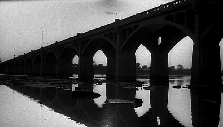
Here’s a frame I grabbed from the DVD of “Rumblefish” where some black halation occurred when making dupes of shots for optical transitions:
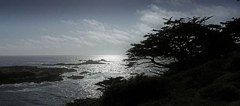
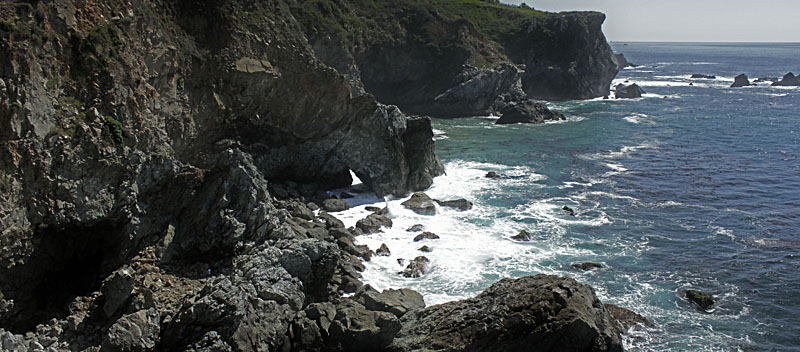
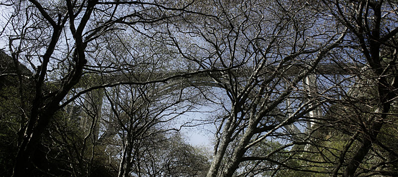
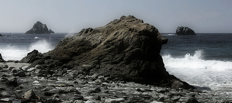
Here’s some photos I took during our scouts, treated by me in Photoshop to evoke the feeling I’m going after, just that I probably softened them a bit more than I intended because I don’t know how to get the blacks to glow other than to do a Gaussian blur overlay:
We’ve settled on doing the D.I. at Warners Motion Picture Imaging, who did “The Astronaut Farmer” for the Polish Brothers. So far, I’ve managed to enlist the services of Reduser regular (and San Francisco local) Dane Brehm as our DIT, and we should be doing a small test next week that we can put through the paces to create our dailies workflow and give me something to color-correct at Warners MPI.
I’m guessing right now that we will shoot 5K 2:1 with a 5:1 compression, composed for cropping to 2.40 : 1. I liked this approach on my other two Red movies with the Polish Brothers, shooting 2:1 and framing for 2.40 : 1, it gives me a little bit of wiggle room for fixing the framing occasionally in post plus makes it a bit easier to create the 16x9 full-frame HD version for TV broadcast later.
I arrived in San Francisco on Wednesday night after driving all day up the 101 in intermittent rainstorms (I have to say that the rolling green hills south of King City remind me of the Battle of Naboo in “Phantom Menace”… but I digress.)
I’m shooting a very small indie production for director Michael Polish based on the book “Big Sur” by Jack Kerouac. The story is basically autobiographical, about Kerouac’s attempt to escape the attention he was getting after the success of “On the Road” by leaving his home in Long Island, NY and going to a small cabin in the Big Sur area, in Bixby Creek Canyon, but finding himself unable to get away from his demons and drinking problems as he hangs out with his old pals from the San Francisco area. We have scenes in Big Sur, San Francisco, and the smaller towns in between, and on Highway 1 as well.
From the start, Michael Polish has used one word to describe how he wants Big Sur to look, which is “epic”. There will be a visual contrast set-up between this intensely internal personal conflict and this grand forbidding landscape, the intimate set against the immense. That’s the general idea at least… we just have to do it on a tight budget and a 20-day schedule.
We first talked about shooting this on film, mainly because it’s a period story (set around 1959-ish) and the challenge with digital is always that it seems so immediate and modern. A 2.40 : 1 aspect ratio was a given; we’ve done it on all our movies together except for the first one, “Twin Falls Idaho”. We decided that the b&w photographs of Ansel Adams and Edward Weston were going to be our guide to how Big Sur should look in the wide shots. The closer shots would sometimes be more experimental, “jazzier” you could say, to match Jack Kerouac’s state of mind.
However, soon it became apparent that we needed to find even more cost savings than shooting in 35mm 2-perf would allow, and I felt that Super-16 was the wrong approach to achieve a medium-format look for the wide shots, so shooting in digital was broached again. Michael Polish wanted to discuss digital from a positive angle, in what it could do for us; he always approaches things first in terms of getting the right look for a movie and he’s very open-minded. I think he would have fought for film had I told him that there was no other way of getting the look we needed, but the truth is I didn’t think it was.
Originally I had proposed taking an MOS 8-perf VistaVision camera around with us just to shoot the wide shots, feeling that it we wouldn’t burn too much film in the process (I was concerned that 2-perf 35mm wasn’t going to be sharp-enough when we went really wide.) So when digital came up again, my immediate thought was that if we could get a hold of the new 5K Epic camera, we might come closer to achieving this highly detailed, clear, medium-format film look for the landscapes that you sense in an Ansel Adams photograph. Michael agreed (plus he liked the fact that the camera was called “Epic”.) Also, the HDR function would come in handy when shooting views of the ocean when the sun was glaring off of the water, always a major challenge for digital photography. And personally for me, the idea of shooting on this new camera was exciting in same the way that using a VistaVision camera would have been – I’m always looking for a new learning experience.
But there was also the issue of the period look, and Michael was a bit concerned about the close-ups being too crisp and edgy in digital, something I feel can be controlled with filtration, plus the “M-X sensor look” is generally smoother, less electronic-looking, than most other digital cameras. (This brings up another issue, which is whether I considered using the ARRI Alexa camera, which I had just used on a cable TV pilot in Vancouver. Personally, I loved the look of the Alexa footage on the pilot – it’s very filmish and faces looked beautiful on it – but since a high-resolution image on the big screen was a major goal for this movie, recording in a 1920 x 1080 format just didn’t appeal to me, especially if we were cropping to 2.40.)
We have talked about desaturating a lot of the frame, either overall or selectively, to achieve the mood of a b&w movie while staying in color, but I also suggested that we try doing something in the D.I. later to fog the blacks in the frame, the way that blacks can halate in a b&w movie print.
The trick will be how to do that in the D.I. without impacting the sharpness of the shadow detail in the wide shots. It will take some experimentation. For the close-ups, we are probably going to use some very light Black Frost or White Frost diffusion (probably #1/8) to soften them a tiny bit. It will also help with the period feeling, and the b&w film stock feeling I think. But the wide shots will be shot clean for maximum resolution.
Here’s a frame I grabbed from the DVD of “Rumblefish” where some black halation occurred when making dupes of shots for optical transitions:
Here’s some photos I took during our scouts, treated by me in Photoshop to evoke the feeling I’m going after, just that I probably softened them a bit more than I intended because I don’t know how to get the blacks to glow other than to do a Gaussian blur overlay:
We’ve settled on doing the D.I. at Warners Motion Picture Imaging, who did “The Astronaut Farmer” for the Polish Brothers. So far, I’ve managed to enlist the services of Reduser regular (and San Francisco local) Dane Brehm as our DIT, and we should be doing a small test next week that we can put through the paces to create our dailies workflow and give me something to color-correct at Warners MPI.
I’m guessing right now that we will shoot 5K 2:1 with a 5:1 compression, composed for cropping to 2.40 : 1. I liked this approach on my other two Red movies with the Polish Brothers, shooting 2:1 and framing for 2.40 : 1, it gives me a little bit of wiggle room for fixing the framing occasionally in post plus makes it a bit easier to create the 16x9 full-frame HD version for TV broadcast later.
Last edited:
") . Thanks in advance for sharing so I can learn something practical.
. Thanks in advance for sharing so I can learn something practical.