Welcome to our community

Be a part of something great, join today!

  • Hey all, just changed over the backend after 15 years I figured time to give it a bit of an update, its probably gonna be a bit weird for most of you and i am sure there is a few bugs to work out but it should kinda work the same as before... hopefully :)

Ask David Mullen ANYTHING

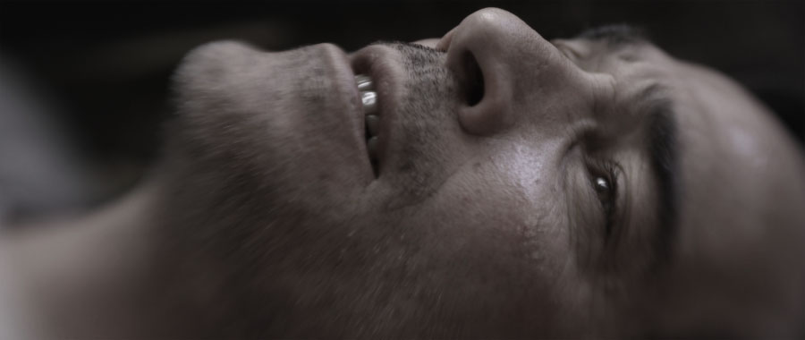
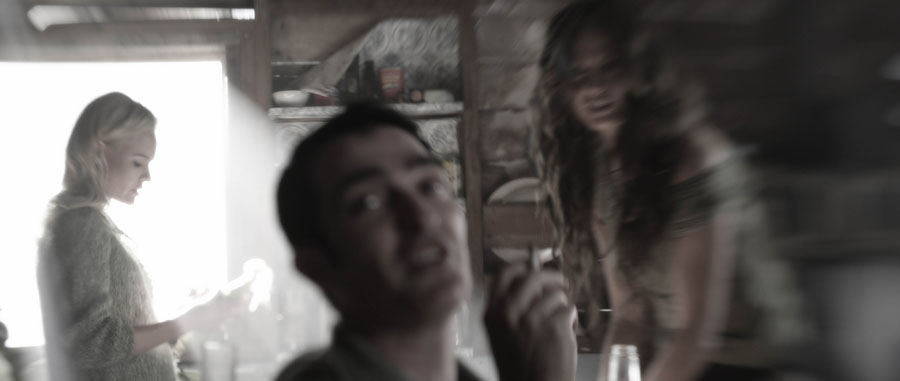
It's really quite amazing. The shot almost looks like a Lens Baby shot. I heard you used lens baby on shots before. David could you share with us about that and what lens & camera combos you like most
 
I used a Lensbaby for some shots in "Big Sur" on the Epic. The difference between using the Lensbaby and just using a tilt-focus lens or blurring one side of the frame in post is that the Lensbaby can be flexed to create a continually shifting distortion, something that a single-frame won't show.

bigsur19.jpg


bigsur33.jpg
 
Very nice David can you share with us your favorite lens & camera combinations? Do you choose them per every pictures requirements for each scene?
 
I choose different cameras and lenses for each picture since I'm a renter, not an owner. Partly this allows me to try looks unique to each project, but also, I think life is short and you should sample a lot of what's out there. This is one reason why, when I was shooting 35mm features, I alternated between Kodak, Fuji, and Agfa. If I had to be pressed on it, I would have said that in general the Kodak stocks were the most polished technically, the most accurate, and generally the sharpest... but I was more interested in how these stocks altered reality, not so much a mechanical recreation of reality. And sometimes it was Fuji or Agfa that first came out with an improvement in stocks that Kodak followed up on (and often then surpassed). Back in film school in 1988, shooting in 16mm, people were choosing between the new 7291 and 7292 stocks, 100 ASA and 320 ASA... I didn't think much of '92 being a bit grainy, but sometimes you needed the speed -- and then Fuji came out with the 250T and 250D stocks, which were better than 7292.

With digital color-correction, one is less tied to an inherent look to a film stock, or even some of the out-of-the-box looks of the digital cameras, and to some extent, the look of the lenses can be altered -- we tend to pick lenses more for their speed and their flare characteristics, maybe their weight, whereas in the past, their color bias and contrast mattered more since it was hard to time it out in a photochemical post.

I am looking forward to the Dragon sensor because I think it addresses one of the major reasons why many people shoot on the Alexa -- dynamic range. It matters so much to many DP's that it trumps resolution. Now with the Dragon, you get both extra dynamic range and higher resolution, and you get it in a smaller body than a Sony F65.
 
David,

A few months ago I posted questions about mixing color temperatures for a short movie I was gonna shoot.

W finished shooting a few weeks ago and the movie is being cut.

I taught I would share the results and ask you for your opinion

You can see a few stills here:

http://www.flickr.com/photos/rodrigoprata/sets/72157635197278194/

The shots are not graded yet, just in camera setup.

Thanks again for your help.
 
Looks nice, but the question is, was this the look you were going for? I might dial back a bit of the saturation but I don't know what you were intending.


The warm tones are close to what I had imagined, but I wanted the blue a bit bluer, it looks like the mixing of the two color gave the blue a litle tint to the magenta side also, I`ll try to time that a little bit out.

I thought it to be very hard to create this tonality difference, I had no HMIs and had to use a Double CTB on my tungsten lights to get to this blue tonality, also, on the warm side, I had my lamps dimmed to almost 30% of capacity.

I plan on desaturating the color a little bit also. I always shoot with the contrast and saturation way up because I find the red monitor to lack contrast overall, but when I open the actual files, its always more contrasty and saturated them what I saw on set.

There is one more question I would like to make on this project.

In this particular look, the director wanted to associate the warm tones with a sense of security, specially when the kid is home, and the blue tones with the danger from the outside, specially associated with his fathers figure, wich is a drunk peddler separated from his mother but the boy belives him to be a folkloric figure that has come to take him away.

The bedrom scene is when the danger from the outside meets the security of his home and also his mother.

I did not wanted to create those symbolisms because i thought that in this particular case, it would be too obvious that every time the father shows up, everything would become blue (and the director wanted the differences in tonality to be very accentuated) and when he didn`t show, everything would have a warmer look.

I tried my best to work with the director vision despite not necessarily agreeing with it, but I wanted to ask you for your personal opinion on things like this. Do you think that visual symbolisms like that help telling the story, or they can become a distraction on the sense that the changes on the look may draw attention to itself?

Thanks very much for your attention again.
 
I like color symbolism -- I'm a follower of Vittorio Storaro. I think colors can support the story emotionally. But I try to keep it motivated by sources so that it's not distracting. So if the "blue" father steps into a room that was already lit warm, I can't really change the room to blue unless he turns off the lights and the room switches to moonlight. However, you may be able to sneak in a blue edge or something, an accent.

And you don't necessarily have to use strong saturated colors -- the blue sequences can be steely blue-grey and they still will stand apart from the warm shots just by the difference.
 
Hey David i was wondering do you also supervise dvd releases on your movies?
i was checking Le Samourai movie and see there is day and night difference between two releases. (not talking about PQ) so which one we should see as a original one? This movie get released at least 5 different distributor and all of them looks different to me.


Criterion dvd (likely they gonna release on bluray and look same)
Xxll43o.jpg


Fox Pathe France
MyVdq8l.jpg


gotta admit Fox Pathe release %100 2010s blockbuster movie by Michael Bay
 
I haven't had an old title of mine retransferred so I haven't dealt with that, but a couple of my movies were timed without my supervision.

I was shooting "Smash" in NYC when the color-correction for "Big Sur" had to happen quickly before Sundance and other than giving LightIron a few notes on each scene, I didn't do a full supervision -- and then the film was recut and retimed again quickly after Sundance without my supervision again because I was still working in NYC. That was a bit disappointing for me. The general look is what I intended and it looks good, but there are some scenes I would have timed a bit darker (I finally saw the movie in July at a film festival in Ann Arbor, MI.)

I'm hoping that some distributor some day wants to make an HD transfer of my earlier movies like "Twin Falls Idaho" -- and asks me to be involved. Unfortunately I think a lot of indie movies from a decade ago and more are destined to only exist on an out of print DVD copy.

"Le Samourai" was visually designed to be nearly b&w so I think the neutral color of the Criterion version is probably more correct, but it looks too light. It seems lately that a lot of new transfers of old movies are timed on the bright side for some reason.
 
Hi David! I have a question about frames rate. I know for fight scenes it's common to shoot them at 22fps. Anything else and the trick starts showing up too much. But what is your opinion about car chases? I think 22fps barely adds any speed. As long as the streets are empty, do you think going lower is fine? If so, when do you think it starts looking fake? I have heard of shots done as low as 12fps which is double speed and a good and useful speed bump. But not sure how real it looks. Thanks for your input David. Much appreciated!
 
I think 20 fps is about as low as you would dare to go for a car, maybe 18 fps, that's about it. 12 fps would look obvious -- it would only work on a very smooth road where the car did not hit any bumps and did not take any turns, and nothing else in the frame was moving, and the camera work was static or incredibly smooth. It might work on a speedway for example, in a brief cut. In general, the shorter the cuts, the more you can get away with tricks.

Trouble starts to be that even if you could fake one shot at 12 fps, you couldn't fake most of the others, so the car would move differently and faster in that one shot. At least 20 fps would intercut with 24 fps footage.
 
Thanks David.
I was thinking of using 12 fps for locked tripod shots of the car taking a curve, so it could look more aggressive without going too fast as curves are dangerous. And yes, just for brief cuts. Or just locked tripod shots in general. Because I think any other not locked type of shot the camera shake would be too exaggerated in 12fps.
So you think you can get away with 20fps or even 18fps if the shot is handheld? Like shot from another car?
 
There is no bright line here, the more you undercrank, the more the camera movements will be sped up, so a bouncing handheld shot will look sped up more visibly as you shoot at a lower frame rate.

A car taking a turn at twice the speed in reality would exhibit some effect from the forces at work that it wouldn't turning at a slower speed.

I can't give you numbers below 24 fps where the effect works or doesn't work at, it just depends, like on the smoothness of the operating, the bounciness, etc. When in doubt, do a test.

Look at "Mad Max" and "The Road Warrior" and you'll see some undercranked shots, you can decide whether you buy them or not. I'm sure the ones that work don't stand out, it's only the ones that don't work, but even then, those shots add to the mood and energy of the movie even if you can tell they are undercranked.
 
Thanks David. I had planned on running some tests. But I wanted to get a base first. You're right about Mad Max. Even though some shots are clearly undercranked they don't really take away from the whole experience. The same for example can't be said about Knight Rider. I guess it does depend on how you plan the shots. Thanks again David.
 
Just depends on the project. I was happy to be able to drag out some old 1/4 Fogs for a flashback scene in "Smash", otherwise I was mostly using either Schneider Hollywood Black Magics or Tiffen GlimmerGlass filters. But I'm about to shoot a small feature with no diffusion at all.
 
Hi David,

I LOVE the trailer for "Big Sur" and was wondering if I could watch it anywhere in the wild?

There are a few shots in the trees that have so much detail its staggering!!

Also, did you use fog filtration on it? or did they do most of that in post?

Thanks, and I love your work :-)
- - Justin
 
Rumor is that the release will be November 1.

The movie was shot clean except for one shot, any diffusion was done in post. But the halation around the sun through trees was just lens flare. In post we blurred the black areas and layered them back over the image for a black halation effect.

We also smoked the sets and fogged the woods whenever we could.
 
Hi David.
We watching series 2 of Smash in the UK at the moment, looks great! Could you tell me what lighting setup you use on the staged scenes, this is where we see a full dress rehearsal of Marilyn and cast performing as it would be when the show goes on Broadway.
These scenes tend to be transitions from a rehearsal into the full blown scenes.
Not looking for a complete detail of what was used but the type of lighting and gels etc.
Thanks Paul
 
Back
Top