Welcome to our community

Be a part of something great, join today!

  • Hey all, just changed over the backend after 15 years I figured time to give it a bit of an update, its probably gonna be a bit weird for most of you and i am sure there is a few bugs to work out but it should kinda work the same as before... hopefully :)

Ask David Mullen ANYTHING

Haze increases aerial perspective, which can enhance the feeling of depth on wider-angle lenses (though a hazed room looks flatter -- and hazier -- on telephoto lenses except when foreground objects are in silhouette looking towards bright windows).

Some people feel a light amount of haze helps when shooting on video with smaller sensors to counteract some of the increase in depth of field.

Also some people feel the loss of contrast can be more helpful with digital, though a bright light is going to bloom more and take up more of the image.

I just find working with smoke on location, and keeping it consistent, and breathing it for fourteen hours a day, is such a pain in the a--- that I'll only do it when it allows me something unusual, like shafts of light. Though I have smoked a majority of a movie just for that visual texture throughout and it always looks great. Just not healthy.
 
Haze increases aerial perspective, which can enhance the feeling of depth on wider-angle lenses (though a hazed room looks flatter -- and hazier -- on telephoto lenses except when foreground objects are in silhouette looking towards bright windows).

Some people feel a light amount of haze helps when shooting on video with smaller sensors to counteract some of the increase in depth of field.

Also some people feel the loss of contrast can be more helpful with digital, though a bright light is going to bloom more and take up more of the image.

I just find working with smoke on location, and keeping it consistent, and breathing it for fourteen hours a day, is such a pain in the a--- that I'll only do it when it allows me something unusual, like shafts of light. Though I have smoked a majority of a movie just for that visual texture throughout and it always looks great. Just not healthy.

I second that keeping it consistent is an absolute pain in the a**.
 
Maybe David could help me out with a low budget lighting concern.

So I have a low budget script in which a lot of it takes place in a small apartment on the second floor. The layout is a straight line from the front door---kitchen--living room--bedroom--bath, so from the bedroom you can see the kitchen door. I probably won't be able to get lights through the 2nd story windows or up to them to punch any light in. I have access to 2 2ks, a tungsten ari kit with some small lights up to 1k, and a 500 soft box.

The scenes in the apartment go from intense and emotional to very intimate, and I am a bit concerned on how to light the space. My best bet I guess is some form of soft bounce with practicals, I also have some christmas lights. I'm thinking maybe a 1k or 650 bounced off the wall and using practicals for a bit of contrast. I don't mind harsh lighting for some of the intense sequences. I could get some photos of the room up if that would help, but any advice would be great.
 
I think the biggest problem is going to be whether this is a white-walled apartment, as most are - it's very hard to create mood with white walls unless they are so far back that they can fall off. Otherwise, you're talking about a lot of flagging. This is why something painted in midtones is easier to work with.
 
I think the biggest problem is going to be whether this is a white-walled apartment, as most are - it's very hard to create mood with white walls unless they are so far back that they can fall off. Otherwise, you're talking about a lot of flagging. This is why something painted in midtones is easier to work with.
Yeah unfortunately it's all white walls. I was going to paint the bathroom a green color, and I dunno about the bedroom. Painting it would suck, but I suppose some things you gotta do.
 
Yeah unfortunately it's all white walls. I was going to paint the bathroom a green color, and I dunno about the bedroom. Painting it would suck, but I suppose some things you gotta do.
Gah! Don't even talk to me about whitewalls! They kill your film faster than a burning camera. :frown2:
Nah, just wanted to pitch in that white walls is a PITA and that any tips on what can be done (short of painting the entire room) would be great :thumbsup:
 
David I heard something today...Casablanca and other films of the period had shadows painted onto the set. Have you heard of this actually being done - is it fact or fallacy?
 
David I heard something today...Casablanca and other films of the period had shadows painted onto the set. Have you heard of this actually being done - is it fact or fallacy?

Yes, I've heard about that -- the most common trick you see are the corners and tops of walls being darkened with paint to create separation and fall-off, but I've even heard about shadow patterns being painted on a set. "Rumblefish" did this as a homage to those movies -- there is a moonlit shot of the main house (I think Diane Lane's house) with leafy patterns painted on the house.

One of the best stories I've heard is about Gregg Toland shooting "Ball of Fire" for Howard Hawks. For the scene where Gary Cooper stumbles into Barbara Stanwyck's hotel room and confesses his love for her in the dark, thinking he's talking to another professor, Toland and Hawks wanted her face to be in the dark and yet see her eyes. Toland decided that the best thing would be for her face to be painted black -- so they called the make-up room that morning and told the make-up people to paint her face black. Stanwyck grabbed the phone and said "What in the hell kind of movie are you making???"
 
Last edited:
Interesting. Its food for thought. I can imagine people like Curtiz, Fritz Lang or even Hitchcock involved in German Expressionist technique in film back in Germany utilising ideas like this in Hollywood.

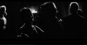
Also sorry to hound you, however I am interested to know about best ways to shoot scenes like this from last year at Marienbad. Obviously this is hard lit from one side but is it wise to light the camera side anyway and take it down with ND in camera, or to do this during the processing/in post. If you know you are going to these extremes of contrast?

Last year at Marienbad is so superbly lit. Have you seen any resources anywhere, or articles that goes into any detail on the making of the film? Just thought i would ask, as I know that you have read (in detail) so many magazines that might have covered it.

EDIT: Your second post took a while to pop up...strange. So that is very interesting. I will look at Rumblefish again and see. It seems like a simple but effective idea. Love the "ball of fire" annecdote, made me smile. More tools for the box!!!
 

Attachments

  • last year at marienbad.jpg
    last year at marienbad.jpg
    9.9 KB · Views: 0
If you don't want any shadow detail, there is no reason to add fill light only to try and remove it in post. However, if you plan on adding a lot of contrast to the image in post and you want some shadow detail, you may need to add more fill than you normally would.

Basically this is where testing comes into play, you shoot tests at different key-to-fill ratios then take it through the post route you want to use. Then you'll see the sort of lighting ratios you want to get on set to end up with the correct results after post.

Speaking of painting shadows for a b&w movie, "Last Year at Marienbad" is famous for painting the shadows on the ground for this one overcast day scene for a surreal effect.

However, I don't recall any specific articles on the cinematography, but there may be a more general one on Sacha Vierny's work that I once ran across somewhere.
 
A scene from Schindler's list also comes to mind. Oskar is sitting in a club speaking to his wife (35:47) and make-up was apparently used to paint light under Neeson's left brow to great effect. I love the shot. When the camera gets it's closest you can obviously see it best, but in the wider segments of the shot it is pretty seamless.

4610493489_5909bea79c_o.png
 
Last edited:
When NOT to White Balance?

When NOT to White Balance?

This isn't really a Red specific ? but more of a general one (although I imagine the response would apply somewhat to using a Red).

It seems that there are times when you don't want to white balance. For example, I was cutting some footage of a gritty scene where a hitman ?'s and then shoots a man.

The scene had a nice eerie blue tinge. The only drawback was that the hitman's teeth no longer looked white but were rather light blue. The first thought that went through my head was "Well someone obviously didn't white balance." But why should they have? If the actor's teeth were white, then the rest of the shot would not have looked nearly as interesting.

As it is, I was able to secondary color correct his teeth to make them white again w/o disturbing the color balance (really imbalance) that made the rest of the composition look so good. (I drew an oval window around his mouth, animated it to follow his movements. Inside the oval, I applied a secondary color correction effect that selected the bluish shade of his teeth, desaturated it and boosted its brightness.)

So when do you decide not to white balance? Again I'd like the reply to be more general than Red specific. Thanks so very much.
 
If you mean "white balance" as in putting a piece of white in front of the lens and hitting the white balance switch, I actually rarely white balance except when trying to correct some odd greenish cast out of a source. Otherwise, I pick a color temp as the base for the scene. And it's not always neutral, in fact, often it isn't. For example, I had two day interior scenes in dark, rundown apartments for my police drama pilot (shot on the Red) where I decided to set the color temp at 4000K for a cold effect in daylight. And I have picked 3700K for some scenes shot in 3200K lighting for a warm effect.
 
David, How do you know what the color temp is? Are you going by what the lights are rated at, eyeballing it or are you using a color temperature meter?

Thanks very much again. Much appreciated.
 
It's not hard to guess what it is, and besides, you see the effect of different color temp settings on the Red anyway, so if you guess wrong, you can change it until it looks right.

But I'm generally used to either setting a camera at 3200K, 5600K, or something roughly halfway in between as a starting point. That covers me in many situations.

We use a color temp meter, but that's mainly to see what color temp various fluorescent tubes are at, with how much green, for matching purposes. Or in general to match one light against another, like to make sure a series of daylight-balanced lights are close enough to each other - often HMI's vary quite a bit in the amount of blue in them, and LED's can have some green in them. And it's not unusual to light a day scene with HMI's outside of a window, daylight Kinos inside the room, and maybe some small LED's here and there, like over the camera lens.
 
David, I'm going to be shooting a documentary with a lot sit-down in home interviews. Most of them will be conducted in front of a black background, and I have two Westcott Spiderlight TD-5 softboxes (switchable on/off five CFC bulbs, CRI 93 rated). I'd like the looks to be pretty consistent from one interview to the next.

This may be a very hard ? to answer, but do you feel a color temperature meter like the Sekonic C-500 would be useful or a waste of $1K when shooting under these circustances? While can control the softboxes well, the ambient light is going to vary quite a bit from house to house and time of day, etc..

Also, a somewhat related ?. Do you shoot Macbeth or DSC Labs charts before takes? I've read and heard such varying advice on this, that I'd love to hear your take (no pun intended).

Thanks again.
 
I only shoot color charts in testing in prep, never during a shoot. Color charts are too subjective otherwise (when matching charts, most colorists start with the grey squares on the MacBeth charts anyway).

I use grey scale charts during a shoot before a scene IF some human being is going to be at the other end, color-correcting dailies from scratch. However, with the metadata as a starting point, I find that I don't even have to do that when I shoot on the Red, a dailies colorist sees pretty clearly what I'm trying to do. At that point, I only need someone to fix the problems, like changing exposure problems I couldn't correct on the iris during the take, or a shot that moves from one color temp to another with no cuts.

The thing with charts is that they won't be there in the final cut, so they don't serve much purpose in a final color-correction of the edited master (though a framing chart is still useful if you are, for example, cropping to 2.40) -- charts are only useful for testing, or for dailies color-correction. But if following the base metadata works fine for dailies transcoding, then you don't necessarily need to take the time to set-up charts.

The other use for charts may be as a reference for setting exposure if you want to see a black & white & 18% grey reference and how the exposure tools in the viewfinder or on a waveform react to that. But you don't necessarily have to record that chart. But even in that case, the chart is only a form of additional information, your real-world subject may require some exposure adjustment.

I don't own a color temp meter myself, I find that carrying a few pieces of 1/4 & 1/2 Plus Green and Minus Green (and CTO's and CTB's of course) is enough in most situations to match something odd I encounter on location (you can always double-up a gel if necessary.) Also, I find that it's better to undo the amount of green you add to a light to match another, better than overdoing it.

You should be able to see most of these color biases on your monitor anyway, and just correct by eye using gels. Then if you end up with an overall green cast, you can white balance the Red or go into the RGB Video Gain levels and change them (I find changing Green Gain from the default 1.0 to a 0.8 or 0.7 enough to correct most greenish scenes.) Then adjust the Color Temp level separately.

But if your interviews are against black and you are controlling the key and fill lights, you shouldn't need a color temp meter, just balance the camera for your lights.
 
Back
Top