Welcome to our community

Be a part of something great, join today!

  • Hey all, just changed over the backend after 15 years I figured time to give it a bit of an update, its probably gonna be a bit weird for most of you and i am sure there is a few bugs to work out but it should kinda work the same as before... hopefully :)

Ask David Mullen ANYTHING

I've got a question about "2001." There's a scene where Dave is moving from one room to another and the image seems to move from fisheye to rectilinear without cutting. Is this some sort of visual trick, or can it really be done?
 
I like it when I can believe the lighting inside the spaceships, that it comes from the sources on the set. I'd lean more towards a "2001" and "Alien" approach if I had a choice rather than mimic too closely the 60's TV show lighting, other than the use of colored light, which I would do IF I could motivate it logically into the set design (like the use of colored light in "2001").

Yea funny enough parts of the design of Quantum reminded me of Star Trek: TMP especially the brushed aluminum walls in MI:6 headquarters, almost like what that Enterprise might've looked under modern day aesthetics.

I seem to remember Star Trek: TNG being moodier the first four or five seasons, oftentimes the crew quarters set or Ten Forward very much so, but as the show progressed and Marvin Rush left for DS9 it took on a blander, flatter more high-key, (though I think the colors are louder) look. Not sure if it was Jonathan West's style or Rick Berman removing any hint of style. John Alonzo in Generations was about as contrasty as it gets (though in retrospect some of those scenes kinda look like the Enterprise was having a power shortage or something, there are lights that are inexplicably off or half-lit).

It wasn't until Enterprise that I noticed little tricks like having the 'sun' from a nearby star cast an afternoon-like glow into the sets with windows. I also really love the VFX shots in Star Trek 2009. They really sell the effect of an operator actually being in space photographing the whole thing with a slight hint of shakiness, especially when the Enterprise goes or comes out of warp and the camera jerks back as if the operator was startled or knocked off his feet.
 
I've got a question about "2001." There's a scene where Dave is moving from one room to another and the image seems to move from fisheye to rectilinear without cutting. Is this some sort of visual trick, or can it really be done?

You'll have to be more specific -- I don't recall any change like that. There are a lot of distorted wide-angle shots in the movie but mostly masked by the curved set designs, so perhaps you are just seeing the barrel distortion in one moment when the camera moves past some vertical lines but into a room with curved lines that hides the barrel distortion.
 
You'll have to be more specific -- I don't recall any change like that. There are a lot of distorted wide-angle shots in the movie but mostly masked by the curved set designs, so perhaps you are just seeing the barrel distortion in one moment when the camera moves past some vertical lines but into a room with curved lines that hides the barrel distortion.

I'll see if I can find some screen shots. It just stood out to me because it was such a dramatic shift that it didn't seem that it could have just been barrel distortion.
 
There were these guys who shot a commercial where they set up a camera with a heavy fish eye on and constructed a corridor set infront but in such a way that the verticals and horizontals were curved to counter the lenses curve so they end up recording as straight lines. the end result being that when the subject walked down the corridor they went from pin prick to full frame in a few steps.

Perhaps they built the set as such? Dunno, just a suggestion to what you've described but I cant remember it either. Perhaps they went from a room into a tunnel?
 
Hi David. I just bought your book and cant wait for it to arive and start reading it!
 
Hi,
Can you please guide me to shoot on darkness by red camera. Basically the scene is like this- on the basement around 1 pm some people are trying to hide. To get the correct feel what should be my measure to light scheme ?
 
First of all, you have to divorce yourself from thinking that the lighting on the set has to look dark to your eyes. All that matters is how it looks on the camera. I can make high noon in the desert look like moonlight with the right exposure, so the actual light levels used have nothing to do with how dark the scene looks. There were dark & moody scenes in movies back when film stock was only 40 ASA after all, or even lower. And they probably used powerful carbon arc lamps to get the effect...

The second thing is that you have to define what you mean by "dark". A dark scene can either be high contrast with lots of black and small areas of light, or it can be low in contrast with a lot of dim underexposed ambient detail and no highlights. Or a mix of both in different parts of the room.

You also have to decide if there is any possible source of light in the room, for example, in a closet where some light is leaking from under the bottom of the door, or in a basement with casement windows allowing small amounts of moonlight or streetlight to leak through.

If you actually have written a scene in a sealed room that would be pitch black in real life, then you have to ask yourself how any character would be able to see anything in that situation. So if you can, you want to first start with seeing if there is even the possibility of some light source in the space, no matter how small.

Otherwise, you get forced into adding light simply to see what's going on, and generally you end up doing some sort of shadowy moonlight effect and hoping the audience doesn't think about where the light is coming from.
 
I have noticed that on Blu-Ray, Super-35 movies look better than they did in the theaters in film prints. They also look better when digitally projected. I think it's partly because the slightly grainier look of Super-35 (compared to anamorphic using the same film stock) is less noticeable in digital presentations, particular for home HDTV viewing.

Is the extra grain due to the smaller negative, the optical anamorphosing process or both? (I guess if the digital extraction was made straight from the DI or IN it would cut down on the graininess) And do you prefer 3-perf or 4-perf? I was reading where what appears to be cost savings on the front end can come to bite you because making the IP or release prints for 2.39 exhibition can be so expensive. Also is it more acceptable to use a common topline or common center?
 
Is the extra grain due to the smaller negative, the optical anamorphosing process or both? (I guess if the digital extraction was made straight from the DI or IN it would cut down on the graininess) And do you prefer 3-perf or 4-perf? I was reading where what appears to be cost savings on the front end can come to bite you because making the IP or release prints for 2.39 exhibition can be so expensive. Also is it more acceptable to use a common topline or common center?

Just the smaller negative compared to 4-perf 35mm anamorphic. 2.40 extraction from Super-35 uses about 2.5-perfs worth of negative. In the old days of doing the conversion using an optical printer, there was also some grain from the duping (though if you kept the number of dupes the same as when any other movie going through an IN and IP for release prints, the duping portion wasn't adding much grain) but a bigger factor was that the conversion step (usually from an color-corrected Super-35 IP to an anamorphic IN) involved rephotographing the image through the lens of an optical printer, the other steps were contact-printed, and an optical printer tends to sharpen the grain edges.

With a D.I., you are mainly looking at the grain of just the negative plus any electronic noise picked up in the process, plus any sharpening making noise and grain more pronounced.

If you are doing a D.I., there aren't any additional costs from using 3-perf instead of 4-perf, and there are definite cost savings from 3-perf. And if you are composing for 1.85 or 2.40, both use the same negative area on a 3-perf and 4-perf frame, so there is no quality difference. 4-perf allows more repositioning in post if necessary, and it's easier to keep hairs out of the picture area. I prefer 3-perf (except for anamorphic photography) just because it bugs me to expose a 1.33 negative and extract widescreen formats from that, I'd prefer to have a negative that is closer in shape to the final format so future restorers aren't scratching their heads at a 4x3 image trying to figure out how to crop it.

I suspect center extraction is more common.
 
Sorry Pete:

Instead of REPLY I hit EDIT, which I can do as a moderator, and I wrote over your original post, which was about dealing with filter reflection. Can you repost it? The photo you showed was quite lovely.


Generally the solution is to tilt the filter, but this requires a rectangular filter and a mattebox that allows you to tilt the filter. This is one reason I like Panavision's basic 4x5 mattebox, it has a large slot for holding two stacked trays, so you can also use a single wider tray that holds the filter at an angle (called an ARF: Anti-Reflection Filter tray). And you can squeeze two filters into the ARF tray. All the other tiltable matteboxes like ARRI's are too large and bulky.

M. David Mullen, ASC
 
Last edited by a moderator:
Mannequin?

Mannequin?

David,

The more I study filmmaking, the more I realize the critical role lighting plays for obtaining quality exposure and setting the mood/tone of the composition.

So there are times when I just want to experiment with lighting between projects. But don't always have someone willing to stand in while I adjust lights, filters, flags, etc..

So, esp. when you were starting out, did you confront the same problem of needing a subject to light? One possible solution I've been considering is to get some type of a mannequin to use as a stand in. Does this make any sense to you or anyone else, LOL!?

Thanks very much!
 
My sister is two years younger than me and photogenic, so she was the star of a number of my Super-8 short films that I practiced lighting on. One of my shorts starred her and her boyfriend at the time, a guy who later became a screenwriter and TV producer years later. A number of college friends also acted in my short films.

I would just shoot these micro shorts based on a simple concept that I wanted to experiment with. Here are some frames from one of my Super-8 shorts (ignore the cheap telecine transfer):

gift1.JPEG


gift3.JPEG


gift9.JPEG


gift14.JPEG


This was from a short silent Super-8 film I submitted to get into film school. Funny thing was that when I got into film school, we had to take a Super-8 class and I had been shooting that format for a decade, so after I turned in my assignment and it was in the style of a b&w Orson Welles movie, I got asked to shoot everyone else's movies, starting me on the path of being a cinematographer rather than a director. But these frames give you an example of the kind of cinema I was into in my early 20's.
 
Hello again David,

At this point what do you see as the main aesthetic difference(s) between
images shot using 35mm negative and images shot with the Red MX (given that
in post you try to make the MX look as much like film as possible)?
 
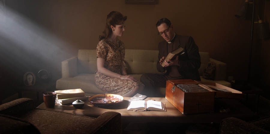
I meant Source-4 Lekos, whether tungsten or HMI, but yes, a Joker 800 in a Source-4 is like a mini-Xenon. Here are some shots I took on the set of "Manure", with shafts of light:

Two Joker 800 Source-4's off camera right:
900manure185.jpg


1K Xenon outside the window:
900manure186.jpg

David, would you say the hotspot these sources create are a trade-off for the effect you want?

I mean the floor and the book in the table are quite hot.

If the composition doesn't include the area that the light is hitting you can just ignore it and maybe cover in black material to reduce reflection.

Just thinking over it.
 
Back
Top