Vladislav Grausbard
Active member
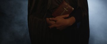
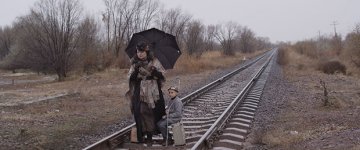
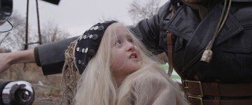
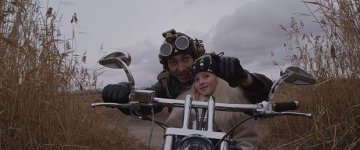
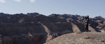
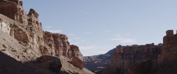
Hi All. Here's a still from the short steampunk style film, I'm currently shooting. Trying to come up with a master look for this shots. Many thanks
R3D files link
R3D files link

Follow along with the video below to see how to install our site as a web app on your home screen.

Note: this_feature_currently_requires_accessing_site_using_safari
I find that a wise idea prior to shooting is to go out and collect reproductions of works of art or previous films and create a Look Book, so that the cinematographer and the director are on the same page in terms of the kind of color, brightness, and mood they're trying to establish in each scene. I've dealt with DPs who literally had Look Books of 100+ pages in a binder or iPad for feature films, some of them really beautiful and detailed with classic paintings from Renaissance artists and master craftsmen.
I don't think it's a good idea to not have a clear approach prior to shooting and then just say, "hey, what can we do with this" in the color correction room. There's literally 276 ways you can go with these images. It's better to have a starting point and say, "well, we're looking for a high-contrast, desaturated look" or "we want it to be more on the green and strange side" or "we want it bright and warm and beautiful" or "we want a very soft 1940s Technicolor look." All those mean something.
Even if you were to say, "I want it to kind of look like O Brother Where Art Thou," only I want to go cold and blue instead of sepia, that would be a good start. Come up with some ideas on your own and I think you'll have a better chance of getting what you want.
I don't dispute that there are times where you see an image in the color timing room and the DP has to say, "wow, that's not what I expected. Can we try something else?" And the colorist can say, "what if we split the difference and do X, Y & Z?" That can work, too.