Welcome to our community

Be a part of something great, join today!

  • Hey all, just changed over the backend after 15 years I figured time to give it a bit of an update, its probably gonna be a bit weird for most of you and i am sure there is a few bugs to work out but it should kinda work the same as before... hopefully :)

REDUSER UPGRADE TIME

Status
Not open for further replies.
Generic compliment #43!

Seriously though, I love the extreme colors. The old color scheme was nowhere near as pronounced.
 
Last edited:
Just my opinion. The new look seems cold and creates the feeling of isolation. The old REDuser had a warm and welcoming feel.

EDIT: Maybe if the avatar area were white instead of grey. Just seems there needs to be more whitespace somewhere.
 
Last edited:
Android

Android

It looks great, guys. One thing. On my Android phone, the Quick Navigation button near the bottom of the page doesn't allow you to scroll through the options.
 
The new look seems cold and creates the feeling of isolation. The old REDuser had a warm and welcoming feel.

I agree, but warm was never RED's thing. NAB 2007 was REDs first real debut, and they brought along a giant metal spider. It's hard to get a web site to say... "Hello, we are RED. We build cutting edge professional cinema equipment... and FUCKING GIANT MECHANICAL SPIDERS! THERE'S ONE BEHIND YOU RIGHT NOW!" ...but this new design conveys that pretty well.


There will be a RED.COM store update tomorrow....
Should we expect an updated interface or new information?
 
Last edited:
What is the difference between the "What's New" and "New Posts" right below it? Seems redundant.

Also, will the notification tab alert when there are new messages?
 
I've got a big white band under the RedUser header on my iPad running 4.3. This is where the navigation used to be telling me what forum and thread I was looking at.

So I can not easily see where I am or how to move up one folder level if I want to.

I do like the new loom though.

Mike
 
I've got a big white band under the RedUser header on my iPad running 4.3. This is where the navigation used to be telling me what forum and thread I was looking at.

So I can not easily see where I am or how to move up one folder level if I want to.

I do like the new loom though.

Mike


I'm getting the white band on my iphone as well.
 
The search function seems messed up. If for instance I click on Jarred's name and select view forum posts I see a few new ones then jumps to posts from 2009. The same thing works for my own name.
 
With the black on gray in the settings panel it's difficult to tell what the text says. Otherwise it's looking great :)
 
I agree, but warm was never REDs thing. NAB 2007 was REDs first real debut, and they brought along a giant metal spider. It's hard to get a web site to say... "Hello, we are RED. We build cutting edge professional cinema equipment... and FUCKING GIANT MECHANICAL SPIDERS! THERE'S ONE BEHIND YOU RIGHT NOW!" ...but this new design conveys that pretty well.
Yeah, I agree it's an identity choice. And I'll adapt. But it really is harder to look at and read. Probably a generational thing.
 
This is the new design on Windows, Firefox 4. I suspect this looks much better on your Macs.

ReduserNewDesign.jpg
 
Generally I like the refresh. A few things need color tweaking still. Mainly the instructional/button/fill-in text. For instance, as I type this, the "show your signature" below is black on dark grey. Hard to read. Some of these things need to be lighter, such as matching the medium gray "Quick Navigation" text above this pane. Thanks.

Cheers,
Oliver
 
I agree with Oliver. Great start, needs some cleanup in font colors, and the top banner just feels crunched to me. It doesn't have the breathing room it needs with the login box, banner ad, etc. Just a petty thing I suppose in the scheme of things, but it does bug me. The body of threads feels really nice though. I feel like I can breathe.

I feel the same people that don't like the new look are the same people that don't like facebook when it gets updated. This design is pretty, clean, fast, and tight. Four things we all like.
 
Marcus Irvine said:
This is the new design on Windows, Firefox 4. I suspect this looks much better on your Macs.

That big white box was also visible on the iPhone and iPad running iOS 4.3. The UI looks MUCH better on IE9 than it does on the iPad and iPhone.

IE9.PNG


I have not had much luck actually uploading an image. The upload buttion does not function under IE9. When I switch to the old style upload, then I can browse, but again, upload does not actually function. The black text on gray is diffiuclt to read. Even more difficuilt is the white text on yellow. :)

Upload_Image.PNG


Another issue I noticed on the iOS is that the page numbers show up below the post, which add's a line break. It also clips. IE9 seems to render it correctly.

Previous site would show "Last Page" instead of the page number. This was easier to press on the iOS devices than the number, which is just a smaller target for my big finger. :)
 
Not sure on the overall look, but I suppose we'll get used to it.

My main problem is the Thread list grey colour (with white Thread text and light grey Thread starter info) - it's difficult to read and looks very 'bright'... the rest is OK (PC/Vista on the laptop I'm using). Still has the white bar at the top and the forum/what's new tab 'eats' into the white bar by a few pixels (this may be throwing some browser alignments off?).

As I mentioned on another thread, looks like RED is preparing for a big NAB/post NAB influx of users/traffic as the Forum & RED site get an update... so stuff like this in terms of housekeeping gets tested/thrashed out now.

We did the same thing for a Project I created at my last company - we pretty much had all the elements we wanted (ready to go) and then went into website/PR for a few weeks leading up to the Trade Show announcement... hope it's the same here as I'm eager for news on EPIC-S.

Back on topic - maybe just have more contrast in the choice of colours for backgrounds and text :smile5:

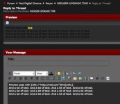
Note - just using advanced 'reply to thread' also highlights an odd colour combo - the preview window is black text on dark grey... very hard to see.

So - overall, I just think a little bit of colour fixing is needed, to stop Oldies like myself squinting at our screens!
 
When you hit the 'Preview Post' button the text is black instead of white. Shouldn't that also be white?
The new look is great, looks cleaner now.
 

Attachments

  • previewpost.jpg
    previewpost.jpg
    38.7 KB · Views: 0
Status
Not open for further replies.
Back
Top