Welcome to our community

Be a part of something great, join today!

  • Hey all, just changed over the backend after 15 years I figured time to give it a bit of an update, its probably gonna be a bit weird for most of you and i am sure there is a few bugs to work out but it should kinda work the same as before... hopefully :)

Reduser.net Redesign

aethetically it looks o.k....but not so functional...it does wear me out reading it..can't even remember the old one..but it never hurt my eyes.
Seems like the postings since have kinda dropped in numbers too.
 
Agree, this message board went from bad to worse. Trying to be constructive, I offer an easy solution rather than just complain. There are many other formats much superior than this one. Here's one.

http://investorvillage.com/smbd.asp?mb=144&mn=68812&pt=msg&mid=10324411

http://investorvillage.com/smbd.asp...commendedBy=&AuthoredBy=&MinRecs=&FilterType=

That blinding white is terrible on my eyes. I'll stick with the neutral gray thanks, and this forum is far easier to navigate than the scary place you just sent me.
 
Count me as one who preferred the old REDuser design. But I could co-exist with this one if they just made the background or text on every other thread on the new threads page, a slightly different shade or color.
 
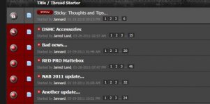
1. The "thread title" and "started by" are too close to each other in the "New Posts" view. OK in the normal, go to a specific sub-forum, view. The "New Posts" view does not have any line breaks in it either.
2. Posts you have read and have not read are too close in level to each other in the "New Posts" view. OK in the normal, go to a specific sub-forum, view.
3. Layout on iOS devices is not great.
-a. The thread page numbers are wrapped around.
-b. The started by is in a larger font than the thread title

I have attached sample images for numbers 1 and 2. These are from IE9, which looks MUCH better than using an iOS device.

All of my viewing is done by using the "New Posts" button.
 

Attachments

  • ReadVsUnread.PNG
    ReadVsUnread.PNG
    10.6 KB · Views: 0
  • NormalView.jpg
    NormalView.jpg
    20 KB · Views: 0
I'm not one to make a habit of speaking negatively of a design, however I must say I have been on REDuser a bit less because of it.

(Is that a good thing?) Hehe.

Also, I'm not the only one I know who has been visiting less as of lately.

Perhaps the design is not yet complete?
 
I'm not one to make a habit of speaking negatively of a design, however I must say I have been on REDuser a bit less because of it.

(Is that a good thing?) Hehe.

Also, I'm not the only one I know who has been visiting less as of lately.

Perhaps the design is not yet complete?
Yeah, I've seen my productivity go up as well since the redesign...
 
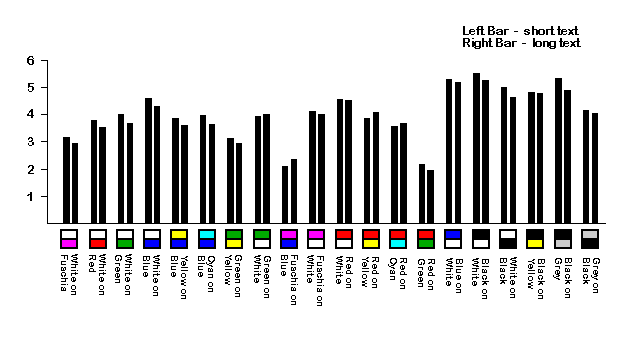
For me, this red/gray combination is a little bit tiring, and the text/background has too little contrast.
There are many studies out there, but generally people generally perform best with combinations that include black or white in them.
COLOR.GIF

http://www.laurenscharff.com/research/survreslts.html
 
Well my thought was to just revert back to the old design which was nice to look at. even the new shades of red and grey etc on this new one are tough for me.


Just go back to the old style, can't that be done with relative ease? and once the "new" version has the kinks worked out, throw it online or somethin (right now i am editing this post, and it's a total nightmare

agreed
 
I thought I was being overly critical at first when I thought the same thing - Dark, Segmented, visual disconnects in some parts (Threads seem to have larger gaps between the posts). The Burgundy left avatar background created a nice vertical supporting structure that all the posts cantelevered off, providing a nice warm visual anchor and vertical continuity as you scroll... Maybe just bring that back and tighten the gap between posts, lighten the reply box a smidgen and its sweet.
 
Back
Top