Dan Hudgins
Well-known member
- Joined
- Feb 16, 2007
- Messages
- 1,369
- Reaction score
- 0
- Points
- 0
- Location
- San Francisco, CA USA
- Website
- www.dancad3d.com
More or less Cinematic?
More or less Cinematic?
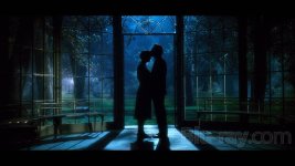
I re-graded some of the examples above so that the "white point" in the images is not so far down from monitor white.
The question is:
Are these grades less "cinematic" (or more dynamic)?
And does having the white point closer to midtone in the grade make the results look less "video" (or just mirky)?
You may need to adjust your monitor brightness a little since I was using a gamma 2.4 monitor. I noticed in some of those that the whites in the image were clipped a bit but then broght down way under monitor white, giving the images both a blown-out and dark look at the same time, so some of the compression in the highlights is in the images, not because I brought the highlights up. (not so good to grade jpgs). You need to look at the originals above to see what changed. There is also the issue of the ITU/CCIR 601 limits of 16-235 rather than 0-255 for 8 bit images, and I'm viewing on a CRT monitor so I may see more detail on both ends than someone viewing on an HD or LCD monitor that only shows 16-235.
More or less Cinematic?
You are 100% correct about production design. Many first timers overlook the color palette in their short films and wonder why it does not look cinematic even with semi porofessional lighting and a camera like red.
I re-graded some of the examples above so that the "white point" in the images is not so far down from monitor white.
The question is:
Are these grades less "cinematic" (or more dynamic)?
And does having the white point closer to midtone in the grade make the results look less "video" (or just mirky)?
You may need to adjust your monitor brightness a little since I was using a gamma 2.4 monitor. I noticed in some of those that the whites in the image were clipped a bit but then broght down way under monitor white, giving the images both a blown-out and dark look at the same time, so some of the compression in the highlights is in the images, not because I brought the highlights up. (not so good to grade jpgs). You need to look at the originals above to see what changed. There is also the issue of the ITU/CCIR 601 limits of 16-235 rather than 0-255 for 8 bit images, and I'm viewing on a CRT monitor so I may see more detail on both ends than someone viewing on an HD or LCD monitor that only shows 16-235.