Welcome to our community

Be a part of something great, join today!

  • Hey all, just changed over the backend after 15 years I figured time to give it a bit of an update, its probably gonna be a bit weird for most of you and i am sure there is a few bugs to work out but it should kinda work the same as before... hopefully :)

Just wrapped a no-budget shoot. Here's some stills.

Aaron Lochert

Well-known member
Joined
Oct 9, 2013
Messages
1,202
Reaction score
3
Points
38
Location
Tucson, AZ
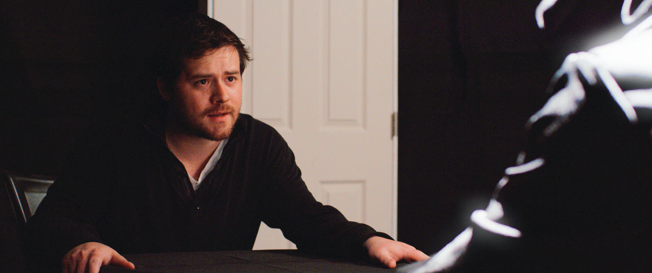
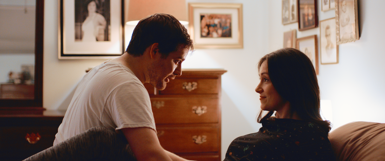
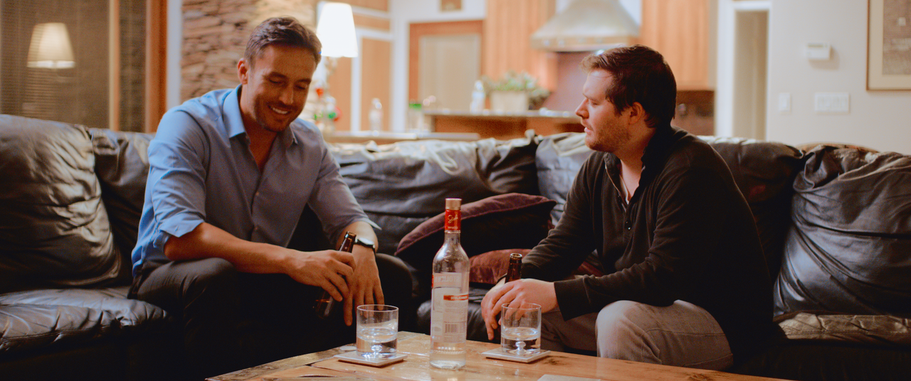
Hey guys, just sharing some screengrabs from something I DP'ed last weekend. It's a film called Lament which is about a man who's poor choices trap him in a state of limbo. In order to move forward, instead he must go backwards and relive the pain many times over until he has proven worthy to continue.

We shot this in 3 and a half days. The script was 25 pages. We had no crew (me, my AC, a sound guy, and a make-up artist, the lead actor was the director) and little money. But damn if we didn't get it done despite the impossible.

Shot on Epic-W Helium directly to 2K Prores. These are all taken from an 8K or 6K window on the sensor - I utilized the hell out of that feature to minimize lens changes. Since it was all being scaled to 2K the difference in 8K and 6K were just about moot.

Lenses used:

Tokina 11-16 for all the daylight exteriors and driving scenes
Zeiss Contax 35mm f/1.4 for just about everything else.
Zeiss Contax 50mm f/1.4 for the bedroom closeups.
Zeiss Contax 100mm f/2 for the couch closeups.
1/4 Black Pro Mist for all the daylight exteriors

Any questions or critiques, I'd love to hear it. There are definitely things I would have done differently had we had the time, crew, and money for it, but that's the way these things go.

Enjoy :)

30616874427_0fbab3259d_o.png


44643793165_e8ec7324b9_o.png


44643793145_69a6e59607_o.png


30616874197_1a7b37c1ca_o.png


44643791285_ea14535d40_o.png


44643791435_19274739ce_o.png


44643791035_df52af61ed_o.png


43740328870_4873edfebb_o.png


[
30616873877_9c6e2d45ea_o.png


43740328380_ca662d5b5e_o.png


43740328530_fe4eecba1e_o.png


43740328250_15d2869a1f_o.png


44643792525_58b6f04168_o.png


44643791735_6f6c9bfe8d_o.png


44643791705_beb89162bc_o.png


43740327710_69120839ac_o.png


44643791985_ea406194b2_o.png


43740327860_e2208e7281_o.png


44643792235_f22ba5f686_o.png


44643791545_d3c405b31f_o.png


30616872867_f97e7f81c9_o.png


43740326970_d448ceb7a5_o.png
 
Great Looking Images Aaron!!And It sounds like a great story as well.
 
Aaron,


Maybe a few "lighting" changes. I don't know exactly what lighting mood you were going for so my suggestions could be entirely wrong.

44643791035-df52af61ed-o.png


44643791285-ea14535d40-o.png


new.png


43740328530-fe4eecba1e-o.png


44643792525-58b6f04168-o.png


44643791735-6f6c9bfe8d-o.png


44643791705-beb89162bc-o.png


43740326970-d448ceb7a5-o.png


9.png


30616872867-f97e7f81c9-o.png
 
Last edited:
A suggestion was made on another forum that "dark" is the latest trend. And by "dark" I think they meant images where everything is "under". The alterations made by Rand, among other things, brightened the images. Maybe too much for my liking in some of the images. In nearly every instance I prefer the exposure of the original images. I find that images where everything is "under" are visually appealing to me. Sorry, but I'm not sure of the proper way to describe such images. Images where the brightest part of the image is well below 100 IRE and everything is placed on the lower-end of the brightness scale. Here are some examples, from the work of Natalie Kingston:

Sticking+to+My+Guns_prores.00_01_22_16.Still007.jpg


619936901_780x439.jpg


Intersection_Color_1080p.00_08_21_05.Still009.jpg


I find the lightened images garish compared to the originals. They scream at me. A middle-ground between the two might be better.

It is interesting that rand's eye wanted the images brighter. And wanted them that much brighter. Whereas the result of his brightening the images made them look less "cinematic" to my eye, as much as "cinematic" is a thing that can be defined and not just a visually-prompted emotion.
 
Last edited:
Images where the brightest part of the image is well below 100 IRE and everything is placed on the lower-end of the brightness scale. Here are some examples, from the work of Natalie Kingston:

It is interesting that rand's eye wanted the images brighter. Whereas the result of his brightening the images made them look less "cinematic" to my eye, as much as "cinematic" is a thing that can be defined and not just a visually prompted emotion.

I agree about the observation concerning the brightest part of an image being placed well below 100 IRE. I think this look is associated with cinema particularly from the 70's, 80's, and 90's (or perhaps before film grading went digital).

From what I understand, deliberately placing the whites up to 100 came more from the Broadcast TV world.
I remember part of this supposedly being aesthetic as there is a preference for brighter and higher contrast images. I heard the other reason being more technical particularly during the analog days as an image up to 100 IRE made for a stronger (perhaps more QC friendly) broadcast signal. I remember reading about this but don't know entirely how true either statement is.

It's interesting that there now seems to be less distinction between a "broadcast TV" look and a "cinema" look.
Many films seem to now place the brightest point up to 100 IRE or equivalent.

I also think the rise of streaming video (particularly Youtube and Netflix) has given us another aesthetic
where the color seems to be much more saturated than what is normally associated with the "classic" color cinema look.

Be interesting to hear from colorist like Wielage, Most, and Blackstone regarding this.

Anyway, the images look nice.

Brian Timmons
BRITIM/MEDIA
 
John,

I might just have to double check my monitors brightness level, because to me those images look underexposed for skin tones, and the one I posted looked about normal. I have been having problems with my video drivers lately, so they very well may be giving me improper brightness levels.

I'll check.
 
The shots that in the dark room with the hooded man are supposed to be dark with a single shaft of light. It's low-key because it's mysterious. That source is supposed to be the only light source in the room in the story, so although I did have some other lighting on the main character, I didn't want it to feel like he was lit. Also, you're not supposed to see the black cloth in the background. It's supposed to be an infinite void of darkness. Seeing the black cloth ruins the illusion.

The shots in the bedroom have mint-green walls, not white. Her character was sleeping right before when these shots start, so it's not supposed to feel high key at all. It's an intimate scene and playing it bright is counter to that, IMO.

Brightening the moon-light scene and white balancing it just reveals how poorly I lit this one. I purposely let this one sit more in darkness because I couldn't afford, nor had the crew or time to do any of the background lighting that I would have wanted to do.

The two guys on the couch is supposed to feel somewhat somber. I won't get into the story but high-key is not what that scene called for. We also had discussions in pre-production to make this one warm in color (along with all the other interiors, really). Again, the walls aren't white, so white balancing them to white is undoing set design and lighting decisions.

All these dark scenes are contrasted with the bright scenes outdoors. In pre-production it was discussed that we get this contrast correctly, so the piece has some dynamics because it jumps between limbo in the desert and these warm memories. Slamming everything to max brightness kills some of that vibe.

Hope that answers some things.
 
Them sticks and stones kick me out of the flow, it's ruining my Zen.

pN7IXJA.jpg


Any chance of reshooting this, Aaron?
 
Aaron,

Alright then, understood. With the walls, I thought it was maybe the Helium sensor adding a little green to them , but now that I know they were mint green , that explains a lot. Plus, I kind of figured that the black cloth should'nt be made that apparent.
 
It is interesting that rand's eye wanted the images brighter. And wanted them that much brighter. Whereas the result of his brightening the images made them look less "cinematic" to my eye, as much as "cinematic" is a thing that can be defined and not just a visually-prompted emotion.

The fact that the word "cinematic" is used in any proximity to my work makes me giddy. Thanks for that :)

I agree about the observation concerning the brightest part of an image being placed well below 100 IRE. I think this look is associated with cinema particularly from the 70's, 80's, and 90's (or perhaps before film grading went digital).

From what I understand, deliberately placing the whites up to 100 came more from the Broadcast TV world.
I remember part of this supposedly being aesthetic as there is a preference for brighter and higher contrast images. I heard the other reason being more technical particularly during the analog days as an image up to 100 IRE made for a stronger (perhaps more QC friendly) broadcast signal. I remember reading about this but don't know entirely how true either statement is.

It's interesting that there now seems to be less distinction between a "broadcast TV" look and a "cinema" look.
Many films seem to now place the brightest point up to 100 IRE or equivalent.

I also think the rise of streaming video (particularly Youtube and Netflix) has given us another aesthetic
where the color seems to be much more saturated than what is normally associated with the "classic" color cinema look.

Be interesting to hear from colorist like Wielage, Most, and Blackstone regarding this.

Anyway, the images look nice.

Thanks for the kind words. I think you're right about your observations, lots of different styles of media merging together, changing minds of what "right" should be. I'm personally not a fan of slamming whites up to 100 IRE because then that leaves little room for anything above white. Perhaps that's why the shift toward HDR is happening, we need headroom again for brighter-than-white highlights.

Šabović Adis;1829116 said:
Any chance of reshooting this, Aaron?

No chance - no budget for reshoots nor the travel to get there. I also deliberately put that foreground rock there for some parallax when we dolly in on this shot. I can see what you mean about wanting it totally clean, but I think a different location entirely would have been needed for that. Maybe a lake-bed or something like that.

Who's the actor playing Phil Holland? :smilewinkgrin:

Haha I didn't even see that connection until just now. That would be Thomas Jernigan, the director of this film as well.
 
Back
Top