Welcome to our community

Be a part of something great, join today!

  • Hey all, just changed over the backend after 15 years I figured time to give it a bit of an update, its probably gonna be a bit weird for most of you and i am sure there is a few bugs to work out but it should kinda work the same as before... hopefully :)

DR ..a good discussion!!

Underexposure on Monstro is just straight up unusable... Venice has to win in that regard... What's up with the RED sensors going green? They need someone working on the Color Science pronto... And really for each individual sensor.
 
What's with the big difference in brightness between standard and low light modes in your image? Are these charts not all aligned?

I just set them all to ISO800, didn't tweak them or anything. I just figured the Gemini and Venice had their dynamic ranges shifted between their standard and low-light modes, so you'll see more in the dark but clip earlier too when going low-light. Maybe it's something else.
 
Underexposure on Monstro is just straight up unusable... Venice has to win in that regard... What's up with the RED sensors going green? They need someone working on the Color Science pronto... And really for each individual sensor.

Did you see where I dialed out the green?

Monstro: https://farm2.staticflickr.com/1757/41803339974_bfbbe1f9a1_o.png

Venice: https://farm2.staticflickr.com/1739/42525649491_c07abbc6d6_o.png

When looking at these two, "straight up unusable" comes to mind... but not when I'm looking at Monstro.
 
Did you see where I dialed out the green?

Monstro: https://farm2.staticflickr.com/1757/41803339974_bfbbe1f9a1_o.png

Venice: https://farm2.staticflickr.com/1739/42525649491_c07abbc6d6_o.png

When looking at these two, "straight up unusable" comes to mind... but not when I'm looking at Monstro.

Definitely unusable. There's still green in the dark parts of the blanket. And I'm not saying the Venice is usable by any means, just that if I had to pick which underexposed image, the Sony would win.

Also, there's a stuck pixel in the Monstro sensor, a red pixel on the blanket.

At the end of the day, if the ISO range craps out after 3200, why even allow it? Especially when RED cripples us with the IPP2 menu. I don't get the logic of everything RED does, but when exposed properly I think the Monstro blows the Venice out of the water.
 
I had an Alexa chart somewhere on my hard drive so I threw that in.

First, I processed all clips to ARRI Alexa/Log-C color via a color space transform in Resolve to avoid any visual bias with different gamma curves showing each chip at different brightnesses. Then I white balanced all clips to the 6/20 chip via the raw tab. I also matched their exposures via these settings:

Alexa - ISO 800
Monstro - ISO 2500 +0.15 exposure
Gemini - ISO 1600 -0.05 exposure
Gemini Low Light - ISO 5000 +0.24 exposure
Venice - ISO 1090
Venice 2500 base - ISO 5880

Unless I messed something up, this chart at viewed at 100% scale should represent 1:1 pixels for a 4K delivery. These include the first clipped chip, as well.
27680418897_3f1a41f222_o.png


Provided the methodology for shooting these charts was sound, this should provide a clearer demonstration of what's going on. And when white balanced, you can see how the black balance goes off on some cameras. What the Alexa and the Venice do nicely is a very neutral greyscale while the red cameras show color shifts - color balance the top end and the bottom end goes another way.

The Venice appears to have some rolling/banding/frequency noise going on - not fixed pattern. Luigi provided two frames and the horizontal lines move vertically frame to frame. I also am not seeing very much CMOS smear as was suggested. It's probably a dark spot in the rolling noise causing the illusion - won't know for sure until we have a few seconds worth of footage to look at with some vertical panning included.

All I know is this many discrete stops is impressive for all the cameras involved. I can see 16 stops on all cameras. I can also just barely make out the division line before the 17th stop. Now, who's to say what makes a "usable" stop, but that's for you to decide as the artist.


Exactly an excellent representation Aaron. I do not have time and I thank you for this. ;)


Guys, what I can tell you for now that Venice behaves well, very well balanced in every sense.
Each sensor has its own characteristic and response to light.
In everyday reality I still find that Monstro is the best choice, feeling looking at the image, leaving out the DR test.
I'm trying to take some more between Monstro and Venice these days.
 
The more tests I see the more I wonder whether LL is even that useful. Does it really even have any less noise than Standard to trade for the two stops of highlights? When I had a gemini in front of me I was surprised how much noisier LL was. Would be interesting to see both exposed the same and see what the noise improvement really is... It's possible not many situations would merit losing the highlights just to get less than a stop more sensitivity.
 
I think people need to keep in mind their own preferences and end-use scenarios can lead to different interpretations of the test data. Other peoples results might be different to what you would get if you were to gather and interpret the same data yourself.
 
Last edited:
Les,

I also think if more people posted their results instead of the same few people posting over and over again, there would be much more complete data from which to derive a better overall consensus.
 
More eyes on would indeed provide more points of view, which could be worthwhile even if reaching a consensus isn't always possible or even desirable.

It's understandable though if people keep their testing and analysis to themselves, in fact that would be the more 'normal' thing to do, for a variety of reasons.

I just think we're lucky that people are willing to share their findings and achievements and help others out here to the extent that they already do.
 
Yes, results vary from person to person, but they should never be too dramatic in same case scenario situations when it comes to stock everything. As for charts, they're pretty much as stock as it gets. Once my Monstro arrives I'll be doing some testing as well.
 
Last edited:
From this chart, all RED cameras have a sensor smear effect. is it really so? or is it due to the way it was debayered?

Thanks

Pat
 
I’ve never seen so much sensor smear even on other xyla charts.


Pat, you should see the r3d of Phil, until then you can not say.
If we use the same methods it should have the same results.
Perhaps, he did not clip the first step on the chart.
 
My thoughts...

I've been loving the many different creative grades that Rand has been posting on various threads. Some folks post a lot of cat photos; Rand posts a lot of grades. OTOH, I'm less impressed with the "rescue grades" I've seen, both from Rand and others. Is it amazing that we can see individual threads of a black sweater shot on a moonless night, with only the dim glow of a nearly-spent cigarette burning slowly in the character's almost-forgotten memories? Yes. But let's be serious: there's a way to light things to get the effects you want and there's a way to grade to get the look you want. At some point, these rescue operations are no more than "painting by numbers", and they look a bit like painting by numbers. Many of the rescue grades I've seen have strange casts to them. Maybe it's my monitor. Maybe it's the monitor of the person who's grading. Maybe it's the consequence of painting by numbers.

Now, before I get flamed too much, I want to state up front that I understand that the human vision system can be very tolerant of noise in the shadows. And I understand that that same vision system can become distracted by that noise for a variety of reasons. So...some noise is OK, some other noise is not, and that's why we test and that's why we observe and take notes. I'm not trying to say its all one or the other when it comes to noise.

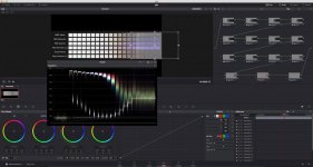
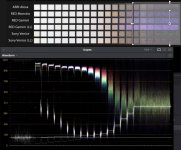
However, as I've also said before, not all exposure levels are created equal, and pretending that 16 stops of dynamic range is like 16 nice little zero-one bits is just folly. To illustrate the absurdity of digging deep more than a few stops in to the negative, I've created a series of overlapping power windows and placed them progressively across the Xyla chart posted previously. There's no grade over the first column. The second column through to the end gets a gain of 1.06 and a contrast bump of 1.02. On top of that, the third column through the end gets a gain of 1.07 and a contrast bump of 1.02. On top of that, the fourth column through the end gets a gain of 1.08 and a contrast bump of 1.03. And so forth, with each stop increasing in both gain and contrast (until the last few, where I had to manually pick values). If you multiply it all out, there's a lot of gain and a lot of contrast enhancement adding up as we move to the right.

Attached is a screenshot of the Resolve (full screen and cropped in) showing the comparison of true full-range contrast and noise quality vs. successive digs into the negative. And what we see are 9 very clean stops and a 10th stop that's got some noise. Stops 11, 12, and 13 show progressively more noise as the value that's supposed to be white turns into a cloud and the line that's supposed to be black keeps walking its way up. Stop 14 barely disconnects the bottom range of "white" from the "black" line. Stop 15 connects the two, and at stop 16 the noise of the "white" area fully engulfs the "black" line. The waveform graph shows that on average, the "white" noise floats a little above the "black" line, which means that yes, our brains can see a distinction and thus claim a signal-to-noise victory. But do we have the clear zones that Ansel Adams talks about in his pioneering work of The Camera, The Negative, and The Print? No: that's really gone at stop 13.

Now, because the WFM is adding up all the noise across all the sensors, this particular test doesn't clearly show whether one bad actor is skewing/screwing the results of a better sensor. Using my eyeballs, it does look like ARRI and SONY have a stop less noise than RED around stop 11 or 12. But this is (or should be) so deep in the shadows that it shouldn't be a distraction, especially if one likes the organic noise of the sensor or if one adds film grain as part of a creative look.

TL;DR: ETTR and grade!

Dropbox link to original Xyla comparison chart, screenshot, and Davinci Resolve project: https://www.dropbox.com/sh/ivyuj5imqu56tmo/AAA1XybMZJIVpVTttj_gpyIZa?dl=0
 

Attachments

  • xyla-screenshot.jpg
    xyla-screenshot.jpg
    95.1 KB · Views: 0
  • xyla-crop.jpg
    xyla-crop.jpg
    91.3 KB · Views: 0
Thanks a lot Michael!


Yeah, most of my attempts to recover underexposed images are to see how far a specific sensor can be pushed until it breaks. To be honest with you, none of the images that I pushed would I personally use in professional setting. All of the test show how very important it is to properly expose you images. Red raw is a great codec but "it's not your mama", it can't save you from poor lighting and exposure choices.
 
Why are the blacks purple on all of the red cameras? I’ve always felt this in the noise compared to other cameras but this highlights the differences in the blacks well. Noise can be pleasing and add texture and nostalgia but if it’s got a color to it, it becomes unnatural and I think the viewer senses that on some level.
 
Back
Top