Welcome to our community

Be a part of something great, join today!

  • Hey all, just changed over the backend after 15 years I figured time to give it a bit of an update, its probably gonna be a bit weird for most of you and i am sure there is a few bugs to work out but it should kinda work the same as before... hopefully :)

Color Charts vs IPP2 in Davinci Resolve

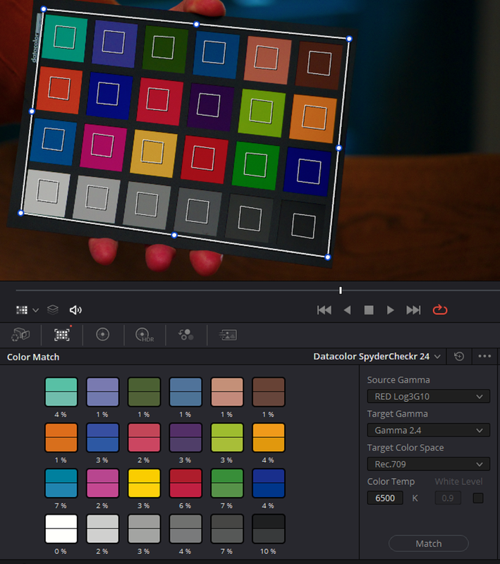
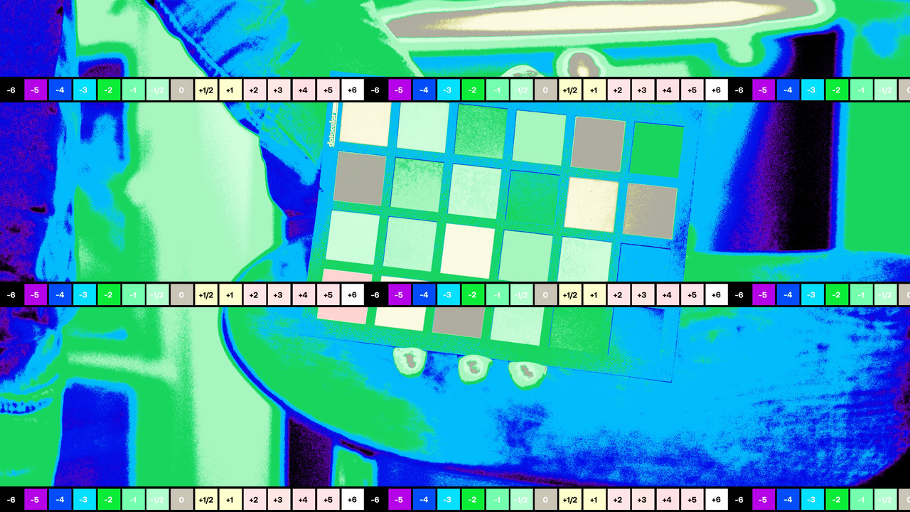
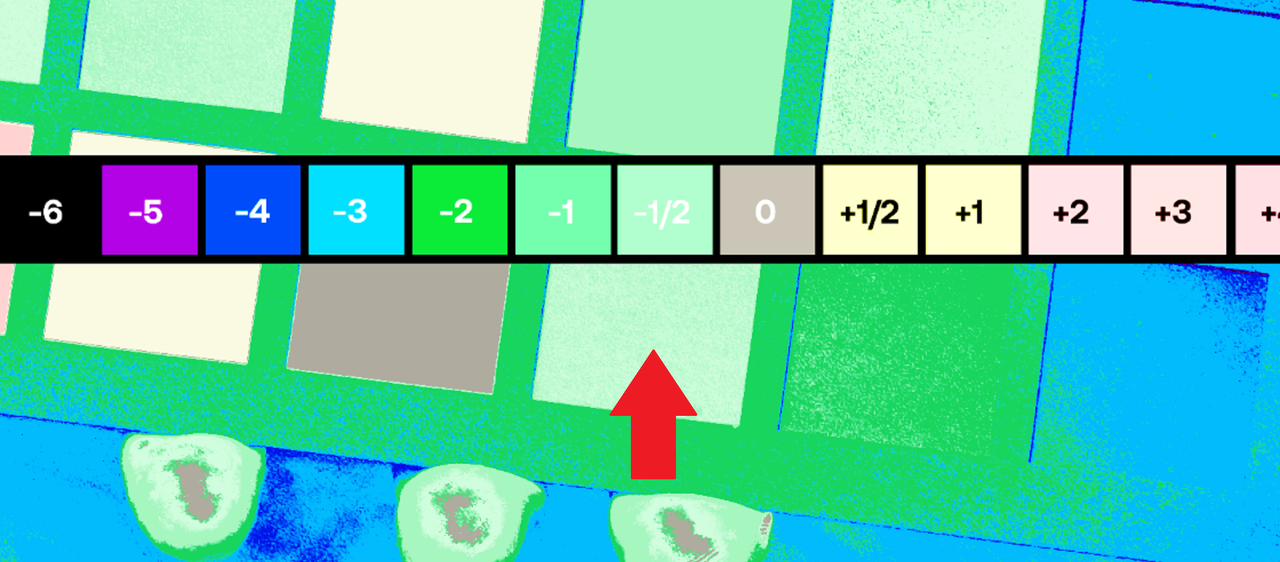
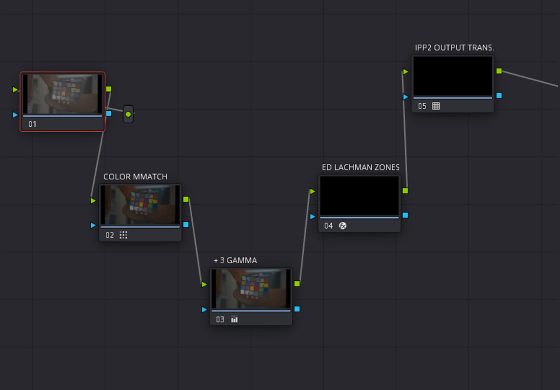
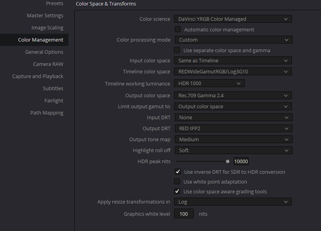
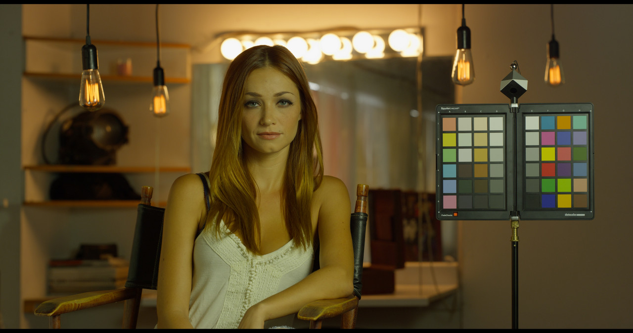
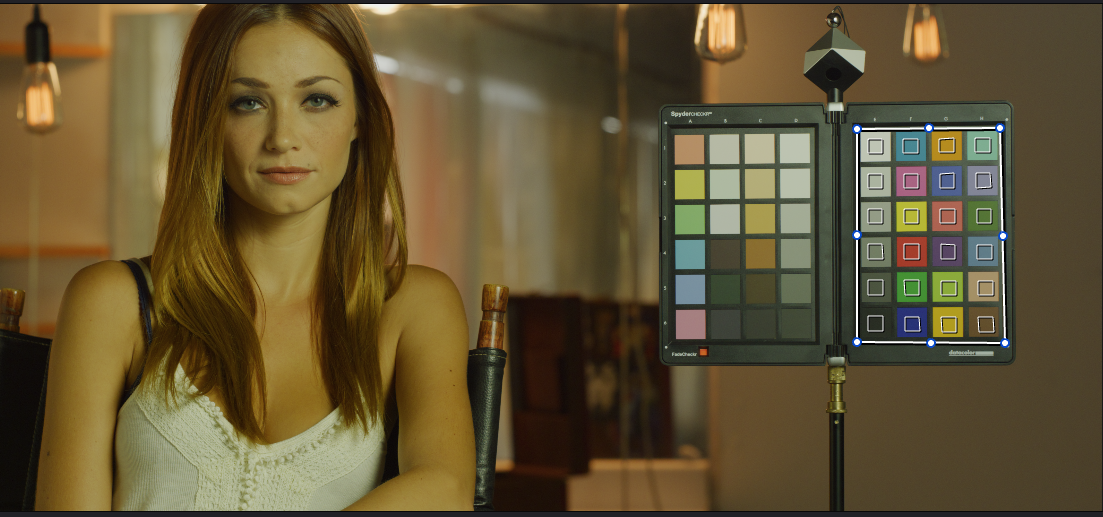
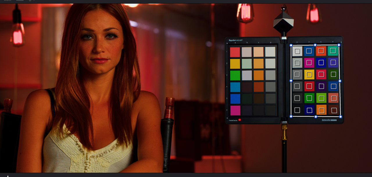
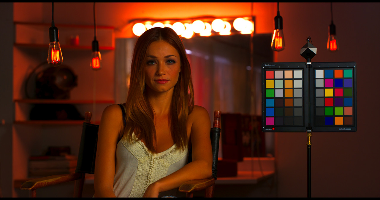
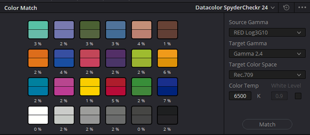
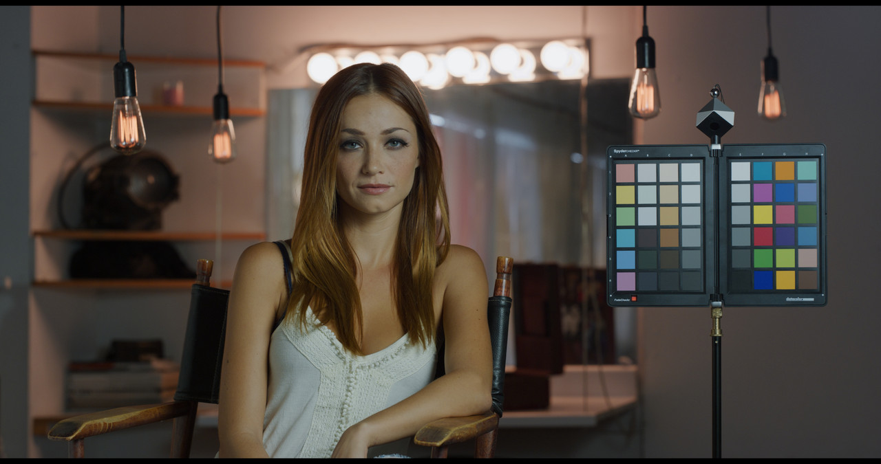
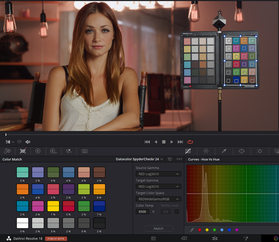
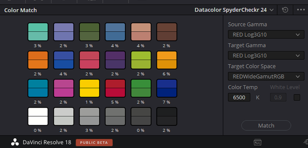
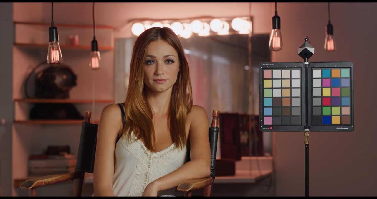
There's quite an extensive tutorial on using ColorMatch over at MixingLight.com. Bottom line is that ColorMatch doesn't do a very good job at setting the initial luminance values. You can get much better results if you set up the "proper" luma values before you execute the colormatch.
 
Bill,

I first ran an "ED LACHMAN ZONES'' after the COLORMATCH then added a +3 gamma so that 18% grey was properly exposed. I don't like relying on anything but my own skill to solve my problems for me not some chart to act as my color correcting JESUS.. What happens in mixed lightings situations, lights with low CRI ratings, LEDS with color spikes or if there is not a COLOR Chart reference at all in the scene you have to grade, then what can be done by the color grader?

Screenshot-5185.png


1.jpg


2.jpg


18% GREY A HALF A STOP UNDER EXPOSED

2-5.png


WITH +3 GAMMA BEFORE ED LACHMAN ZONES, 18% GREY PROPERLY EXPOSED

Screenshot-5186.png


4.jpg


4-5.png

3.jpg
 
Last edited:
Here's a perfect example of How a Color Chart will fuck you in a Mixed lighting situation

The example image below is a RED sample image from PHIL HOLLAND on RED.com. First you must understand that the Chart in this image was merely included as a "GUIDE" to help correct the image with NOT to be used to correct the colors with any kind of "COLOR MATCHING" Chart tool.


1) first here is the IPP2 Color Managed Settings I used in this example, the results were the same in an IPP2 Node based IPP2 Transform Lut workflow as well.

Screenshot-5194.png


2) Here is PHIL's RED R3D file at 5600K the default for most RED clips. You'll notice that the Image has a Datacolor Spyder Checkr in the frame. So I should be able to get a pretty good approximation for the correct colors from which to continue to color grade from if I use the "COLOR MATCH" tool in Resolve. Let's try it and see.

1.jpg

2.png


After COLOR MATCH, what the HELL !!!!


3.png


4.jpg


5.png


What Happened???

What Happened was that the COLOR MATCH tool did an excellent job of properly adjusting the Colors for the Lighting that was illuminating it. However, because the lighting hanging from the ceiling and the lighting from the Vanity mirror didn't illuminate the Color Chart at all, The COLOR Match Function didn't take them into account whatsoever.


Here is just a basic grade for the Overall lighting from that image. I used the Color chart in the Image as a 'Guild / Reference" to get a decent skintone while maintaining a decent balance/ accuracy to the colors on the chart.

1-1-4-1-1-4.jpg
 
Right on, Rand. I NEVER use Colormatch, esp. since Davinci color managed made the scene.

Yeah,

I was a true believe when I purchased my DATACOLOR SPYDER CHECKr almost 11 years ago. However, after using it with Resolve a few times, I felt Suckered!!. Now I have recently taken a Seminar where under accurate/ near perfect lighting conditions, the Chart can be used to help make/ make better IDT's for existing cameras. So it's not completely useless just yet.:thumbsup:
 
Ummh, literally, that's how it looks when a chart applied with the settings I have poseted above, no RAW settings changed (R3D as in source RMD - 5000k WB; tint minus 16):

IPP2 straight transform without color match:

NO-CHART-PHIL-1-1-1.jpg

With color match using settings I have posted in previous posts above:

CHART-PHIL-1-1-2.jpg

I can assume you're doing something wrong when using color match. I'm no pro here, but clearly the settings I was using are giving stable results and I assume are pretty accurate based on vectorscope readings:

IPP2 transform without color match:

Screenshot-2022-06-18-214853.jpg

After color match:

Screenshot-2022-06-18-214923.jpg

Vectorscope is in 2x zoom.

I don't know the color of the walls in Phil's R3D, but I suppose those were pink, or close to. Just look at the skin tone - it's much, much closer to a real one. I don't have an HDR display to try it in the HDR workflow, or any other than REC709/SDR. But for SDR it clearly works and does a good job using the pipeline I've mentioned already.

Your grade is actually closer to the color match one than the original one to my eye. While staying with less saturation and creating much more separation. But I was here not for the grades, I was asking for a base for a further grade - transferring as much color from the set to the post, so the colorist would see what I was intending him to see (of course in cases where the lighting wasn't like in recent Batman, where charts would obviously be f***ed up).

Actually I came here for answers from someone like Graeme (or someone else from RED) to chime in on the correct workflow with charts and color match tool in IPP2 and SDR/HDR and all those cases we can end up utilizing the IPP2 workflow in Resolve. Because the results utilizing my preferred workflow just don't work. While the LUT workflow actually works ok.
 
I didn't correct the image before using Color Match, I used as I stated a Default of 5600k. What's the purpose of COLOR Match if you're going to do initials corrections like you did to them? Your images look monochrome yellow or pink. What are you trying to get accurate with the Vectorscope? Which one of the three Lighting sources in the image are you balancing for?
 
It seems that you are still using the same erroneous COLOR MATCH settings as before to get the results you posted above.

Screenshot-5200.png


Screenshot-5200-2.png


1-1-5-1-1-5.jpg


From Resolve 18 Manual

Screenshot-5201.png
 
Last edited:
I prefer the results when leaving the footage 3G10, and transforming to 709 within the color match tool. If the footage is first transformed to 709 in the Raw tab (or Color Management) and then color matched, the contrast is a little more baked in.

Good Luck CM3G10.jpg CM2.4.jpg
 

Attachments

  • photo117036.jpg
    photo117036.jpg
    66 KB · Views: 0
Howie,

Those settings are correct, but are you using a RWG/LOG3G10 to REC709 IPP2 LUT transform with those First Project settings?. You first started out in a RWG/LOG3G10 workspace in the Clip CAMERA RAW with the correct COLOR Match Settings as well. Then you went from a RWG/LOG3G10 workflow to a standard REC709/BT1886(GAMMA 2.4) workspace also with the correct COLOR MATCH settings. Since you are in a REC709/ BT1886(GAMMA2.4) project and exporting as a REC709/ GAMMA 2.4 , your SOURCE and TARGET GAMMA should both match as well as the REC709 Target COLOR SPACE.
 
Last edited:
Back
Top