Welcome to our community

Be a part of something great, join today!

  • Hey all, just changed over the backend after 15 years I figured time to give it a bit of an update, its probably gonna be a bit weird for most of you and i am sure there is a few bugs to work out but it should kinda work the same as before... hopefully :)

"Birthday" short film, Epic and Cooke S4

Nicely shot. Great soundtrack. I did find it painfully deliberate in the framing and camera moves. It felt more in tune when it went hand held towards the end. Im not sure the dolly moves were needed. I think they may have been better as static shots. The moves added to much complacency for me. Great lighting and cookes always look so comforting. Nice work.
 
Its a shame that this is more about the camera and the aesthetic opportunities than about the characters. Being a little film about mourning someone's death, I found little care for the feeling of its characters, whilst the effort it seems went all the way to making images that looked like editorial still images.

Nothing wrong with that, but when the director misses his shot on being able to tell the story through the characters, no matter how carefully shot the piece is, it will be shallow. A little more balance between visual and content would have helped.

The lighting was beautiful tough, although the art direction also helped. Although a little darker would have probably suited the subject matter more closely. Thanks for posting.
 
Thank you guys for your feedback!

The father and mother are elegant and dignified even if they are in pain...
It's something you can see especially in older people

I think slow dolly moves and this kind of framing help to explain the alienation of the characters, while a too organic/shaky camera would be more obvious...

By the way i spent a few hours discussing about it with the director :)
 
Production design and cinematography was beautiful.

I didn't think the dolly was a huge problem, but I would've loved to see more hand held shots.

Great job!
 
Nice Work Miki e Pietro :cheers2:

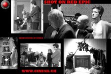
Shot on RED EPIC "Machete" 599
 

Attachments

  • cu.jpg
    cu.jpg
    97.2 KB · Views: 0
Really liked this piece I don't agree with the previous posters about the dolly moves.I really liked it and think it added to what you and the director were trying to achieve. Loved the lighting and colour palette. What I didn't like was the score...really didn't like that. Felt it was overbearing and tried too hard. It also just didn't match the mood for me at all.
 
Last edited:
I liked the contrast of the steady smooth shots and the handheld work... a really excellent short and got the point accross really well!
 
For me....

Handheld throughout would have felt false. Especially in 2.39:1. You decided it was supposed to be a little stagey, you worked with toplight, strong production design and minimalist acting to accomplish that, and it worked. Good choices on location, light, and color grade.

I agree the score at the end is trying to inject an uncomfortable tension that is already present in the image of the dead woman. Then the candle flame and those strings kick in--that moment took me straight out of the mood you created. Extinguished candle and normal music, fine; crazy squealing violin score and no candle smoke, sure; one or the other might not have done this, but the two together put a layer of cheese over a human story. Perhaps not for others.

I can only say this because the light was at once cinematic and naturalistic for most of the film.... the shot of the woman in front of the bookcase. Beautifully framed. But the toplight makes her nose very bright, and with little fill and no eyelight, and let's just say she doesn't have the nose for it.

The dolly moves with handheld switchup worked for me. Any more intensity in either would have distracted; I think you achieved a nice balance. Also despite the 2.39 frame, the two homes feel like minor characters in their own right. That's about all there is to say, I think it's well shot.
 
The handheld camera in the second half motivated the story arc in a nice way. Would have liked to see a little more development in the characters but great job. Visually spectacular.
 
Nice work!

I can never understand after I watch a well made piece, such as this one, how some people nit pick about such minutia. I'm assuming that most of the posters on here work with visual story telling. If they do then they should know how many working parts go into any film making endeavor. There is no way of knowing, especially from a distance, what factors go into an artists decision making process.

All I can tell you is that your piece held me for it's entire four plus minutes. It was well shot and acted. And bravo for dealing with a complex and heavy subject matter.

To the nit pickers I suggest you pick up a copy of Letters to a Young Poet and give it a read.
 
Hmmmm. I really don't think anyone said they didn't like it. It was just an opinion on the camera style. Every comment here has been positive.

+1

I just re-watched it. I picked up on some more handheld shots this time around, really liked them. Maybe I'm just a sucker for handheld. Overall the style was great and everything worked.
 
If I put a piece up on a camera forum it's not because I want to hear "nicely done" or "beautiful!"

It's because I want detailed critique of what worked well and what could've been better. Because I want people to mention things you wouldn't normally bring up in conversation or, say, a Vimeo comment...In other words act like critics not fans, because that's a thousand times more valuable.


I suspect this piece received a fair bit of nitpicking because it is unsettling, yet very well shot.
 
It's true that this forum is many things, and one of them is a technical critique venue. When someone posts something they are opening the floor to criticism. I can only speak for myself when I say that I have absolutely no idea what another artists reasons are for the creative decisions they make. One man's cheese layer is another man's whip cream.
 
Back
Top