Welcome to our community

Be a part of something great, join today!

  • Hey all, just changed over the backend after 15 years I figured time to give it a bit of an update, its probably gonna be a bit weird for most of you and i am sure there is a few bugs to work out but it should kinda work the same as before... hopefully :)

Color Charts vs IPP2 in Davinci Resolve

Alex Lubensky

Well-known member
Joined
Nov 18, 2016
Messages
483
Reaction score
22
Points
18
Location
Kyiv, Ukraine
Website
vimeo.com
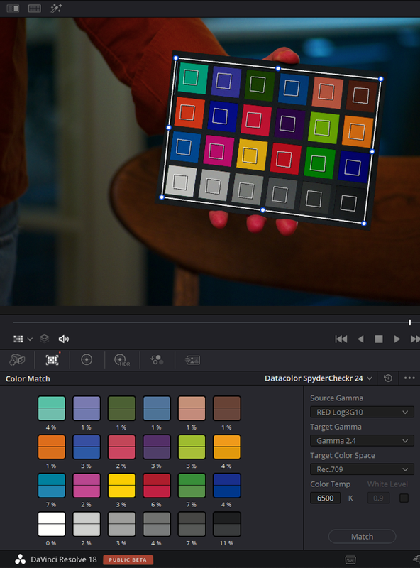
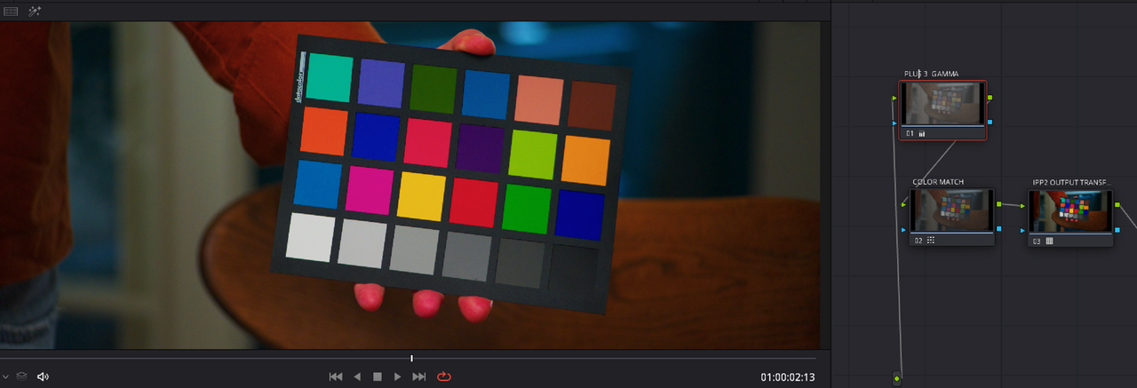
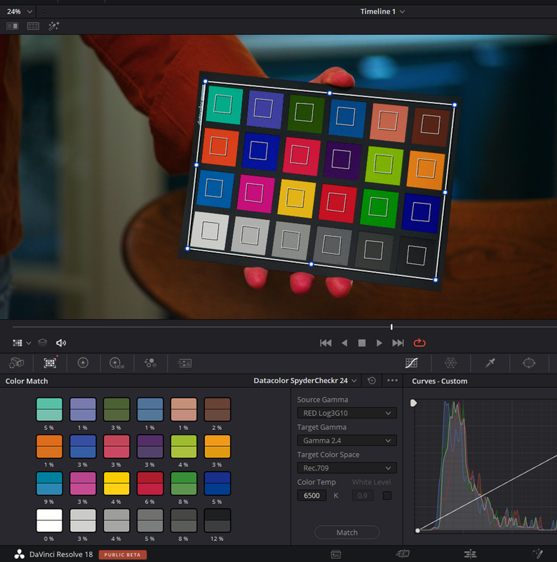
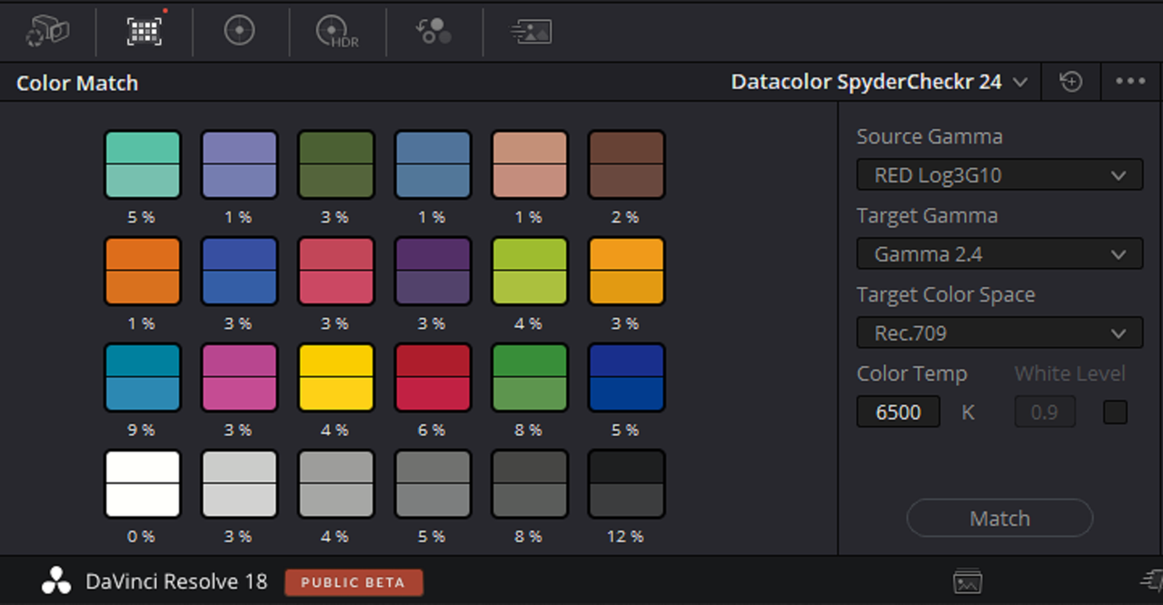
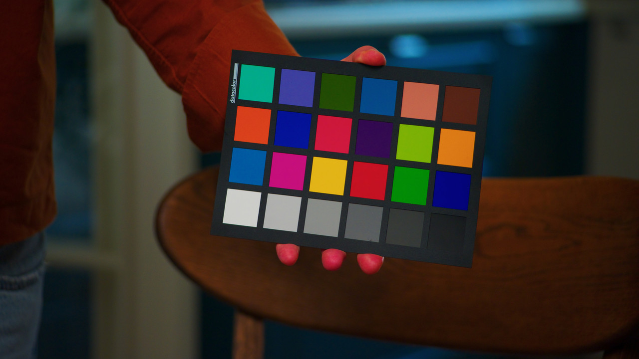
Hey there, I was wondering who else uses the Color Charts in their workflow? I'm using datacolor chart and usually end up with kind of weird results, especially when I'm using lights (be it skypanel or aputure 300d - same) instead of sunlight. I'm getting too much of a red saturation in resolve, sometimes clipped highlights (weird contrast)

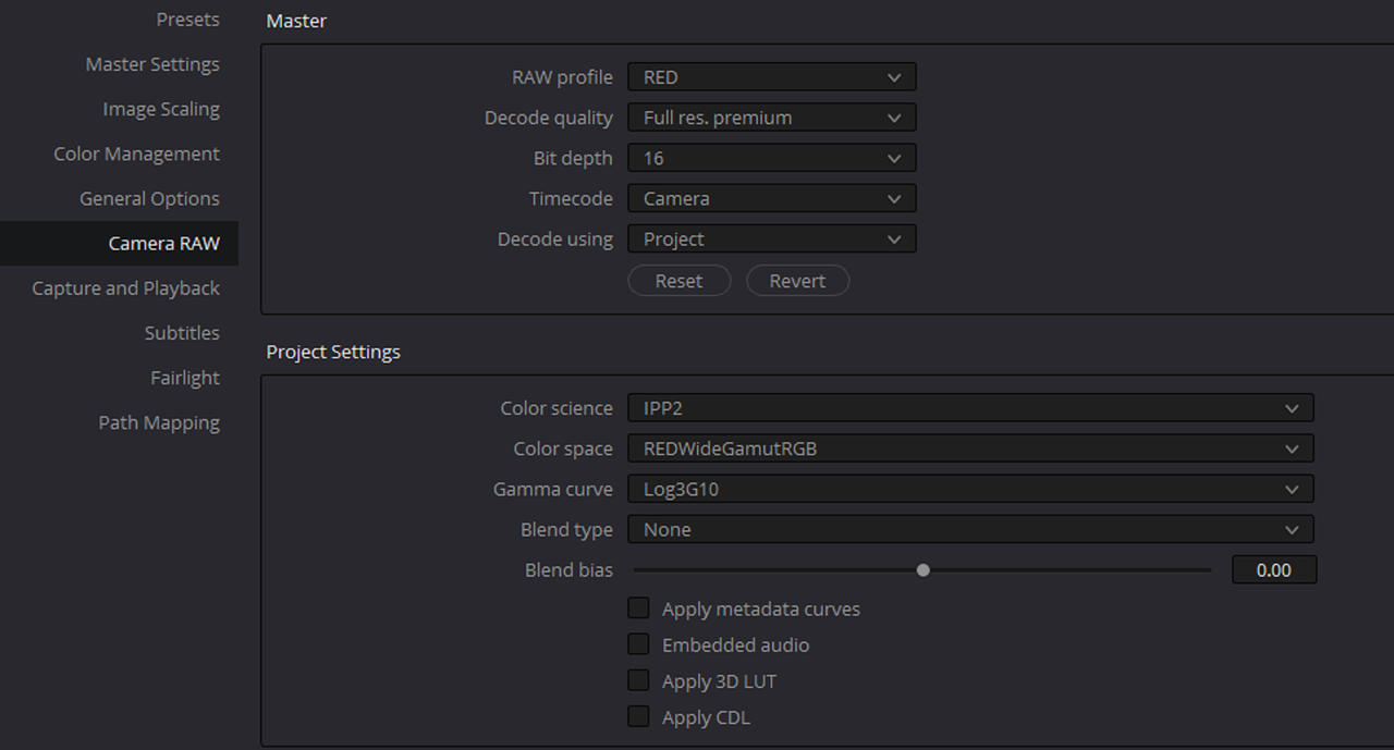
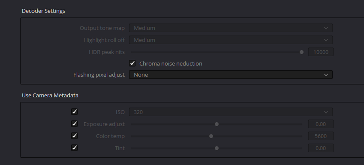
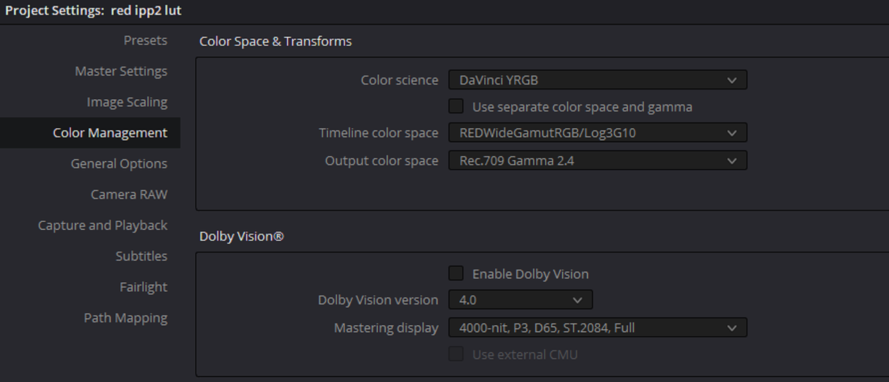
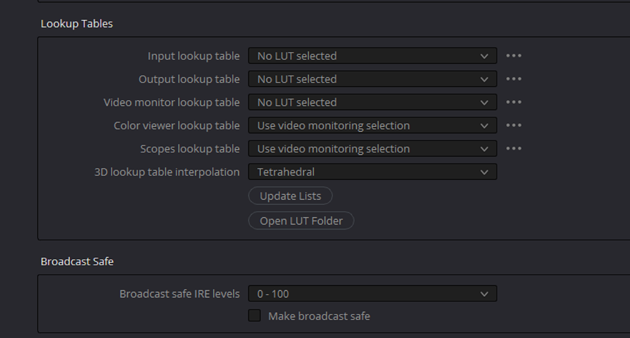
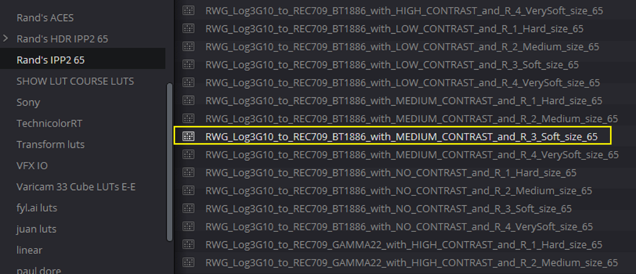
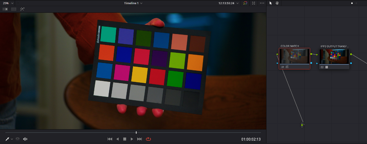
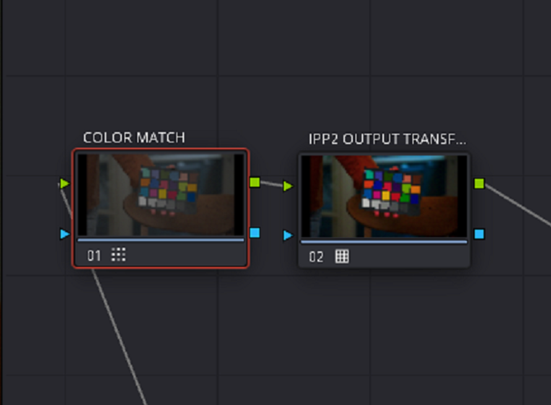
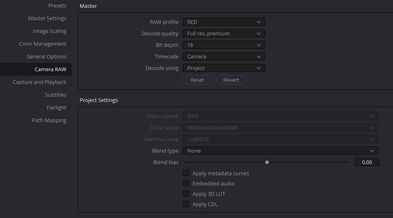
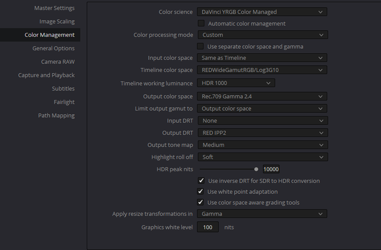
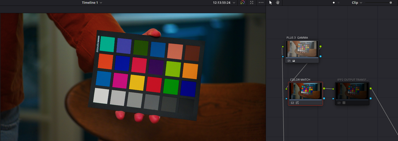
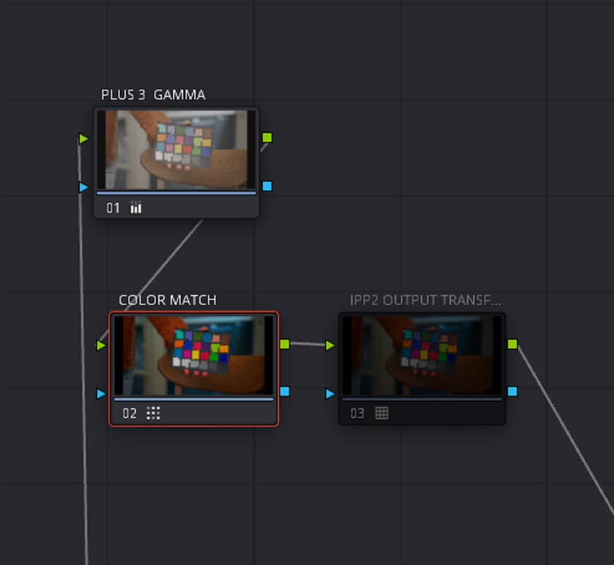
After the release of the IPP2 some things have become more complicated on the color chart use in Davinci Resolve for me, and I was wondering what's the right way to use them (settings wise) in DR and IPP2 workflow.
Screenshot 2022-06-08 124022.jpg


Screenshot 2022-06-08 124232.jpg

Screenshot 2022-06-08 124301.jpg
 

Attachments

  • Screenshot 2022-06-08 124301.jpg
    Screenshot 2022-06-08 124301.jpg
    91.2 KB · Views: 0
Alex,

These are the correct settings to get the results you are looking for from an IPP2 WORKFLOW.

1.png

2.png


3.png


Screenshot-5075.png


I used this IPP2 OUTPUT TRANSFORM

FSFBF.png


Screenshot-5074.png


Screenshot-5073.png


Screenshot-5076.png


Screenshot-5077.png


WITH PLUS 3 GAMMA BOOST IN PRIMARY WHEEL BEFORE COLORMATCH NODE

Screenshot-5081.png
 
Last edited:
Thanks Rand, I've got good results too this way (LOG3G10 and RedWideGamut for timeline, and output transform with a LUT). While it's a legit option, still I wanted to have controls over the contrast and hilghlight rolloff in the raw tab instead of the lut transform in the node tree and looking to find the correct settings both for the color managed workflow and the color checker tab. I'm not a colorist so this is somewhat complicated to me)

Also, in the color checker tab - 6500 is chosen because it's the monitor WB, or you should set it to the camera WB?

Here's the original image with LUT transform only (IPP2, Medium contrast, soft highlight rolloff

1-1-3-1-1-3.jpg

Here's with a color chart correction applied this way:

1-1-4-1-1-4.jpg

The color chart window settings:

Screenshot 2022-06-08 at 15.41.54.png

Davinci Resolve Settings:

Screenshot 2022-06-08 at 15.43.01.png

Raw Settings:

Screenshot 2022-06-08 at 15.43.15.png
 
Last edited:
Alright then Alex,

I don't use the Color Chart tool really at all because if those chips aren't evenly illuminated properly every time under different light sources you will get incorrect and different results every time . I assumed the 6500K was to represent the WHITEPOINT for both RWG'LOG3G10 and REC 709 which is D65(approximately 6500K)
 
The reason why I'm trying to use the color chart is because the Godox VL200 has some slight tint/wb that's pretty far from 5600k, resulting in a kind of magenta/warm image produced by it, and I'm trying to figure a correct way to overcome this in mixed light situations
 
Alex,

I would stick with the D65 whitepoint ( About 6500K) setting if you are going to be looking at a REC709 image on a calibrated REC709 monitor because that is the whitepoint for REC709.

I would also suggest using "REDWIDEGAMUTRGB/LOG3G10" for the "TIMELINE COLOR SPACE" instead of "REC709/GAMMA 2.4" if you are going to be using the "CAMERA RAW" settings you displayed in POST#4

Hence the reason I wouldn't use a COLOR CHART under mixed lighting conditions because all of those colored lights will have to be equally represented and have to be evenly illuminated on that chart for those chips to give an accurate result.
 
Last edited:
IPP2 COLOR MANAGED

D.png

2.png

Screenshot-5082.png

Screenshot-5075efe.png

RE-DID COLOR MATCH UNDER IPP2 COLOR MANAGED THIS TIME

Screenshot-5085.png

Screenshot-5086.png


Screenshot-5089-23.png


Screenshot-5087.png


1-1-2-1-1-2.jpg
 
Last edited:
The reason why I'm trying to use the color chart is because the Godox VL200 has some slight tint/wb that's pretty far from 5600k, resulting in a kind of magenta/warm image produced by it, and I'm trying to figure a correct way to overcome this in mixed light situations
If something like that happened to me, I'd throw the charts out the window and start by fixing the color temperature. We routinely use the Chromatic Adaption plug-in in Resolve to first solve the color temp issue, then we eyeball the chart with scopes. My opinion is that the Color Checker chart is notoriously unreliable (the Color Checker Video is a little better), but don't think that adjusting the chart is going to make the rest of your images right. I do think the DSC charts can work in a display-referred Rec709 workflow, at least if you get a recent-vintage one (which DSC guarantees will work).

A B&W chart will tell you very quickly if the color temp is reasonably neutral on set:

aKwCgAL.png - Click image for larger version  Name:	aKwCgAL.png Views:	0 Size:	26.4 KB ID:	3792713

I think people expect too much out of the Color Match mode in Resolve. It can only do so much, and only when the chart is good and it's very well-lit. Even then, there's nothing Color Match can do that you also can't do manually. Just using a CST node and then making a few small adjustments is generally enough to get perfectly decent results.
 
Marc,

I totally agree! I had purchased the Datacolor Spyder Checkr many years ago when I first got interested in Color Correction . I was made to believe that this would give me the most accurate colors from which to start my grading from. After a couple of times of trying to make sure that the lighting that was being used illuminated the chart at a perfectly even angle and trying to make sure that the grid in Resolve was evenly aligned in the center of each chip but getting much different results each time I did it, I stop using it. I think the Datacolor Spyder Checkr chart I had is in a box somewhere in my attic now.
 
The target Colorspace in the Chart Match function should match the timeline in a color managed workflow or one is going to double down on the 709 transform, once in the match, and once in the color management. That why the hand is so angry and red.

Good Luck
 
The target Colorspace in the Chart Match function should match the timeline in a color managed workflow or one is going to double down on the 709 transform, once in the match, and once in the color management. That why the hand is so angry and red.

Good Luck

Exactly where do they not match? This is an IPP2 workflow that means it's RWG/LOG3g10 then transformed to REC709 with an IPP2 Output Transformm LUT. What RED IPP2 Camera Raw Settings are you using where your method would be correct? The Color Match says TARGET COLOR SPACE AND GAMMA not TIMELINE COLOR SPACE and GAMMA
 
Last edited:
Exactly where do they not match? This is an IPP2 workflow that means it's RWG/LOG3g10 then transformed to REC709 with an IPP2 Output Transformm LUT. What RED IPP2 Camera Raw Settings are you using where you method would be correct? The Color Match says TARGET COLOR SPACE AND GAMMA not TIMELINE COLOR SPACE and GAMMA

Target color space and gama actually mean exactly the timeline color space
 
While, it is rather confusing, the examples from above prove it.

And under most circumstances it does magic in the log+lut pipeline. I will show some examples tomorrow
 
Target color space and gama actually mean exactly the timeline color space

Alex,

TARGET means the final color space and Gamma of the image not what it currently is. If you are grading in a DISPLAY-REFFERED Workspace instead of a SCENE-REFERRED Workspce then you are correct.
 
Last edited:
Here's the same chart used outside. It was shot about 20:00 outside and the sky was in a tad summer pre-rain condition. This is straight out of camera conversion using IPP2 pipeline in resolve, cam set to 5600K, Medium contrast and Soft highlight roll-off, no chart corrections used:
NO-CHART-1-20-1.jpg

And this one is the same after the chart corrections used:
CHART-1-20-2.jpg

Just take a look on the blue cloth in the left of the frame. Take notice of the greens in the background, the glass in the right side of the frame. It's all has become closer to a true to life tonality and saturation/brightness combo. Also look at the hand, how much more nuanced it has become.

Davinci Resolve set to:

Screenshot-2022-06-18-125006.jpg

Screenshot-2022-06-18-125104.jpg

Screenshot-2022-06-18-125156.jpg
 
Red IPP2 straight transform on the left, color chart correction applied on the right:
Screenshot-2022-06-18-125907.jpg

Just look at the difference in the blue patch. And it's the same in every blue patch, also green/yellow brightness difference is quite remarkable.
 
Alex,

TARGET means the final color space and Gamma of the image not what it currently is. If you are grading in a DISPLAY-REFFERED Workspace instead of a SCENE-REFERRED Workspce then you are correct.

that's exaclty what I was thinking of at first, but the results I was getting when thinking this way were just incorrect.


While, the method in the previous post is working good - I just don't like using luts in nodes in my workflow with Red cams, and I'm trying to figure out another path to work with charts in Resolve with REC709/SDR workflow, but still can't find the correct settings.
 
Alex,

You said a lot but you didn't explain really anything.

1) Are you trying to say that because you used the Color Match function that you got different more accurate result than without it?

2) Are you trying say that because you still used the wrong Color Match settings that you got good results anyway?

3) Are you trying to say that because you finally used the correct Timeline Color Space and Output Color Space instead of Rec709/ Gamma 2.4 for both in a Davinci YRGB workflow that now your Color Match settings are correct? You do understand that does settings in Davinci YRGB are really only Metadata and that Resolve is not doing a damn thing in processing your image right?


As Marc and myself have both said earlier this Color Chart is only really meant to "guide" from and not to give the most accurate color info everytime. You used this chart for a REC709 workflow this time, how about with a P3- D65 or REC2020, REC2100 HlG or ST. 2086 project. You have to make damn sure you get the Color match settings for those correct.

You can use a Resolve Color Managed, Davinci Wide Gamut or an ACES workflow which I use instead of Transform Luts. You can Also use Color Space Transforms instead of Luts

I think you're relying on this Chart a little too much and one day your reliance on these charts for totally accurate color info is going to come back and bite you in the ass.
 
Back
Top