Welcome to our community

Be a part of something great, join today!

  • Hey all, just changed over the backend after 15 years I figured time to give it a bit of an update, its probably gonna be a bit weird for most of you and i am sure there is a few bugs to work out but it should kinda work the same as before... hopefully :)

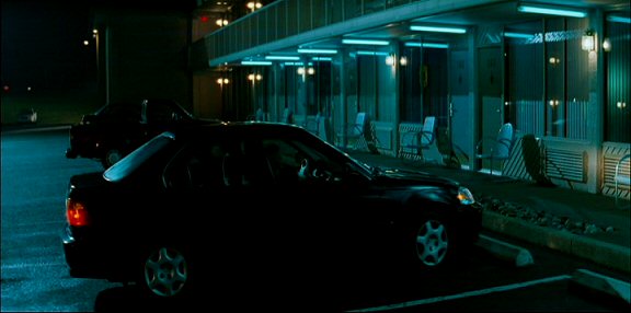
Trying to achive a color similair to The Bourne Ultimatum-

Every part of the short was believable that it was shot at night, except when I had the man walk inside then outside, you could see where things were over exposed so I had to do some pick ups. I came back at night to do that one shot. I could have shot the whole movie at night time, I just wanted to experiment with the effect.

In "Cast Away" wasn't the beach scene where Tom Hank's is holding the volley ball while he is standing in the surf done day for night. That was really well done. I want to rent "The Beach" and "Where Eagles Dare" to see how theirs turned out.
 
sure, the problem is always the skies (Nightmare - as in they are generally brighter that at night (less backlight = less atmosphere sub-scattering) - polas can help at the right time of day and in the right conditions) and, as a Dp, controlling the direction of shooting in crucial as you always aim to create some light/shade to mimic and fake the "keylight" feel that night shooting has. with no sky in shot I find backlight and 3/4 backlight are good - although you need a lot of fill - so that when you underexpose that there is still some detail in the faces. sidelight has the benefit that the pola will do a lot of work plus you get the benefit of contrast.

However, one thing you did learn was not to do that particular thing again (inside vs outside balance) - next time you shoot like that you'll schedule accordingly so you end up shooting that as the light in the exterior drops so that the balance of the interior exceeds the exterior. A late call can assist that or, in the event of a summer shoot (assuming you are northern hemisphere) scheduling this portion towards the winter end of the shoot (assuming that the drama runs over a few weeks/months). We're already one step closer to "perfect" day for night.

Modern technology allows for sky replacements which help a lot. In castaway - although good - you can tell that some digital work was done - both the sky was stripped in and , if I recall correctly, tom hanks has a torch in the scene which looked, to me, like it was tracked in (not that it was bad btw - I'm always noting nonsense like that - goes with the job).
 
I think James and David have it right as usual. Art direction is most responsible for look. And skin tones are the anchor that all other color effects hang from. One thing I'll add is that in situation where you have some control over the foreground, but very little over the background it's possible to color shift the background by shifting the foreground in the opposite direction and then balancing the foreground back to white. So for example to get a green look try adding a small amount of magenta to your key light, and then gray card under the magenta key. As long as you don't push it too hard and or rob your lights of spectrum this works pretty well.

IBloom
 
Yes, IBloom, that is a very nice effect - agreed. Another nightmare I always hit is I live in a country of a particular asthetic (not mine) where WHITE walls are de rigeur (damn you, imported Swedish minimalist aesthetic) and directors often want noirish moody pics. Add to this a lethal mixer of generally small rooms and directors who want actors to improv the scene - often putting them next to the white walls - forcing you to either 1. control the blocking or 2. harder lighting on the actors than you like to stop it getting everywhere. :angry02:

this leads to a flagging nightmare (consequently slower shooting). My constant battle with Production designers is to get them to paint the walls a few shades darker than required in the final piece and ( if going to a DI) generally in a colour spectrum that stays away from skin tones to enable Pogul to work them seperately - Nip/Tucks Green/cyan is pretty good for separation and tone - since adding soft light is more manageable than flagging it - so controlling it as a cameraman is no problem. It's an updated version, I guess, of when art department used to paint shadows on walls. Generally the designer, weilding a pantone chart, will ask questions like "should the walls be bone or ivory?" - when, in fact, I'm looking for something quite a few shades darker. Darker than he'd like.

The upshot of darker walls, I find, is then on the set you can soft light the actors and the walls take care of themselves. You also get credit for 3 things as a result - 1. you light fast and 2. the actors look great. 3. it looks moody.:)
 
Also, there is the old rule that bright areas advance, dark areas recede, so placing a brighter subject against a darker background adds to the three-dimensional effect and draws your eye to the subject. Of course, you could do the reverse (dark subject against bright) if you want to work in silhouettes, assuming the background is uncluttered and non-distracting or out-of-focus...

Paint is (generally) the cheapest form of art direction that has the greatest visual impact, because the walls of a room are in almost every shot except looking straight up or down, or at a huge window. And once you make the decision to paint something, now you can choose the color and whether it is warm, cool, etc.

Although oddly enough, once I started working on mid-budget union films, it become harder to get production to paint walls on location, because of the costs of union painters. I did a movie with a mostly African-American cast ("Akeelah and the Bee") and got into a heated discussion with the line producer because he didn't want us to paint the white-walled location that was the main character's living room. He said it was unaffordable to paint a room (!) -- and this was on a 5-mil feature. I've had rooms painted on half-mil features, so this was odd. Eventually the art director had to promise that he could get it painted (and painted back) within the budget so we did -- and it made a huge difference, of course.

Then a similar thing happened on my last show, which was a 9-mil feature -- we had to turn a classroom into a principal's office by adding a fake wall divider with a glass door in it, to split the space between his office and the receptionist's area. I was told that it would cost $30,000 to put a divider and it was not in the budget. I was scratching my head as to how a flat with a door in it could cost $30,000, but eventually the art director found a way to make it happen, mainly because we never found any other shootable space for the office scene (which is where the climax of the movie took place.)

That's sometimes the "trouble" with coming up from low-budget features, you know certain things are possible if only you had LESS of a budget...
 
Here's a quote from American Cinematographer about Bourne Ultimatum:

"...The cinematographer (Oliver Wood) says... I still think film is the best recording medium, and with a DI I can pull out more information and better information than I could with any of the digital formats I’ve tested. But I shoot film differently than I used to. I don’t use filters at all. The less glass you can put in front of the lens, the better, and I can do that kind of image correction in the DI.”

Emphasis added.

Read full article here.

Steven
 
I believe what David is saying is very true. Even taking the color tones out of it for a moment. The biggest giveaway of a low budget film are bad sound and bad art direction. On the surface, it would seem that a low budget film would have a difficult time with budgeting for art direction. But the reality is you HAVE to make this a priority. It ties everything together. Art direction can say a lot more abut your characters than dialogue a lot of times. It's that perfect combination of lighting, art design, sound, and of course good acting that bring scenes to life.

Fix it in post is not as smart as design it for post.
 
shadowboxerDVD4.jpg


Nice shot David. Could you give the stock/asa details if you still remember?
 
One thing I absolutely hate about blueing up a scene in the grade is the horrible magenta/purple colour it makes skin tones go - totally unrealistic and distracting (you can try desaturating a bit but then the skin tones just go greyish & deathly-looking). I think David's tactics are absolutely ideal if your art dept/wardrobe budget can stretch to it.
 
in my second short ever, I discovered I could shoot in blue if I didn't color balance my DVX100A ($1,800 on ebay last year). So blue became the color of hell (that's Satan griping about the kind people he has to deal with)

http://mingfilm.com/video/ONTHELASTDAY_trailerSL.mov

The budget was the pizza

That's right - fixed Scarlet for me, unless December 3rd brings chaos and upheaval.
 
That's sometimes the "trouble" with coming up from low-budget features, you know certain things are possible if only you had LESS of a budget...

This is the paradox of the low budget music video. When I was doing $2K, $4K videos we were always patting ourselves on the back for getting great things in front of the camera.

As soon as we had $15 and $20K to spend per day, all of a sudden you have to pay everybody close to a real rate. Often there's too many elements to make happen, so you have to delegate (as it's supposed to be), but those things cost real money because you're now working on a "real" show!

Things were definitely easier on the $4K jobs!
 
Back
Top