Welcome to our community

Be a part of something great, join today!

  • Hey all, just changed over the backend after 15 years I figured time to give it a bit of an update, its probably gonna be a bit weird for most of you and i am sure there is a few bugs to work out but it should kinda work the same as before... hopefully :)

FILM NOIR - Trouble Is My Business

Thor Melsted

Well-known member
Joined
Jan 8, 2009
Messages
252
Reaction score
0
Points
16
Age
54
Location
Sherman Oaks, CA
A dark tale of a doomed romance, of murder and betrayal, told in the classic style of black & white film noir.


I wanted to share this with the RED community. I figured you might appreciate this kind of project.

Shot on two Scarlets with ARRI primes.

Cinematographer: PJ Gaynard
Lighting supervisor/gaffer: Ralph King

Director: Thomas Konkle
Writers: Thomas Konkle & Brittney Powell
Starring: Thomas Konkle, Brittney Powell, David Beeler

Producers: David Beeler, Thor Melsted

Two and a half months ago, we ran a successful Kickstarter campaign and not only met, but exceeded our fundraising goal.
The goal for that campaign was to generate funds to shoot the opening scenes of our film. A private investor matched what we raised on Kickstarter, and with the help of a professional crew who believed in the project sufficiently to defer their salaries for those days of work until full funding was secured, we shot the opening of the movie.
Post production is well underway and the first 20 pages will be complete within 2-3 weeks.
We are currently trying to raise $10,000 as first money in towards the modest $250,000 budget.

We have a new website and kickstarter campaign up, with a look behind the scenes.
Feel free to take a look.

Here are a few frame grabs. Click the image for the 4K TIFF.


Any and all feedback is appreciated. I'll do my best to answer any questions anyone might have.

If you like what you see, please share this with your friends. Share it with someone who loves film noir.
 
Anybody have any comments? We're open to both criticism and praise, obviously. Just want honest feedback.
 
The lighting is great! Like the cinematography too.
 
I enjoy the lighting but the sharpness is excessive - skin looks plastic and unflattering
Ironically I would suggest degrading the image more to get rid of the digital sharp look
But that's jist me - I watch a lot of film noir - and these movies rarely had big budgets

They were moody - I think you have the lighting right, and production design
But right now it looks like a modern film "trying to look fim noir"

Make sense? I mean this in a positive constructive criticism kind of way
It's too clean (damn 4k resolution! Lol) noir it up!

Cheers
 
Appreciate the feedback!

This is not the final grade, so rest assured we're taking this as constructive criticism.

Thanks!
 
What Tim said.
Like the lighting, dont care much for the camera work, like the actors.
Maybe less noise reduction ?(If there is any)
Nice work anyway.
 
Just as a suggestion for the future, try shooting with a net or heavier diffusion filter (pro mist). It will help soften the image and give the light sources and highlights a bit of a glow.
 
Like the overall look and feel - Perhaps as the other users suggested. Some more polishing and its there. Very well done.
 
Here's what our director had to say when I talked to him last night (I'm paraphrasing somewhat):
I really want a kind of alternate universe noir, in the regard that if cleaner image had been possible then I highly doubt Huston, Welles or Tournier wouldn't have gone for it.
We are making an original work in the same style, rather than a copy of the technical limitations of the time.

I probably should have mentioned this at the outset, but the goal was never a "warts and all" noir look, but rather that lighting and story telling style, which was born out of severe limitations of budget and/or equipment.
The feel is supposed to be a kind of Maltese Falcon meets Raiders of the Lost Ark by way of Blade Runner, if that makes sense.
We're also ultra low budget, but we have access to much better equipment than the classic noir, so it is going to look different. For one thing, noir films of that era were not 2.4:1 aspect ratio. We also did chroma key on several shots for set extensions, seeing as we have in-house VFX which allows us to do stuff they couldn't do back then, so there's that too. But anyway, I digress.

All that said, we most definitely appreciate the feedback - some of which we'll take to heart and some of which we'll disagree with, but that's how it goes :)

Oh, and we only shot the leading lady with a half Hollywood Black Magic filter, the rest was "natural."

Thanks guys.
 
I agree with Tim for sure about the sharpness, but its better that it that sharp to begin with, it will definitely help when downgrading to DI 2K for cinema. All in all, everything is textbook :) good job
 
I enjoy the lighting but the sharpness is excessive - skin looks plastic and unflattering
Ironically I would suggest degrading the image more to get rid of the digital sharp look
But that's jist me - I watch a lot of film noir - and these movies rarely had big budgets

They were moody - I think you have the lighting right, and production design
But right now it looks like a modern film "trying to look fim noir"

Make sense? I mean this in a positive constructive criticism kind of way
It's too clean (damn 4k resolution! Lol) noir it up!

Cheers

I was going to mention this, then I read what Tim Whitcomb said. I agree.
Lighting seems to have achieved the look but the 4K sharpness is stickin' in the eye.
 
Hahaha yeah... I've been mucking around with that Filmconvert software that peeps have been taking about, and with 4k RAW, it's totally badass. You can add all sorts of different Kodak and Fuji film stock looks with grain etc.. This would definitely add NOIR and smooth the edges out :)
 
Noir used lots of on-camera filters, you did not. You can't use super-hard noir-style lighting and no filtering - one goes with the other. In noir the women were not lit the same way as the men - which is what you seem to be doing here.

The men look correct, when there are only men in frame it looks like a real noir piece - but the women don't have their glamour come across enough. I think this is lighting and also a makeup issue. Noir used HEAVY makeup, designed for black and white.

Trying to filter in post is not the same. Learn filters - use them.
 
Last edited:
This is true... Ironically I was just reading an article David Mullen wrote about 'Dior Nets" that were used on Anna Karenina, and I have never even heard of this before, so it is definitely interesting.
 
That's good, sharpness is not bad, we cant always destroy the sharpness of the image for better old film look & your director is right about that.
just add some filmconvert next time, see if it helps for better old style cinematic look.
 
I think you have to breakdown this sharpness discussion into two separate issues: the sharpness of old b&w stocks, lenses, and general quality of what's available to watch today (quality of the film element, transfer quality, etc.) and then the second issue, the use of lens diffusion back then. Generally a film noir would have been shot clean (other than b&w color-contrast filters outside, maybe an occasional fog filter for a foggy scene) except for woman's close-ups, which usually got some special filtering, glass or nets. But the more gritty film noirs did not use diffusion filters as a general rule. However, many might have opted to shoot on the softer, grainier Super-XX stock rather than Plus-X, or push-processed Plus-X, or even push-processed Super-XX. And lenses weren't as sharp back then, and a low-budget film noir probably would not have used the best equipment nor the best labs, plus many survive today in the form of an old print.

So if you really want to match that old look, beyond lighting, production design, composition, etc., there is the general softness of the day to match, the level of graininess, certain optical characteristics of b&w negative (like halation around car headlamps), then there is the use of lens diffusion of women's close-ups.

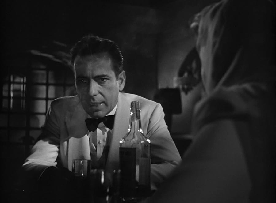
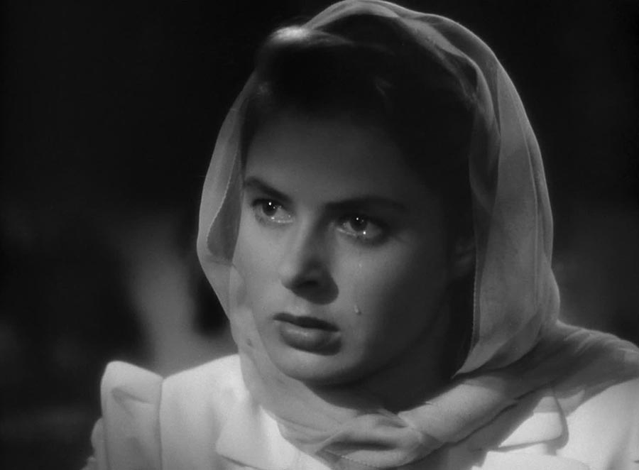
As a reference, look at these frames from "Casablanca":

casablanca1.jpg


casablanca2.jpg


casablanca3.jpg


You can see the use of diffusion in the close-up of Ingrid Bergman, but the wide shots would not have had any, maybe the medium shots had something slight. The softness of the wide shots is more a factor of the lens and stocks of the day.

So you may consider first as a base diffusion something like a 1/4 Black ProMist, not so much for a diffused look but something to match better the softness and halation of the older b&w stocks and lenses. Or perhaps something like a Classic Soft Black, the lenslets in Classic Softs creating a ring/bubble diffusion that is more like the ring halation that old b&w negative stocks caused around candle flames and car headlamps. Then something heavier for the close-ups of women.

Or you could take the attitude that b&w digital is its own look, clean and modern, though in this case the images are retro so perhaps the texture should be too. I do feel that sometimes monochromatic digital can look too clean and sharp tough, at least for dramas (maybe not for a landscape movie trying to emulate a 8x10 photo.)
 
I enjoy the lighting but the sharpness is excessive - skin looks plastic and unflattering
Ironically I would suggest degrading the image more to get rid of the digital sharp look
But that's jist me - I watch a lot of film noir - and these movies rarely had big budgets

They were moody - I think you have the lighting right, and production design
But right now it looks like a modern film "trying to look fim noir"

Make sense? I mean this in a positive constructive criticism kind of way
It's too clean (damn 4k resolution! Lol) noir it up!

Cheers

I agree, the potential is there but it still has a video edge (almost feels 30fps).
Perhaps blooming the whites a bit might do the trick. The old lenses that these films were shot on imparted plenty of mood and aberrations. They would use nets for the women even if they were using a hard key light.
Even adding in a bit of a vignette (very slight) here and there might help as well.
 
Last edited:
Back
Top