Welcome to our community

Be a part of something great, join today!

  • Hey all, just changed over the backend after 15 years I figured time to give it a bit of an update, its probably gonna be a bit weird for most of you and i am sure there is a few bugs to work out but it should kinda work the same as before... hopefully :)

DESERT P9 commercial

Frank Mirbach

Well-known member
Joined
Sep 13, 2007
Messages
431
Reaction score
0
Points
0
Website
www.mineworks.de
Hi guys,

we shot this one for the German shoe manufacturer HAIX (www.haix.com), a leading manufacturer of high quality fire fighting, rescue, military, law enforcement and outdoor recreation footwear.

Shot on R1 in the driest place on earth, the Atacama desert, Chile, where parts of QUANTUM OF SOLACE have been shot also. You probably remember the building ...

http://frankmirbach.com/mirbach_haix_film/haix_h264_mirbach.mov

Feedback welcome !!

Director: F.Mirbach
DP´s: F. Mirbach, H. Gerken
Editing: C. Crowe
Music: M. Wegmann


If the stream is too slow, there´s also a YouTube version here:

http://www.youtube.com/watch?v=CPjV-6Vp2Vw
 
Very cool Frank.

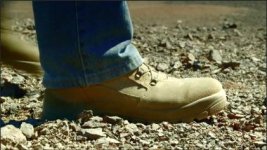
Great first shot of the rocks and the boot coming into frame. Why is the shadow on the ground that fills the frame after the boot passes by so blue-violet? Grading choice, reflection from the jeans, sensor problem with underexposure? Also, why is the first part of the close up on the guy so out of focus? Creative choice or just missed it? Finally, why is the color balance so different between the first wide shot of the environment (bluish) to the second after the close-up (very yellow). Makes it feel like we've changed locations or time of day suddenly with no clear explanation why.

Nice rack focus from the tumbleweed to the boot/lower leg walk-by but the jump cut is jarring because the timing/cadence of his steps changes for that one clip vs. the clips before and after. If you tap out the speed of his footsteps, you'll see what I mean. The key to a great jump cut is to make sure the speed and motion of the movement is the same before and after.

Creatively speaking, I love it. I think the warmer grade in the latter half makes the environment look less hostile than the cool grade in the intro. I'd probably stick with the cool grade to maintain the feeling of desolation, heat and dryness. You don't want the place to look like a pretty sunset in Phoenix. If you need the boots to be warmer, you could use a power window and just warm those up. Maybe slowly go warm once we transition to him on the balcony.

The only problems I saw were in consistency of the grade, the missed focus on the first close-up and that jump cut I mentioned. Other than that, great concept, great photography. Can be so much better with minimal post, minor edits and perhaps replace that out-of-focus close-up with another section from same clip that is more in focus.

One last comment you could maybe pass on if you want. I'd echo-stamp Desert P9 and maybe HAIX as well rather than the slow fade-in with the slight enlarge. The font lends itself to a hard "stamp" action with the echo blur and a nice sound effect would emphasize that. Generally it's not a good idea to use the same font for body copy that is used for brand logos and trademarks so maybe change all other text to another font and use upper-lower instead of all caps for the non-brand verbiage. URL at the end needs some kerning between the w and the first dot and the p and the last dot.

You asked for feedback. :)

-michael zaletel

Hi Michael,

thanks for your feedback, you´ve got a good eye !

The grading of the scenes from cool to warm has been a creative choice to emphasize the long way the guy has to walk through different landscapes, so assuming a location change is what was intended. The bluish shadow at the very beginning was a sacrifice we had to make to achieve the overall blue look in the first part.

The editing, jump cut and all, has been made according to several test screenings as well as the out of focus shot. We created several versions of the film and the feedback we got showing the "out of focus" version was the best. For me, it added a certain dynamic, underlining the hard conditions in which the guy makes his walk. As always with commercials, the client has the final decision and luckily, they liked my favorite version.

I agree with what you mentioned about the graphics, but that also has been a client wish. The do have two different logos already, and didn´t want to establish a third one, which had been already created by us for the commercial. So, as a compromise, they decided to use the selected font also as "Logo"

Frank
 
These purple spots, what caused them?


Note: If you look at the full sized video a rock in the background and some of the metal on the boot are very oddly colored.
 

Attachments

  • Screen shot 2010-05-28 at 10.44.00 AM.jpg
    Screen shot 2010-05-28 at 10.44.00 AM.jpg
    22 KB · Views: 0
These purple spots, what caused them?


Note: If you look at the full sized video a rock in the background and some of the metal on the boot are very oddly colored.

Hi Ian,

not sure what you mean exactly ?

Frank
 
At the very end, what is the building? That building was also used in a James Bond movie. Is it a hotel?
 
At the very end, what is the building? That building was also used in a James Bond movie. Is it a hotel?

That's the ESO Hotel - a recreational hotel/building used for the scientists and other people working at the Paranal Observatory in the desert.

Paranal Observatory: http://en.wikipedia.org/wiki/Paranal_Observatory

ESO Hotel: http://en.wikipedia.org/wiki/ESO_Hotel

I highly recommend anyone interested in space exploration to sign up for the ESO Cast video podcast: http://www.eso.org/public/esocast.html
 
Hi Ian,

not sure what you mean exactly ?

Frank

They appear to be blown-out highlights... More of them appear on the shoestring catches when the left shoe comes into frame as well...

Shoe_Hilights_01.jpg
 
That's the ESO Hotel - a recreational hotel/building used for the scientists and other people working at the Paranal Observatory in the desert.

http://www.eso.org/public/esocast.html

That´s right and it´s one of the most unusual and beautiful places I´ve been to. The whole architecture is so Bond ! Our crew even slept in the Bond crew containers...

Frank
 
They appear to be blown-out highlights... More of them appear on the shoestring catches when the left shoe comes into frame as well...

Shoe_Hilights_01.jpg

Hmm, gotta see into that. I can´t remember to have that in the 2K master...

Frank
 
Excellent Frank. :-)
 
Back
Top